Concept Project, Visual Design
Liquid Lab
Who.
A healthy juice company, Liquid Lab
Themes.
Fresh, healthy, customizable, whole, energy, colorful, local, vibrant, accessible, nutritious, restore, fortify, rejuvenate, modern, refreshing
Focus.
Refreshing
Design.
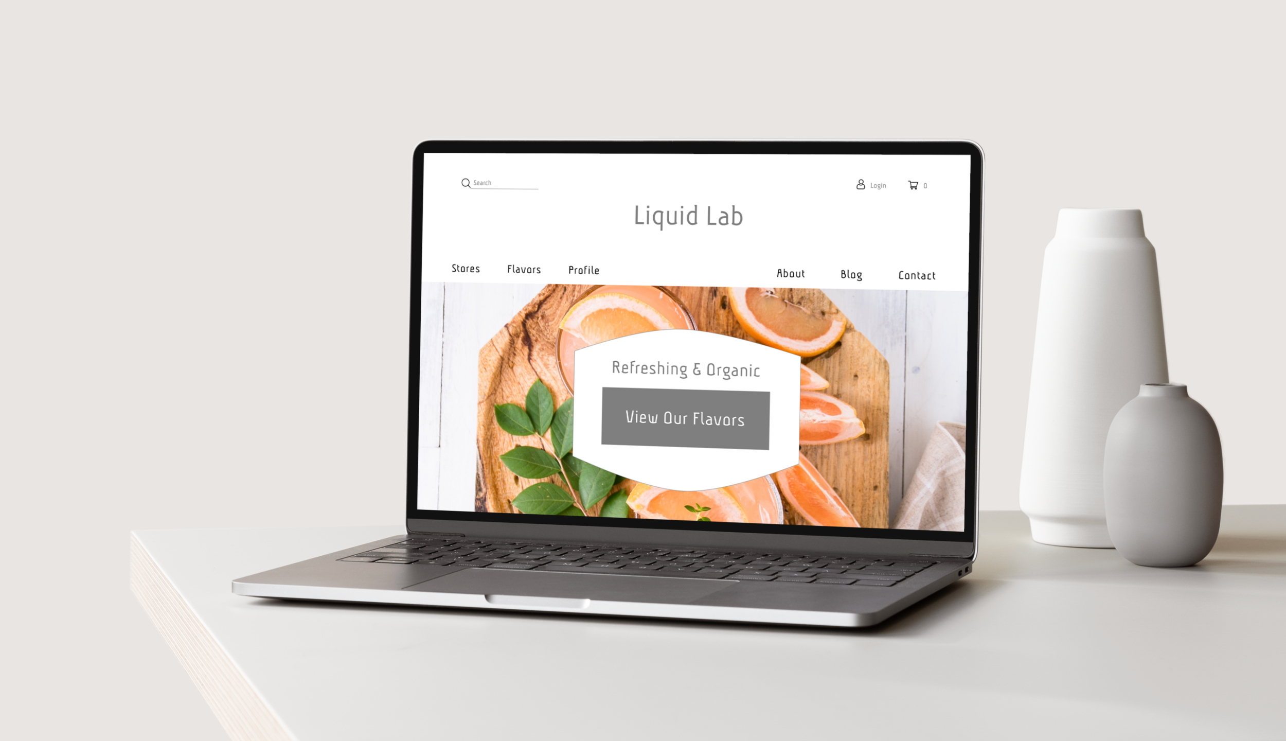
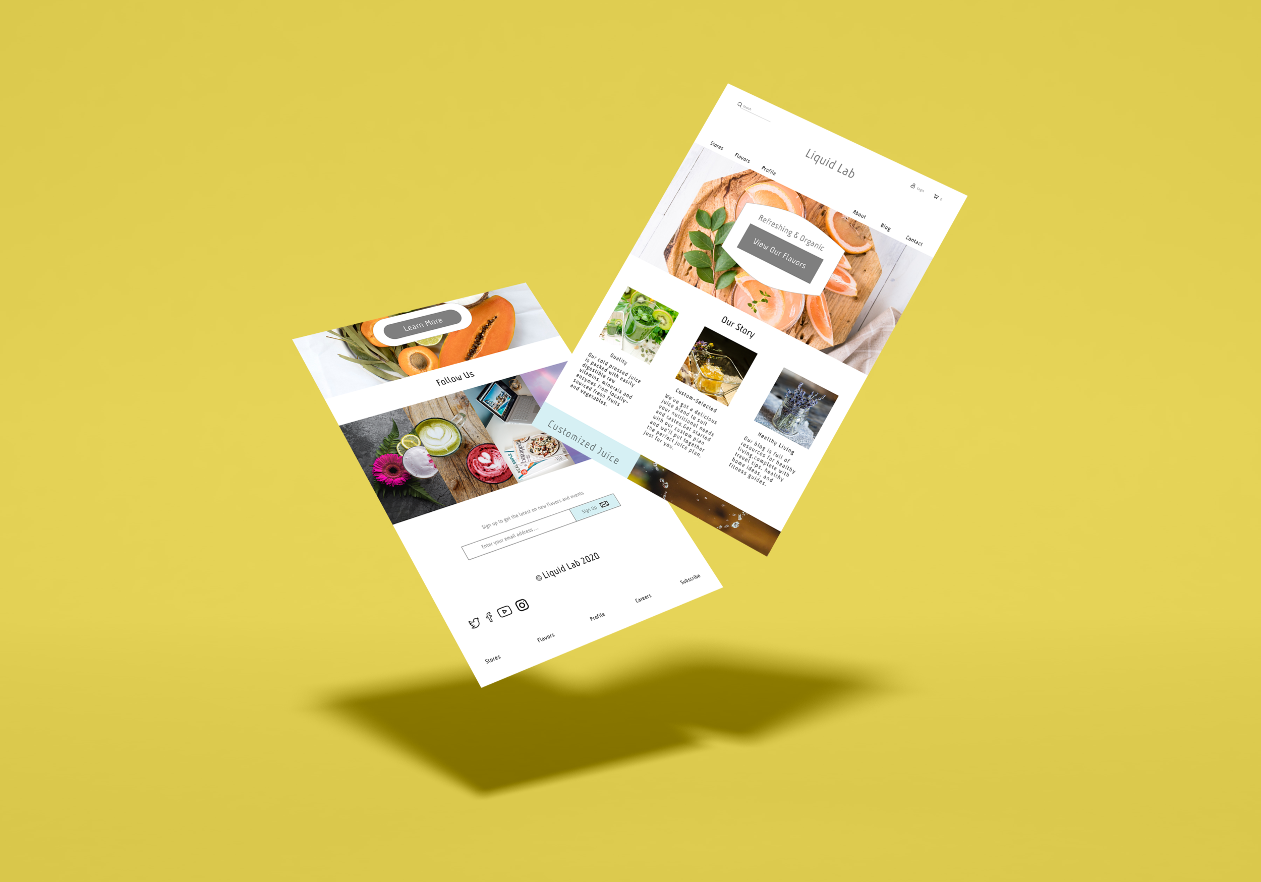
Landing Page
Strategy
Provide information on healthy eating, quality nutrition, and body positive images to educate customers on the mission of Liquid Lab. Their juices are made with carefully chosen ingredients that are meant to be a beneficial addition to a client’s lifestyle rather than a supplement for meals and health routines.
Objective
For clients to incorporate juice, pre-made or custom-created, within their daily life, so that they take in quality nutrition to feel well and are equipped to take on their day, energized, refreshed, and ready to go!

Brand Research
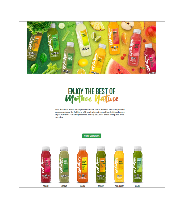
Evolution.
The site utilizes earthy colors with a focus on greens and nature. Images of fruits and vegetables encourage the idea that their drinks are natural and fresh. They openly and clearly share information on their ingredients, story, and blog.
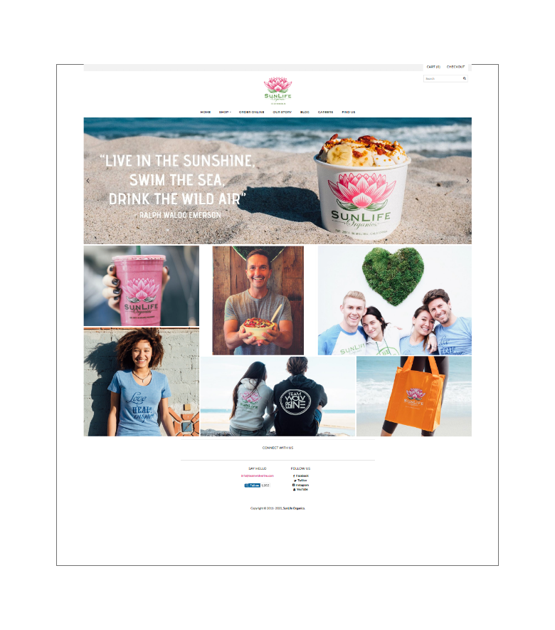
SunLife Organics.
The idea of sun, life, and organic is shown through beach shots, light, and minimal design. The vibrant stencil of the green and pink logo pops against abundant white space. They focus on quality over quantity and organic ingredients.
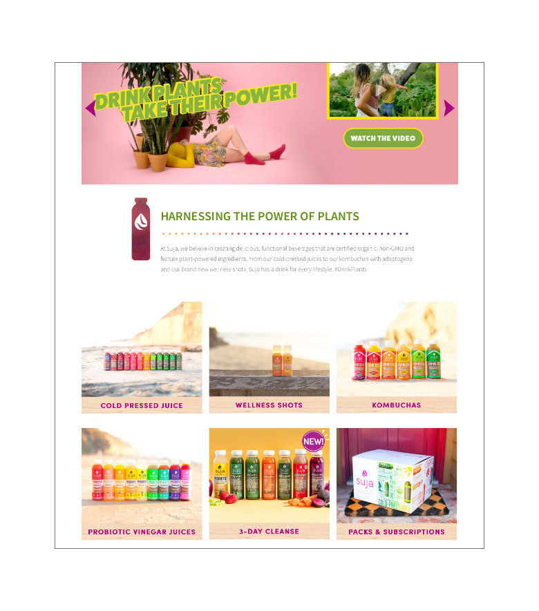
Suja.
Word choice, such as “cold pressured,” “wellness,” and “power of plants,” emphasizes health. There are multiple opportunities to order their products on the landing page, and the content targets testimonial and seasonal items.
2 of the companies, Evolution and Suja, sell their products in grocery stores, such as Ralphs, Whole Foods, and Bristol Farms. SunLife Organics is a smoothie and juice company with stores in California and Texas, and they do not currently sell products outside their local stores.
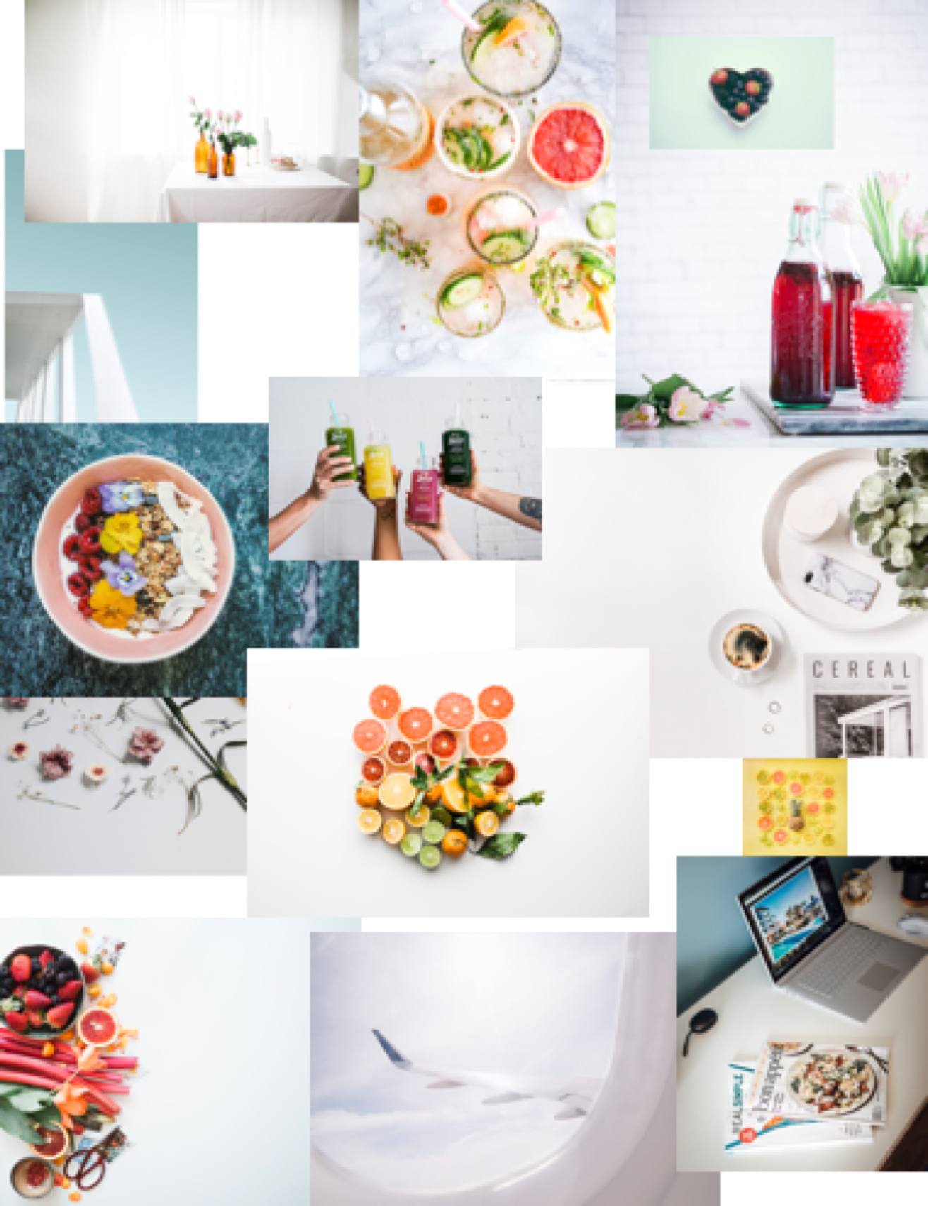
Moodboard.
Focus: Refreshing
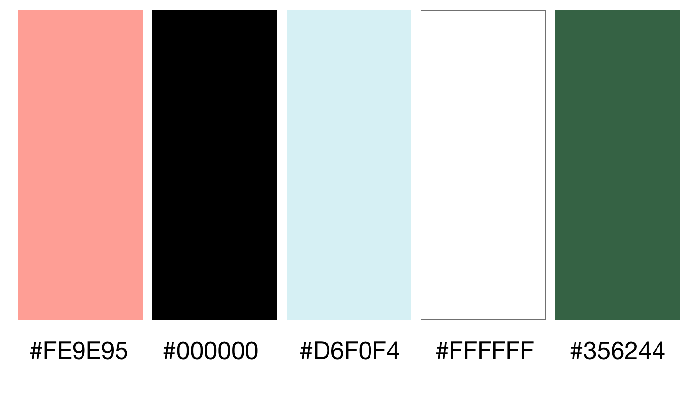
Colors.
Inspiration: Citrus, Water, Greens
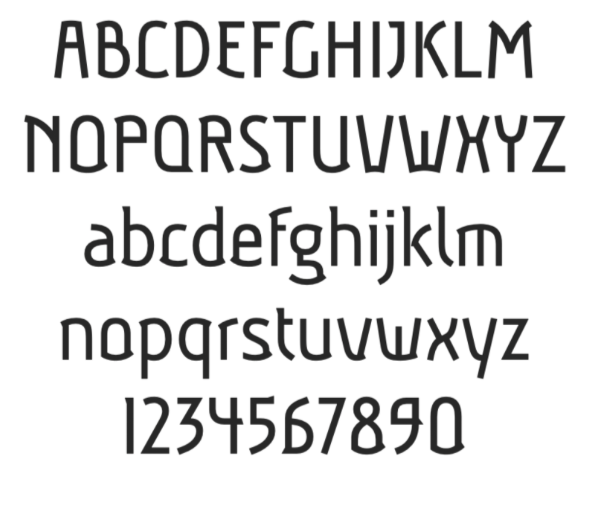
Typography.
Font Choice: Aubrey
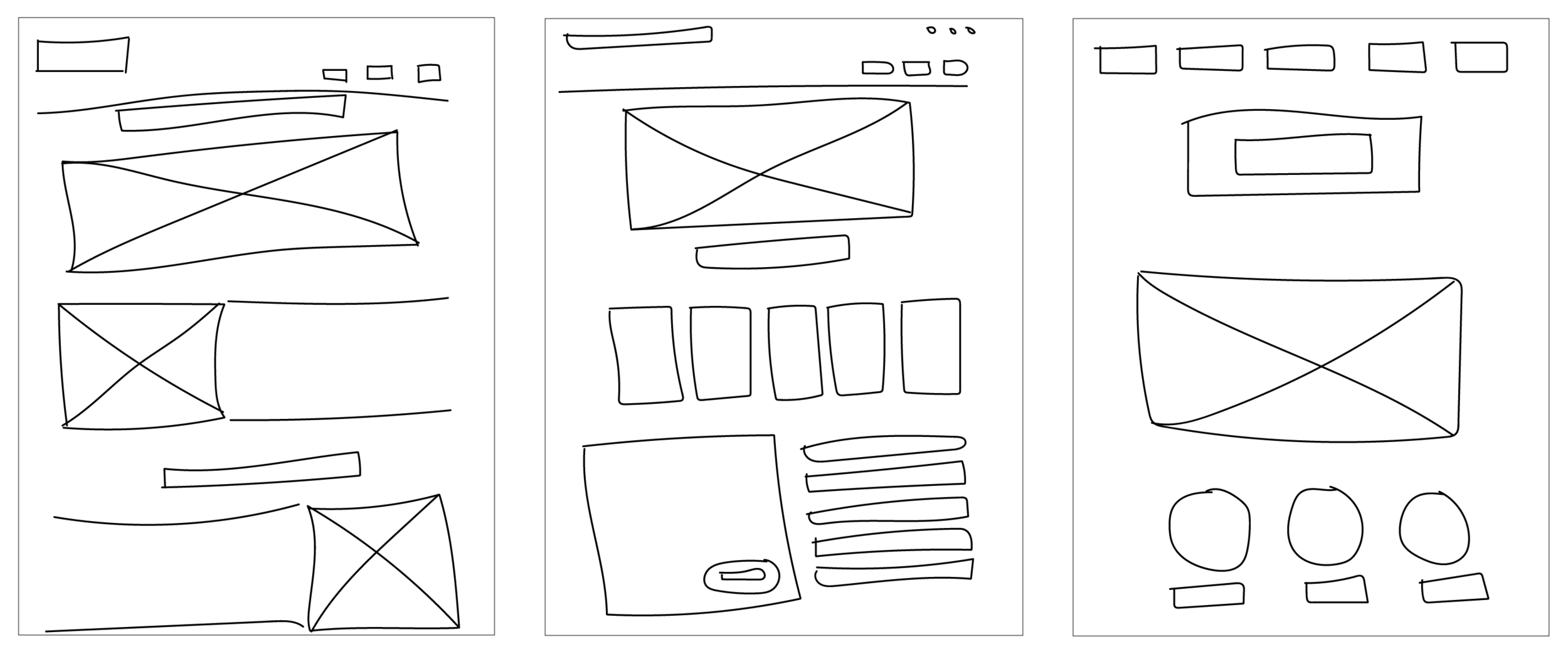
Sketches.
Brainstorm: Pen and Paper
First Wireframes.
“I just learned how to use Sketch!”
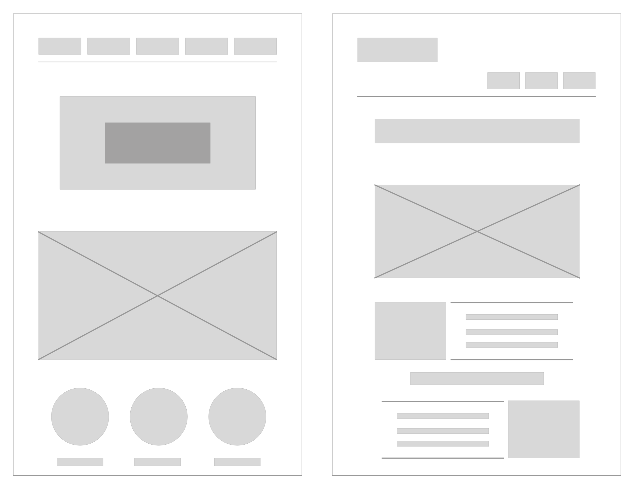
Second Wireframe.
Redesign: Landing page template
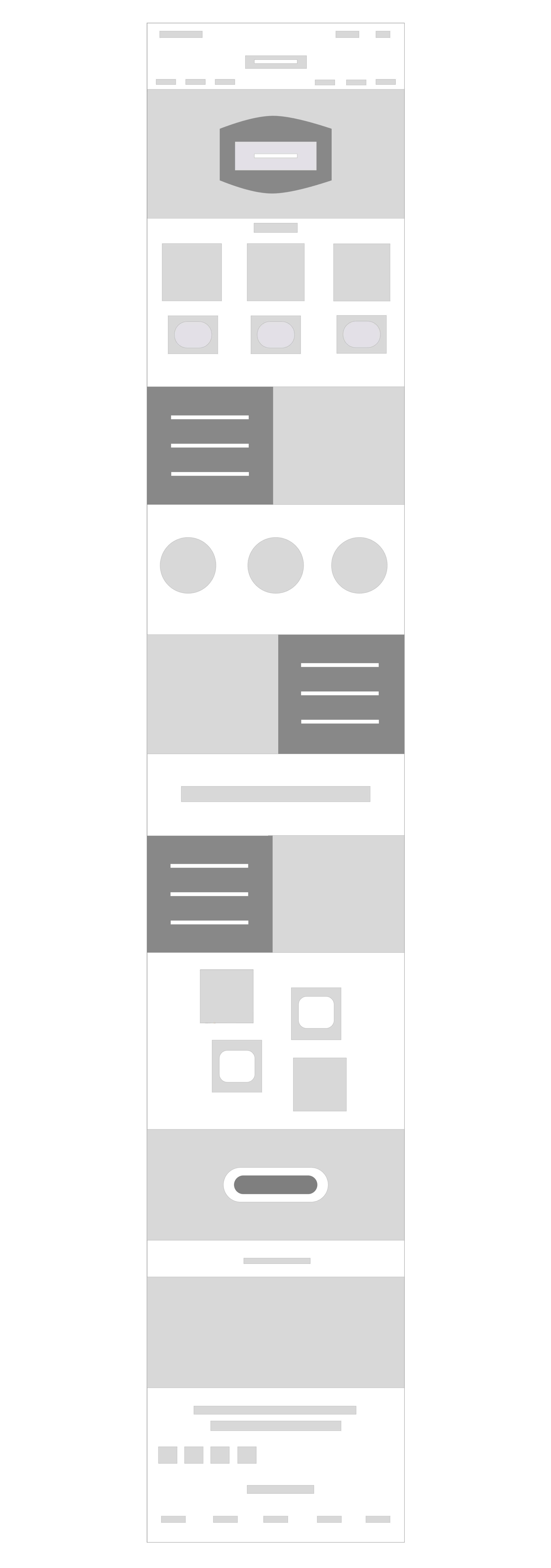
Landing Page
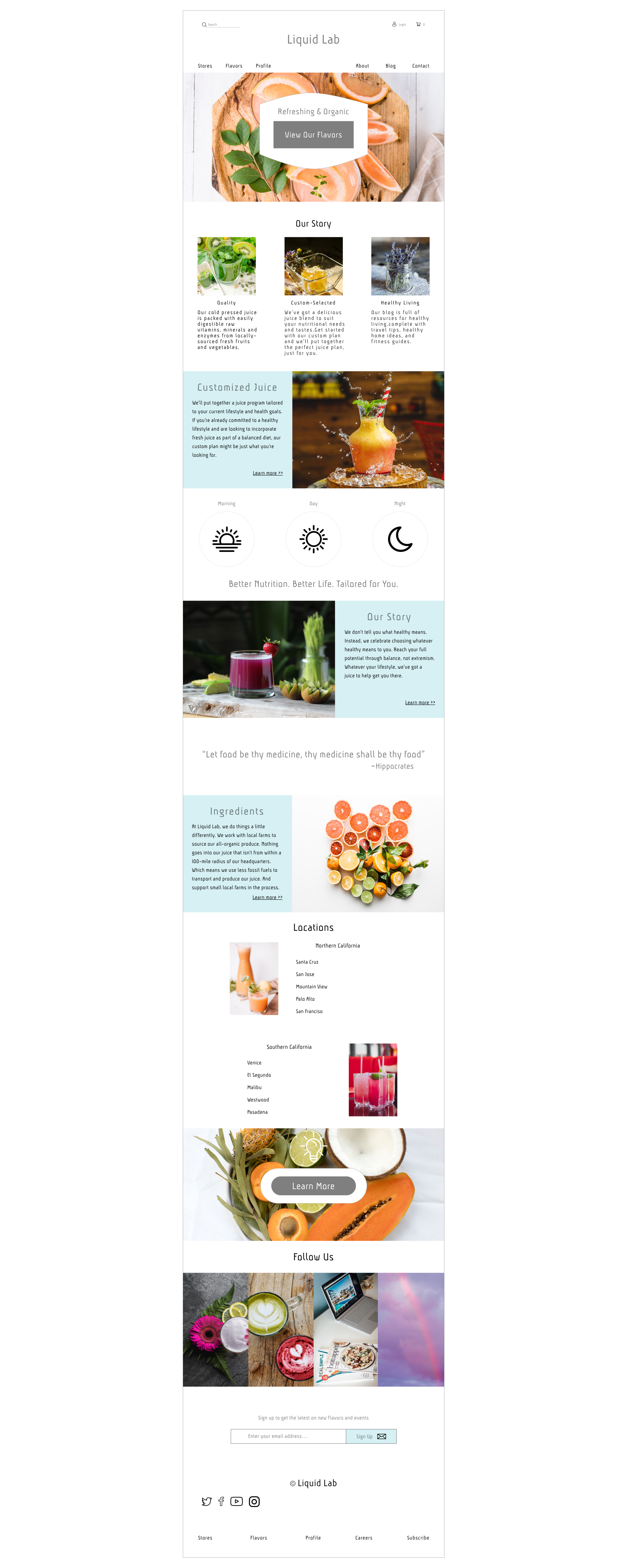
Liquid Lab Design.
For the creation of the Liquid Lab landing page, I used Sketch to develop the initial wireframes, final wireframe, hi-fi mockup, and the final landing page. I wanted to incorporate as much of the company ethos and audience interests on the page, so it contained multiple sections and ways to learn more with:
Opportunities to learn about customized juices, their story, and ingredients through page content and links to blog posts.
An ability to align with each person’s health preferences with juices that match to a client’s morning, day, and night.
Store locations, social media posts and platforms, and newsletter links for people to stay connected to Liquid Lab.
Reflection.
Initially, the design was shorter in length and concentrated on the Liquid Lab juice with ways to purchase the product. With the deliverable being one landing page, I wanted to add more ways to learn about the company and draw health inclined clients into their story.
The juice companies I originally researched shared information specific to their juice and kept the length of their homepage pretty short. So, I researched other health companies but in the restaurant industry, which turned out to be beneficial for design ideas on how to lay out the page in a way that could support more information. With a combination of ideas from restaurants and juice stores, image stock from Unsplash, and a design focus of “refreshing,” the Liquid Lab landing page was completed!