
Privva
Cybersecurity and Venture Risk Assessment Platform
Company
Privva was originally a startup focusing on cybersecurity and venture risk assessment. They were located in Arlington, VA, Link, and they manage an online program that determines if working with a 3rd party vendor would align with a client’s security standards. They were later acquired by Smarsh, Link, and incorporated into their family of products. Privva utilizes vendor questionnaires, testing, and data collation to determine the risk of companies working with outside vendors, and they calculate various risk scores that align with each company’s security preferences.
Product
The online portal was the channel from which Clients and Vendors would determine a working relationship. With the product, Clients create, send, and reply to individual or groups of Vendors, while Vendors complete and respond to Client’s security questionnaires or auto-fill questions from previous partnerships. Clients determine the type of assessments, questions, and risk scoring for each project, and the Vendors are 3rd party companies that may work in conjunction with the Client depending on their question responses, answer explanations, and flagged remediations.
For example, a company like Target, may work with outside vendors for product deliveries and buyer collaborations. The security department would determine the risk of working with vendors based off of their assessment responses and calculated risk scores.
As a UX Consultant, I advised and worked together with the Project Manager and Stakeholders on various Proof of Concepts (POCs), such as revised data graphs, stakeholder agendas, such as new Client and Vendor features, and team finds, such as coding bugs and various restructuring to their client account portal. The deliverables geared towards product design with a UX perspective, since high-fi MVPs, information architecture, and Stakeholder feedback were prioritized over Clients’ and Vendors’ usability test scores for each project.
Position
Tools
Figma, Lucidchart, Keynote,
Duration
1 year and 1 month
+ / - 20 hours a week
Setting
Remote Office, Thanks Zoom!
Adobe Illustrator, Google Drive
20 Design Projects
7 Figma Prototypes
70% of Work In Use
Auto-Extension Requests, Email Templates, Risk Assessment CTAs, Bulk File Uploads, Vendor Requests, View Assessment Expirations, Custom Field Edits, Transfer Files, and Others . . .
Auto-Extension Request for Clients, Vendors, and their Combined Process, Vendor Request and Bulk File Upload for the Start, Fill-In, Edit, Save, and Uploads Process, and Others . . .
With Product Manager Feedback, Stakeholder Priorities, and Developer Work, over 2/3rds of the Designs were Integrated into the Privva Systems Account Portal.
Email Templates
Code Bugs
25 Email Designs for Varied Scenarios
2 Bugs Found on the Account Portal
Vendor Requests
20 Screens for Request Process
A Few Projects and Finds
New Placement + Design of the Page
User Page
Contributor Process
5 Selected Options + Switch Process
Issues Layout
2 Adds + Restructures of the Issues Page
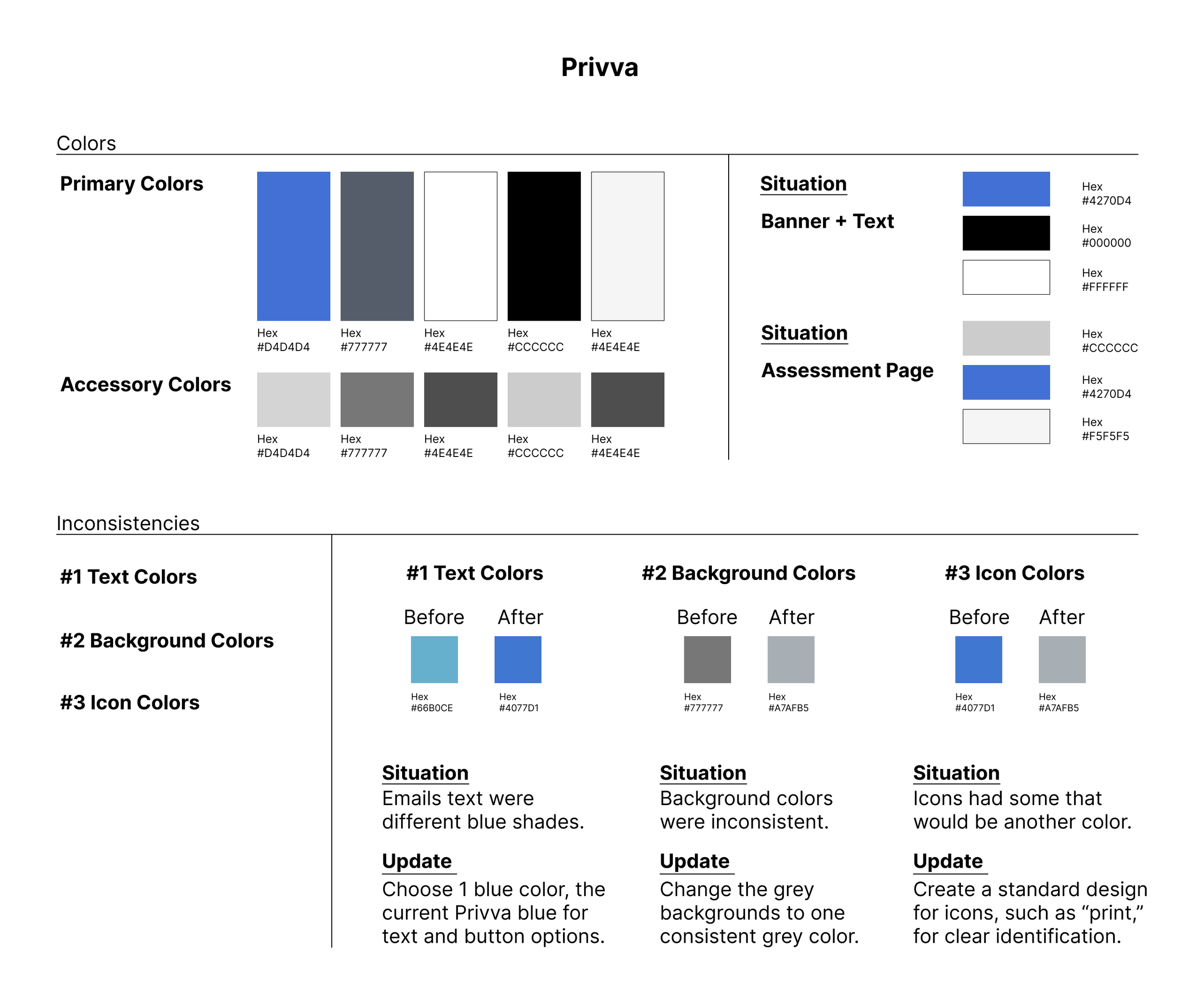
Text Inconsistency
Decimal Text + Mismatched Fonts
Color Discrepancy
Inconsistent Screen Colors + Icons
MVP Project Style
The project style consisted of multiple projects being prioritized as visual designs that were created and delivered as minimal viable products (MVPs) Link. With a quick turn around, visual concepts with notes were prioritized over prototyped designs.
Hi-Fi Deliverables in a Sprint Timeline
Adaptability of
the Portal
Product Features and Client Customization
Workflow Load
Focus on Webpage Information Architecture
The company’s client portal questionnaires and risk score settings allowed for a range of specificity for each client project, because questions and response ratings were customizable for the vendor. Each client company may have a high range of security protocol and priorities, work with different types of vendors, and change their scoring requirements for different situations. With this, feature adaptability and customization was a product focus, so that Privva’s online objective of vendor risk assessment and client project security would be applicable to a range of small, medium, and large companies, who also partner with a variety of regular and new third-party vendors.
Because of the emphasis on MVP design deliverables, my workflow consisted of product research, information architecture, visual low - fi mockups, and mainly mid - fi to high - fi handoff files. Based off management’s timeline and priorities, Client and Vendor perspectives were gathered from proto-personas, task analyses, and user journeys, which were used to direct the designs along with Privva’s stakeholder feedback.
Product Info + Work Style
Privva Users


User Product Interaction
“ I’ll see if we can utilize answer responses from the last time we worked with their team. I can double-check to see if any of our current standards have changed since then, and edit individual answers and replies. ” - Steve
User Persona
Vendor Product Interaction
User Persona
Client
Steve
Alex
Client Behavior: The client wants to ensure that the people they work with have protocol in place that will safeguard both of their companies’ information.
Client Needs + Goals
A standard met by 3rd party vendors.
Clear communication with their security team.
An understanding of their set risk compared to other vendors and for this project.
Client Pain Points + Frustrations
Not being able to sufficiently organize vendor project and assessment information.
Setting access to different people and groups in the company.
Organizing and accessing drafted, in progress, and previous project files.
With their Privva portal account, they create project assessments, select individual assessments or create specific questions for the work assignment, score and adjust the risk status, and develop client - vendor relationships. They utilize the client account portal to create, send, score, review, and bundle assessments. They can view different risk scoring graphs and see vendor scores distributed over selected times.
For example, they can see a history of scored assessments online and whether assessments have expired, require extensions, and have been approved.
Vendor Behavior: They have their current way of operating, but will amend their information security standards when working with client companies.
Vendor Needs + Goals
They want to quickly complete client assessments so they can start work together.
Compare questions from past responses.
View an organized dashboard with client details.
Vendor Pain Points + Frustrations
Unclear communication channel between the client about questions they misunderstood.
Forgetting to complete partially answered assessments and amending flagged answers.
Viewing the assessment approval status by the client after it has been sent and reviewed.
The vendor responds to assessments for potential work relationships with clients. They are able to use previous responses with VRM Automation, Link, and AutoAssess, Link, to quickly complete answers and save time in the intermediary of finalizing or making changes to their security protocol. After assessment review, question follow-up, and security status approval, vendors are able to move forward and collaborate with clients.
For example, they can view their assessment status and extend the assessment timeframe to upload material and answer responses before the due date.
Vendor
“ I need to see if their answers have changed from last time and see if their security standards are the same or better. We’ve changed and updated our information standards, so they’ll have to update theirs too.” - Alex
8 Project Samples + Finds Explained
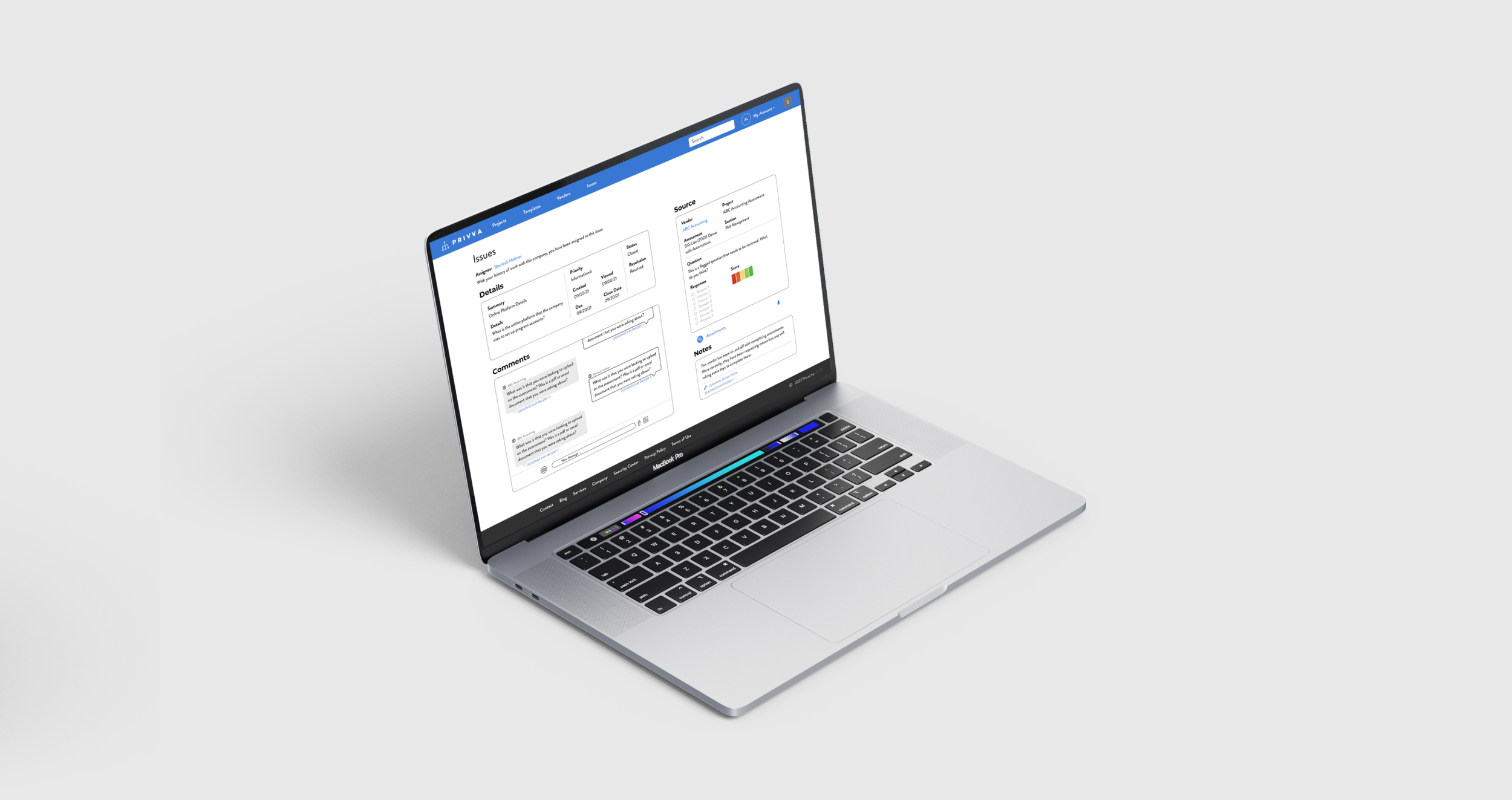
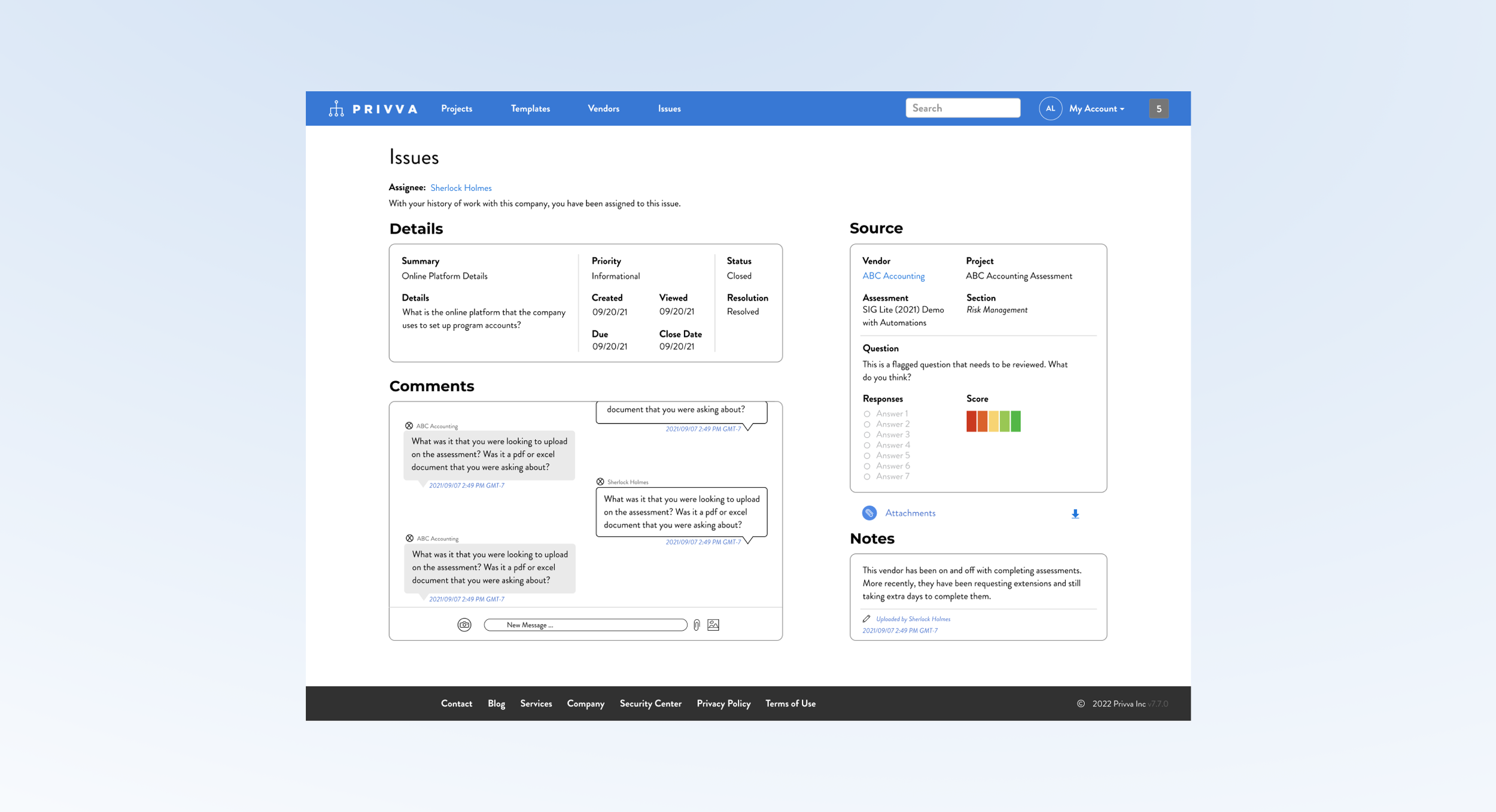
#1, Issues Layout
2 Adds and Restructures of the Issues Page
Project Objective
Change
Along with the new messaging section and change in page layout, other changes were made:
Incorporate a “Comments,” message section.
Include a Risk Score for the “Source,” section.
Conceptualize a new page layout.
Create and include a “Notes,” section.
Restructure the “Source,” and “Details,” content.
Iteration
After feedback, changes were made to account for the time stamps, risk scores, and content order:
Time stamp the “Notes,” section.
Time stamp the “Comments,” section.
Show multiple Risk Score “Question,” options.
Delete extra download options.
Move assignee to the top of the screen.
Create a visual design of a messaging system and notes section and include it in a new reorganization of the client “Issues,” page.
The issues page information was originally stacked in 2 narrow columns, which made the additional “Comments,” messaging section look out of place in the original design. So, a new layout was suggested that organized all of the sections with the new additions so that people can see, understand, and accurately use each section in relation to its function.
Summary and Next Steps
The messaging area needed more page real estate to emphasize its priority of use on the page and to function better with a larger section so that people can view current messages and see previous messages. The “Details,” “Source,” “Notes,” and “Comments,” sections are individually restructured and reorganized as a group to accommodate for the “Comments,” section. All of the information a user would view is condensed onto 1 full screen page.
Suggested Test: SUS Usability
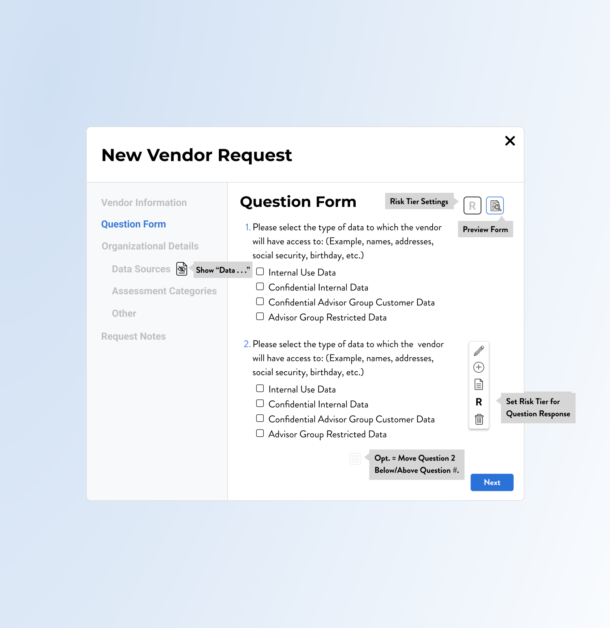
#2, Vendor Requests
20 Screens for the Form Action Process
Some edits and iterations:
Custom Fields content is condensed.
Remove extra screen steps for “Delete.”
Tool tips for icons and an ability to hide and view question answers is shown.
Update the Vendor Request Design with Sections and Options, such as “Risk Scores,” and “Organizational Details.”
Privva had a Vendor Request Form process already integrated onto their site. Because of the location of the CTAs and layout of the page content, it was oftentimes overlooked by users. This project consisted of a new placement and visual for the vendor request start process with new sections, new form fields, question edit options, custom fields, and a larger pop-up modal for the action of completing the request.
Change
A few main changes:
Include Icons for edit options, like “Edit Text,” “Write Notes,” and “Add Question.”
New order of Vendor request sections.
Larger modal and new content look.
Iteration
Objective
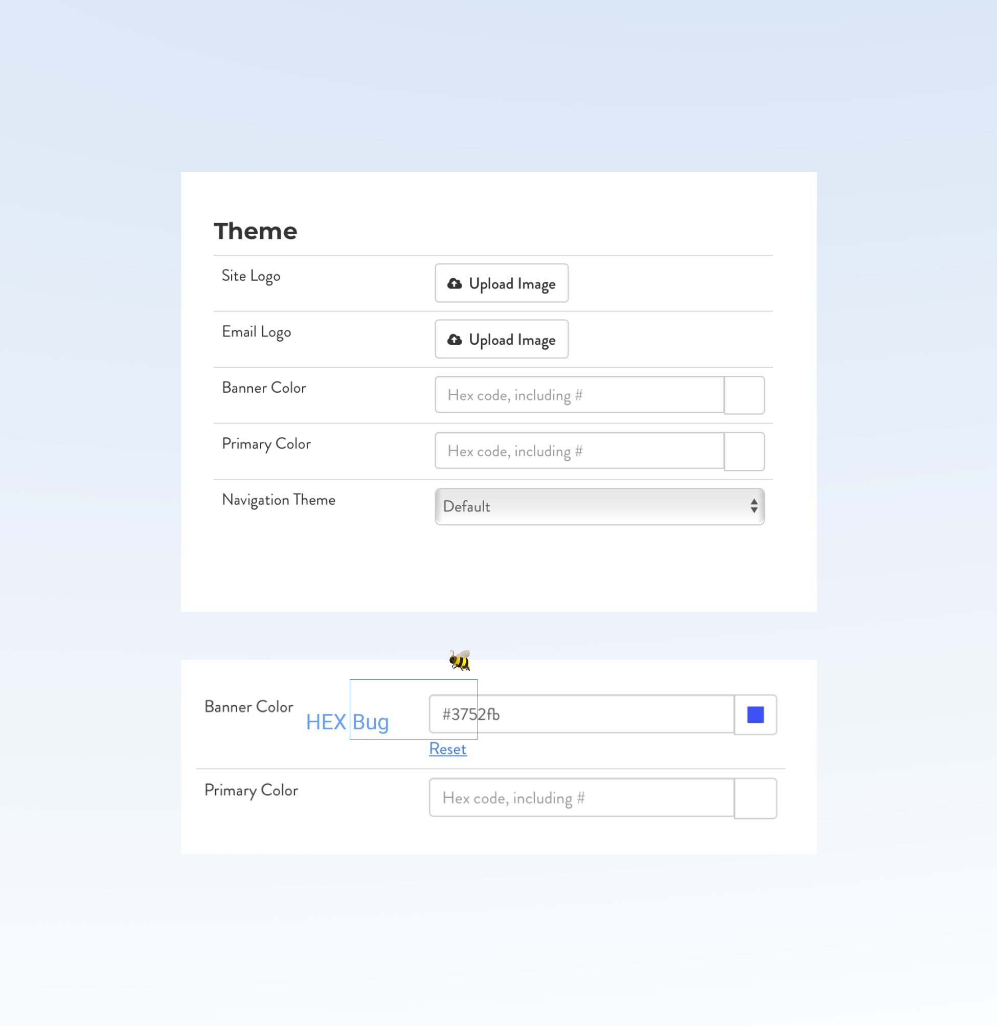
#3, Code Bugs
2 Bugs Found on the Client Portal
No iterations to this find! :
The bug was removed by the Dev Team, and the HEX code manual entry was fixed for client companies’ banner customization.
Investigate a glitch on the “Settings,” page, where a manual entry of the Hex color code was incorrectly changing the “Banner Color.”
During research and task analysis on the the client settings page, I noticed the “Banner Color,” was inaccurately auto-filling the HEX color to another color than the initially typed HEX code. This happened after typing in 3 Hex code letters and numbers, where the form field would complete the 6 numeral Hex color code to a different color code. The new color was unable to be adjusted, even if you retyped the letters.
Change 🦋
Spotted, an error with the “Banner Color” :
The color picker option worked just fine for people who chose that option, but the second option, to type in a HEX color, would be corrected with backend code that would allow it to properly function for users.
Iteration
Objective
#4, Email Templates
25 Email Designs for Varied Scenarios
Some modifications and updates:
Include client custom banner choices.
CTAs, like “Extend Assessment,” “View Assessment,” and “Sign-in,” are included.
Copy was changed to align to feedback.
Create and iterate email designs that apply to general Privva templates, specific use cases, and Client and Vendor content.
The original email designs had inconsistent layouts, colors, and type that were visibly condensed in an email. This made the content difficult to take in and read since excess white space surrounded small text size and compacted content. The new email designs focused on increasing the typeface, stretching content to the email screen, and consistently using current Privva brand colors for each email design.
Change
A few adjustments :
Edit copy for a clear company tone, order of information, and cleaned up text.
Include Privva’s brand logo and colors.
Pair text with white space for readability.
Iteration
Objective
A Mix of Project Focuses, Catches, and Adjustments.
Changes include access to an upgraded vendor request process with new additions and a cleaner visual look, a seamless banner color change without surprise bugs, and various emails that align with Privva’s brand identity and client customization. These projects reflect a focus on information architecture, visual design, and user interaction with revised designs that seamlessly integrate and combine with their original design.
Placement of sections + text and buttons + action processes are a few project priorities.
Summary: A placement and visual for the Vendor Request Forms is part of the project, where the Vendor Request Form process is adjusted with new sections, form fields, question edit options, custom fields, and pop-up modal.
Next Steps: Test how the integration of new features work in the design process and focus on the “Risk Tier,” option.
Suggested Test: SUS Usability
The 3 projects prioritize new features, unexpected fixes, and content hierarchy to define content and improve the portal structure and experience.
This was the 1st portal bug that I caught during research and task analysis on another project.
Summary: This digital bug catch, an inability to manually enter the Hex code, is a design change that the Dev Team fixed. After the removal of the bug, both the date picker and the typed in color code correctly adjusted the portal’s banner color to the client’s brand or custom color.
Next Steps: The HEX color bug corrected itself on a page refresh, but it is inconvenient to people whose first experience on the page is a glitch.
Suggested Test: Observational
#2, Vendor Requests
#3, Code Bugs
#4, Email Templates
👏 Break, Project Review
#2, #3, #4 Project Summaries + Next Steps
Improve readability by combining increased text size with balanced white space for a simple email.
Summary: Blue hues that were no longer being used through the current Privva branding were edited to match the current brand guide. Other versions were added over time to the template list with specific actions, details, and custom options.
Next Steps: The new email designs focus on larger typeface, bringing the current Privva colors into the logo and email details, and text that could be adjusted to existing email copy.
Suggested Test: A/B
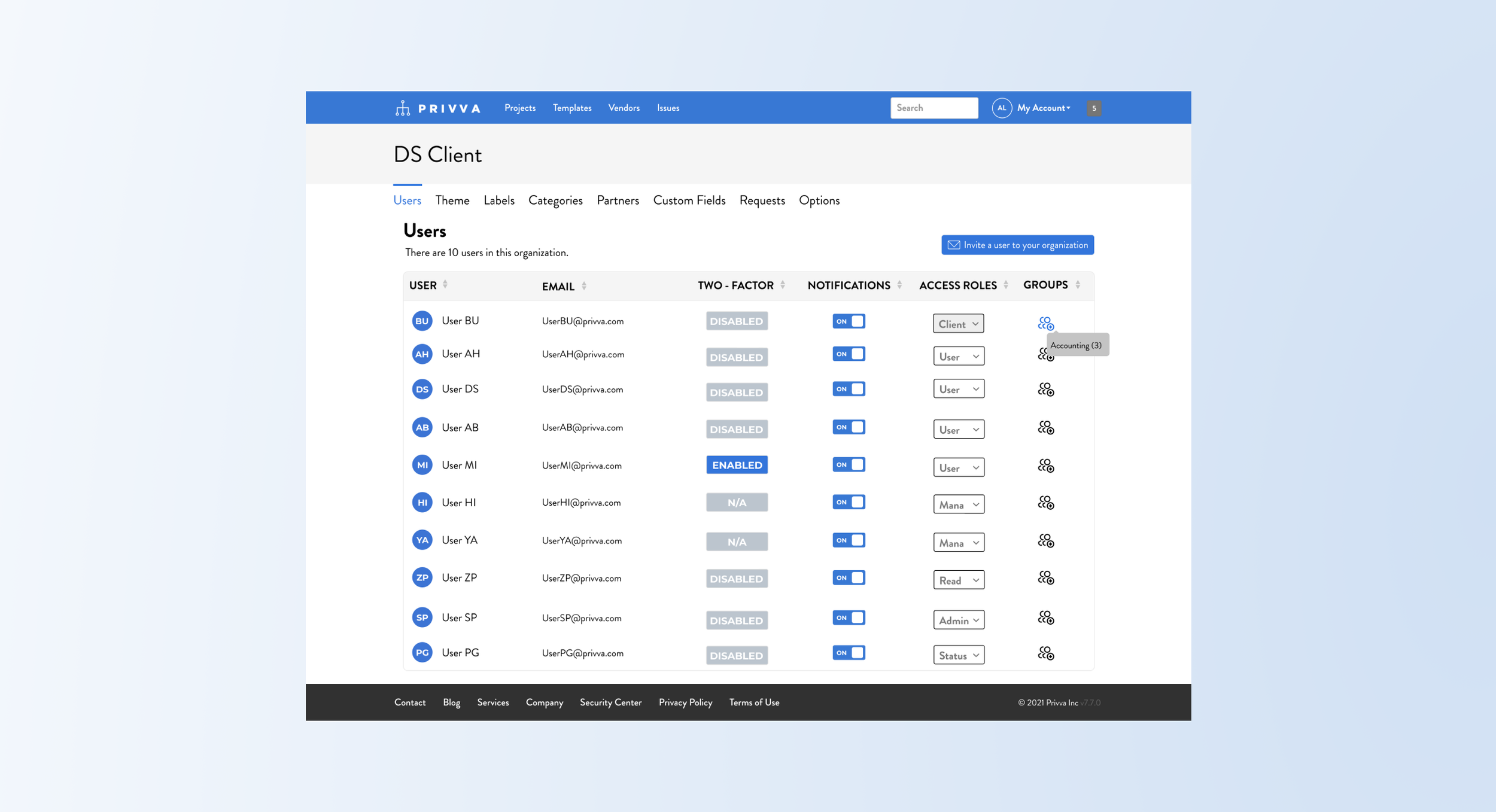
#5, Users Page
New Placement and Design of the Page
Project Objective
Change
New criteria on the “Users,” page is included and shown through a change to the visual look with:
Include columns for “Access Roles,” and “Groups.”
Reimagine and create a revised “User,” page.
Show how you would assign people to “Groups.”
Include a CTA to invite people to various groups.
Redistribute user and email content to harmoniously span the screen page.
Iteration
The “Users,” page aimed to include access roles for different groups and an ability to invite a user to the client’s company or organization.
Users would be assigned to groups, like “Admin,” “Management,” “User,” and these groups would have different access roles assigned to them on the account portal. Depending on their team responsibilities and roles in the company, the individual users would be able to access and engage with select information and different areas of the account portal.
After a hi-fi mockup’s review and feedback, the access roles look and process is adjusted with:
Instead of text, use an icon for the “Groups,” row.
Include a number placement for the group.
Have the user’s initials or visual by their name.
Change the copy for users’ titles and access roles.
Differentiate “Groups,” versus “Access Roles,” with a hover tooltip and dropdown assignments.
Summary and Next Steps
This “User Page,” project included new information and processes that were different from the original “User Page.” Additional information was integrated onto the page with a variety of access roles and with the “Creating Groups,” process for users. For next steps, I would conduct tests on the group process of creating, adding, and moving people to groups to further define and design the action process with different user scenarios. After a few internal revisions, the process of adding people to groups was approved and then merged with the original “User Page,” visual design.
Suggested Test: A/B and Usability SUS
#6, Contributor Page
5 Selected Options and Switch Process
Project Objective
Change
The main changes were to visually show multiple contributors and the assignment process with:
Differentiate between primary and additional contributors on the Client Custom Fields Page.
Combine the types of contributors in 1 section.
Provide a mix of options for the visual arrangement of the “Contributor,” section.
Add “Role,” and “Email,” details to each person.
Show how to edit and reassign contributors.
Iteration
After sharing mockup options of the contributor lists, the visual details and process were cleaned up with:
Include the initials of the contributors by their name. This may be updated with profile pictures to visually identify the contributor along with text.
Minimize the steps to change contributors.
Automatically delete the primary contributor.
Shift contributors up the ladder as they change.
Simplify the process to change contributors.
Include roles, labels, and processes for the Primary and Additional Contributors on the Contributor Section of the Custom Fields Page.
The main visual item was to include multiple contributors to a section that initially only allowed 1 company user to visually be shown as a contributor. The process of changing the status of a person from a primary to additional contributor and vice versa was also included. Additionally, the label of “Primary Contributor,” is assigned to 1 main person, while all other contributors are listed under, “Additional Contributors.” Client company information was shown on this page, and contributor emails and roles were added to this visual update.
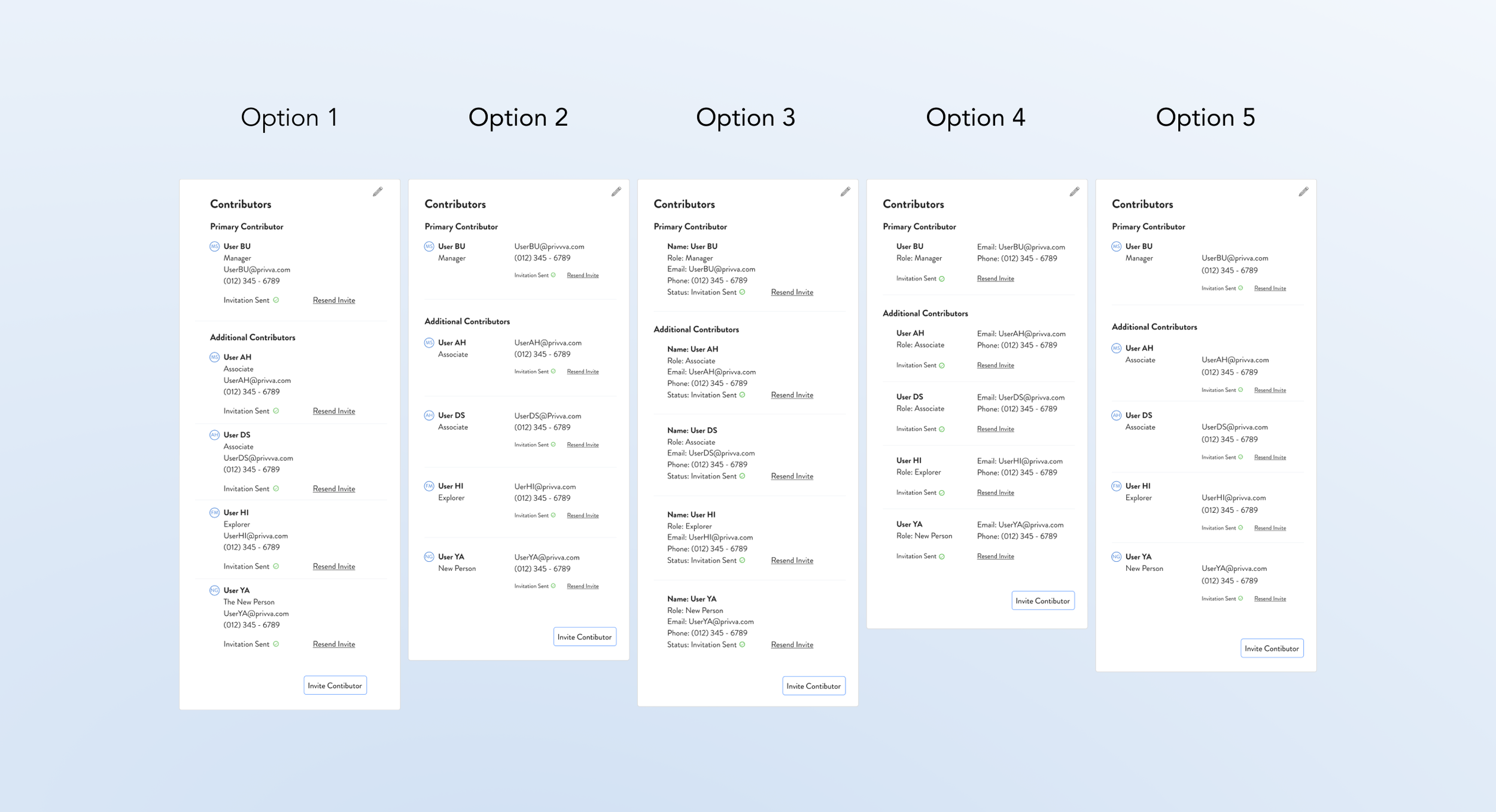
Summary and Next Steps
The visual rework of the contributors and a mockup of the process of changing additional contributors to primary contributors is simplified. Multiple options are finalized for the “Contributor,” section, and an add + delete option and reassignment of their status is able to be adjusted. Next steps would be to focus on how users would add, delete, move, and change group assignments and individual details. An A/B test would provide perspective on this process along with user preferences on the visual options.
Suggested Test: A/B and Usability SUS
Two More to Go!
2 User Finds during the Projects
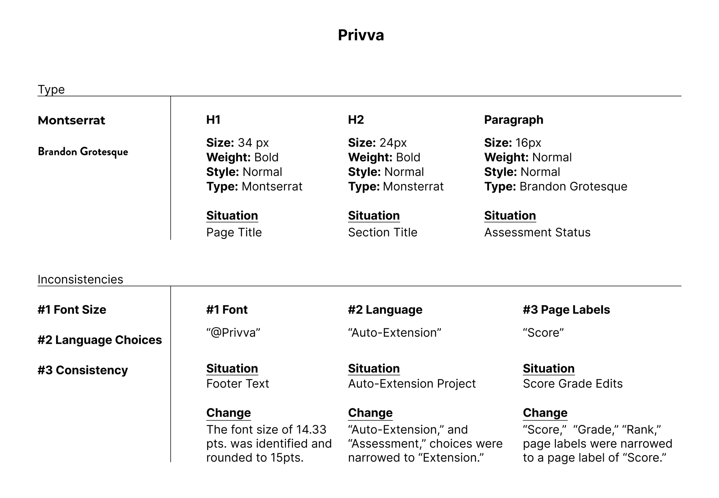
#7, Type Inconsistency
Finds + Changes
Throughout the portal, the size of the headers, body, and other copy varied on some web pages. Finds and changes include:
Font: Decimal Type Face, such as 19.2 could round to 20 px font.
Language Choices: For new processes, identifying terms that would be user-friendly.
Reword Text: Similar or confusing text would be recommended other labels.
Decimal Text Sizes + Mismatched Fonts
Type Context
Privva has 2 main fonts that are used with their portal pages and their emails. Throughout their design, there were occasional inconsistencies in font sizes and text typography. Word choices that identify user actions and inconsistent type were reviewed during UX projects.
Text Summary
Changes were made so that language and text were matched to Privva’s standard typography, font sizes, and brand voice for users.
Test: A/B with a review of type option choices and preferences
#8, Visual Discrepancy
Throughout the portal, there were some mismatched brand identity colors and design icons. Finds and changes include:
Color Callouts: Change email template visual accents and links to be consistent with Privva’s blue company color.
Color of Text & Links: Identify and decide on 1 grey hue for the background color.
Icons: Some pages contained different icon imagery or inconsistent icon colors for a similar action. Change the icon to be consistent and choose 1 color for the icon for clear identification on all portal pages.
Various Screen Colors Used Inconsistently
Finds + Changes
Changes were made so that email templates and online visuals were consistent with Privva’s defined brand identity for users.
Test: A/B with a review of visual option choices and preferences
Visual Summary
Visual Context
Privva’s main color palette consisted of a blue that mixed with grey, black and white colors. The color hues were, at times, different shades on various pages. These discrepancies in text, background, and icon colors and imagery were adjusted for visual consistency.
“Design needs to be plugged into human behavior. Design dissolves in behavior. ”
— Naoto Fukasawa
Project Timeline Revisit
UX Product Design
Types of MVP projects were prioritized with visuals and processes:
Reflection about the type of work experience
Quick designs, rapid iteration, and MVP deliverables were converted from POCs, and UX priorities were adjusted for a more integrated and user-friendly experience. The 2 types of projects that were most common, were visuals and action processes. With visuals, elements such as buttons, tool tips, search categories, icon choices, and navigation changes were a priority. With action processes, user flows through a portal process, connections to other site areas, and referring to other user preferences and product features were focuses. In both cases, visual designs were researched, interpreted, and created in agile.
Visual designs rapidly drew from existing designs but with more relevant meaning. Action processes developed from information architecture research of various sites and with concepts added to existing portal page functions. Research times varied but the priority was on speed, and most of the designs were updated visuals or processes rather than entirely novel to the user interface.
1. Visual Designs
2. Action Processes
Personal Reflection
Personal Reflection about My Work Experience
1. Simplicity
2. UX Upgrades
3. Clearer Communication
4. Design Integration
While designing for various client, vendor, client—vendor, and company-consumer processes, the projects main focuses were on design simplicity, UX upgrades, clearer product communication, and design integration into the already existing account platform. Rather than a complete upgrade to the visual look of the product and its design system, the priorities were on adjusting previous design elements and flows to better communicate product abilities, assessment statuses, and new features in terms of how users would interact with the portal’s many options and standard functions.
Similar to a car design, the account portal focus was on its functionality within an existing design. A car has its music speakers, internal layout, and console buttons that may be updated within the internal structure of the car. Similarly, the account portal designs were about design changes that updated its function and visuals within its structure. The exterior design or brand identity with its colors, form, and accents would add to the overall user-experience, but the primary focus was on straightforward user actions, redesigned layouts, and more consistent content.
4 Focuses during the assignment:
Next Steps
User - testing, Iteration, + the Whole Picture
The product was going through multiple revisions of pre-existing design that had already received customer feedback and stakeholder review consensus for UX changes. With various product focuses being upgraded, extensive user-testing was projected for later, after the product was functioning to the standards of the company and pre-existing clientele. This meant that updated designs and new integration of features were streamlined into existing product priorities, such as extensions for assessments, uploading multiple bulk files, and additional information for client contributors, and these were added to the design before testing, such as SUS, of the product.
With parts of the product being updated, the whole design would be considered later and may also look to include a reworked visual design. Functional design was reworked into the product, and future user testing would add to the measure of functionality and user preferences. Then, the design’s function with an updated visual design may contribute to a cohesive, interactive, and quality user-experience.
3. What works now, later, and together
1. Alignment of the users’ experience with the company’s design changes
2. Function of the product in conjunction of the whole design
3 Next Step Goals: