Concept Project, Visual Design
Liquid Lab
Who.
A healthy juice company, Liquid Lab
Themes.
Fresh, healthy, customizable, whole, energy, colorful, local, vibrant, accessible, nutritious, restore, fortify, rejuvenate, modern, refreshing
Focus.
Refreshing
Design.
Landing Page
Strategy
Provide information on healthy eating, quality nutrition, and body positive images to educate customers on the mission of Liquid Lab. Their juices are made with carefully chosen ingredients that are meant to be a beneficial addition to a client’s lifestyle versus a supplement for meals and health routines.
Objective
For clients to incorporate juice, pre-made or custom-created, within their daily life, so that they take in quality nutrition to feel well and are equipped to take on their day, energized, refreshed, and ready to go!

Brand Research.
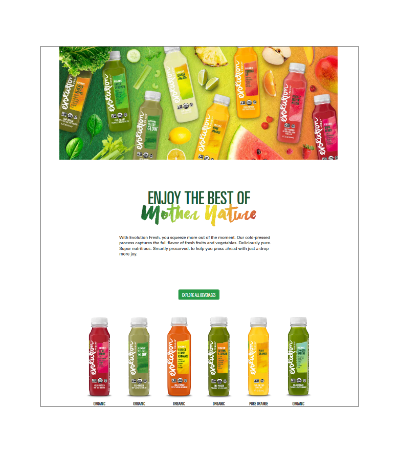
Evolution.
The site utilizes earthy colors with a focus on greens and nature. Images of fruits and vegetables encourage the idea that their drinks are natural and fresh. They openly and directly share information on their story, blog, and ingredients.
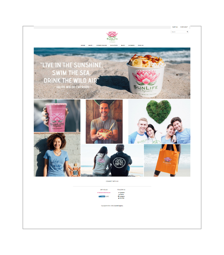
SunLife Organics.
The idea of sun, life, and organic is shown through beach shots, light, and minimal design. The vibrant stencil of the green and pink logo pops against a lot of white space. They focus on quality over quantity and organic ingredients.
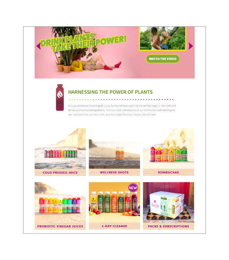
Suja.
Word choice, such as “cold pressured”, “wellness”, and “power of plants”, emphasizes health. There are multiple opportunities to order their products on the landing page, and the content targets testimonial and seasonal items.
2 of the companies, Evolution and Suja, sell their products in Grocery Stores, such as Ralph’s, Whole Foods, and Bristol Farms. SunLife Organics is a smoothie and juice company with stores in California and Texas, and they do not currently sell products outside their local stores.
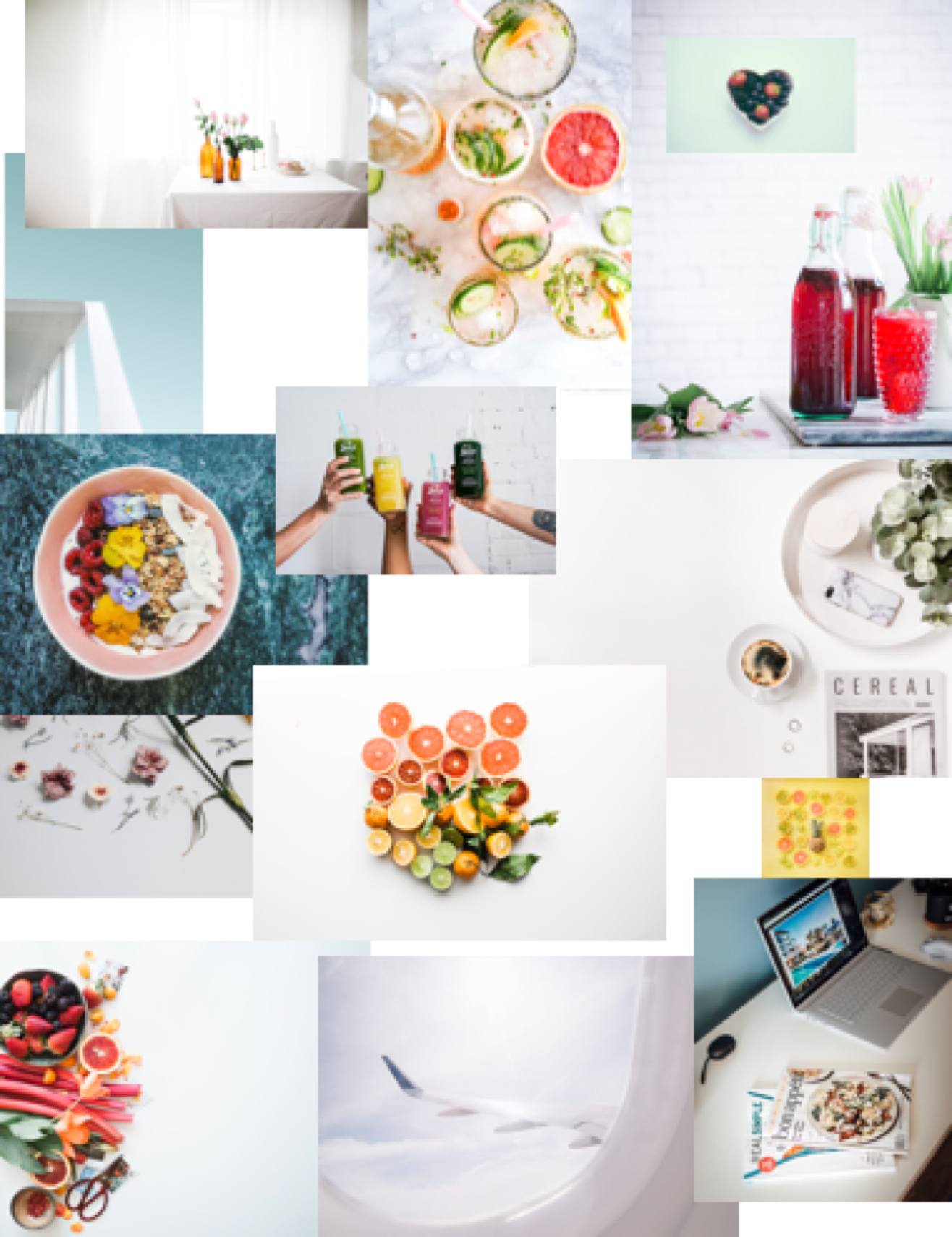
Moodboard.
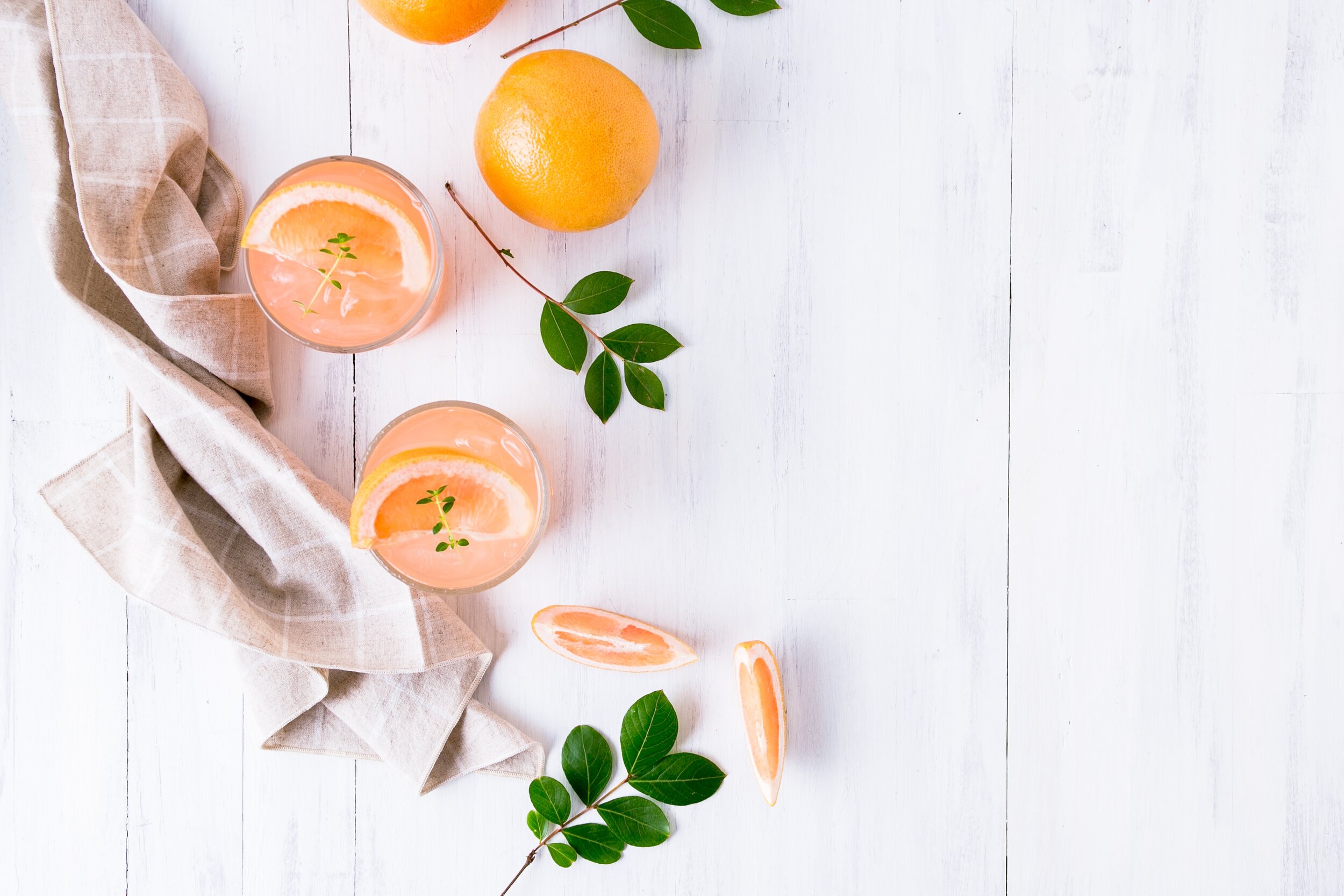
Focus: Refreshing
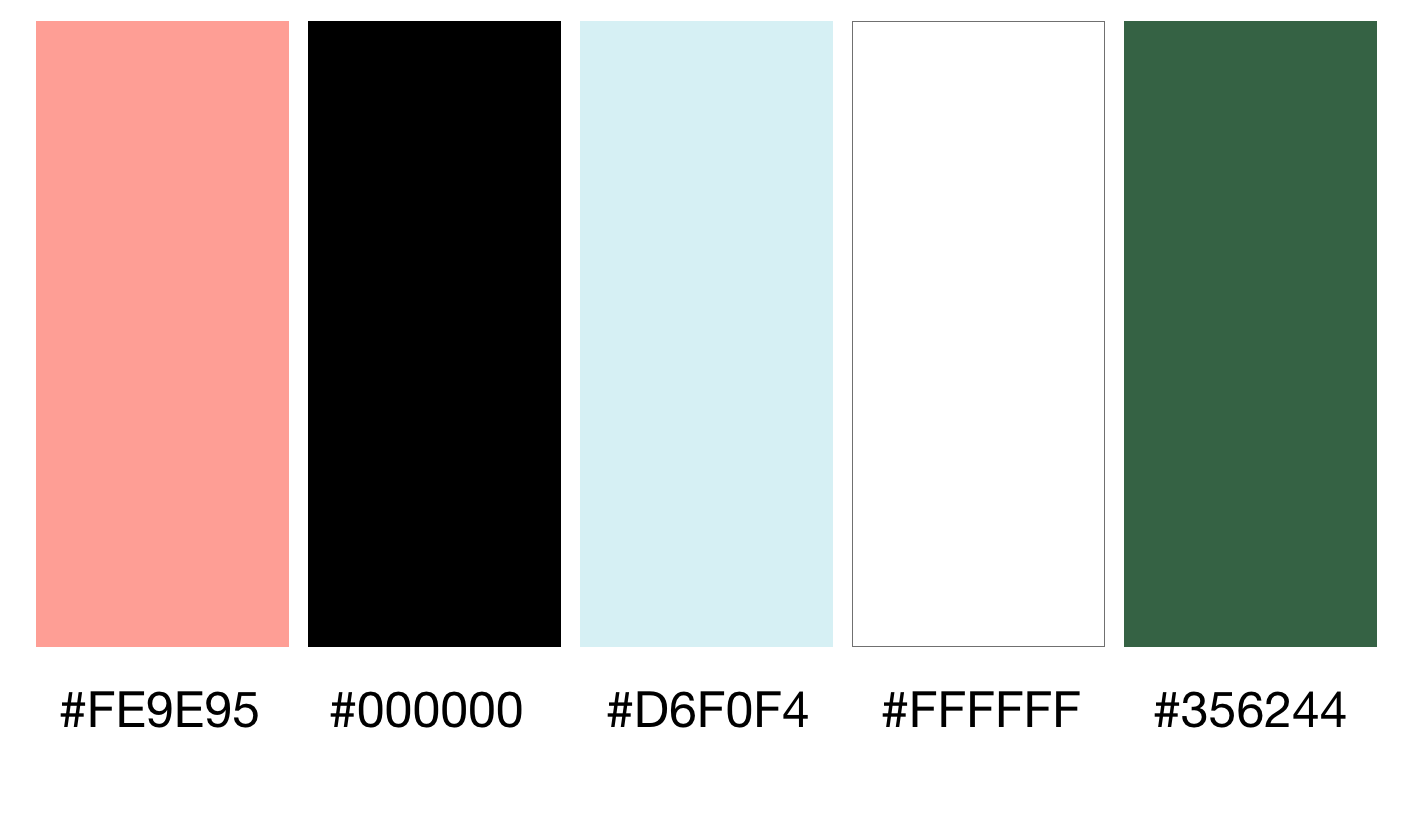
Colors.
Inspiration: Citrus, Water, Greens
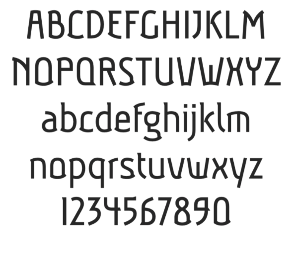
Typography.
Font Choice: Aubrey
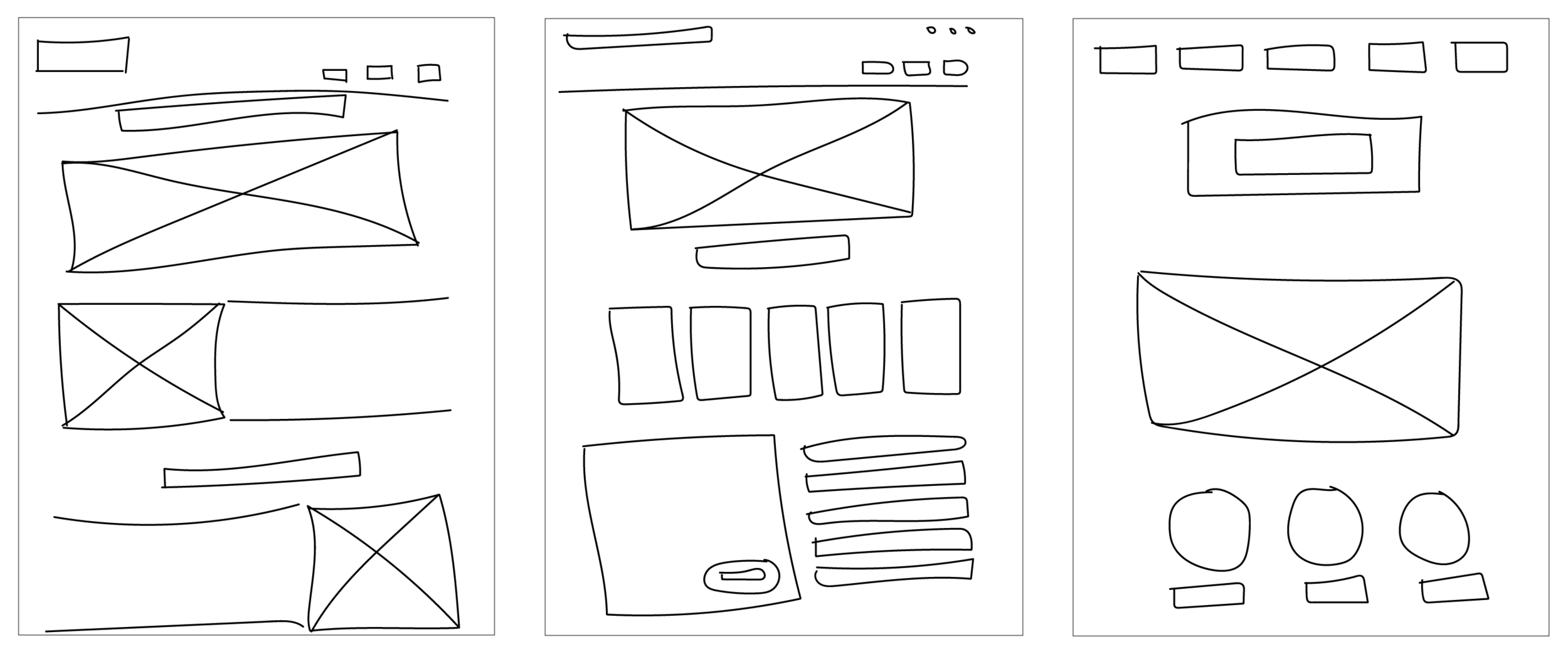
Sketches.
Brainstorm: Pen and Paper
First Wireframes.
“I just learned how to use Sketch!”
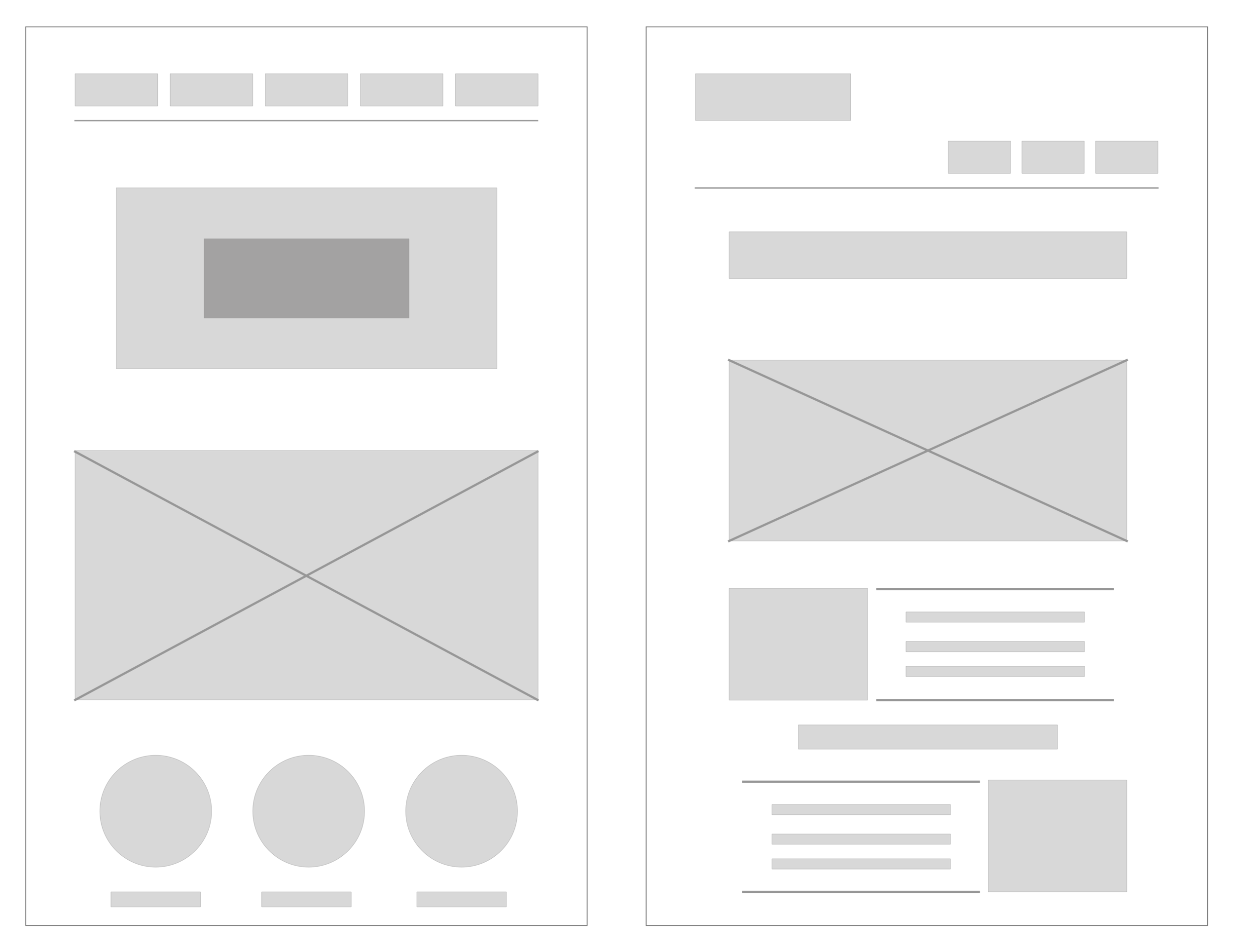
Second Wireframe.
Template for the content and colors
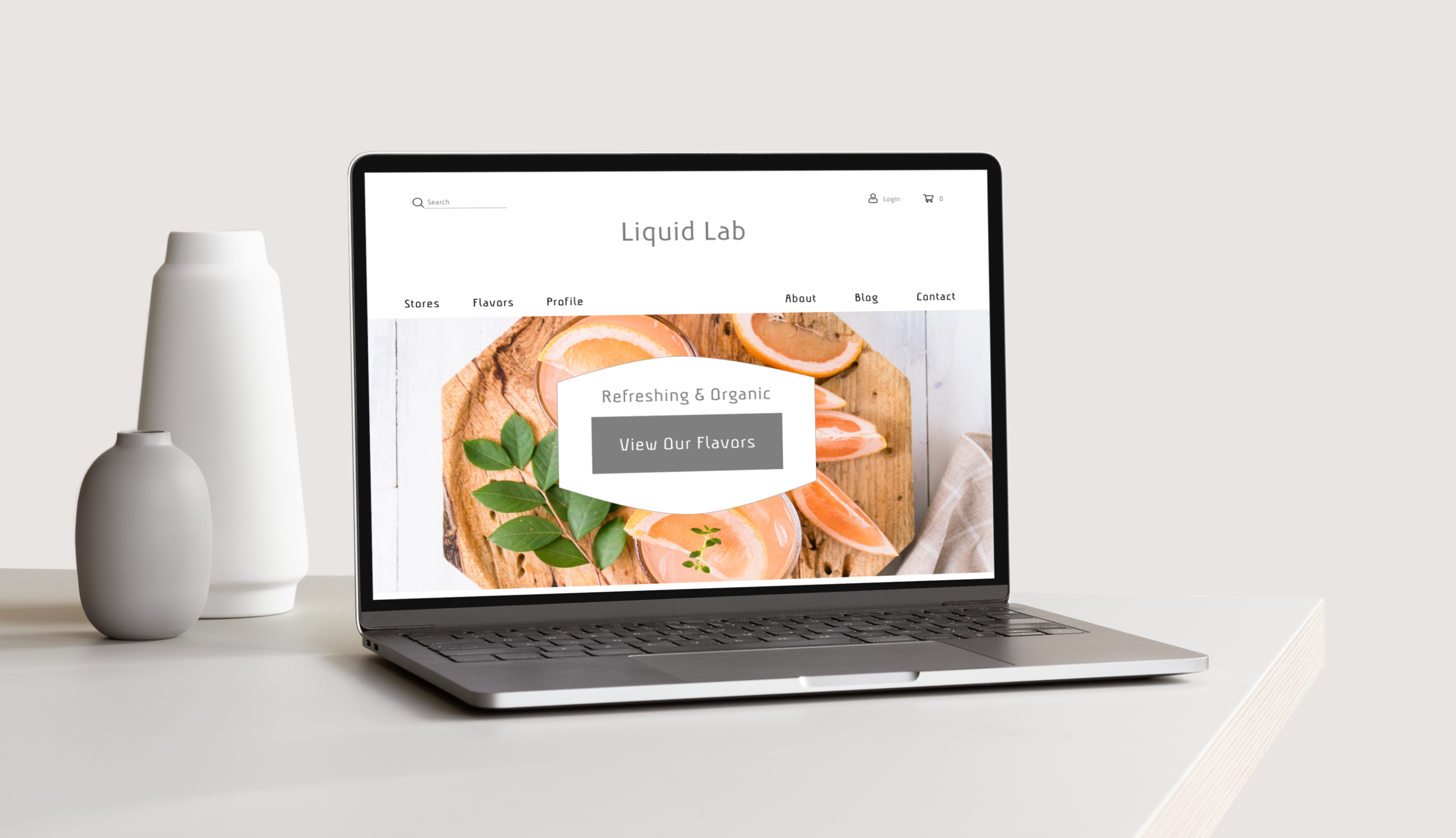
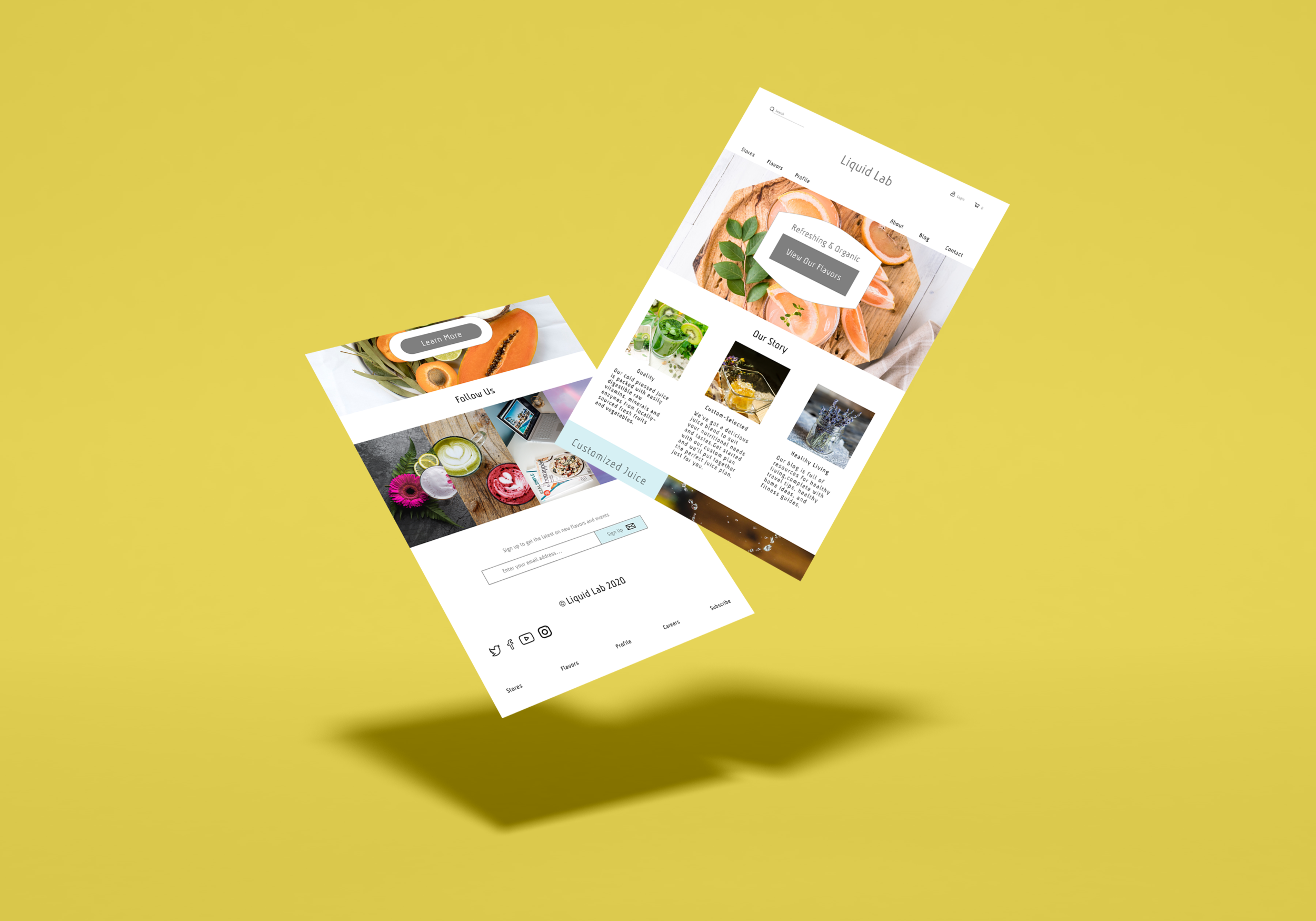
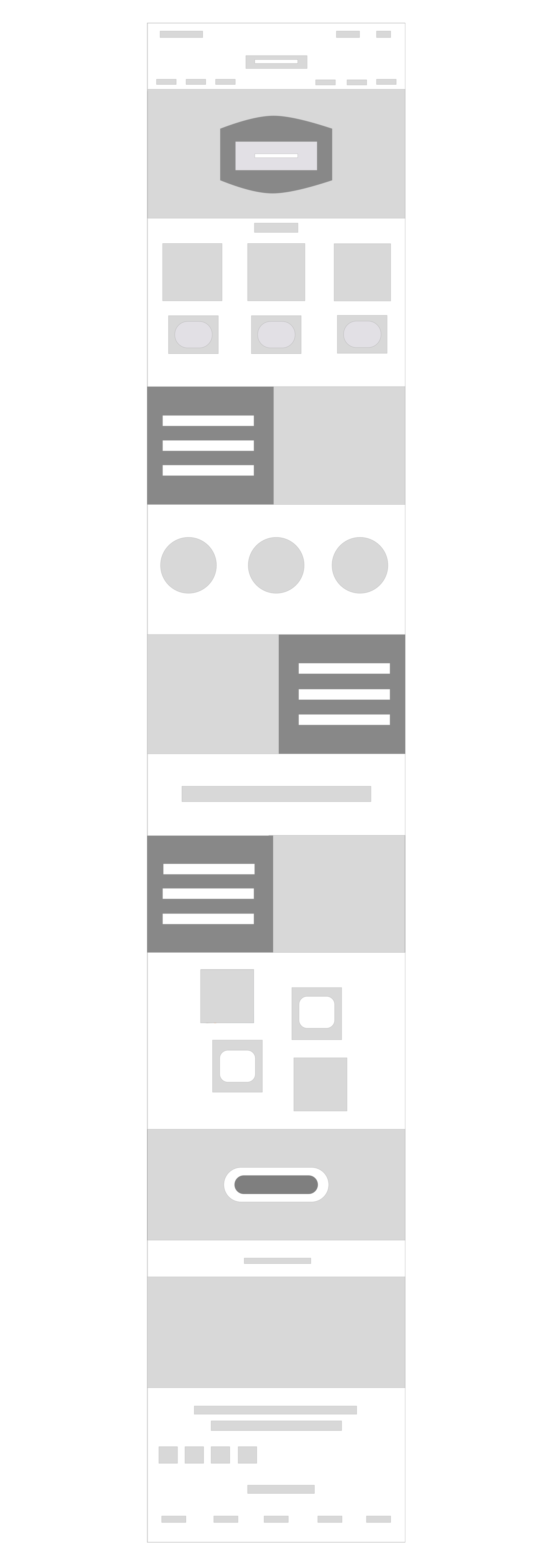
Landing Page
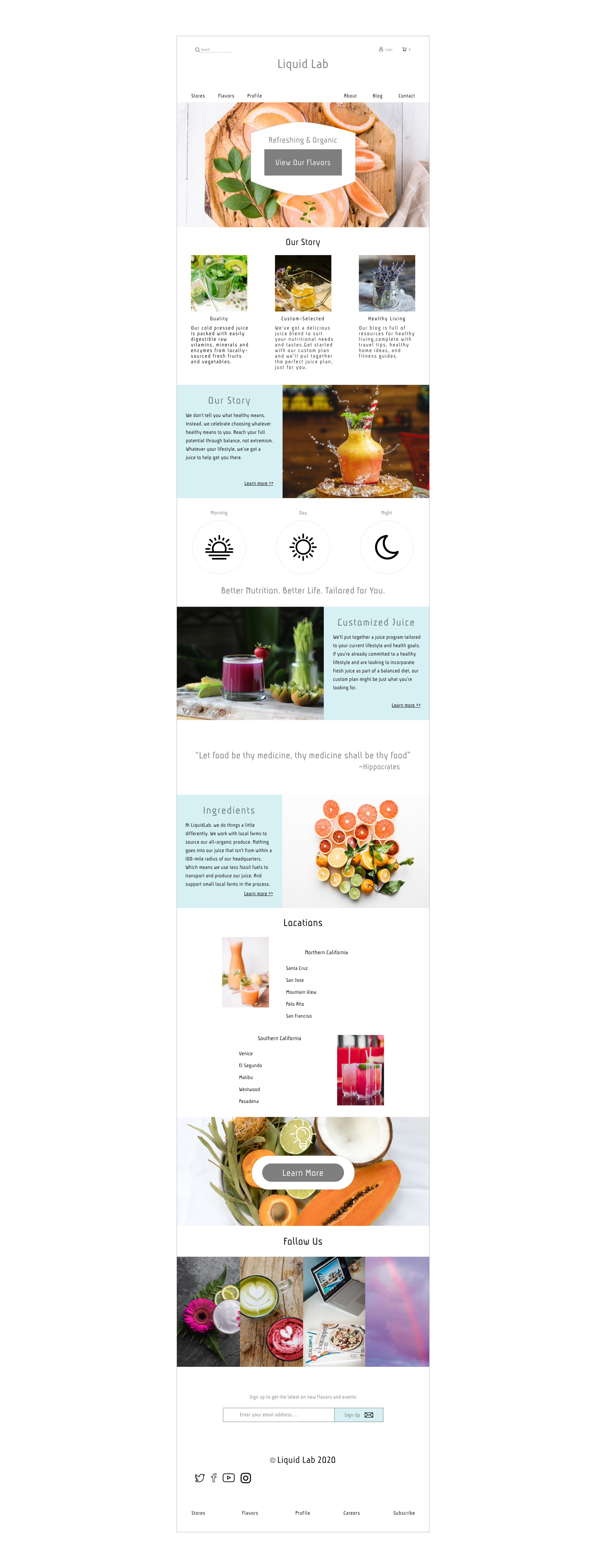
Liquid Lab Design
For the creation of the Liquid Lab landing page, I used Sketch to develop hi-fi wireframes and finalize the page I presented to my class. develop hi-fi wireframes and finalize the page I presented to my class. develop hi-fi wireframes and finalize the page I presented to my class.
It all begins with an idea. Maybe you want to launch a business.
It all begins with an idea. Maybe you want to launch a business.
It all begins with an idea. Maybe you want to launch a business.
Reflection
Initially, the design was smaller but I could not communicate all of the points I wanted to, and I had a problem creating a cohesive design with the initial moodboard and color palette. So, I ventured out of the realm of juice companies, and researched healthy food restaurants to see if their landing pages could provide more detail on how to create one that emphasized their juice but also brought other elements into the picture.