
Orca.
Concept project, Public Transit Company in Seattle, WA
Orca
Duration : 2 Weeks
Tools : Figma, Miro, Keynote, Monday.com
Team : Olivia P. and Doe S.
Focus : Research and Usability Testing
Deliverable : Responsive Redesign
Whatever it is, the way you tell your story online can make all the difference.
Make it stand out.
Whatever it is, the way you tell your story online can make all the difference.
Make it stand out.
Whatever it is, the way you tell your story online can make all the difference.
Make it stand out.
Whatever it is, the way you tell your story online can make all the difference.
Make it stand out.
Whatever it is, the way you tell your story online can make all the difference.
Make it stand out.
Whatever it is, the way you tell your story online can make all the difference.
Make it stand out.
It all begins with an idea. Maybe you want to launch a business. Maybe you want to turn a hobby into something more. Or maybe you have a creative project to share with the world. Whatever it is, the way you tell your story online can make all the difference.

“If I had the option to go somewhere tangibly to buy this ticket, versus online, I would without a question, without a doubt, would not go through their site.”
— ORCA Interviewee N.2
Make it stand out.
Whatever it is, the way you tell your story online can make all the difference.
Make it stand out.
It all begins with an idea. Maybe you want to launch a business. Maybe you want to turn a hobby into something more. Or maybe you have a creative project to share with the world. Whatever it is, the way you tell your story online can make all the difference.
“20x’s more better than the first one. This guy is a lot easier to navigate and I feel like something like this isn’t something you do all the time. As someone who travels frequently, this made it as simple as possible.”
— ORCA Interviewee N.2

“Whatever it is, the way you tell your story online can make all the difference.”
— Quote Source
“Whatever it is, the way you tell your story online can make all the difference.”
— Quote Source
“Whatever it is, the way you tell your story online can make all the “Whatever it is, the way you tell your story online can make all the “Whatever it is, the way you tell your story online can make all the “Whatever it is, the way you tell your story online can make all “Whatever it is, the way you tell your story online can make all the
Whatever it is
- the way you tell your story online can make
- the way you tell your story online can make
- the way you tell your story online can make

Whatever it is, the way you tell your story online can make all the difference.
Make it stand out.

Dream it.
It all begins with an idea. Maybe you want to launch a business. Maybe you want to turn a hobby into something more. Or maybe you have a creative project to share with the world. Whatever it is, the way you tell your story online can make all the difference.
Build it.
It all begins with an idea. Maybe you want to launch a business. Maybe you want to turn a hobby into something more. Or maybe you have a creative project to share with the world. Whatever it is, the way you tell your story online can make all the difference.
Make it stand out.
Dream it.
It all begins with an idea. Maybe you want to launch a business. Maybe you want to turn a hobby into something more. Or maybe you have a creative project to share with the world. Whatever it is, the way you tell your story online can make all the difference.
Build it.
It all begins with an idea. Maybe you want to launch a business. Maybe you want to turn a hobby into something more. Or maybe you have a creative project to share with the world. Whatever it is, the way you tell your story online can make all the difference.
Grow it.
It all begins with an idea. Maybe you want to launch a business. Maybe you want to turn a hobby into something more. Or maybe you have a creative project to share with the world. Whatever it is, the way you tell your story online can make all the difference.
What
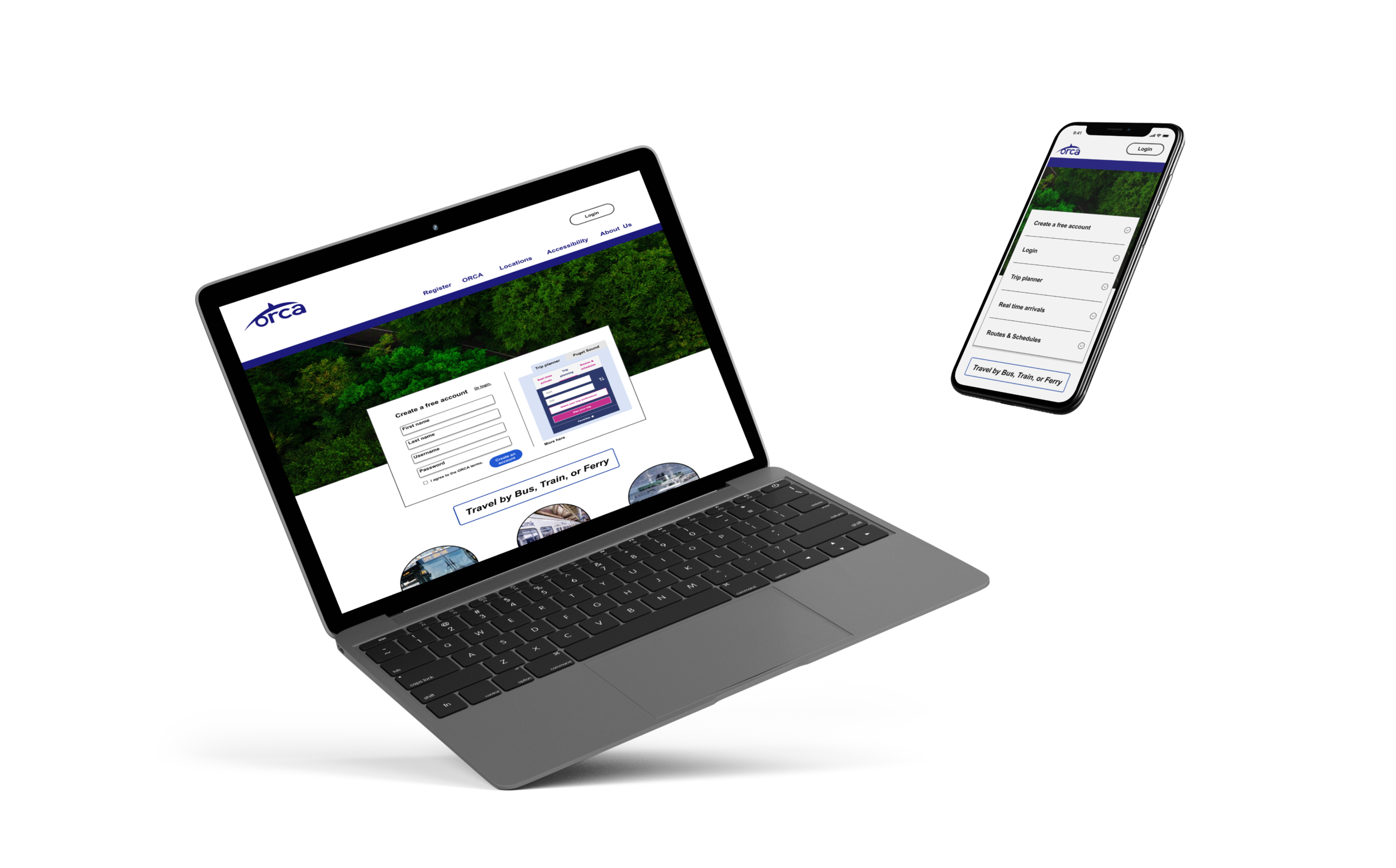
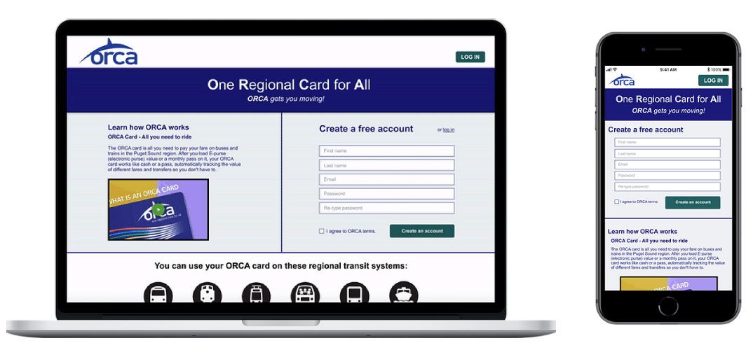
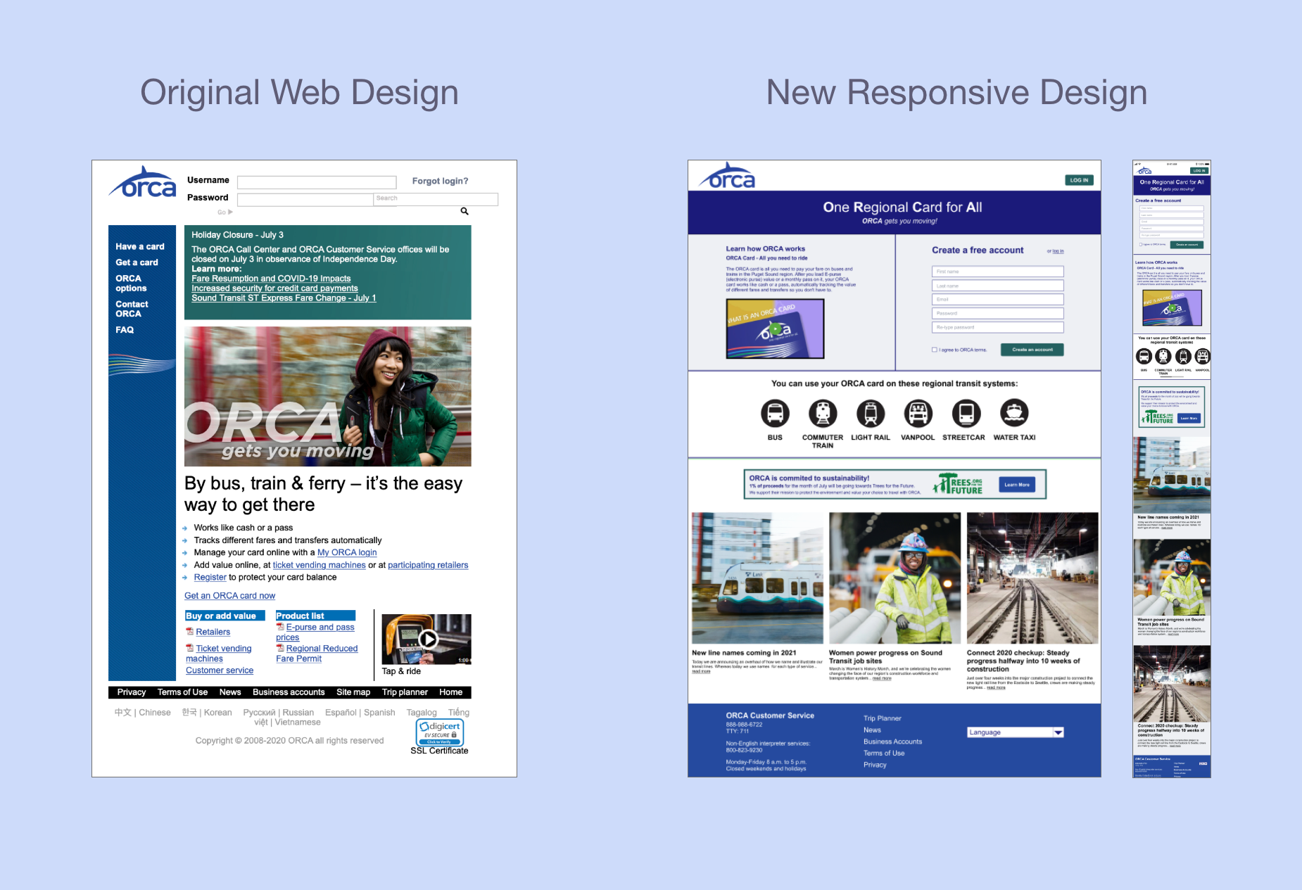
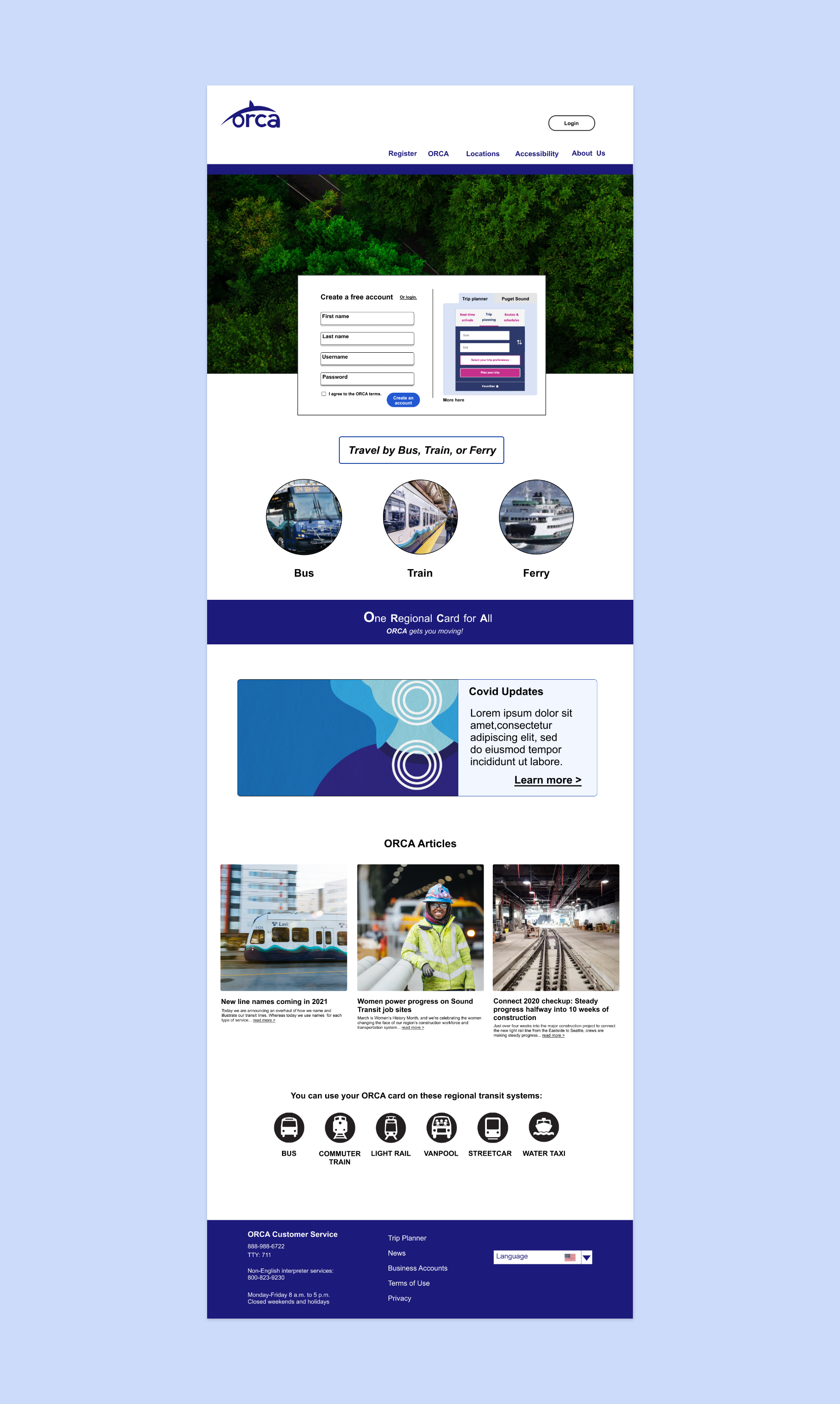
Our group of 3 redesigned a site to meet user and business goals as well as be responsive on mobile. The original site looked exactly the same on desktop and mobile, which created problems for users, such as having to zoom in and out on mobile to be able to see the page content.
Who
The company we targeted is ORCA, a transit company in Washington that provides public transportation for people in Seattle and specific counties in the surrounding area.
Their initiative is for a responsive website to help people use public transit for their commutes so that they can reduce the amount of cars on the road and become more environmentally friendly. Their site does not have the structure to support easy access to information or card management.
Wait, did you say Orca?

Thanks UnSplash!
An orca is not a whale, rather it is a dolphin that looks like a whale. As National Geographic eludes, “Orcas, or killer whales, are the largest of the dolphins and one of the world’s most powerful predators.” (Link)
This powerful entity, the focus of the project, is ORCA, the transit company rather than the dolphin species!
So, we embarked on a research plan to learn more about ORCA by understanding the way current user’s navigate their site on desktop and on mobile.
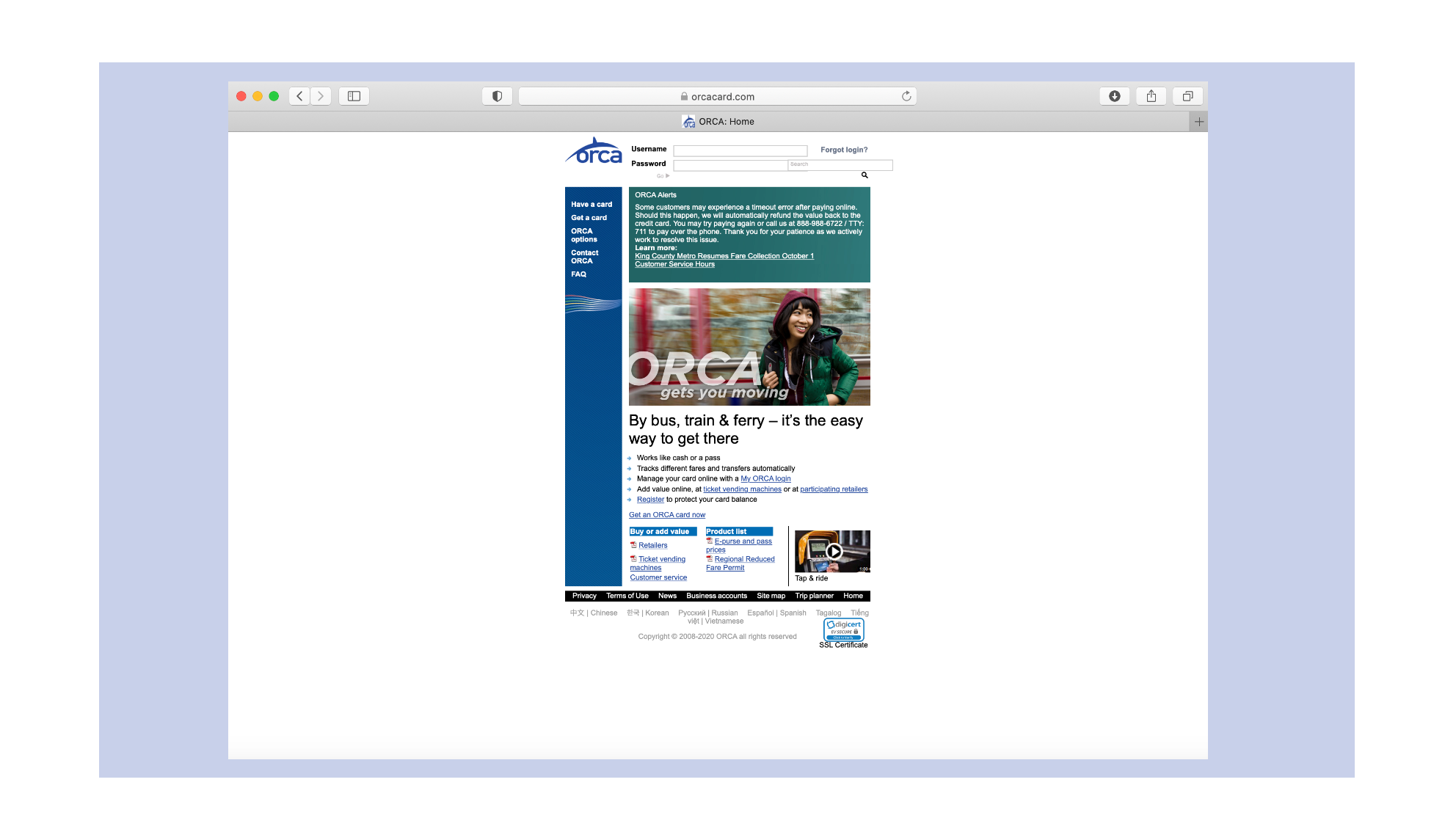
Positioning ourselves into the traveling mindset of a Seattleite, we assumed during initial review, that many people would be visiting the site to create an account or access their current account. So, we set that task for ourselves, to move through the site to create a new ORCA account and add travel funds for later use.
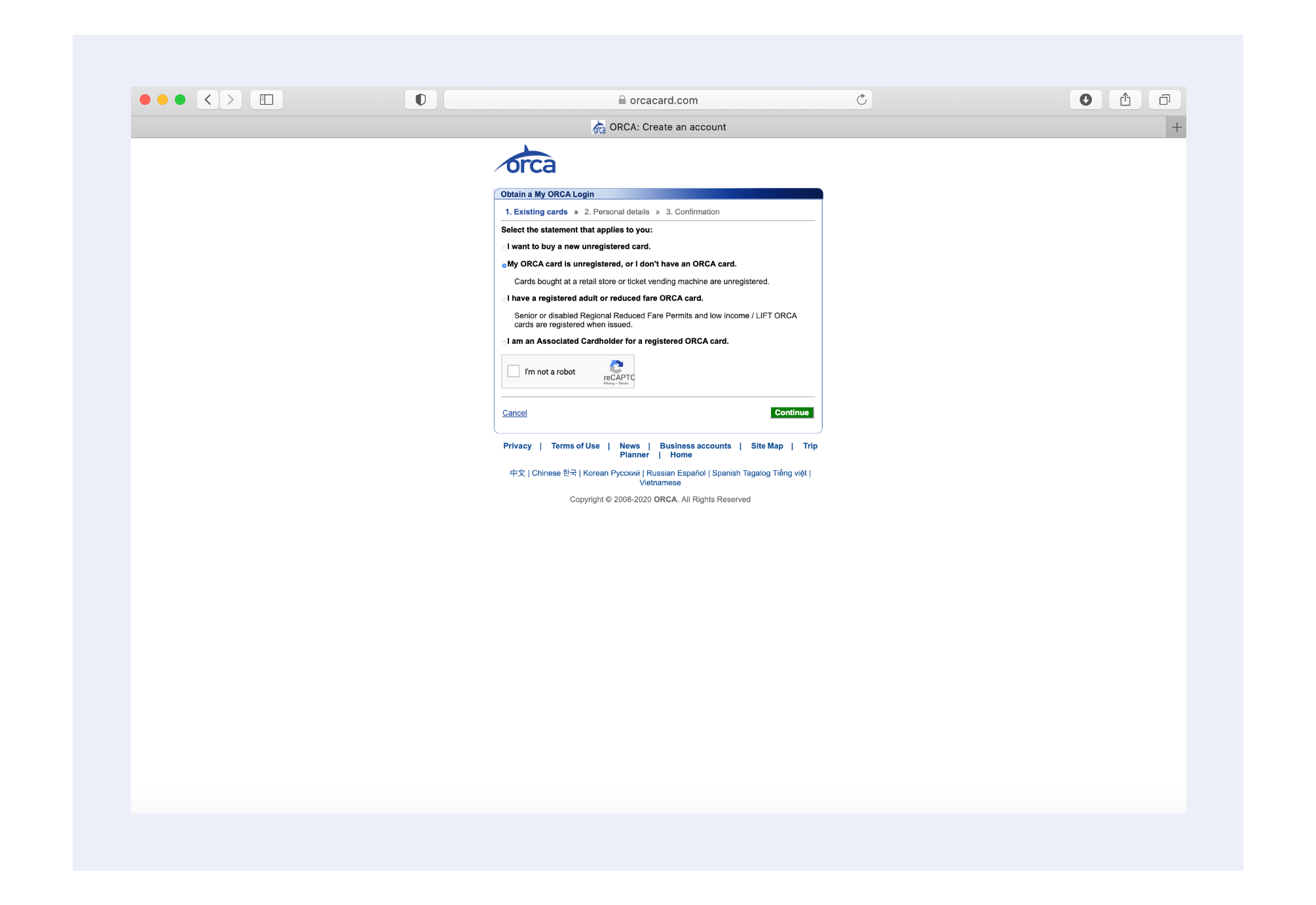
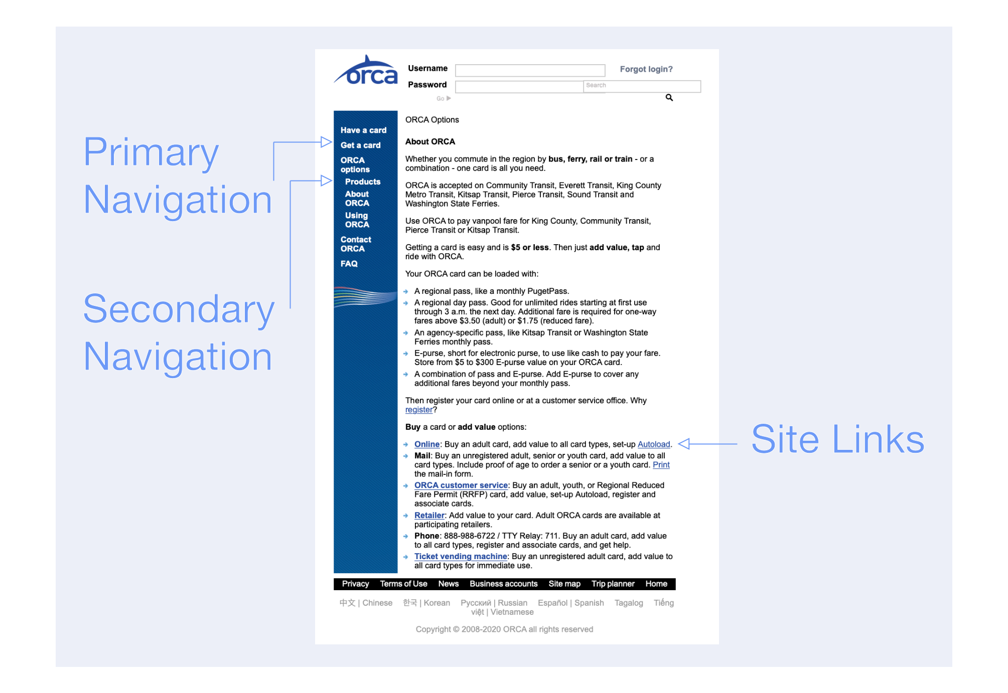
We found this task difficult to complete, because the labeling of site pages were similar in some cases. This led to confusion about where information was located. Do I add money under “My account” or “My card”? Does “Review account” actually mean review account or will it bring me to another related page?
Next, we spoke to people who use ORCA cards in Seattle or use public transportation in other locations. We wanted to learn about their travel habits and preferences, such as buying a day-pass or a monthly subscription, their frequency of public transportation, and their opinion of the current ORCA site.
To compare the original site to a new design, we also conducted an initial usability test. Interviewees moved through the task of creating an account or adding travel funds to an existing account.
“If I had the option to go somewhere tangibly to buy this ticket, versus online, I would without a question, without a doubt, would not go through their site.”
-ORCA Interviewee N.2
Feedback from the usability portion of the interview resembled this comment, with many users frustrated over how to start the process of creating an account and how to shift through the cluttered links, titles, and content on their pages.
The interviews highlighted other areas with navigation, visuals, and responsive design that we will further investigate. Can we focus in on making navigation more intuitive to lead users through the tasks they are trying to accomplish, redesign the visuals to make them more appealing, and reformat the mobile version to be responsive so that the size and material shown is just as easy to read and interact with on mobile as it is on desktop?
We refined the interview data into the perspective of two users. One user is new to Seattle and needs to create an ORCA account. The other is a frequent ORCA traveler who wants to set up autoload payments.
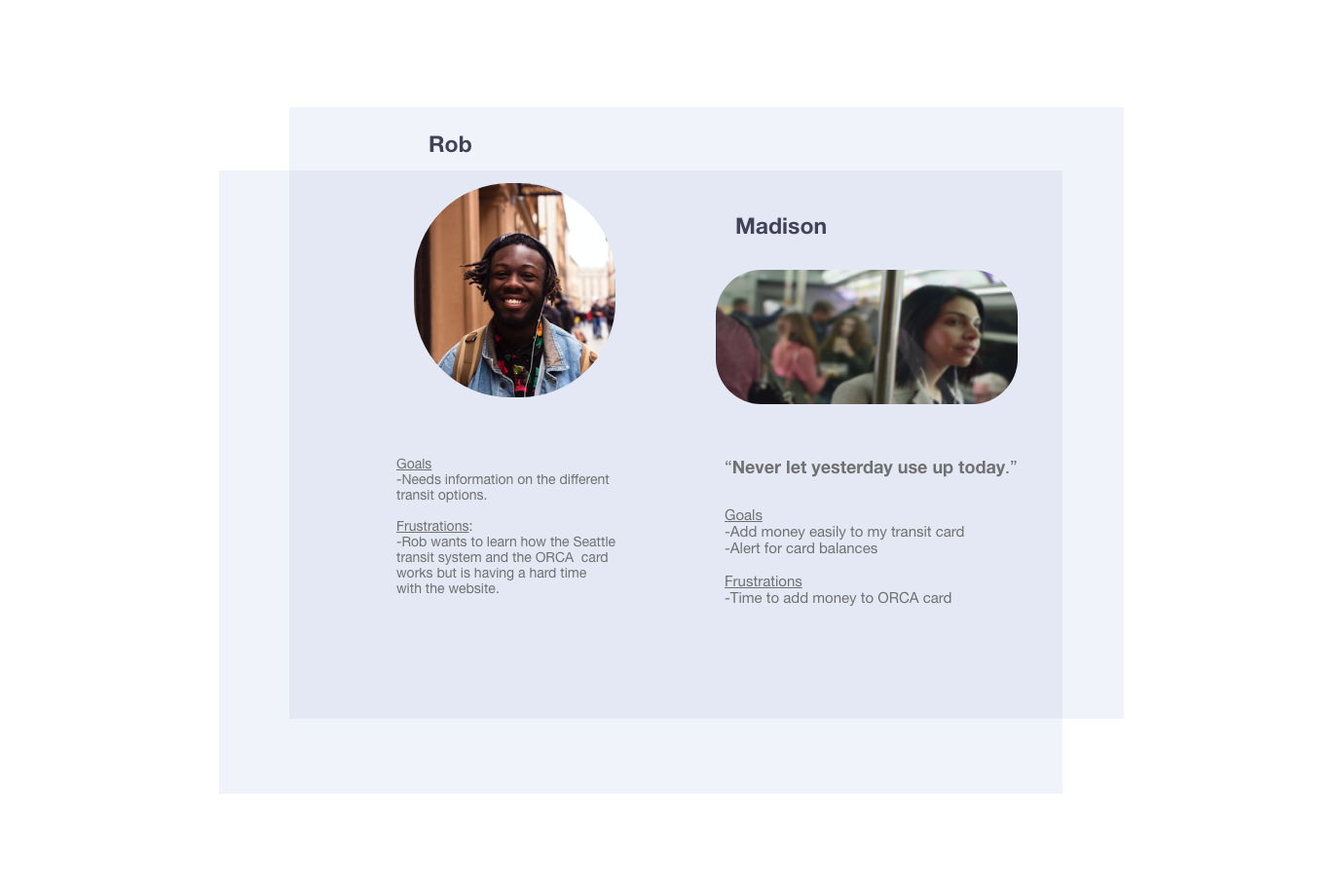
Rob is the new user who is entering the ORCA website for the first time and needs to be led through the setup process for a new account. Additionally he needs to be able to add money to his account for the first time.
Madison is well accustomed to ORCA travel but needs to be able to set up autoload payments so that she can have her monthly balance match her travel schedule and so that she can save time for other tasks.
To plan a design for them, we created a task analysis, site map, and user journey to discover ways in which we could make the site more optimal.
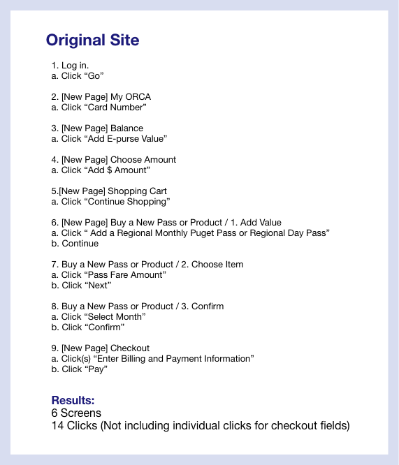
A typical task of adding money to an ORCA card took 6 screens and 14 clicks. We reduced the workload of the user by minimizing the amount of screens they moved through from 6 to 2 screens.
Through a site map, we affirmed the steps to go through the site were inconvenient in terms of hierarchy, the priority of site navigation labels. So, we adjusted the site's layout to increase user coherence, where they can more easily access the correct links with fewer attempts.
Journey maps revealed how Rob and Madison would feel and behave when accessing ORCA pages on a desktop or mobile. We identified that Madison and Rob would most likely need to create an account or autoload money on a desktop because of the small size of the site on mobile. They also may find it mentally draining to zoom in and out of the site when moving from screens and reading information.
Clearer steps through the site should improve the functionality of the site for new and regular users while increasing the ease with which users can move through the site and accomplish tasks.
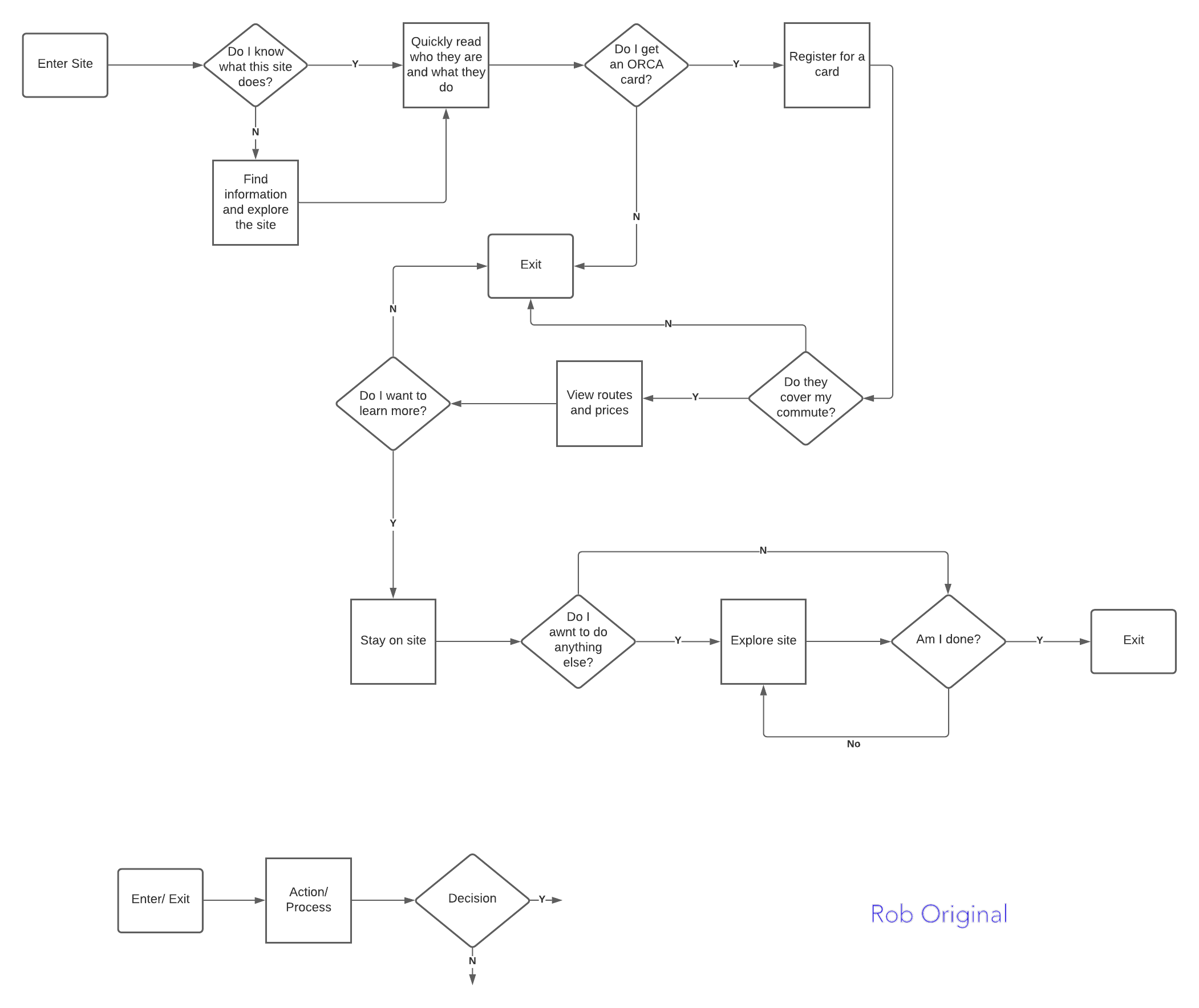
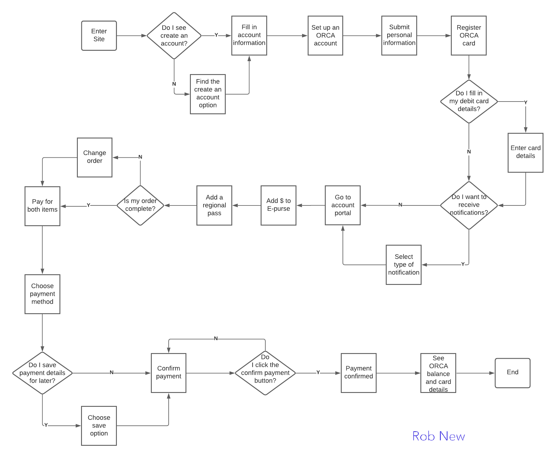
User Flow Insights
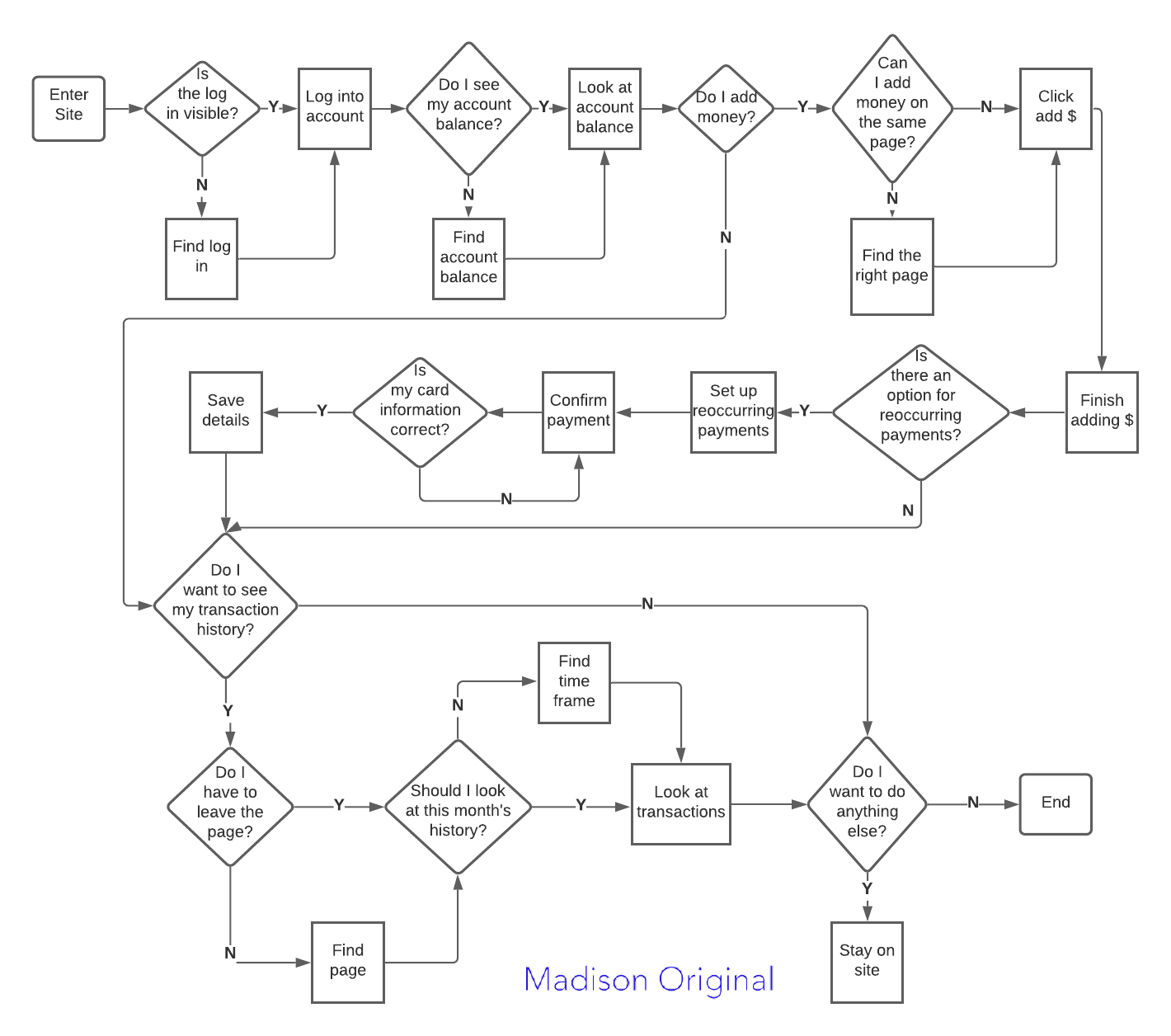
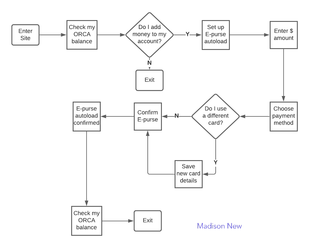
Madison: Original user flow specifies the types of information she wants to view immediately after logging into her account. The second user flow shows a more concise process, incorporated into the new design, which shows her checking her account balance and setting up autoload payments.
Rob: Initial user flow identifies his thought process in choosing to create an account. The new user flow shows, in more detail, his process of creating an account and steps he takes to add money to his account.
Design Studio
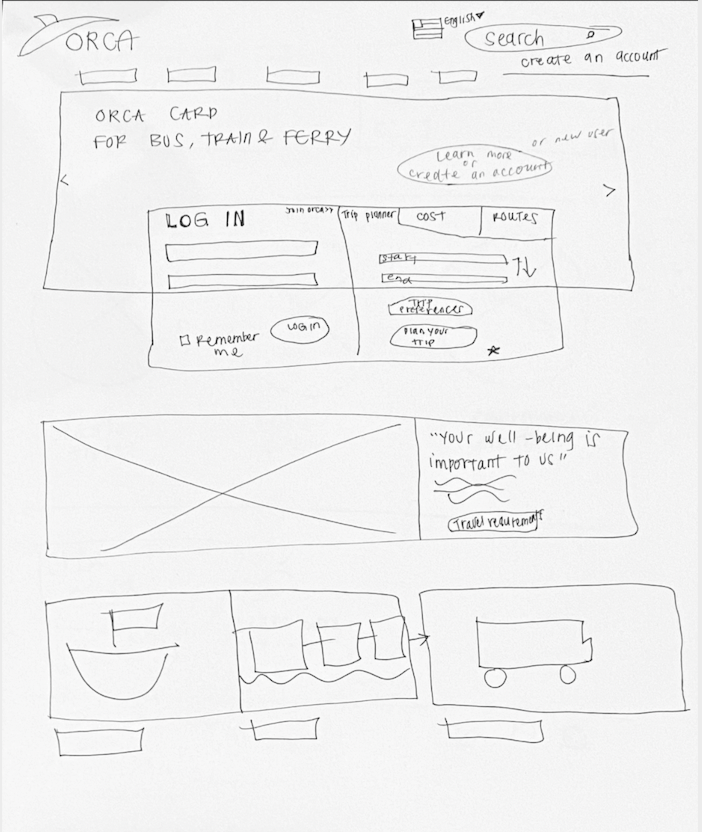
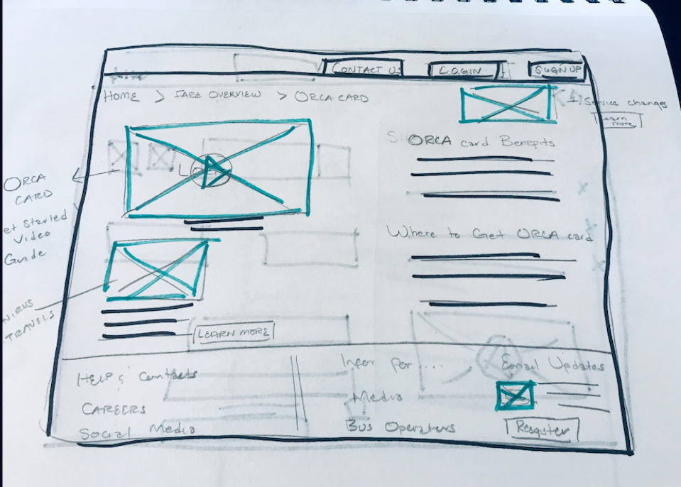
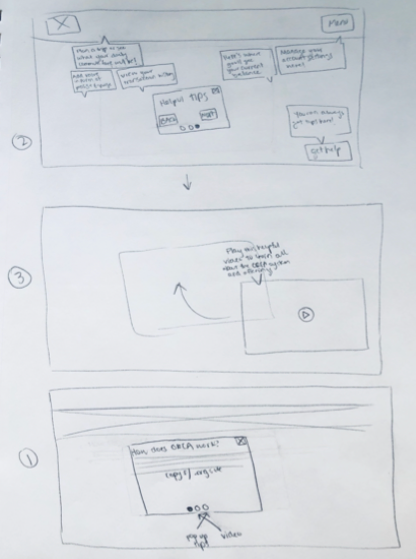
Knowing that a new layout was a focus in reformatting the current site to a responsive design, our group met to brainstorm sketches for both designs. Areas we ideated on were the landing page, account sign-up and autoload process.
So, how should we lay out content and utilize breakpoints? How should we prioritize steps in the account and autoload process? How should we incorporate visuals that assist new users and also show ORCA's environmentally friendly stance?
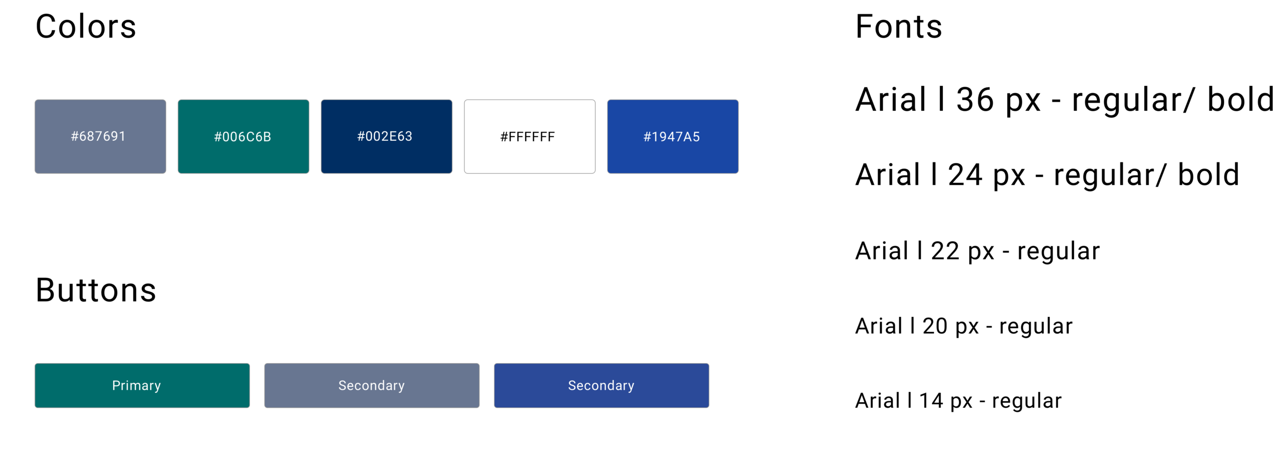
The layout of the site and how users navigate through it was prioritized over developing a completely new visual look for ORCA. We chose to stay with the current ORCA color palette and font but applied to content that is visually clear and easy to understand.
“20x’s more better than the first one. This guy is a lot easier to navigate and I feel like something like this isn’t something you do all the time. As someone who travels frequently, this made it as simple as possible.”
-ORCA Interviewee N.2
The new design received favorable feedback from interviewees with people completing their tasks with more ease. Interviewees shared their experience of creating an account and autoloading money. The visibility and accessibility of information was better, but we also heard feedback on how to improve the design.
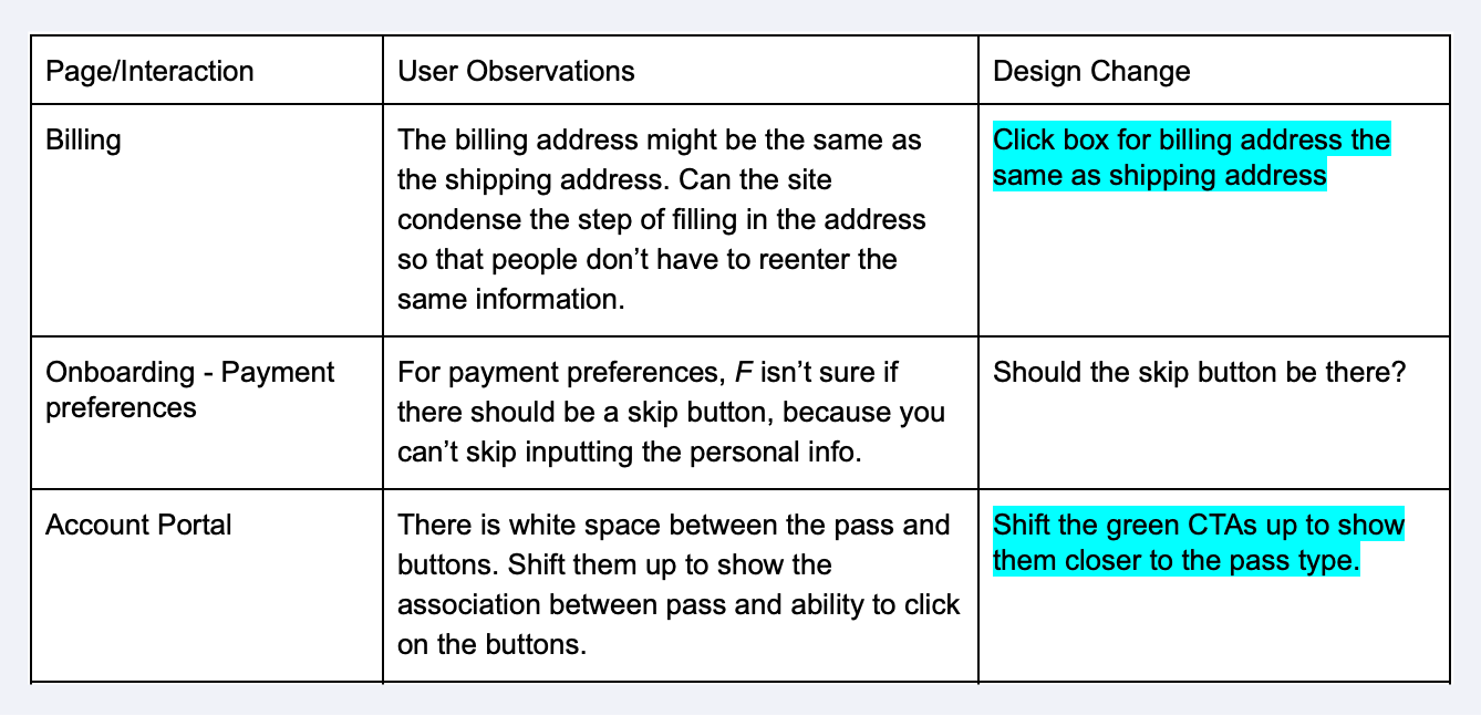
Visibility of buttons, the hierarchy of information when setting up an account, and more confirmation visuals during the checkout process could be enhanced to further simplify and streamline user experiences.
The homepage, onboarding process, account portal, autoload process and visual style were all changed to reflect the feedback we received.
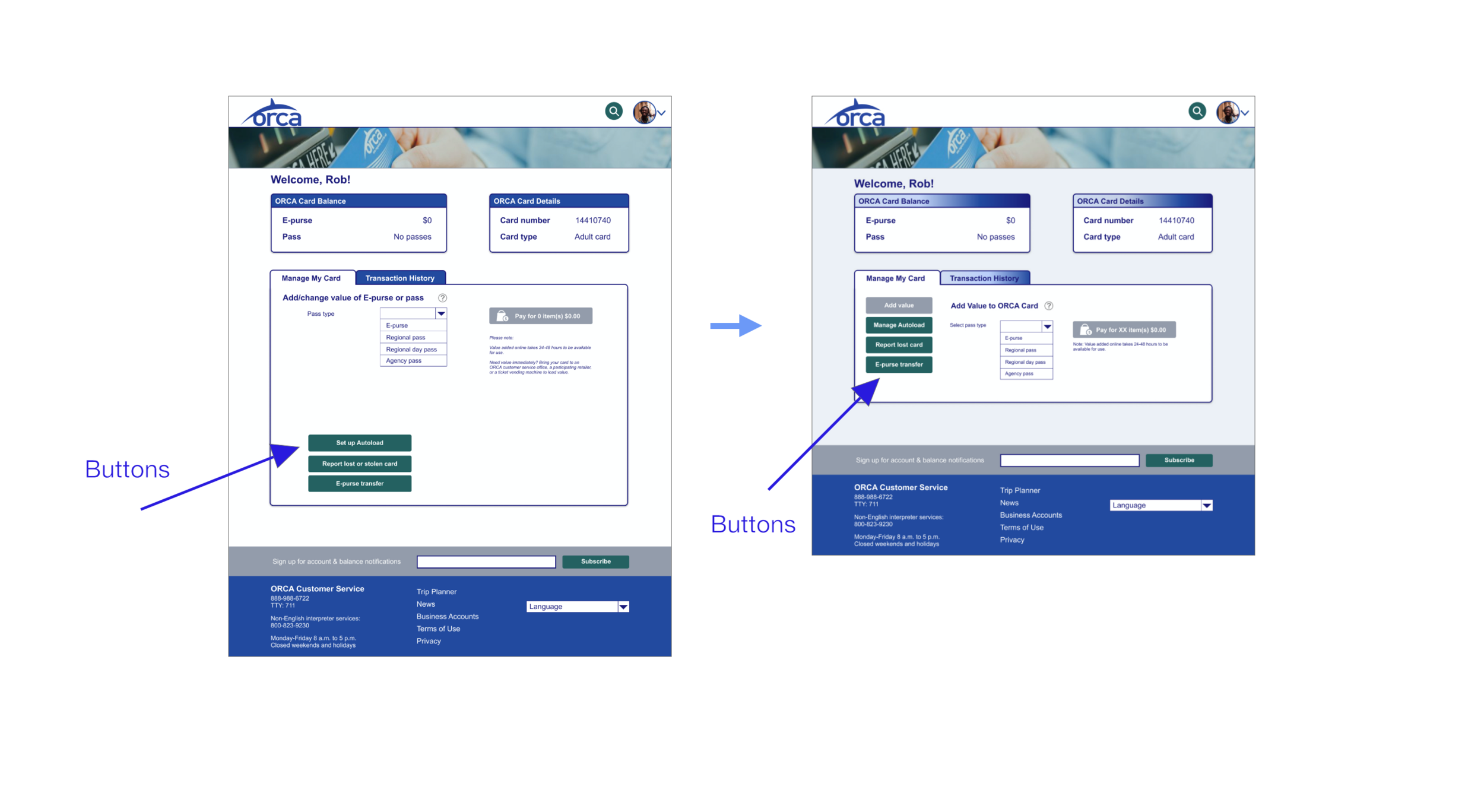
Account Portal: Button Proximity
Buttons moved closer to ORCA transport passes to show association of buttons to changes in the account portal.
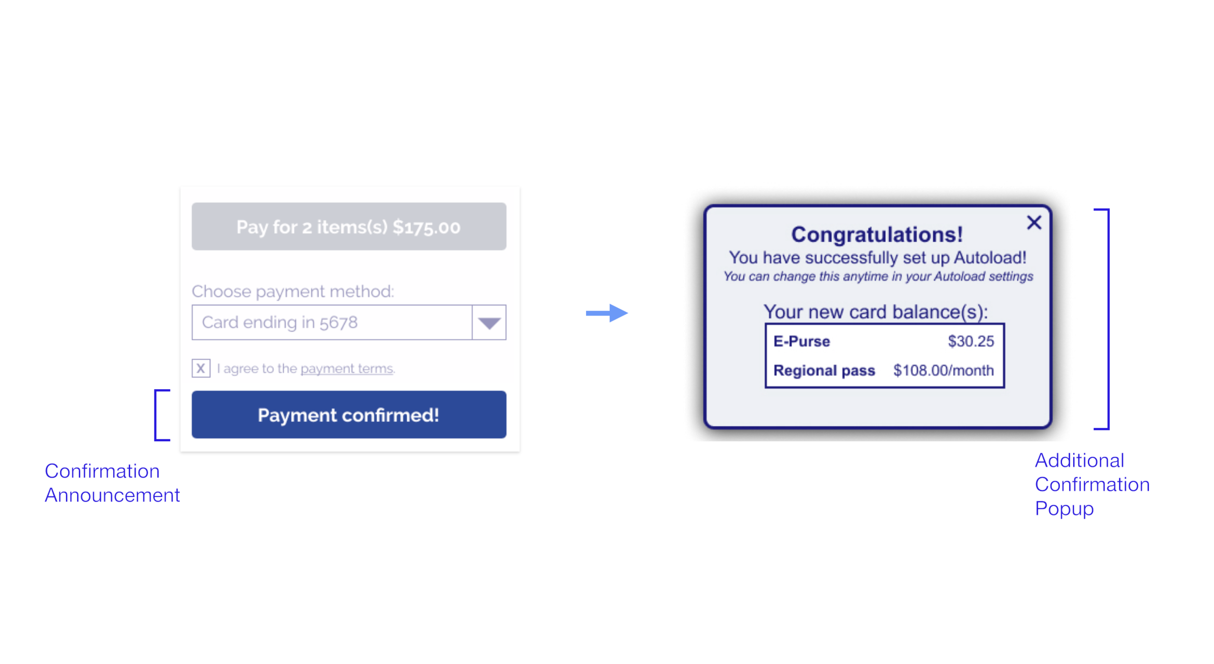
Checkout: Added Confirmation Pop-up
A confirmation popup is added to affirm the payment process has been completed and show a change in card balance.
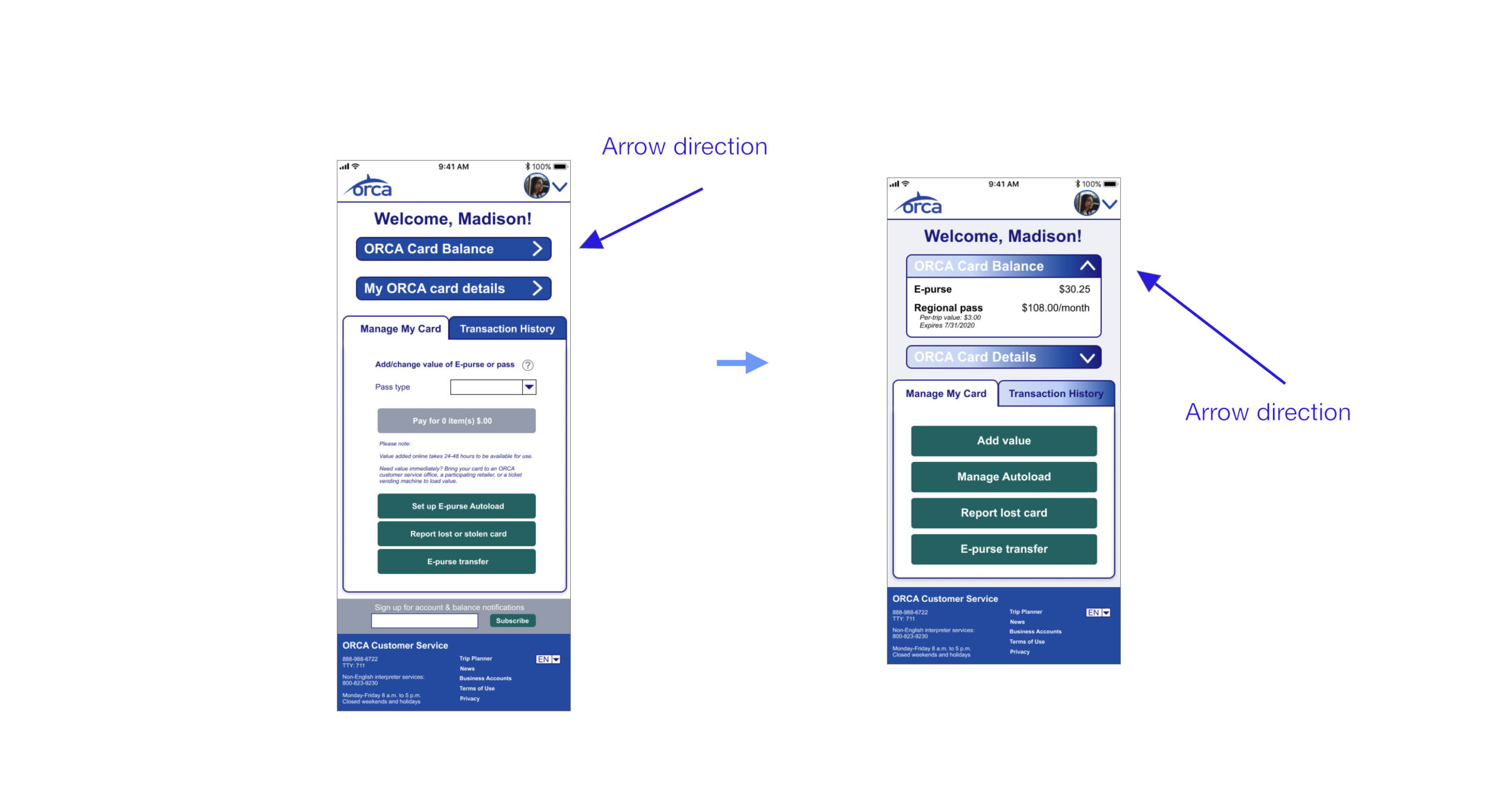
Arrow Direction: Better Signifier
The direction of the "ORCA Card Balance" and "My ORCA Card Details" changes to represent the opening and closing of the tabs.
More changes were made to the homepage, where visuals were adjusted to better show the ability to scroll down the page, new user's information inputted on the homepage would autofill as they continued creating their account on new screens, the billing process was simplified with an option to have your shipping and billing be the same address, and button labels were changed to better match user expectations.
Desktop Prototype
The new design did meet project goals of being responsive, supporting card management, showcasing ORCA values, such as being environmentally friendly, and guiding user's through a new account setup or autoload process in a straightforward and discernible way.
Mobile Prototype
From the initial to later usability test, there was marked improvement in both the time it took to complete tasks as well as in the perception of usability from the original to redesigned site.
After the usability test, we received SUS scores that showed people found the new site more functional, and they also were able to move through it quicker than the original site. The scores improved by 38.6 points from the original to the new webpage, which means that people did find the new design to be more useful. Also, it took them less time to complete goals. The time to create an account and go through the process of adding money to an account was able to decrease by an average of 26 seconds on desktop and an average of 15 seconds on mobile showing the new designs accounted for faster task times.
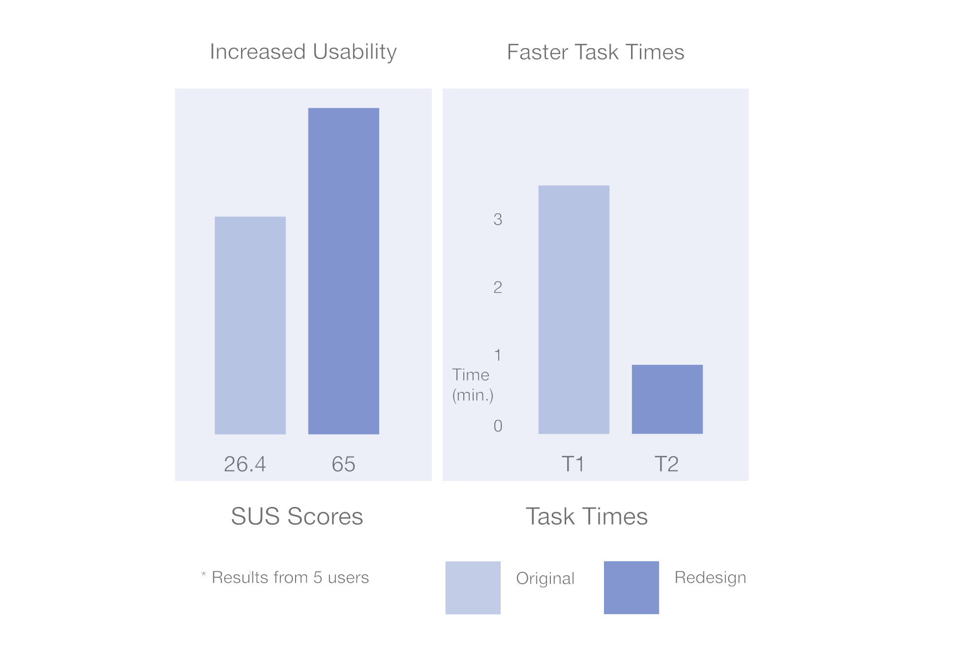
5 out of 5 people had improved SUS scores
38.6 point increase = 🥳
Design Focus
With the focus of the project being on design and teamwork, it was important to collaborate together to produce a final design that met ORCA and user goals. In a duration of 2 weeks, we solved for the initial problem with the prototypes linked below. I also wanted to explore other design variations, so I have been playing with different tones of blues and layout to create something that may be more modern and bright.
Next Steps
Moving forward, I want to continue to build off of user testing. One round of iteration was made after receiving feedback on the new design. It would be ideal to see how the new user scores compare to the first improvement. Once the layout and process of creating an account is highly scored, it would be interesting to then shift the visual colors and typography to see if that further improves users’ experience of the site.
Reflection.
I found I was able to learn about the design studio process, working with a team for a two week project dash, and pitch in on ideas while taking on specific roles with my teammates. By working together, we learned and shared different perspectives and methodologies that helped me (and them too, I think!) to see UX differently. We also got the chance to understand each other’s work flows and to support each other with different contributions, such as speaking to think, sharing feedback, using “Monday.com” to organize and keep us on track, and ideating together on certain tasks, such as with a group affinity map and a design studio meeting.