
Orca.
Responsive Redesign
Concept project, Public Transit Company in Seattle, WA
Orca
Project.
Team
Doe S and Olivia P
My Focus
Research and Usability Testing
Tools
Figma, Keynote, Draw.io, Miro
Who
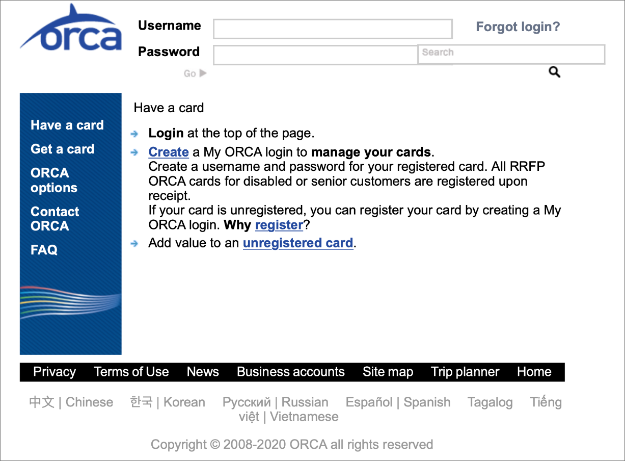
The company is Orca, a transit company in Washington, that provides public transportation for people in Seattle and specific counties in the surrounding area.
What
We were tasked with creating a responsive design for Orca’s website. We designed for mobile and desktop experiences so web pages could adapt to either device.
Problem and Goal.
Their Problem
Their problem is that the original site looks exactly the same on desktop and mobile, which creates problems for users, such as having to zoom in and out on mobile to be able to see page content. Also, their website does not have the structure to support easy access to information for online visitors or proficient card management for people who use the Orca transit system.
Their Goal
Their goal is for a responsive website to help people use public transit for their commutes so that they can reduce the amount of cars on the road and become more environmentally friendly. Additionally, they want to restructure their website so that people can more easily access and view information online and manage their Orca card through their account.
Site Research.
Our team embarked on a research plan to learn more about Orca by understanding the way current user’s navigate their site on desktop and on mobile.
Positioning ourselves into the traveling mindset of a Seattleite, we assumed during initial review, that many people would be visiting the site to create an account or access their current account. We set that task for ourselves, to move through the site to create a new Orca account and add travel funds for later use.
Visibly Small Screen Size
Visiting the Orca website, it is apparent that the size of the content in relation to the screen is uncommonly small compared to other websites. The margins of white space make it seem like the webpage is zoomed out when it really is the actual size of the page.
Did you Say Orca?
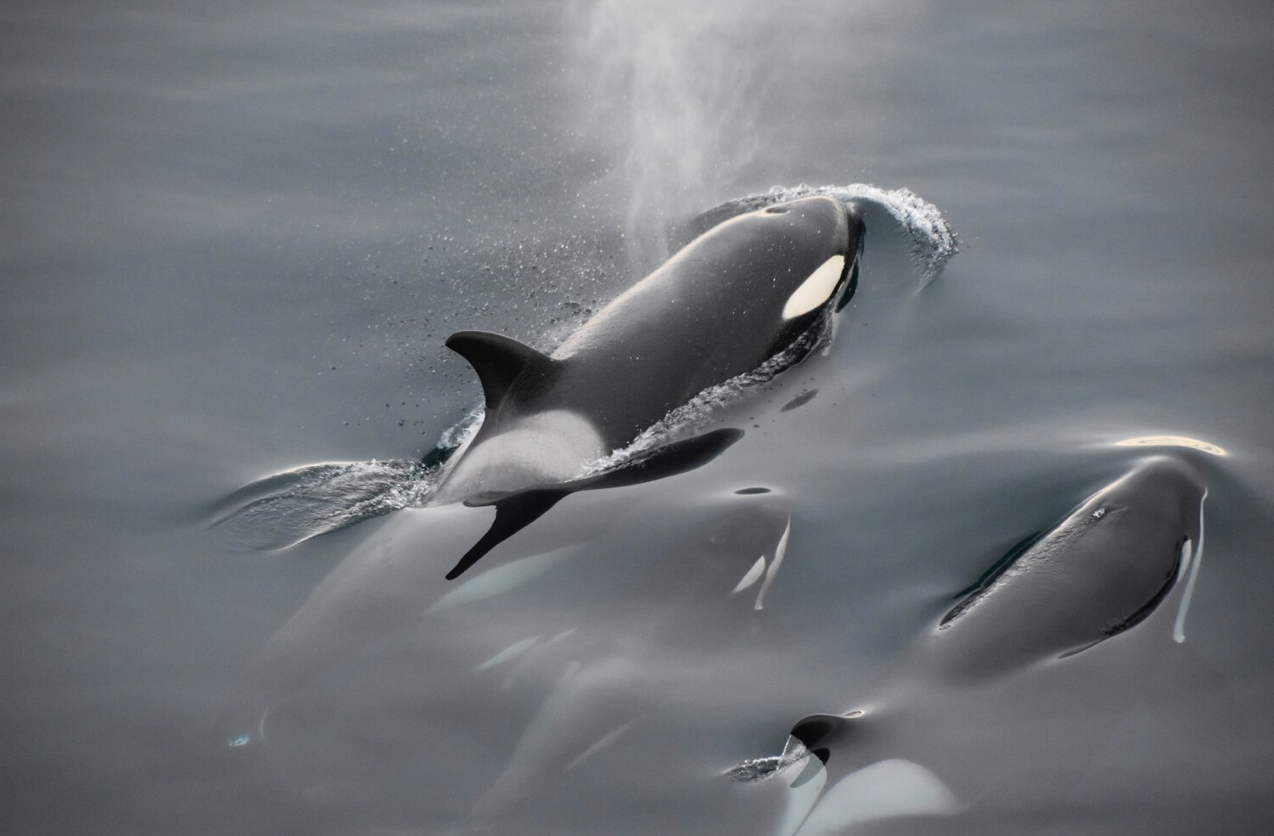
An Orca is not a whale, rather it is a dolphin that looks like a whale. As National Geographic eludes, “Orcas, or killer whales, are the largest of the dolphins and one of the world’s most powerful predators. (Link)
This powerful entity, the focus of the project, is Orca, the transit company rather than the dolphin species.
Unclear Page Titles and Links
Creating a new Orca account and adding travel funds for later use was a difficult task to complete for the team, since there were similar labels for site pages and since page content did not seem to match their navigation titles. It took multiple attempts to locate information on how to add money to an Orca card because of the mismatch of page titles to page content .
User Research from Interviews.
Next, we spoke to people who use Orca cards in Seattle or use public transportation in other locations. We wanted to learn about their travel habits and preferences, such as buying a day-pass or a monthly subscription, their frequency of public transportation, and their opinion of the current Orca site.
Orca Task Analysis
Transport Preferences
Interviewees moved through the task of creating an account or adding travel funds to an existing account. The interviews highlighted other areas with navigation, visuals, and responsive design to investigate. About Orca Page with Titles and Navigation that makes it difficult to visit the page you are looking for on the first attempt.
Goals for Transortation
~ focus in on making navigation more intuitive to lead users through the tasks they are trying to accomplish
~ redesign the visuals to make them more appealing
~ reformat the mobile version to be responsive so that the size and material shown is just as easy to read and interact with on mobile as it is on desktop?
Range of User Feedback
Insights +
+ Do I add money under “My account” or “My card”?
+ Does “Review account” actually mean review account or will it bring me to a page with content that does not match the title of the page?
Insights -
- Do I add money under “My account” or “My card”?
- Does “Review account” actually mean review account or will it bring me to a page with content that does not match the title of the page?
4/5 People use Orca Transit Systems
1/5 People use other Transit Systems outside Seattle
Usability Test Part 1.
To compare the original site to a new design, we also conducted an initial usability test. Interviewees moved through the task of creating an account or adding travel funds to an existing account. The interviews highlighted other areas with navigation, visuals, and responsive design to investigate.
Initial SUS Scores and Site Feedback
Next, we spoke to people who use Orca cards in Seattle or use public transportation in other locations. We wanted to learn about their travel habits and preferences, such as buying a day-pass or a monthly subscription, their frequency of public transportation, and their opinion of the current Orca site. To compare the original site to a new design, we also conducted an initial usability test. Interviewees moved through the task of creating an account or adding travel funds to an existing account.
Problems
~ How to add money to an Orca card.
~ Large Page Margins = difficult to read
~ Confusing page labels, navigation,layout
~ Desktop + Mobile look exactly the same
User Response Feedback
~ “What is “E-card"?”
~ “This is confusing!”
~ “I have to keep zooming in and out.”
The 6 people who were interviewed said that the site was confusing and it took them an average time of 11.11 seconds to complete the task. 2 people were ORCA users and 4 others had used public transportation before. Main points they wanted changed, that they found confusing, etc., were x y z.
5 People completed Usability Testing on the Orca site
Recorded Task times + initial SUS scores
“If I had the option to go somewhere tangibly to buy this ticket, versus online, I would without a question, without a doubt, would not go through their site.”
-ORCA Interviewee N.2
Persona.
We refined the interview data into the perspective of two users. One user, Madison, is a frequent ORCA traveler who wants to set up autoload payments. The other user, Rob, is new to Seattle and needs to create an ORCA account.

Madison
Goals
Add money easily to transit card
Alert for card balances
Frustrations
Time to add money to Orca card
Madison is well accustomed to ORCA travel but needs to be able to set up autoload payments so that she can have her monthly balance match her travel schedule and so that she can save time for other tasks.
Rob
Goals
Needs information on the different transit options
Frustrations
Rob wants to learn how the Seattle transit system and the Orca card works but is having a hard time navigating the website.
Rob is the new user who is entering the ORCA website for the first time and needs to be led through the setup process for a new account. Additionally he needs to be able to add money to his account for the first time.

User Flows Before & After.
Madison Before
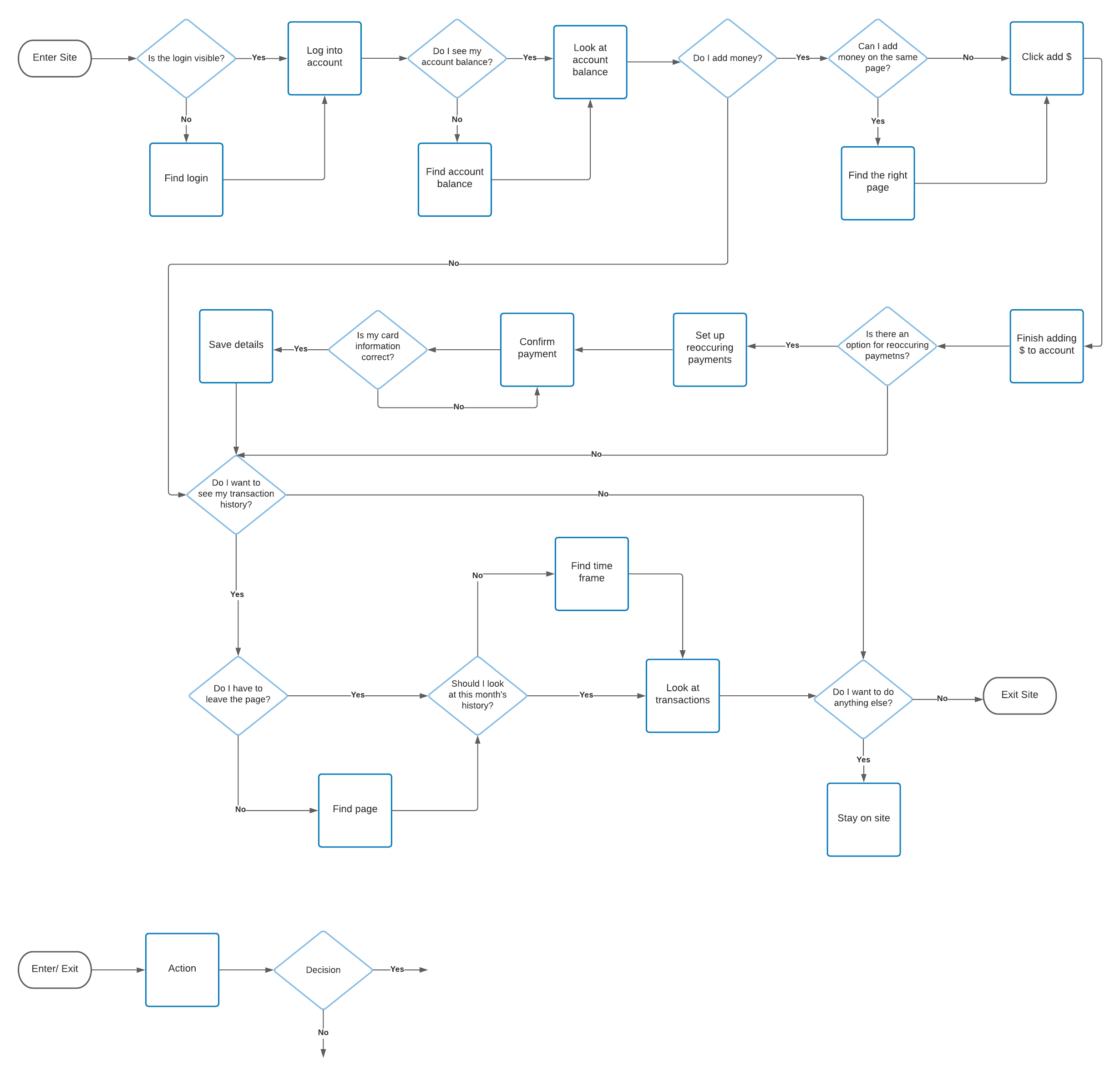
User Flow: Add $ to an Orca Card
Madison After
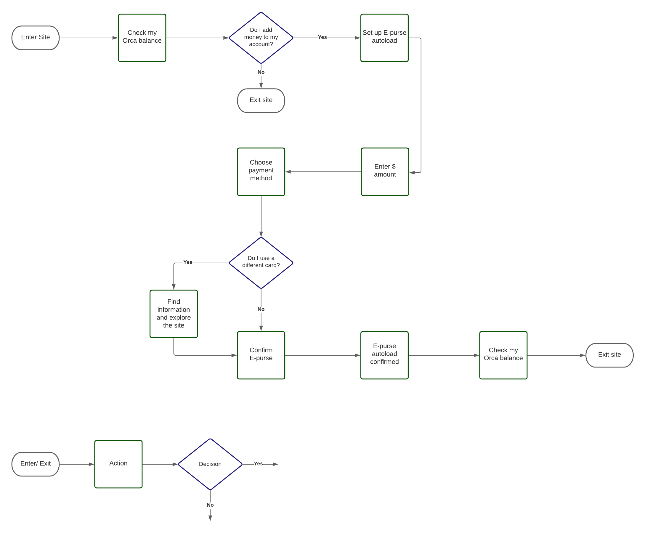
Madison: Original user flow specifies the types of information she wants to immediately view after logging into her account. The new user flow shows a more concise process, incorporated into the new design, which shows her checking her account balance and setting up autoload payments.
Mobile device is used most often for returning users.
Rob Before
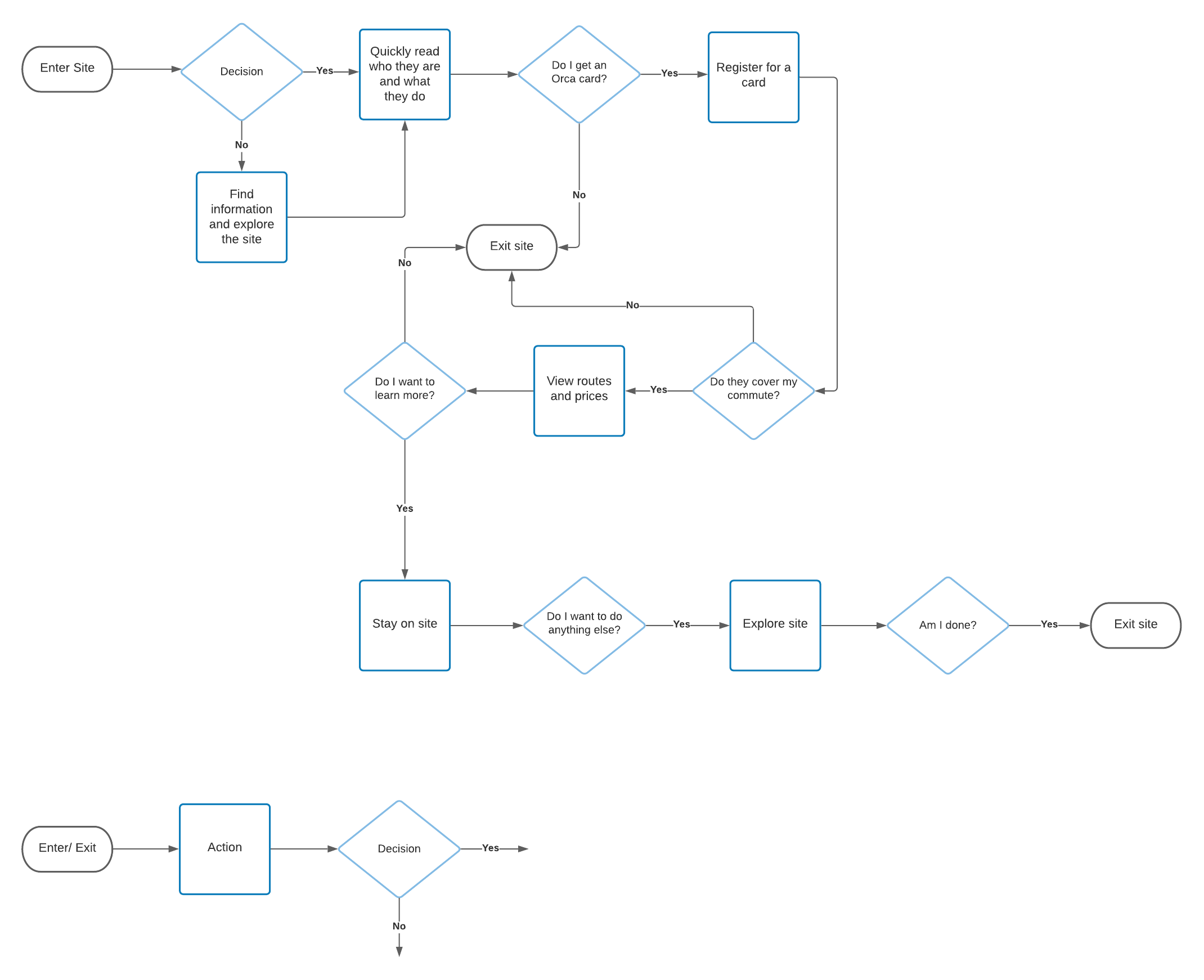
Rob After
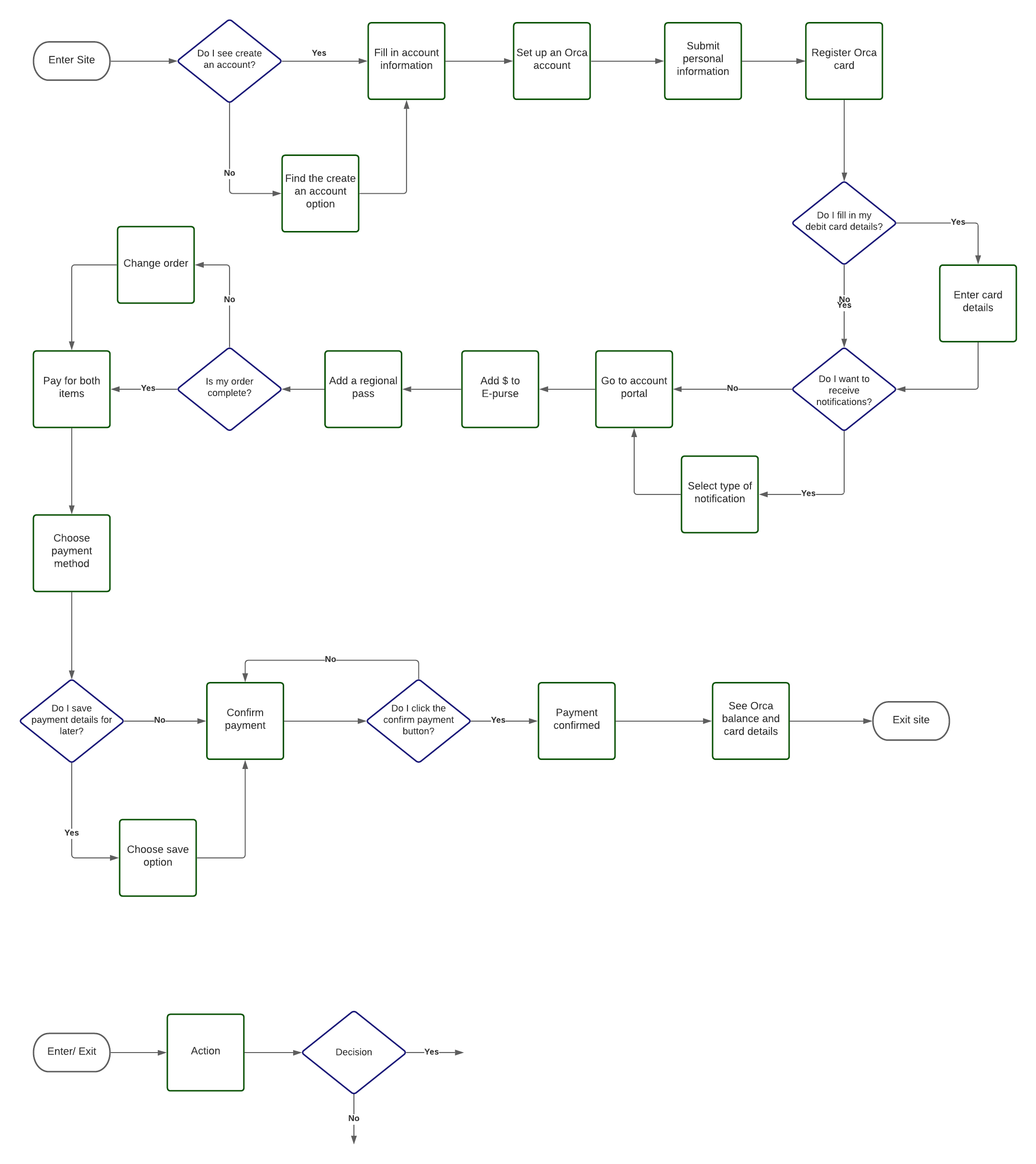
User Flow: Create an Orca Account
Rob: Initial user flow identifies his thought process in choosing to create an account. The new user flow shows, in more detail, his process of creating an account and steps he takes to add money to his account.
Desktop device is used most often for new users
Design.
Design Studio
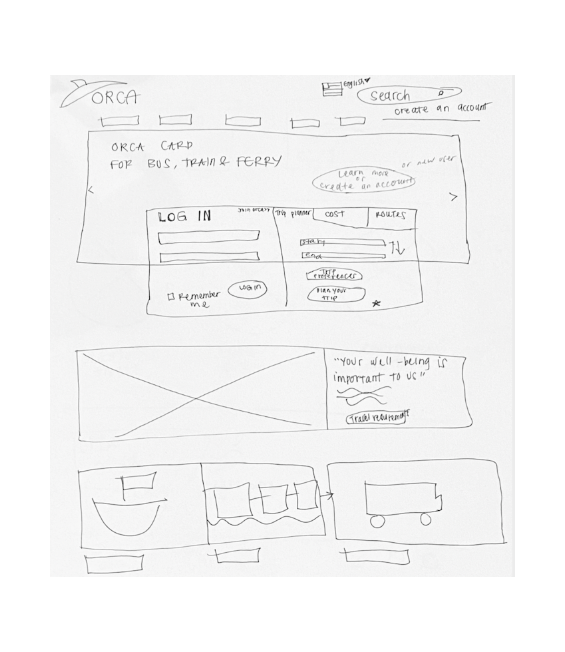
Homepage
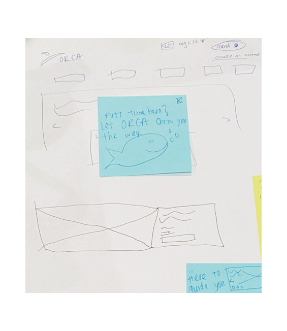
Sign-Up
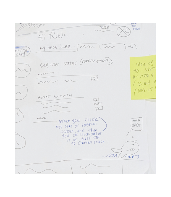
Account Portal
Sketches & Discussion for Responsive Screens
To brainstorm sketches for desktop and mobile designs, Liv, Doe, and I met and ideated on landing pages, account sign-ups, and the Orca card autoload process. We focused on new layouts, navigations, and content hierarchy for the design sketches. Some of the questions we asked were “How should we prioritize steps in the account and autoload process?”, and “How will we utilize breakpoints to show content on mobile and desktop?”
Design Palette
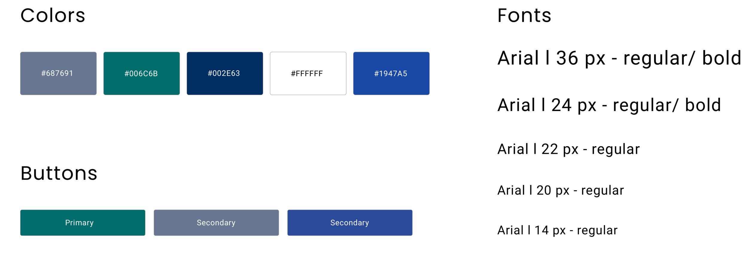
The layout of the site and how users navigate through it was prioritized over developing a completely new visual look for ORCA. We chose to stay with the current ORCA color palette and font but applied to content that is visually clear and easy to understand.
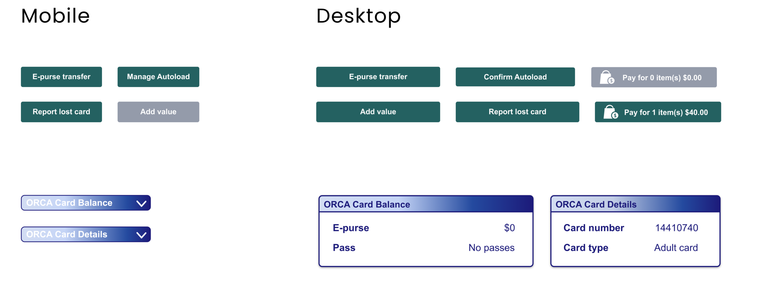
Design Patterns
The account portal on mobile and desktop included green and grey buttons to add money and change the account portal view, tabs for managing an Orca card and viewing transaction history, and drop-downs for “My Card Details” and “My Orca Card Balance”.
Usability Test Part 2.
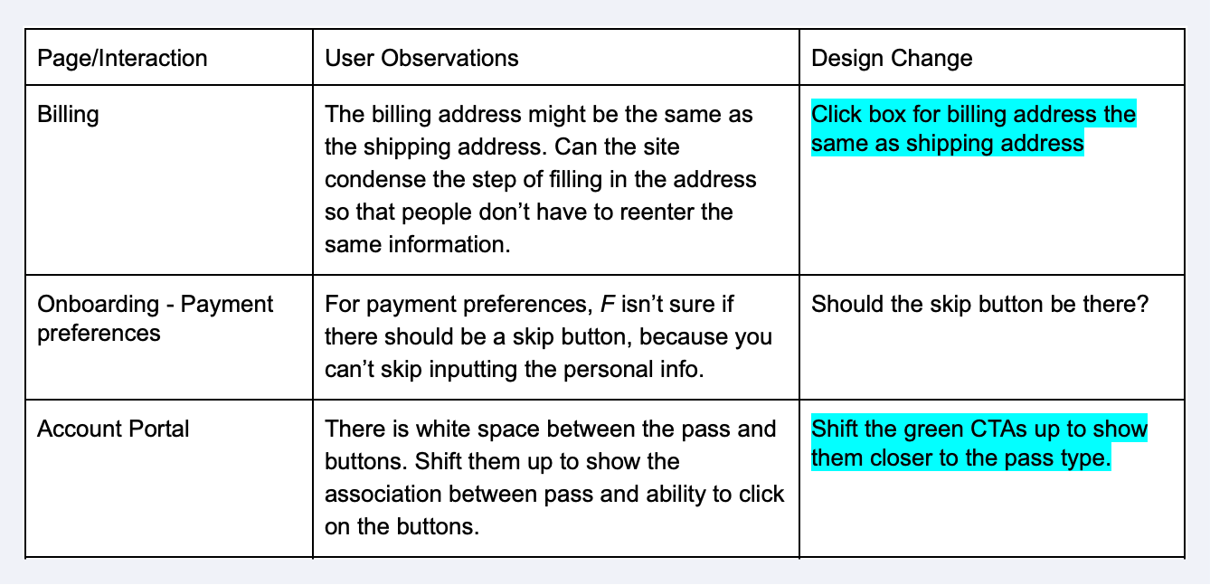
Usability Feedback & Responsive Design Changes
The new design received favorable feedback from interviewees and people completed their tasks more quickly on the responsive designs than from the original Orca site on desktop and mobile. interviewees shared their experience of creating an account and autoloading money. The visibility and accessibility of information improved but layout and minimizing steps was noted as areas the team could improve.
5 People complete usability testing for the new design
Improved scores SUS and 5 second increase
“20x’s more better than the first one. This guy is a lot easier to navigate and I feel like something like this isn’t something you do all the time. As someone who travels frequently, this made it as simple as possible.”
-ORCA Interviewee N.2
Design Improvements.
The homepage, onboarding process, account portal, autoload process and visual style were all changed to reflect the feedback we received. Visibility of buttons, the hierarchy of information when setting up an account, and more confirmation visuals during the checkout process could be enhanced to further simplify and streamline user experiences.
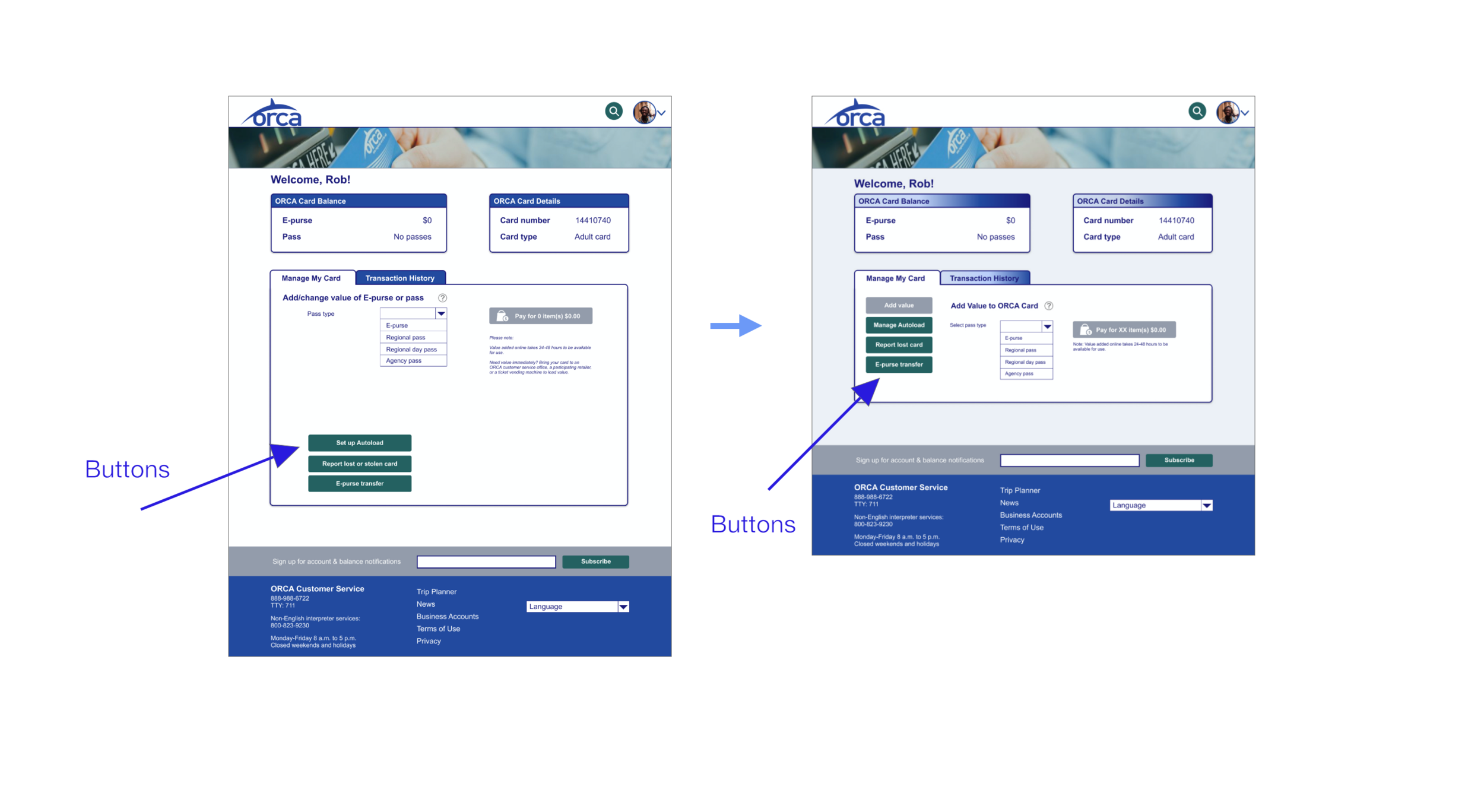
Account Portal : Closer Button Proximity
Users noticed that there was a large space that separated a their ability to add money to their account and click on different buttons. So, the green buttons are moved closer to the “change value option” to show an association of buttons to changes in the account portal.
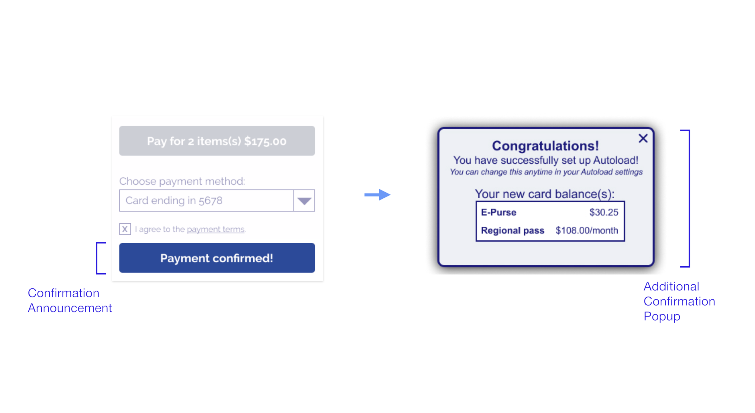
Checkout : New Confirmation Pop-up
During the usability test, users were unsure if their payment went through and some thought the single button confirmation was too quick. A confirmation pop-up is added to show that the payment process was successfully completed.
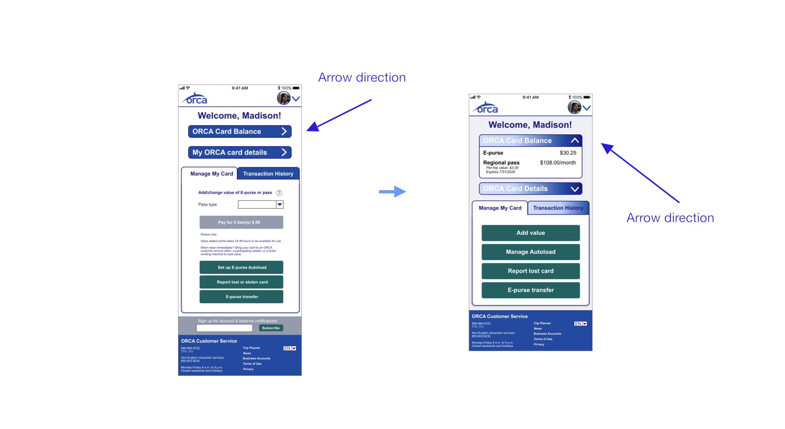
Dropdown Arrows : Better Signifier
People did not realize that the side direction of the arrows next to the “ORCA Card Balance” and "My ORCA Card Details" would drop down when clicked. The arrow directions are changed to face upward when open and down when closed to better represent this action.
Prototypes for Mobile & Desktop.
Rob’s Create and Account Prototype
Desktop Prototype
Rob locates the create an account option on Orca’s homepage. He moves through the create account process with sequential forms and successfully becomes an Orca member. After completing the steps to order an Orca card, he is able to view his account portal.
Desktop Design Highlights:
~ The “Create an Account” and “Login” link are obviously available at the top of the homepage for effortless action.
~ Forms autofill previously inputted information.
~ Orca card visuals show the status of a user’s card.
~ Billing information is visually and hierarchically credible.
~ Account portal makes use of the entire desktop screen.
Madison’s Add $ to Orca Card Flow
Mobile Prototype
Madison adds money to her Orca card and changes her E-pass and regional pass balance. She is able to view her “Orca Card Balance” and “My Orca Card Details” by clicking on the dropdown arrows. Transaction History is available to view so she knows how much to add to her monthly pass.
Mobile Design highlights:
~ “Manage My Card” is front-and-center with green buttons so Madison can efficiently make changes to her Orca card.
~ A minimized menu, makes use of space.
~ A customizable profile picture personalizes the account.
~ The Orca logo takes you to the Orca homepage.
~ Text and images are legible and sized to for mobile devices.
Usability Test Results.
SUS Scores & Task Times Improve with Iteration
After the usability test, we received SUS scores that showed people found the new site more functional, and they also were able to move through it quicker than the original site. The SUS scores improved by 38.6 points from the original to the new webpage, which means that people did find the new design to be more useful. It also took people less time to complete goals. The time to create an account and go through the process of adding money to an account was able to decrease by an average of 26 seconds on desktop and an average of 15 seconds on mobile showing the new designs accounted for more efficiency with faster task times.
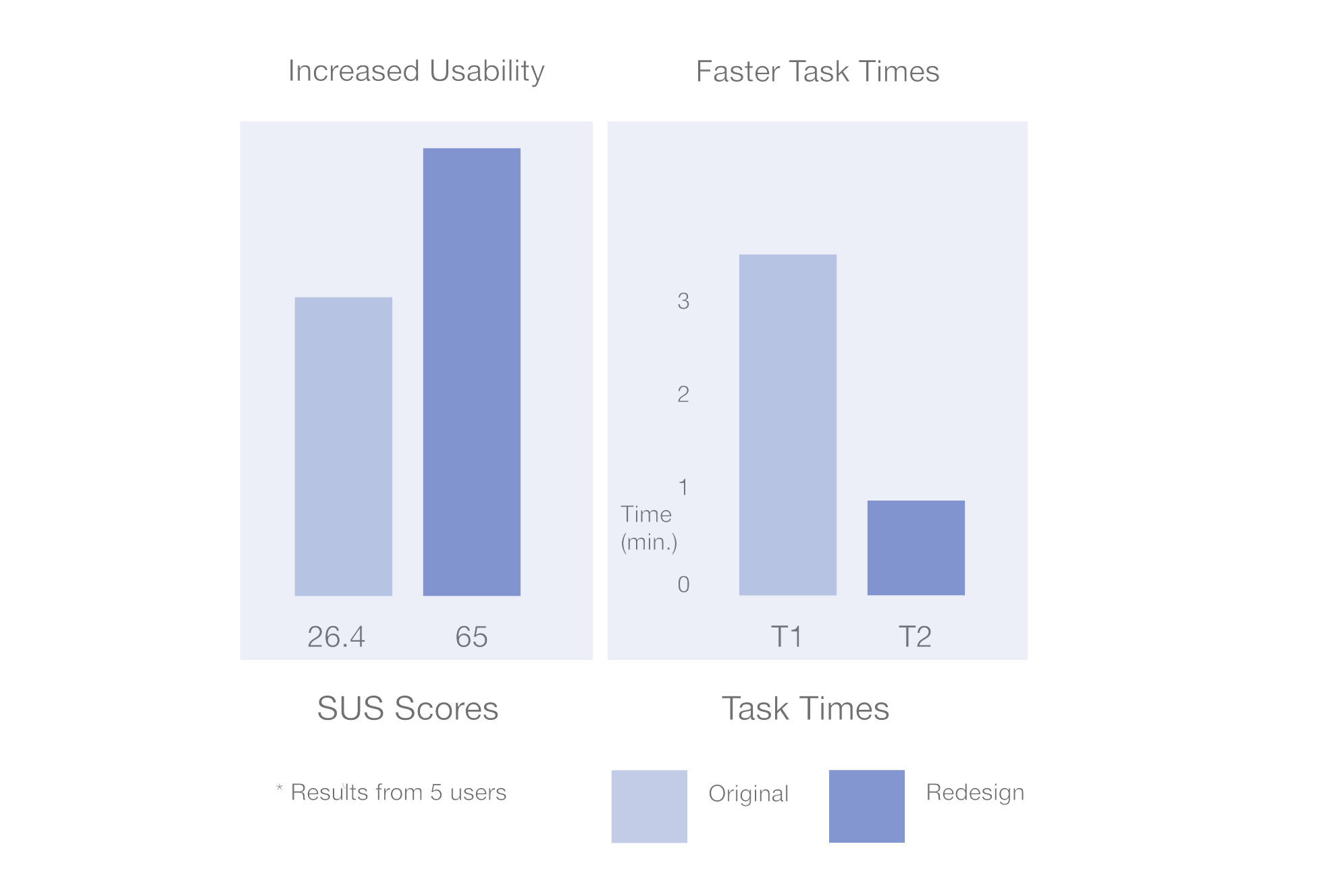
5 out of 5 people had improved SUS scores
38.6 point increase = 🥳
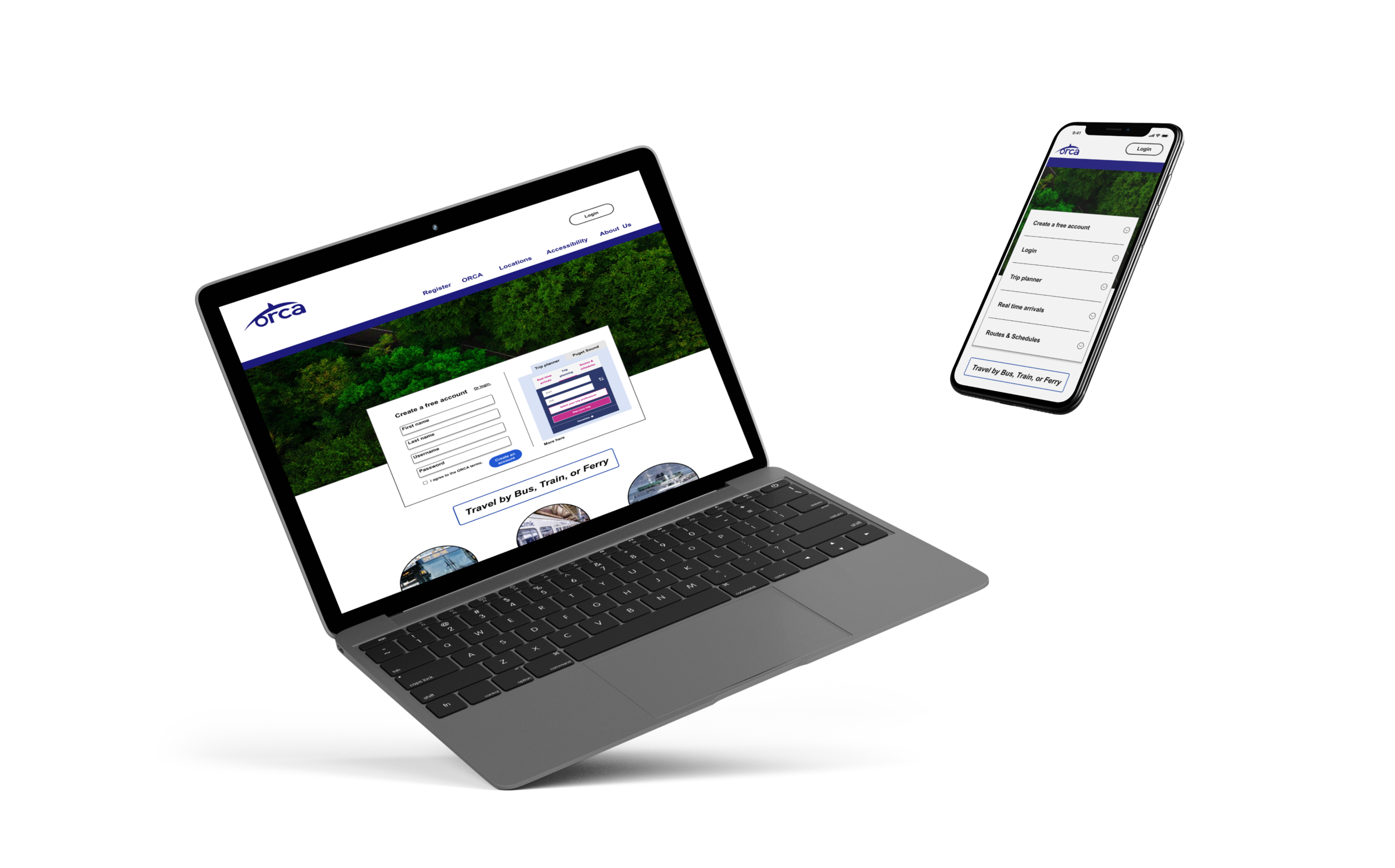
Design V3.
Design Focus After Initial 2 Week Goal
With the focus of the project being on teamwork and responsive design, it was important to collaborate to produce a design that met ORCA and user goals at the end of 2 weeks. Later, I explored other design variations, because I wanted to see how updated visuals would blend with the improved structure that was created.
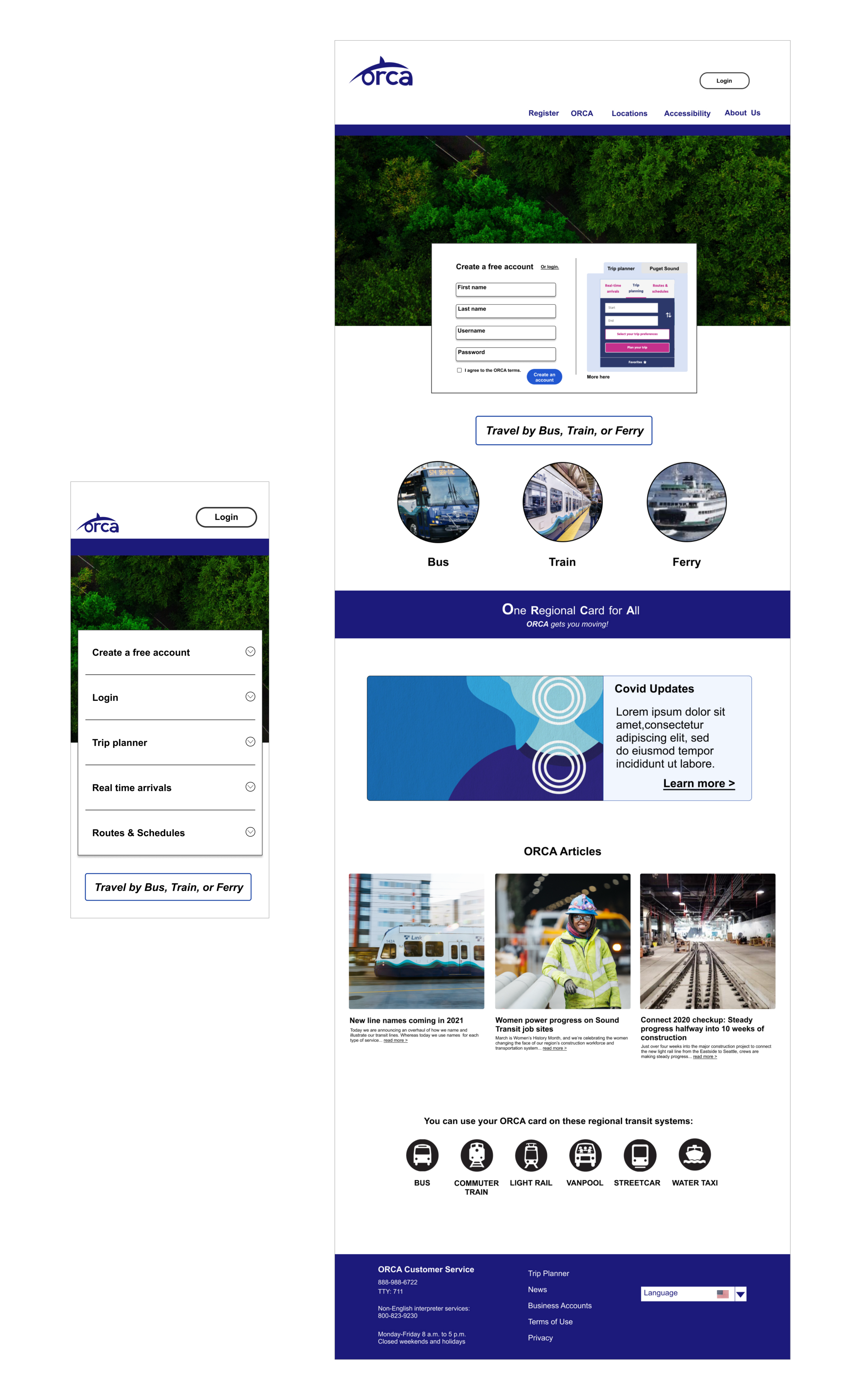
Homepage Design Highlights:
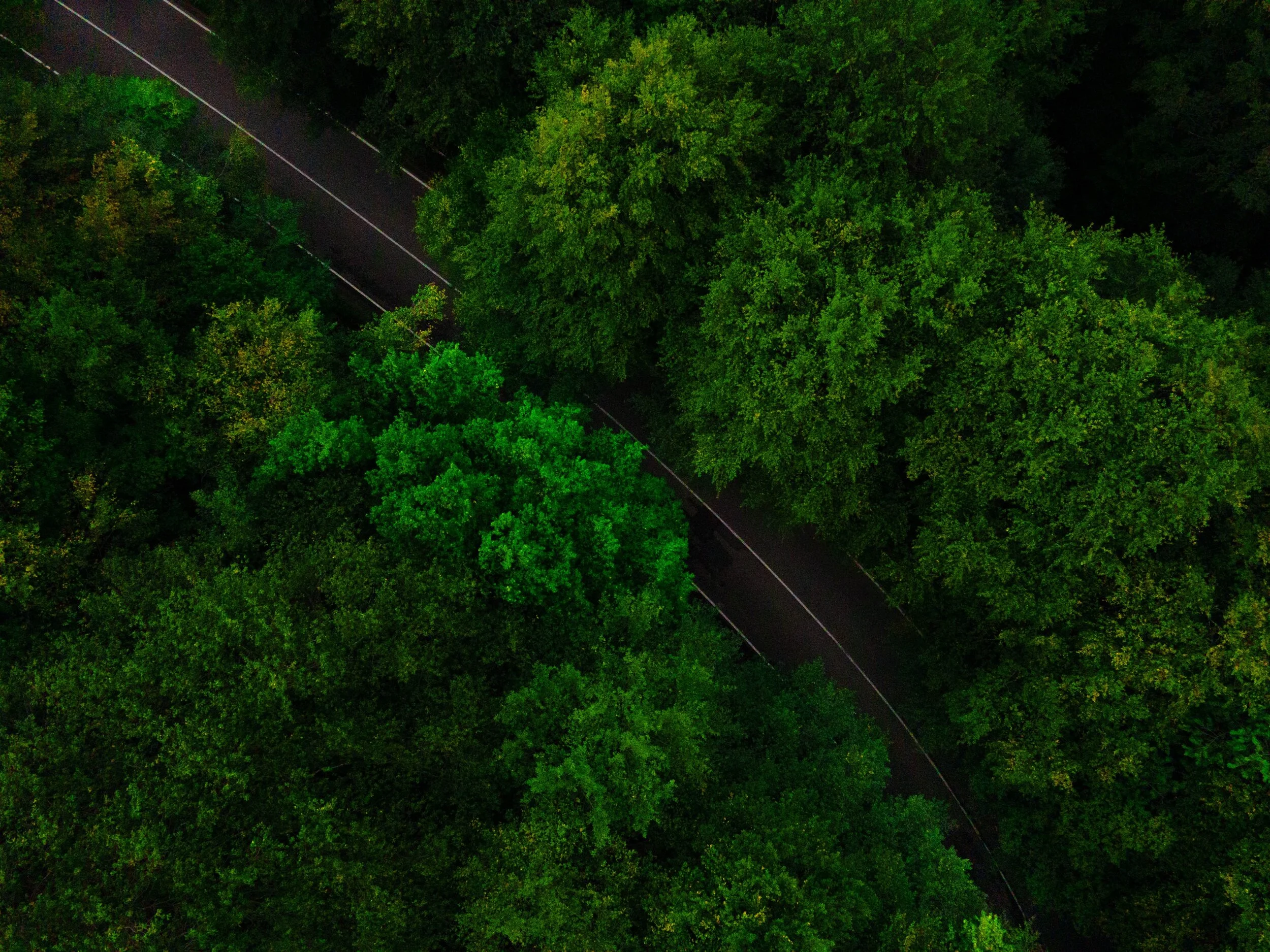
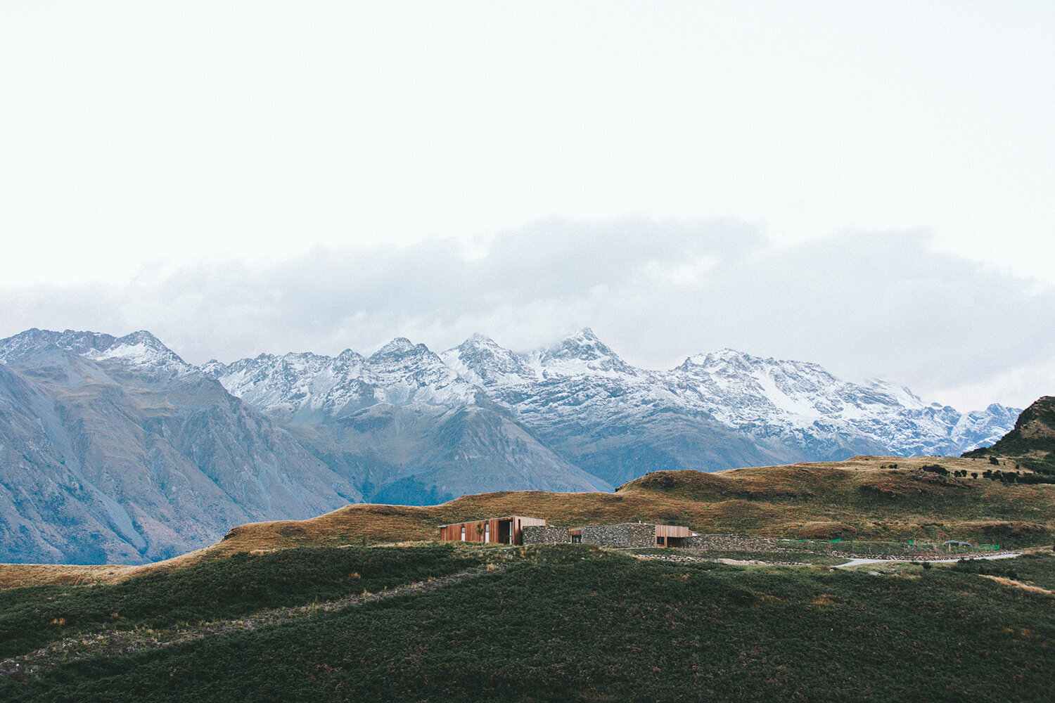
~ Imagery of trees and a road catch user’s interest and show Orca’s connection to transit and to their environment.
~ A bolder colored blue used on their logo, navigation, slogan, and footer speaks to a more modern look.
~ A navigation at the top of the page shows options to clearly access Orca information.
~ A “Trip Planner” is included for people to immediately access transit routes and locate Orca transit schedules.
~ “Bus”, “Train”, and “Ferry” options identify Orca transit systems.
~ A visual for updates is included and speaks to recent regulations.
~ “Orca Articles” shares recent posts for people to learn more.
Next Steps & Reflection.
Reflection
One of my favorite parts about this project was the design studio. Mid-project, the team met and shared different ideas on mobile and desktop designs before wireframing in Figma. We put forth different sketches and defended our designs. Ideas were fleshed out, changed, and coalesced, and the process propelled us into the next stages of the project.
Next Steps
One round of iteration was made after receiving feedback on the new design. It would be ideal to see how the user scores compare to the new design that was created at the end of the 2 weeks. From there, visuals, such as color and typography could be enhanced. With a design that works well for users, the aesthetic could be updated for a + experience.