
Later, you can share the UX note about adaptability and a counter UX Note too, (quote, note, insight)
An Automatic Extension Request was the first project I worked on with Privva. They were looking to create a process for a client to accept and extend assessments and for vendors to submit requests and respond to a client’s extension approval or denial. Additionally, they were looking to select dates that worked within the client’s assessment time frame, such as 2 months, 3 months, and 6 months.
Privva
Cybersecurity and Venture Risk Assessment Platform
Company
Who are they?
A company located in Arlington, VA, the company, Link, was originally a startup focusing on cybersecurity and venture risk assessment. They were later acquired by Smarsh inc., Link. Privva utilize vendor questionnaires, testing, and data collation to determine the risk of companies working with outside vendors and they calculate various risk scores that align with each company’s security preferences.
Product
How does the product work?
The client utilizes/ uses Privva’s base product to run security questionnaires that they send to vendors, which they may choose to work with based on responses and remediations, and based off of longer standing relationships with other vendors. An example of this: A company, like xyz may work with vendors for xyz reason and for a certain situation xyz an for a certain situation, xyz.
Tools
Figma, Lucid Chart, Keynote,
Duration
1 year and 1 month
+ / - 20 hours a week
Setting
Remote Office, Thanks Zoom!
20 Design Projects
7 Figma Prototypes
70% of Work In Use
Auto-extension requests, email templates, risk assessments, bulk file uploads, Vendor Requests, View Assessment Expirations, Custom Field Edits, Transfer Files,
List All 20 Projects
Auto-extension request for clients, vendors, and their combined process, Vendor Request and Bulk File Upload for the start, fill-in, edit, save, and uploads process. List All Prototypes
With product manager feedback, stakeholder priorities, and developer work, over 2/3rds of the designs were integrated into the Privva systems account portal.
What did you work on?
UX Consultant | As a UX Consultant, I advised and worked together with the project manager on various Proof of Concepts (POCs), such as revised data graphs, stakeholder agendas, such as new client and vendor features, and team finds, such as coding bugs and various restructuring to their client account portal.
Position
Adobe Illustrator, Google Drive
Email Templates
Code Bugs
25 Email Designs for Varied Scenarios
2 bugs found on the Account Portal
Vendor Requests
20 Screens for the Form Action Process
A Few Projects and Finds
25 Email Designs for Varied Scenarios
Email Templates
Vendor Requests
20 Screens for the Form Action Process
Email Templates
25 Email Designs for Varied Scenarios
Vendor Requests
20 Screens for the Form Action Process
Email Templates
25 Email Designs for Varied Scenarios
Product Info + Work Style
MVP + Vis Learns
The project style consisted of multiple projects being prioritized as visual designs that were created and delivered as minimal viable products (MVPs) Link. With a quick turn around, visual concepts with notes were prioritized over prototyped designs.
Speed of the work and why no User-testing
Adaptability (Pro)
Company product and client customization
Workflow
Workflow focus on Information Architecture
The company’s client portal questionnaires and risk score settings allowed for a (high turn around) threshold/ range of adaptability. Because each company had a high range of security protocol and priorities and worked with different types of vendors, feature adaptability and customization was a company focus so that . . .
Because of the visual emphasis on MVP designs, my workflow consisted of product research, visual low - fi mockups, mainly mid - fi to high - fi deliverables. Based off management’s timeline and priorities, the client and vendor perspective was gathered from proto-personas, task analyses, and user journeys.
Product Info + Work Style
MVP + Vis Learns
The project style consisted of multiple projects being prioritized as visual designs that were created and delivered as minimal viable products (MVPs) Link. With a quick turn around, visual concepts with notes were prioritized over prototyped designs.
Speed of the work and why no User-testing
Adaptability (Pro)
Company product and client customization
Workflow
Workflow focus on information architecture
The company’s client portal questionnaires and risk score settings allowed for a (high turn around) threshold/ range of adaptability. Because each company had a high range of security protocol and priorities and worked with different types of vendors, feature adaptability and customization was a company focus so that . . .
Because of the visual emphasis on MVP designs, my workflow consisted of product research, visual low - fi mockups, mainly mid - fi to high - fi deliverables. Based off management’s timeline and priorities, the client and vendor perspective was gathered from proto-personas, task analyses, and user journeys.
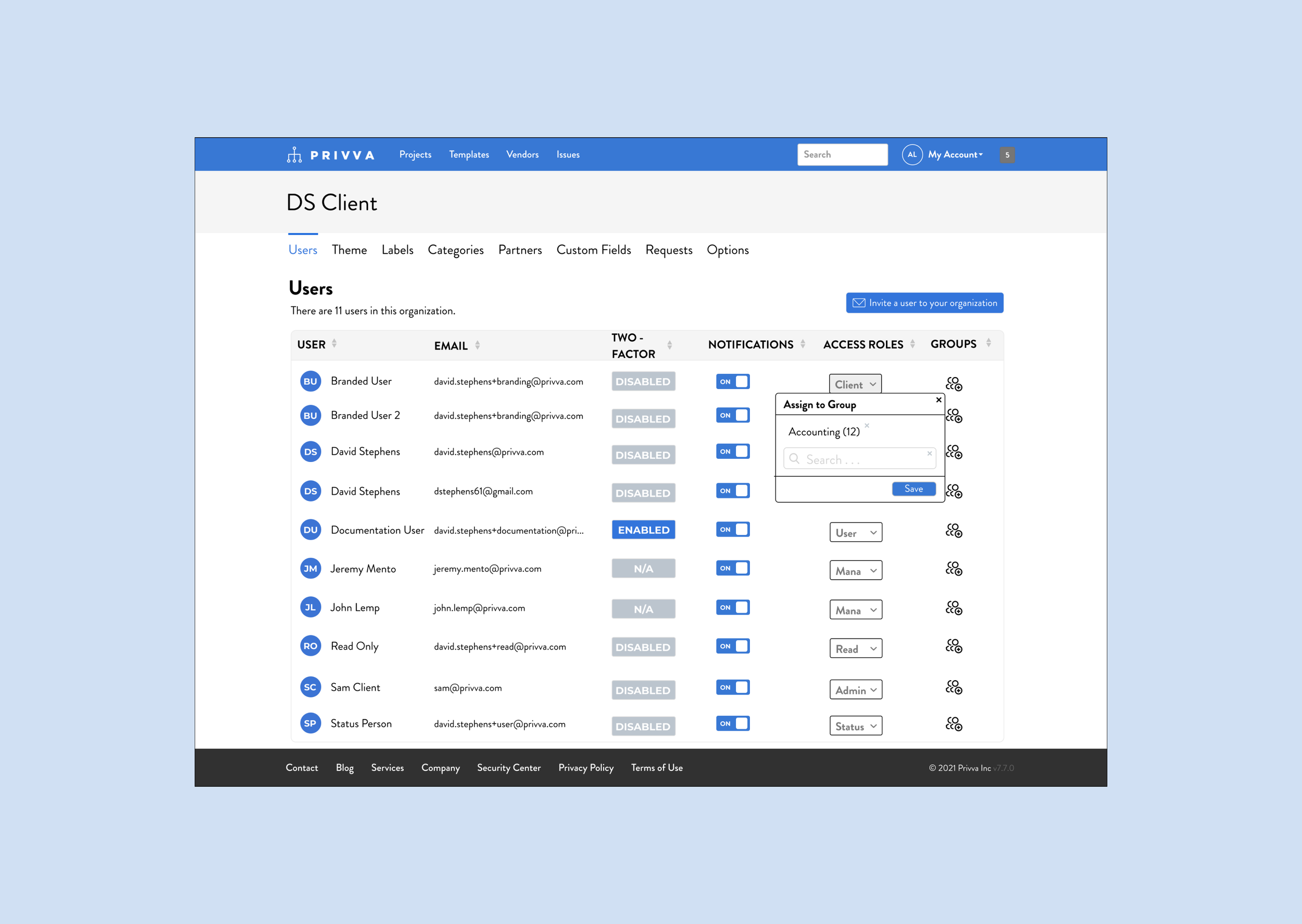
Privva Users


User Product Interaction
User Protopersona
Vendor
Vendor Product Interaction
User Persona
Client
Steve
Alex
For those who have seen the Earth from space, and for the hundreds and perhaps thousands more who will, the experience most certainly changes your perspective. The things that we share in our world are far more valuable than those which divide us.
It suddenly struck me that that tiny pea, pretty and blue, was the Earth. I put up my thumb and shut one eye, and my thumb blotted out the planet Earth. I didn’t feel like a giant. I felt very, very small.
A Few Projects and Finds
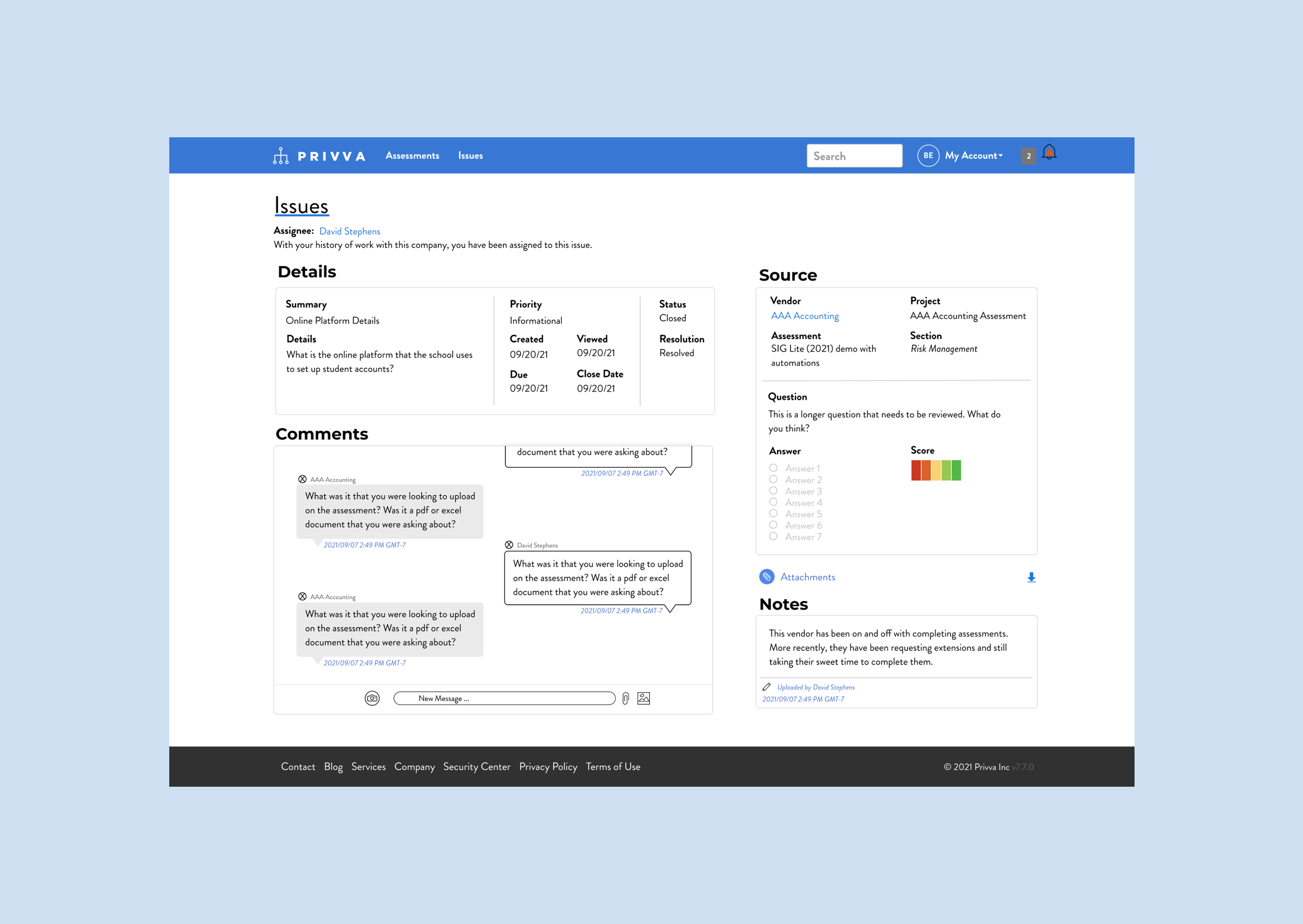
Layout, they wanted to include a section for notes as a request by some of the clients. Later, they also looked to add in a messaging section between the client and third party vendor communication staff. Additionally, while designs were contingent on the issues page (the r side) could shift slightly too. Response breakdown, reorg . . .
Projects
Systems Change 1, Issues Page
Subtitle is a statistic about the project.
Description
Objective
A messaging section is needed due to the frequency of clients wanting to message others too.
Changes/ Result
- Comments Addition
- People Upper L Side Reorganized
- R side format issue change
- A new layout because of the added comments section.
Iteration
Add in People Information Upper Right. What they needed.
Layout, they wanted to include a section for notes as a request by some of the clients. Later, they also looked to add in a messaging section between the client and third party vendor communication staff. Additionally, while designs were contingent on the issues page (the r side) could shift slightly too.
Projects
Systems Change 1, Issues Page
Subtitle is a statistic about the project.
Project Synopsis
Objective
A messaging section is needed due to the frequency of clients wanting to message others too.
Design Change
- Comments Addition
- People Upper L Side Reorganized
- R side format issue change
- A new layout because of the added comments section.
Iteration
- Comments Addition
- People Upper L Side Reorganized
- R side format issue change
- A new layout because of the added comments section.
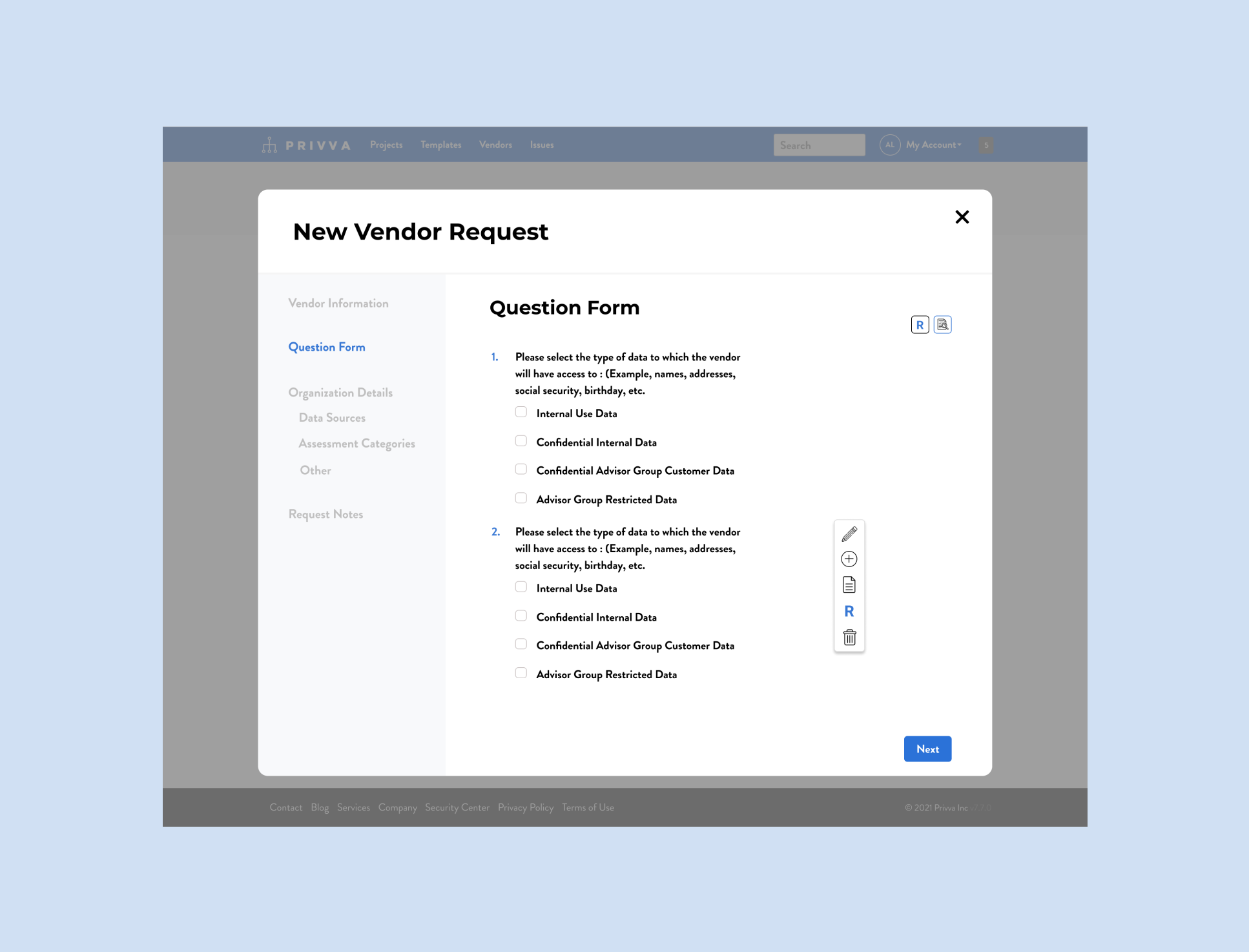
Vendor Requests
2 options with xyz screens
Problem: Old look and confusion about identifying the form options and what they mean and how they work. “Manage my org.” Look through your notes, this one is important!
Change: Hover it has the grey info tab and shows itself.
Icon preferences for notes, add, risk rating, etc.
Spacing and text placement
There was a lot to this project!
Risk Rating focus
Iteration: Manage my org and cut down on screens. Include risk rating option and integration (visual look)
Form fields: Multiple options and manage my organization addition.
Goal: The current placement of vendor request options could be integrated into a reorganization and restructuring of the form review and submission process. So there were 3 parts.
Add and restructure options
Update the forms with my organization information
Incorporate these ojectives and points into an updated visual look for the vendor request (form) process.
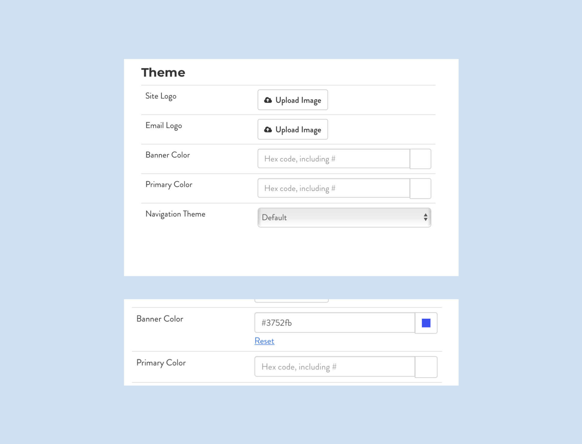
Code Bugs
2 Bugs found on the Client Portal
Problem: Manual HEX Code Color Change was auto-spelling a different HEX code after a partial HEX code was typed into the “field.”
Change: PM had great perspective. Callout to the PM, on the developer’s side they were able to adjust the HEX to accurately reflect the user’s color choice and to allow the user to type in the entire HEX code without it changing mid-type. : )
Iteration: Found a 2nd bug for later.
Banner choice
date, name, type, organization
When you type in the HEX code, the Hex code would automatically fill in a different HEX code and when you refreshed it would change color. Apparently, this was a bug that could be fixed on the developer side.
I caught 2 bugs on the client portal while working on a new visual for an added section to their organization settings, I found that their color option for the client’s customizable banner had a glitch. When manually entering the HEX color code, it would automatically auto-spell the HEX code to a new color after 3 letters and or numbers of the HEX code that was originally entered. This led the user to have a colored banner that didn’t actually match the HEX code they tried to enter. While manually adjusting the color was a bug, the color picker worked just fine for a user to select their portal’s color preference.
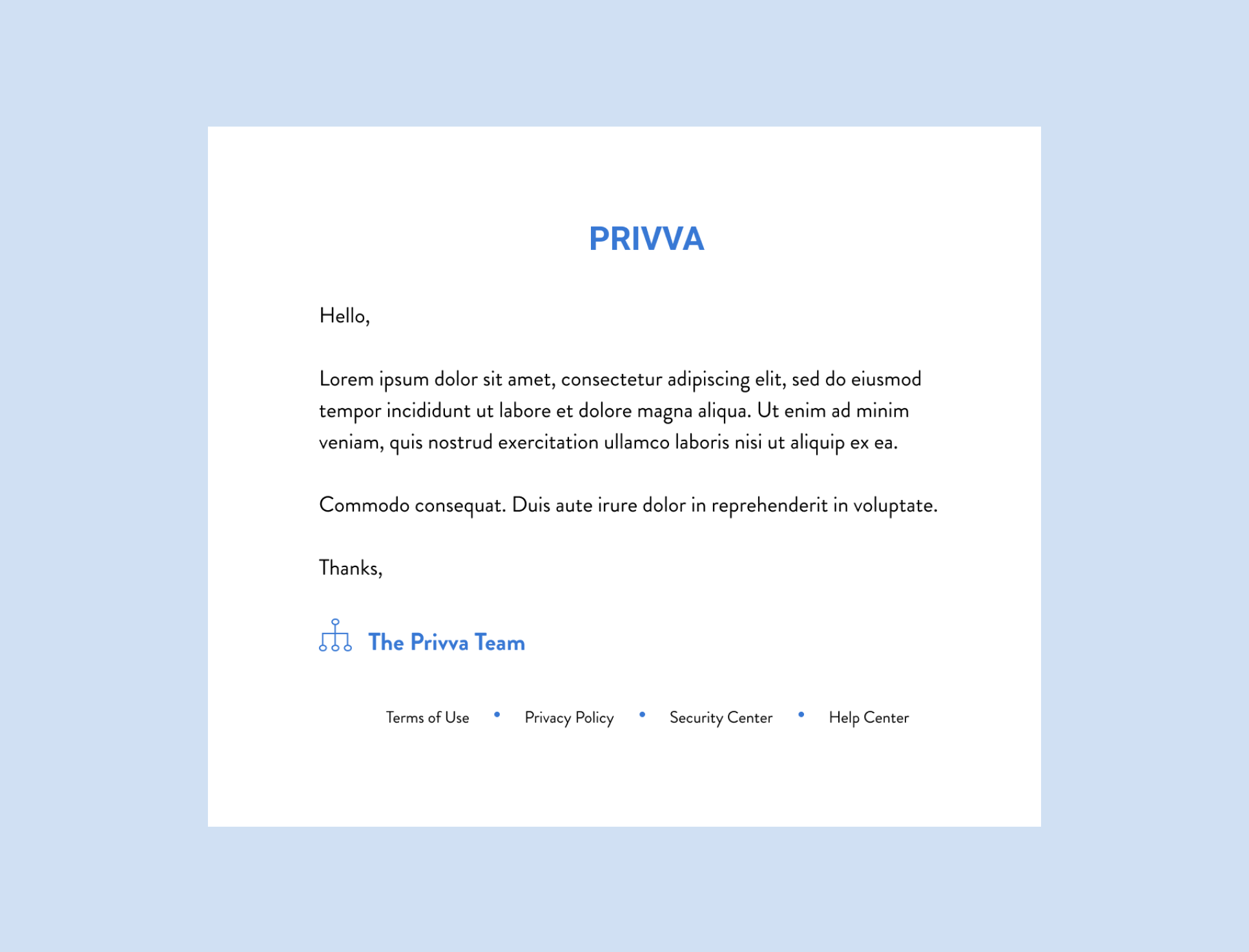
Email Designs
25 Available Email Templates
Design Change: Email templates that were new template visual designs with the same or revised copy.
Banner’s Email Design
Scenario specific
New Scenarios
Reply + answer scenarios
Client customization
Reply + Answer is cool!
Originally, the emails were designed for a part of another project, where a person’s online extension request was connected to email content. Later, a new project agenda was for a general and a client and vendor specific email templates that aligned to Privva’s branding and that was customizable. to client’s brand guides too.
Design Breakdown:
Reply + Answer: if, then y (syllogism)
reorganization of date, title, assessment, hierarchy, and priority of information.
font change
content change
copy revision
Design Breakdown
A few projects and finds summary
These 3 projects were worked over a few weeks to improve the visual experience of their product, and the organizational, hierarchy of information, and placement of new features within current product structures. With these changes, a user has access to an updated vendor request from with new features and cleaner text, emails that direct them towards various scenario actions seamlessly without action frustration over a technical bug. Over the course of my time working with Privva to update different parts of their online portal, these changes reflect a focus on information architecture, visual design, and client & vendor interaction with their current offerings and new additions connecting to their original design.
Information architecture was one of the main focuses. Placement of sections and text, buttons and action processes! ->
Why a proto-persona?
MVP status and what that mean too. Flow and User Testing ->
Priority of speed implementation even thought they say it costs more and take more time to fix something without user testing.
Email Links
Description: They were looking to add a view placement on their “My Organization” page and add in new information blocks on the list as well, with an action process for adding and labeling contributors.
User Page
Change
Add in contributors
view list
hover + show = tool tip
placement in “manage my organization”
Visual look of a POC
Problem
no section in their platform for the current list
visual look
process order
list of people to search from the org.
Iteration:
list view
understanding
title change
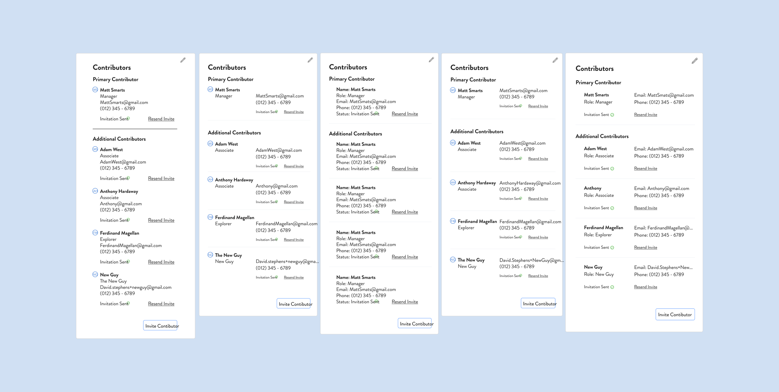
On their custom fields page, the company was looking to add in secondary contributors along with their primary contributors. A primary contributor xyz, while a secondary contributor xys. Their current page only showed 1 contributor, but the client could have other contributors with different levels of site access with only 1 contributor visible on the details page. (That wasn’t represented on the details page). My objective was to visually show and identify primary and secondary contributors and show the action/task process of switching primary and secondary contributors, along with a new visual look and include new content like their emails and role. Option “3,” was chosen as the final option.
Contributor Page Process
Changes
Place for secondary contributors is included.
New visual look
visual options
way to change contributors and edit information
labels for their role
Problem
No place for secondary contributors
Lack of visible information about the person, like their contact information = email.
No way to change contributors from primary to secondary or to add more contributors.
Iteration
Faces of people for company employees changed to their initials.
A simplified way to change contributors
Did we add a button?
1 more iteration, spacing, content, look?
User Finds

Color Discrepancy
Text Inconsistency
On the Privva page and with the original Privva emails, there were color discrepancies with the blue and grey colors being used. For instance, a bright blue was being used on their emails that did not align with the blue used on their portal.
Throughout the website portal, the main fonts Montserrat and Brandon Grotesque were used, but the sizing of the headers, body, and other copy were mismatched on different pages. Additionally, some texts were listed and entered as a (whole but partial) number, such as in the case of a text font being 14.37… where a whole number is more consistent for the design (and for the developer).
Icon Discrepancy
Various screens had icons that were a certain visual look on 1 page but had another look another page, even though they had the same meaning and action. They were slightly different on other screens and were mismatched in their visual context, so suggestions were made about staying consistent with the visual look and user association. (affordance). Additionally, for some projects, completely new icons were chosen, such as in the “ Stream” project where icons for, x, y, z actions were chosen for “process.”
User Finds
Visual Look, identifier
Decision-Action Process, Affordance
Update the look in lens, here, hue
Add an ability identifier (don’t do the affordance)
Share terminology for different text options, such as xyz
risk score design
Pros + cons? if time! less time, more time, understanding of process or no understanding of the process.
completing an action
linking an action to another part of the site
extension request
option, if this happens, then what?
They have a priority on customization
Two - factor authentication reminders???
One more thing?
MVP and Visual Designs
Again, circle back to this amount of hi-fi designs were able to be completed and sent off to the developer team due to the focus on MVP designs. The designs that get the job done and were simple but functional were prioritized over actions, visuals, and processes that would require more time and complication (finesse) to implement. The site/ company priorities (tangled knot) , perogative was on updated parts of the portal that were causing people confusion, and adding in new features. Simple was best!
Speed of the work and User-testing
Reflection
Speed of the work and how that allowed for more visual designs and MVP design work based off POCs but the work was mainly based on the company’s vision and the stakeholder’s user preferences and goals for their product’s features and functions. Work flow was MVP based, which meant that the first iteration was made in a short time frame and with a mid to high-fi design with less prototyping and interactive additions but with more tagged notes and bigger picture ideas saved for later.
***Reasoning for this . . . the stakeholders know the product well enough and the way in which it functions with the clients and vendors well enough to suggest designs they would like to implement. Is it always a bad thing or a good thing? In this case, the product is complicated and also adaptable.
Delta and Plus graph for this?
Simple | Simpler is way better, but!
Desire for user-testing and the back and forth changes based off what other people said was super frustrating.
With a list of tasks, it was more about cleaning up the original design and creating space for prioritized new features that could be a blue print for an overall visual look and in my opinion and hope, more thorough user testing.
Speed of the work and User-testing
Next Steps
How to do next steps for another project?
Visual look | User testing | streamlining action flow | reorganization | Big look
From a micro look, we were constantly looking at micro elements zoomed into changes specific to certain parts of their web portal with these changes made and more often throughout the process, it would be beneficial to zoom out and take in the picture of their designs too!
Client’s take too on why lack of user testing worked here too!
Untangling a lot of knots versus making it more tangled, when they untangle it, they can take it in, say xyz and choose to move on or not to a whole upgrade.
Speed of the work and User-testing
That is a Wrap
Privva
Cybersecurity and Venture Risk Assessment Platform
Company
A company located in Arlington, VA, the company, Link, was originally a startup focusing on cybersecurity and venture risk assessment. They were later acquired by Smarsh inc., Link. Privva utilize vendor questionnaires, testing, and data collation to determine the risk of companies working with outside vendors and they calculate various risk scores that align with each company’s security preferences.
Product
How does the product work?
The client utilizes/ uses Privva’s base product to run security questionnaires that they send to vendors, which they may choose to work with based on responses and remediations, and based off of longer standing relationships with other vendors. An example of this: A company, like xyz may work with vendors for xyz reason and for a certain situation xyz an for a certain situation, xyz.
Tools
Figma, Lucid Chart, Keynote,
Duration
1 year and 1 month
+ / - 20 hours a week
Setting
Remote Office, Thanks Zoom!
20 Design Projects
7 Figma Prototypes
70% of Work In Use
Auto-extension requests, email templates, risk assessments, bulk file uploads, Vendor Requests, View Assessment Expirations, Custom Field Edits, Transfer Files,
List All 20 Projects
Auto-extension request for clients, vendors, and their combined process, Vendor Request and Bulk File Upload for the start, fill-in, edit, save, and uploads process. List All Prototypes
With product manager feedback, stakeholder priorities, and developer work, over 2/3rds of the designs were integrated into the Privva systems account portal.
UX Consultant | As a UX Consultant, I advised and worked together with the project manager on various Proof of Concepts (POCs), such as revised data graphs, stakeholder agendas, such as new client and vendor features, and team finds, such as coding bugs and various restructuring to their client account portal.
Position
Adobe Illustrator, Google Drive
Email Templates
Code Bugs
25 Email Designs for Varied Scenarios
2 bugs found on the Account Portal
Vendor Requests
20 Screens for the Form Action Process