
Privva
Cybersecurity and Venture Risk Assessment Platform
Company
Privva was originally a startup focusing on cybersecurity and venture risk assessment. They were located in Arlington, VA, Link, and they manage an online program that determines if working with a 3rd party vendor would align with a client’s security standards. They were later acquired by Smarsh inc. Link and incorporated into their family of products. Privva utilizes vendor questionnaires, testing, and data collation to determine the risk of companies working with outside vendors, and they calculate various risk scores that align with each company’s security preferences.
Product
The online portal was the channel from which Clients and Vendors could determine a working relationship. With the product, Clients create, send, and reply to individual or groups of vendors, while Vendors complete and respond to Client’s security questionnaires or auto-fill questions from previous partnerships. Clients determine the type of assessments, questions, and risk scoring for each project, and the Vendors are 3rd party companies that may work in conjunction with the Client depending on their question responses, answer explanations, and flagged remediations.
For example, a company like, may work with vendors for xyz reason and for xyz situation. Xyz would determine the risk of working with the vendor based off of their assessment responses.
As a UX Consultant, I advised and worked together with the Project Manager and Stakeholders on various Proof of Concepts (POCs), such as revised data graphs, stakeholder agendas, such as new Client and Vendor features, and team finds, such as coding bugs and various restructuring to their client account portal. The deliverables geared towards product design with a UX perspective, since high-fi MVPs, information architecture, and Stakeholder feedback were prioritized over Clients’ and Vendors’ usability test scores for each project.
Position
Tools
Figma, Lucid Chart, Keynote,
Duration
1 year and 1 month
+ / - 20 hours a week
Setting
Remote Office, Thanks Zoom!
Adobe Illustrator, Google Drive,
20 Design Projects
7 Figma Prototypes
70% of Work In Use
Auto-Extension Requests, Email Templates, Risk Assessment CTAs, Bulk File Uploads, Vendor Requests, View Assessment Expirations, Custom Field Edits, Transfer Files, and Others . . .
Auto-Extension Request for Clients, Vendors, and their Combined Process, Vendor Request and Bulk File Upload for the Start, Fill-In, Edit, Save, and Uploads Process, and Others . . .
With Product Manager Feedback, Stakeholder Priorities, and Developer Work, over 2/3rds of the Designs were Integrated into the Privva Systems Account Portal.
Email Templates
Code Bugs
25 Email Designs for Varied Scenarios
2 Bugs Found on the Account Portal
Vendor Requests
20 Screens for the Form Action Process
A Few Projects and Finds
New Placement and Design of the Page
User Page
Contributor Process
5 Selected Options and Switch Process
Issues Layout
2 Adds and Restructure of the Issues Page
Text Inconsistency
Decimal Text Sizes and Mismatched Fonts
Color Discrepancy
Various Screen Colors Used Inconsistently
MVP Project Style
The project style consisted of multiple projects being prioritized as visual designs that were created and delivered as minimal viable products (MVPs) Link. With a quick turn around, visual concepts with notes were prioritized over prototyped designs.
Hi-Fi Deliverables in a Sprint Timeline
Adaptability of Products
Product Features and Client Customization
Workflow Load
Focus on Webpage Information Architecture
The company’s client portal questionnaires and risk score settings allowed for a range of specificity for each client project, because questions and response ratings were customizable for the vendor. Each client company may have a high range of security protocol and priorities, work with different types of vendors, and change their scoring requirements for different situations. With this, feature adaptability and customization was a product focus, so that Privva’s online objective of vendor risk assessment and client project security would be applicable to a range of small, medium, and large companies, who also partner with a variety of regular and new third-party vendors.
Because of the emphasis on MVP design deliverables, my workflow consisted of product research, information architecture, visual low - fi mockups, and mainly mid - fi to high - fi handoff files. Based off management’s timeline and priorities, the client and vendor perspective was gathered from proto-personas, task analyses, and user journeys, which were used to direct the designs along with Privva’s stakeholder feedback.
Product Info + Work Style
Privva Users


User Product Interaction
“ I’ll see if we can utilize answer responses from the last time we worked with their team. I can double-check to see if any of our current standards have changed since and edit individual answers and replies. ” - Steve
User Persona
Vendor Product Interaction
User Persona
Client
Steve
Alex
Client Behaviors: The client wants to ensure that the people they work with have protocol in place that will safeguard both of their companies’ information.
Client Needs + Goals
A standard met by 3rd party vendors
Clear communication with their security team
An understanding of their set risk compared to other vendors and for this project.
Client Pain Points + Frustrations
Not being able to sufficiently organize client information
Setting access to different people in the company
Organizing and accessing drafted, in progress, and previous project files.
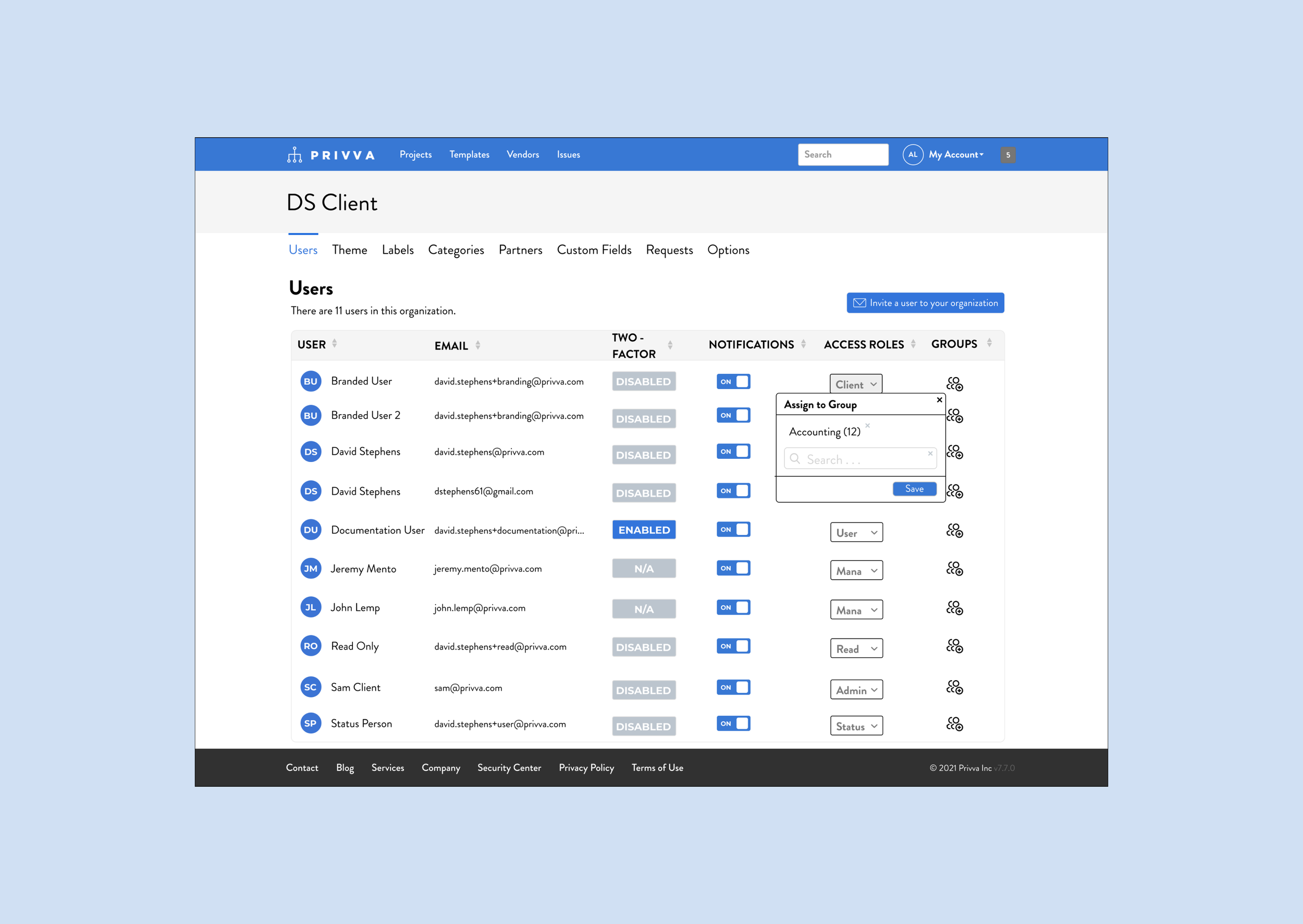
With their Privva portal account, they create project assessments, select individual assessments or create specific questions, to the work assignment, risk status, and client vendor relationship. (Reword). They utilize the client account portal to create, send , score, review, and bundle assessments. They can view different risk scoring graphs and see vendor scores distributed over time.
For example, they can see a history of scored assessments online and whether assessments have expired, require extensions, and have been approved.
Vendor Behaviors: The vendor provides a 3rd party service for so and so, the company. They have their current way of operating, but sometimes, they clean up their information security standards when working with other 3rd party companies.
Vendor Needs + Goals
They want to quickly complete client projects so they can get started on working together.
They also would like to answer assessment questions they have completed before with either saved answers or be able to review previous answers and see how they compare to the current company operating protocol and assessment to know if anything has changed since the last time they’ve worked with them.
Organized account portal to see clients they work with and their status on completing assessments. Previous assessment and notes and communication channels they may have with their new or long-term clients.
Vendor Pain Points + Frustrations
Not being in (communication) about questions they didn’t understand or wanted to complete in a different way, for example, with a note or image when only a fill in bubble response was offered.
Forgetting to complete started assessments and why they need to amend an answer. What should they do?
Seeing their progress of the client approving or not approving their assessment answers and receiving a follow-up of questions to amend in a timely manner.
The vendor responds to assessments for potential work relationships with clients. They are able to use previous responses through Privva automation to quickly complete answers and save time in the intermediary of finalizing or making changes to their security protocol before working together. They can also extend their assessments if they need more time. History of Clients?
For example, if they need to request more time for an assessment they can click a button online to do so.
Vendor
“ I need to see if their answers changed from last time and see if their security standards are the same or better. We’ve changed updated our information standards, they’ll have to update theirs too.” - Alex
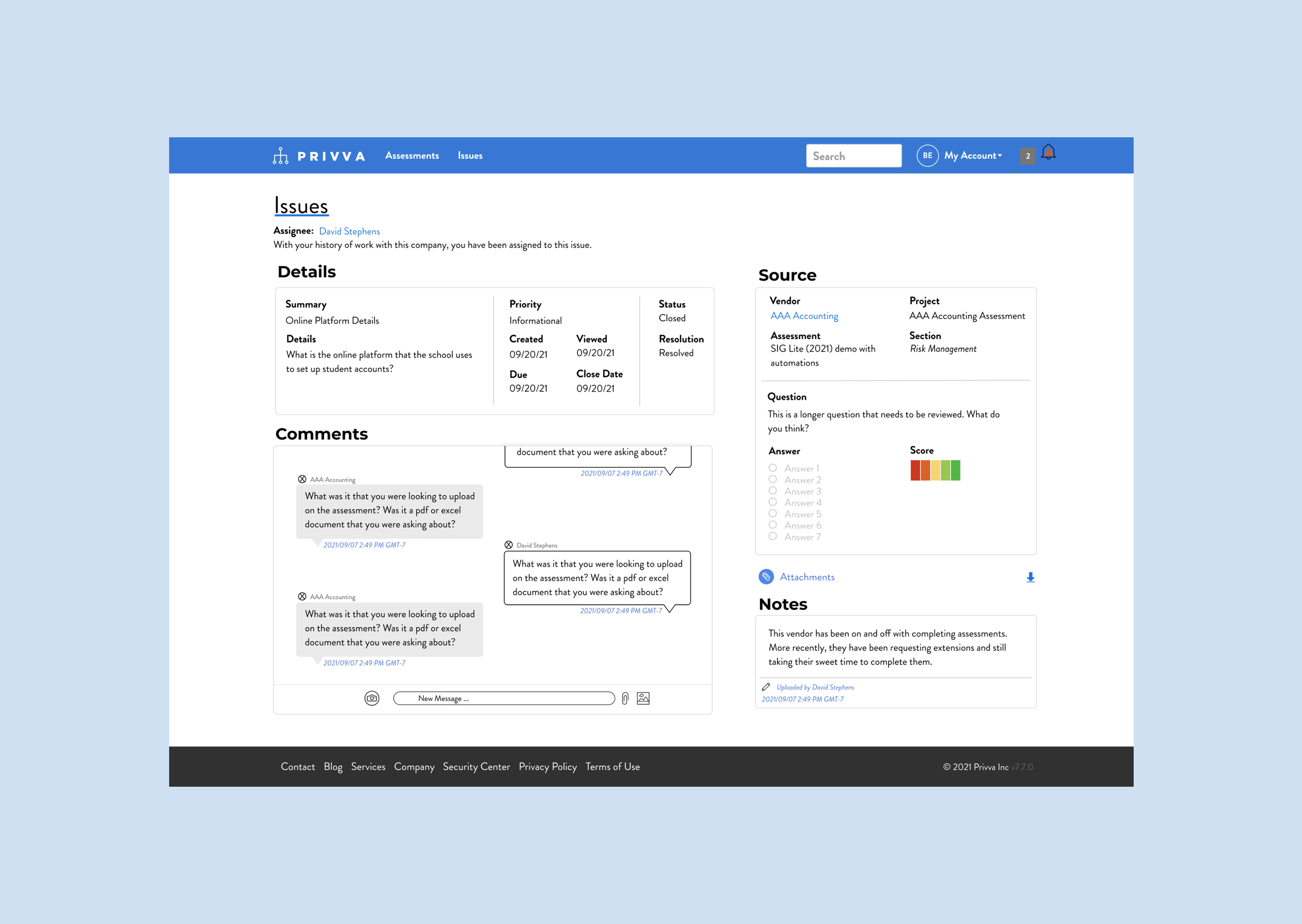
Privva wanted to include a section for notes as a request by some of the clients. Later, they also looked to add in a messaging section between the client and third party vendor communication staff. Layout was another focus on the page. Additionally, while designs were contingent on the issues page, the R side content shifted slightly to better match the reorganized page.
Next Steps
Next Steps
Next Steps
8 Project Samples + Finds Explained
#1 Issues Layout
2 Adds and Restructure of the Issues Page
Project Objective
Focus + Change
With the new design, the main focus was a change to the layout, add notes, hierarchy of the “Details,” section, and new layout.
“Comments,” Addition
People Upper L Side Reorganized
R Side Format Issue Change
A new layout because of the added comments section.
Reorganization of the Sections
Included is the new “Notes” Section
New Hierarchy for the “Details,” Section
Iteration
People Upper L Side Reorganized
R side format issue change
A new layout because of the added comments section.
Challenge
The issues page information was stacked in 2 columns, which made the additional “Messages” section look out of place in the original design. So, a new layout was suggested that reorganized the “Details,” “Comments,” “Source,” And “New Notes,” sections in a different layout.
Summary, Next Steps, and Synopsis
Create a visual of a messaging system shown in a new reorganization of the Client “Issues,” Page.
Layout, they wanted to include a section for notes as a request by some of the clients. Later, they also looked to add in a messaging section between the client and third party vendor communication staff. Additionally, while designs were contingent on the issues page (the r side) could shift slightly too.
Next Steps
Next Steps
8 Project Samples + Finds Explained
Issues Layout
2 Adds and Restructure of the Issues Page
Project Objective
Focus + Change
With the new design, the main focus was a change to the layout, add notes, hierarchy of the “Details,” section, and new layout.
“Comments,” Addition
People Upper L Side Reorganized
R Side Format Issue Change
A new layout because of the added comments section.
Reorganization of the Sections
Included is the new “Notes” Section
New Hierarchy for the “Details,” Section
Iteration
People Upper L Side Reorganized
R side format issue change
A new layout because of the added comments section.
Challenge
The issues page information was stacked in 2 columns, which made the additional “Messages” section look out of place in the original design. So, a new layout was suggested that reorganized the “Details,” “Comments,” “Source,” And “New Notes,” sections in a different layout.
Summary, Next Steps, and Synopsis
Create a visual of a messaging system shown in a new reorganization of the Client “Issues,” Page.
Layout, they wanted to include a section for notes as a request by some of the clients. Later, they also looked to add in a messaging section between the client and third party vendor communication staff. Additionally, while designs were contingent on the issues page (the r side) could shift slightly too.
8 Project Samples + Finds Explained
Issues Layout
2 Adds and Restructure of the Issues Page
Project Objective
Change
With the new design,
Comments Addition
People Upper L Side Reorganized
R side format issue change
A new layout because of the added comments section.
Iteration
Comments Addition
People Upper L Side Reorganized
R side format issue change
A new layout because of the added comments section.
Challenge
The issues page information was stacked in 2 columns, which made the additional “Messages” section look out of place in the original design. So, a new layout was suggested that organized “Details,” “Comments,” “Source,” And “New Notes,” in a different layout with the new section.
“Comments” Addition
Reorganization of the Sections
R side format Issue change
Included is the new “Notes” Section
New Hierarchy for the “Details,” Section
Summary, Next Steps, and Synopsis
Create a visual of a messaging system shown in a new reorganization of the Client “Issues,” Page.
Layout, they wanted to include a section for notes as a request by some of the clients. Later, they also looked to add in a messaging section between the client and third party vendor communication staff. Additionally, while designs were contingent on the issues page (the r side) could shift slightly too. Could share a test option and a test question that you might use here too and include it also in the pitch deck as well as UX Design testing suggestions.
8 Project Samples + Finds Explained
Issues Layout
2 Adds and Restructure of the Issues Page
Project Objective
Change
With the new design,
Comments Addition
Reorganize the information on the upper L side.
Change the fide format issue
Design a layout because of the added comments section and reorganization of the sections.
Create and include a “Notes” Section.
Restructure the hierarchy for the “Detail,” section.
Iteration
After feedback, changes were made:
Comments Addition
Reorganize the information on the upper L side
R side format issue change
A new layout because of the added comments section.
Create and include a “Notes” Section.
Restructure the hierarchy for the “Detail,” section.
Summary, Next Steps, and Synopsis
Create a visual of a messaging system shown in a new reorganization of the Client “Issues,” Page.
The issues page information was stacked in 2 columns, which made the additional “Messages” section look out of place in the original design. So, a new layout was suggested that organized “Details,” “Comments,” “Source,” And “New Notes,” in a different layout with the new section.
Create a visual of a messaging system shown in a new
8 Project Samples + Finds Explained
Issues Layout
2 Adds and Restructure of the Issues Page
Project Objective
Change
With the new design,
Comments Addition
Reorganize the information on the upper L side.
Change the fide format issue
Design a layout because of the added comments section and reorganization of the sections.
Create and include a “Notes” Section.
Restructure the hierarchy for the “Detail,” section.
Iteration
After feedback, changes were made:
Comments Addition
Reorganize the information on the upper L side
R side format issue change
A new layout because of the added comments section.
Create and include a “Notes” Section.
Restructure the hierarchy for the “Detail,” section.
Create a visual of a messaging system shown in a new reorganization of the Client “Issues,” Page.
The issues page information was stacked in 2 columns, which made the additional “Messages” section look out of place in the original design. So, a new layout was suggested that organized “Details,” “Comments,” “Source,” And “New Notes,” in a different layout with the new section.
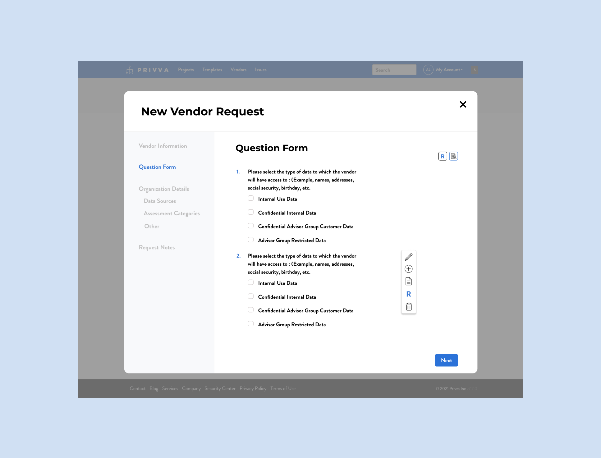
Vendor Requests
20 Screens for the Form Action Process
Challenge: Old look and confusion about identifying the form options and what they mean and how they work.
Focus: Icon preferences for notes, add, risk rating, etc.
Change: Spacing and text placement
Iteration: There was a lot to this project! and risk
There was a lot to this project! and risk rating focus
There was a lot to this project! and risk rating focus
Summary, Synopsis, and Next Steps: Lorem Ipsum Old look and confusion about identifying the form options and what they mean and how they work.
Objective information Here
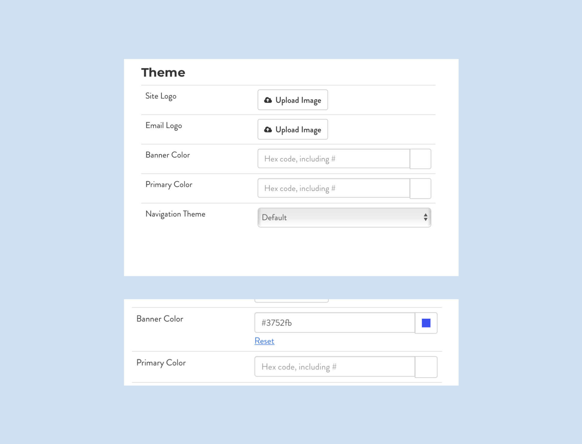
Code Bugs
2 bugs found on the Client Portal
Challenge: Manual HEX Code Color Change was auto-spelling a different HEX code after a partial HEX code was typed into the “field.”
PM had great perspective. Callout to the PM, on the developer’s side they were able to adjust the HEX to accurately reflect the user’s color choice and to allow the user to type in the entire HEX code without it changing mid-type. : )
Iteration: Found a 2nd bug for later.
Banner choice
date, name, type, organization
Summary, Synopsis, and Next Steps:When you type in the HEX code, the Hex code would automatically fill in a different HEX code and when you refreshed it would change color. Apparently, this was a bug that could be fixed on the developer side.
I caught 2 bugs on the client portal while working on a new visual for an added section to their organization settings, I found that their color option for the client’s customizable banner had a glitch. When manually entering the HEX color code, it would automatically auto-spell the HEX code to a new color after 3 letters and or numbers of the HEX code that was originally entered. This led the user to have a colored banner that didn’t actually match the HEX code they tried to enter. While manually adjusting the color was a bug, the color picker worked just fine for a user to select their portal’s color preference..
Objective information Here
Email Designs
25 Email Designs for Varied Scenarios
Challenge: Old look and confusion about identifying the form options and what they mean and how they work.
Design Change: Email templates that were new template visual designs with the same or revised copy.
Banner’s Email Design, Scenario specific
New Scenarios, Reply + answer scenarios
Client customization, Reply + Answer is cool!
Design Breakdown:
Reply + Answer: if, then y (syllogism)
reorganization of date, title, assessment, hierarchy, and priority of information.
font change, content change, copy revision
Summary, Synopsis, and Next Steps / Design Breakdown: Originally, the emails were designed for a part of another project, where a person’s online extension request was connected to email content. Later, a new project agenda was for a general and a client and vendor specific email templates that aligned to Privva’s branding and that was customizable. to client’s brand guides too.
Objective information Here
A Few Projects and Finds Summary
These 3 projects were worked over a few weeks to improve the visual experience of their product, and the organizational, hierarchy of information, and placement of new features within current product structures. With these changes, a user has access to an updated vendor request from with new features and cleaner text, emails that direct them towards various scenario actions seamlessly without action frustration over a technical bug. Over the course of my time working with Privva to update different parts of their online portal, these changes reflect a focus on information architecture, visual design, and client & vendor interaction with their current offerings and new additions connecting to their original design.
Information architecture was one of the main focuses. Placement of sections and text, buttons and action processes! ->
Why a proto-persona? \ Email Links
MVP status and what that mean too. Flow and User Testing ->
Priority of speed implementation even thought they say it costs more and take more time to fix something without user testing.
Layout, they wanted to include a section for notes as a request by some of the clients. Later, they also looked to add in a messaging section between the client and third party vendor communication staff. Additionally, while designs were contingent on the issues page (the r side) could shift slightly too.
Users Page
New Placement and Design of the Page
Project Objective
Change
no section in their platform for the current list
visual look
process order
list of people to search from the org.
List Change
list view
understanding
title change
Iteration
Add in contributors
view list
hover + show = tool tip
placement in “manage my organization”
Visual look of a POC
Summary, Next Steps, and Synopsis
They were looking to add a view placement on their “My Organization” page and add in new information blocks on the list as well, with an action process for adding and labeling contributors.
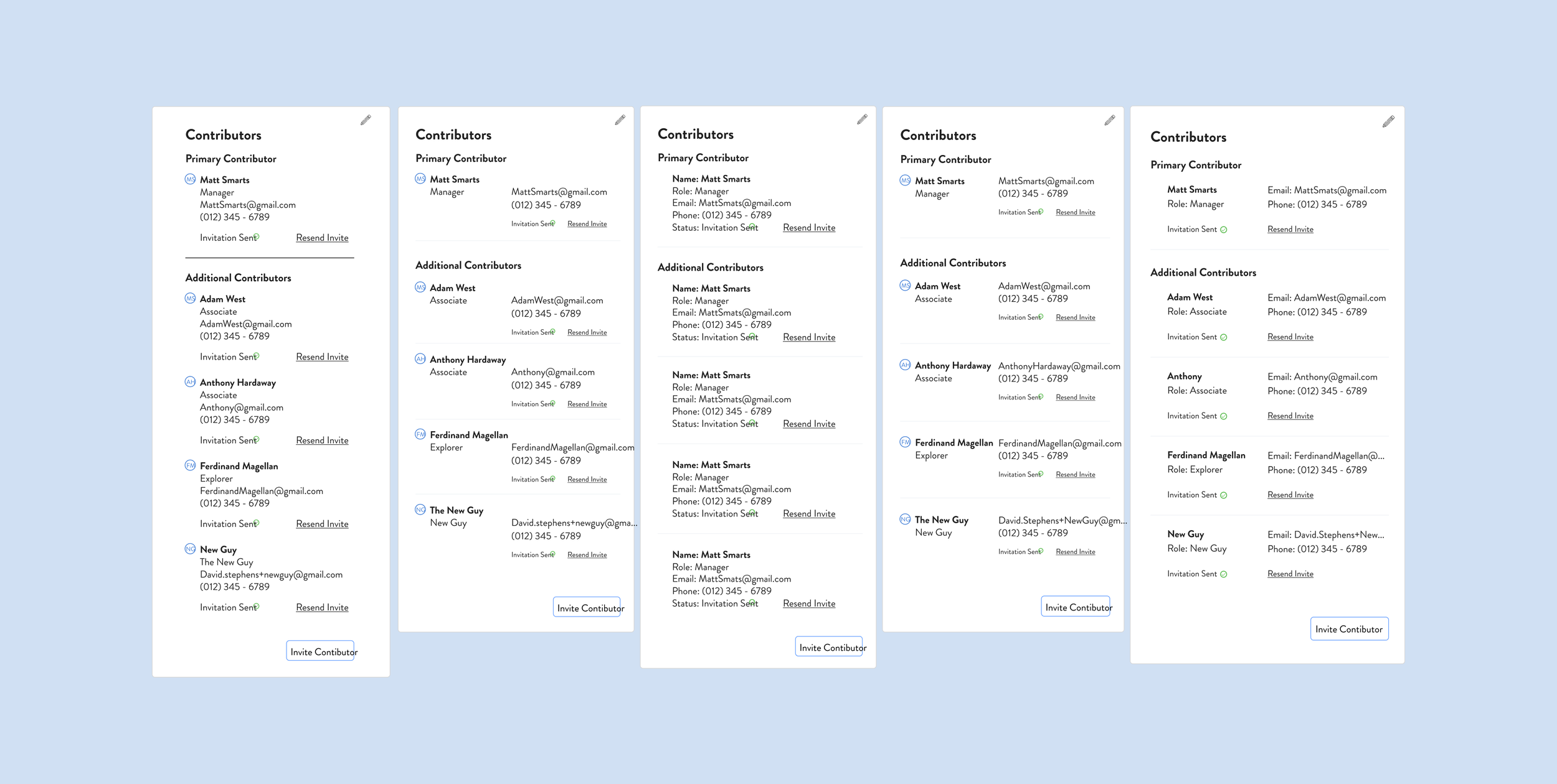
On their custom fields page, the company was looking to add in secondary contributors along with their primary contributors. A primary contributor xyz, while a secondary contributor xys. Their current page only showed 1 contributor, but the client could have other contributors with different levels of site access with only 1 contributor visible on the details page. (That wasn’t represented on the details page). My objective was to visually show and identify primary and secondary contributors and show the action/task process of switching primary and secondary contributors, along with a new visual look and include new content like their emails and role. Option “3,” was chosen as the final option.
Contributor Page (Process)
5 Selected Options and Switch Process
Project Objective
Change
Place for secondary contributors is included.
New visual look
visual options
way to change contributors and edit information
labels for their role
Iteration
Faces of people for company employees changed to their initials.
A simplified way to change contributors
Did we add a button?
1 more iteration, spacing, content, look?
Challenge
No place for secondary contributors
Lack of visible information about the person, like their contact information = email.
No way to change contributors from primary to secondary or to add more contributors.
Summary, Next Steps, and Synopsis
They were looking to add a view placement on their “My Organization” page and add in new information blocks on the list as well, with an action process for adding and labeling contributors.
2 User Finds during Projects

Color Discrepancy
Text Inconsistency
On the Privva page and with the original Privva emails, there were color discrepancies with the blue and grey colors being used. For instance, a bright blue was being used on their emails that did not align with the blue used on their portal.
Throughout the website portal, the main fonts Montserrat and Brandon Grotesque were used, but the sizing of the headers, body, and other copy were mismatched on different pages. Additionally, some texts were listed and entered as a (whole but partial) number, such as in the case of a text font being 14.37… where a whole number is more consistent for the design (and for the developer).
Space is pretty cool info goes here.
What is in space is pretty cool info goes here.
2 Types of Projects
Visual Look, identifier
Decision-Action Process
○ Update the look in lens, here, hue
○ Add an ability identifier (don’t do the affordance)
○ Share terminology for different text options, such as xyz
○ Risk score design
○ Pros + cons? if time! less time, more time, understanding of process or no understanding of the process.
○ Completing an action
○ Linking an action to another part of the site
○ Extension request
○ Option, if this happens, then what?
○ They have a priority on customization
○ Two - factor authentication reminders???
○ One more thing?
Identifier
Affordance
MVP and Visual Designs
Again, circle back to this amount of hi-fi designs were able to be completed and sent off to the developer team due to the focus on MVP designs. The designs that get the job done and were simple but functional were prioritized over actions, visuals, and processes that would require more time and complication (finesse) to implement. The site/ company priorities (tangled knot) , perogative was on updated parts of the portal that were causing people confusion, and adding in new features. Simple was best!
Speed of the work and User-testing
Reflection
Speed of the work and how that allowed for more visual designs and MVP design work based off POCs but the work was mainly based on the company’s vision and the stakeholder’s user preferences and goals for their product’s features and functions. Work flow was MVP based, which meant that the first iteration was made in a short time frame and with a mid to high-fi design with less prototyping and interactive additions but with more tagged notes and bigger picture ideas saved for later.
***Reasoning for this . . . the stakeholders know the product well enough and the way in which it functions with the clients and vendors well enough to suggest designs they would like to implement. Is it always a bad thing or a good thing? In this case, the product is complicated and also adaptable.
Delta and Plus graph for this?
Simple | Simpler is way better, but!
Desire for user-testing and the back and forth changes based off what other people said was super frustrating.
With a list of tasks, it was more about cleaning up the original design and creating space for prioritized new features that could be a blue print for an overall visual look and in my opinion and hope, more thorough user testing.
Later, you can share the UX note about adaptability and a counter UX Note too, (quote, note, insight)
Speed of the work and User-testing
Next Steps
How to do next steps for another project?
Visual look | User testing | streamlining action flow | reorganization | Big look
From a micro look, we were constantly looking at micro elements zoomed into changes specific to certain parts of their web portal with these changes made and more often throughout the process, it would be beneficial to zoom out and take in the picture of their designs too!
Client’s take too on why lack of user testing worked here too!
Untangling a lot of knots versus making it more tangled, when they untangle it, they can take it in, say xyz and choose to move on or not to a whole upgrade.
Speed of the work and User-testing