
Privva
Cybersecurity and Venture Risk Assessment Platform
Company
Privva was originally a startup focusing on cybersecurity and venture risk assessment. They were located in Arlington, VA, Link, and they manage an online program that determines if working with a 3rd party vendor would align with a client’s security standards. They were later acquired by Smarsh inc. Link and incorporated into their family of products. Privva utilizes vendor questionnaires, testing, and data collation to determine the risk of companies working with outside vendors, and they calculate various risk scores that align with each company’s security preferences.
Product
The online portal was the channel from which Clients and Vendors could determine a working relationship. With the product, Clients create, send, and reply to individual or groups of vendors, while Vendors complete and respond to Client’s security questionnaires or auto-fill questions from previous partnerships. Clients determine the type of assessments, questions, and risk scoring for each project, and the Vendors are 3rd party companies that may work in conjunction with the Client depending on their question responses, answer explanations, and flagged remediations.
For example, a company like, may work with vendors for xyz reason and for xyz situation. Xyz would determine the risk of working with the vendor based off of their assessment responses.
As a UX Consultant, I advised and worked together with the Project Manager and Stakeholders on various Proof of Concepts (POCs), such as revised data graphs, stakeholder agendas, such as new Client and Vendor features, and team finds, such as coding bugs and various restructuring to their client account portal. The deliverables geared towards product design with a UX perspective, since high-fi MVPs, information architecture, and Stakeholder feedback were prioritized over Clients’ and Vendors’ usability test scores for each project.
Position
Tools
Figma, Lucid Chart, Keynote,
Duration
1 year and 1 month
+ / - 20 hours a week
Setting
Remote Office, Thanks Zoom!
Adobe Illustrator, Google Drive
20 Design Projects
7 Figma Prototypes
70% of Work In Use
Auto-Extension Requests, Email Templates, Risk Assessment CTAs, Bulk File Uploads, Vendor Requests, View Assessment Expirations, Custom Field Edits, Transfer Files, and Others . . .
Auto-Extension Request for Clients, Vendors, and their Combined Process, Vendor Request and Bulk File Upload for the Start, Fill-In, Edit, Save, and Uploads Process, and Others . . .
With Product Manager Feedback, Stakeholder Priorities, and Developer Work, over 2/3rds of the Designs were Integrated into the Privva Systems Account Portal.
Email Templates
Code Bugs
25 Email Designs for Varied Scenarios
2 Bugs Found on the Account Portal
Vendor Requests
20 Screens for the Form Action Process
A Few Projects and Finds
New Placement and Design of the Page
User Page
Contributor Process
5 Selected Options and Switch Process
Issues Layout
2 Adds and Restructure of the Issues Page
Text Inconsistency
Decimal Text Sizes and Mismatched Fonts
Color Discrepancy
Various Screen Colors Used Inconsistently
MVP Project Style
The project style consisted of multiple projects being prioritized as visual designs that were created and delivered as minimal viable products (MVPs) Link. With a quick turn around, visual concepts with notes were prioritized over prototyped designs.
Hi-Fi Deliverables in a Sprint Timeline
Adaptability of Products
Product Features and Client Customization
Workflow Load
Focus on Webpage Information Architecture
The company’s client portal questionnaires and risk score settings allowed for a range of specificity for each client project, because questions and response ratings were customizable for the vendor. Each client company may have a high range of security protocol and priorities, work with different types of vendors, and change their scoring requirements for different situations. With this, feature adaptability and customization was a product focus, so that Privva’s online objective of vendor risk assessment and client project security would be applicable to a range of small, medium, and large companies, who also partner with a variety of regular and new third-party vendors.
Because of the emphasis on MVP design deliverables, my workflow consisted of product research, information architecture, visual low - fi mockups, and mainly mid - fi to high - fi handoff files. Based off management’s timeline and priorities, the client and vendor perspective was gathered from proto-personas, task analyses, and user journeys, which were used to direct the designs along with Privva’s stakeholder feedback.
Product Info + Work Style
Privva Users


User Product Interaction
“ I’ll see if we can utilize answer responses from the last time we worked with their team. I can double-check to see if any of our current standards have changed since, and edit individual answers and replies. ” - Steve
User Persona
Vendor Product Interaction
User Persona
Client
Steve
Alex
Client Behaviors: The client wants to ensure that the people they work with have protocol in place that will safeguard both of their companies’ information.
Client Needs + Goals
A standard met by 3rd party vendors
Clear communication with their security team
An understanding of their set risk compared to other vendors and for this project.
Client Pain Points + Frustrations
Not being able to sufficiently organize vendor project and assessment information.
Setting access to different people in the company.
Organizing and accessing drafted, in progress, and previous project files.
With their Privva portal account, they create project assessments, select individual assessments or create specific questions for the work assignment, score and adjust the risk status, and develop client - vendor relationships. They utilize the client account portal to create, send , score, review, and bundle assessments. They can view different risk scoring graphs and see vendor scores distributed over time.
For example, they can see a history of scored assessments online and whether assessments have expired, require extensions, and have been approved.
Vendor Behaviors: They have their current way of operating, but will amend their information security standards when working with other client companies.
Vendor Needs + Goals
They want to quickly complete client assessments so they can get started on working together.
Answer + compare questions from past responses.
View an organized account portal with client details.
Vendor Pain Points + Frustrations
Unclear communication channel between the client on following up about questions they misunderstood.
Forgetting to complete partially answered assessments and amending flagged answers.
Viewing assessment approval status by the client.
The vendor responds to assessments for potential work relationships with various clients. They are able to use previous responses with Privva’s automation Artificial Intelligence to quickly complete answers and save time in the intermediary of finalizing or making changes to their security protocol. After status approval of assessments and follow-up about question answers, they can collaborate with vendors.
For example, they can view their assessment status and extend the assessment timeframe to upload material and answer responses before the due date.
Vendor
“ I need to see if their answers changed from last time and see if their security standards are the same or better. We’ve changed updated our information standards, they’ll have to update theirs too.” - Alex

8 Project Samples + Finds Explained
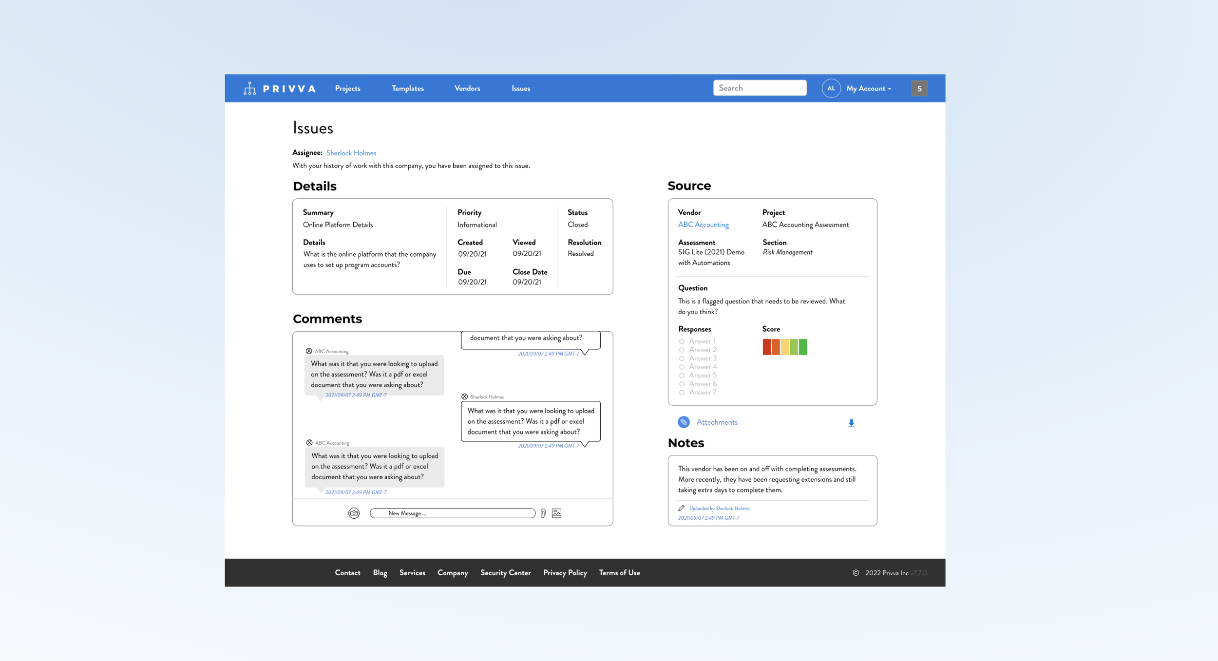
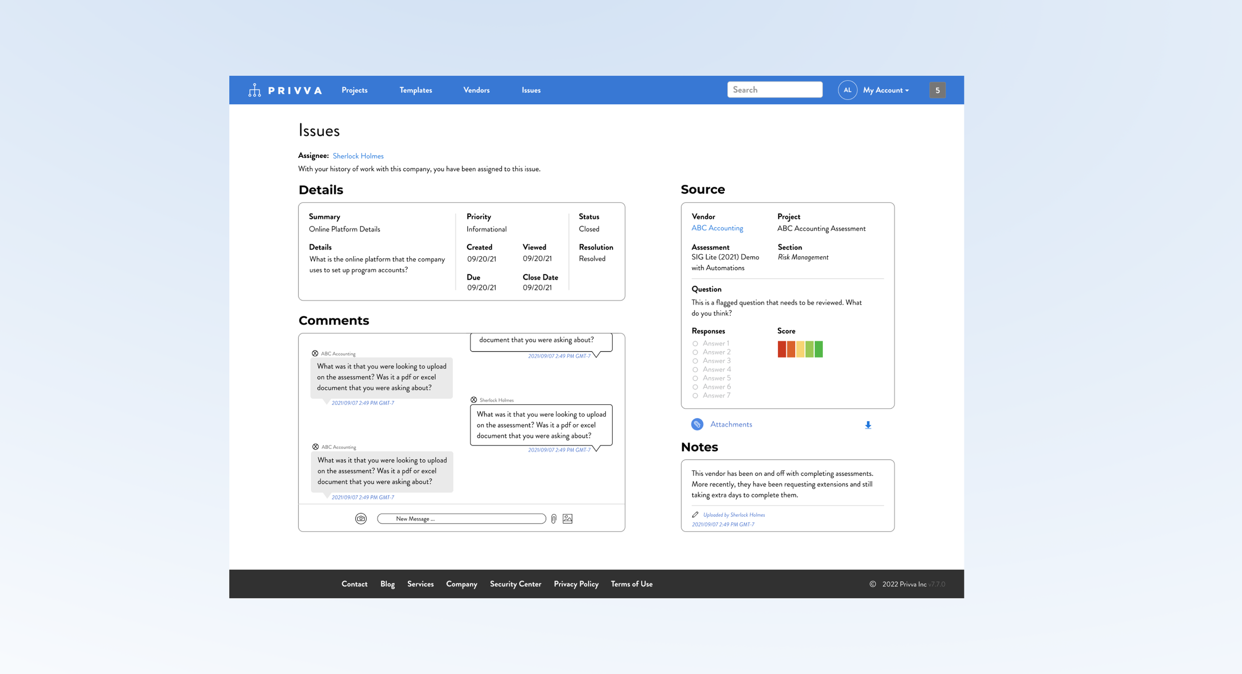
#1, Issues Layout_3.3.1
2 Adds and Restructure of the Issues Page
Project Objective
Change
Along with the new messaging section and change in page layout, other changes were made:
Incorporate a “Comments,” message section.
Include a Risk Score for the “Source” section.
Conceptualize a new page layout.
Create and include a “Notes,” Section.
Restructure the “Source,” and “Details,” content.
Iteration
After feedback, changes were made to take into account time stamps, other risk scores, and content order:
Include a time stamp on the “Notes,” section.
Include a time stamp on the “Comments,” section.
Show how multiple Risk Score Questions appear.
Delete download options except for “Attachments.”
Move assignee to the top of the screen.
Create a visual design of a messaging system and notes section and include it in a new reorganization of the client “Issues,” page.
The issues page information was originally stacked in 2 narrow columns , which made the additional “Comments,” messaging section look out of place in the original design. So, a new layout was suggested that organized all of the sections, “ in a different layout, with the new additions, to better make use of the space so that people can see, understand and use each section in relation to its function.
Summary and Next Steps
The messaging areas needs more page real estate because it needs to emphasize its priority and it functions better with a larger design so people can view current messages and see previous messages and because of its larger size. The “Details,” “Source,” “Notes,” and “Comments,” section are restructured individually and reorganized as a group to acomodate for the messaging section and show all of the information that a user would need on a page.
Suggested Test: SUS Usability
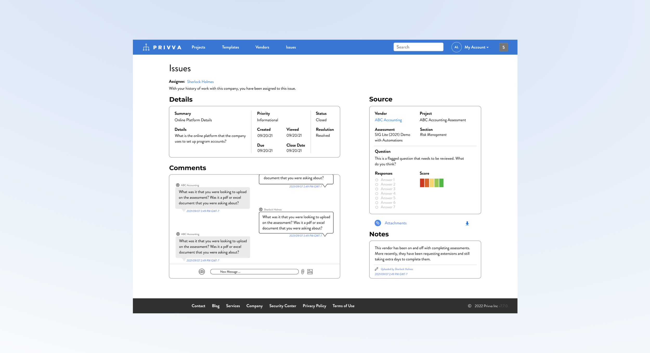
8 Project Samples + Finds Explained
#1, Issues Layout_3.3.1
2 Adds and Restructure of the Issues Page
Project Objective
Change
Along with the new messaging section and change in page layout, other changes were made:
Incorporate a “Comments,” message section.
Include a Risk Score for the “Source” section.
Conceptualize a new page layout.
Create and include a “Notes,” Section.
Restructure the “Source,” and “Details,” content.
Iteration
After feedback, changes were made to take into account time stamps, other risk scores, and content order:
Include a time stamp on the “Notes,” section.
Include a time stamp on the “Comments,” section.
Show how multiple Risk Score Questions appear.
Delete download options except for “Attachments.”
Move assignee to the top of the screen.
Create a visual design of a messaging system and notes section and include it in a new reorganization of the client “Issues,” page.
The issues page information was originally stacked in 2 narrow columns , which made the additional “Comments,” messaging section look out of place in the original design. So, a new layout was suggested that organized all of the sections, “ in a different layout, with the new additions, to better make use of the space so that people can see, understand and use each section in relation to its function.
Summary and Next Steps
The messaging areas needs more page real estate because it needs to emphasize its priority and it functions better with a larger design so people can view current messages and see previous messages and because of its larger size. The “Details,” “Source,” “Notes,” and “Comments,” section are restructured individually and reorganized as a group to acomodate for the messaging section and show all of the information that a user would need on a page.
Suggested Test: SUS Usability
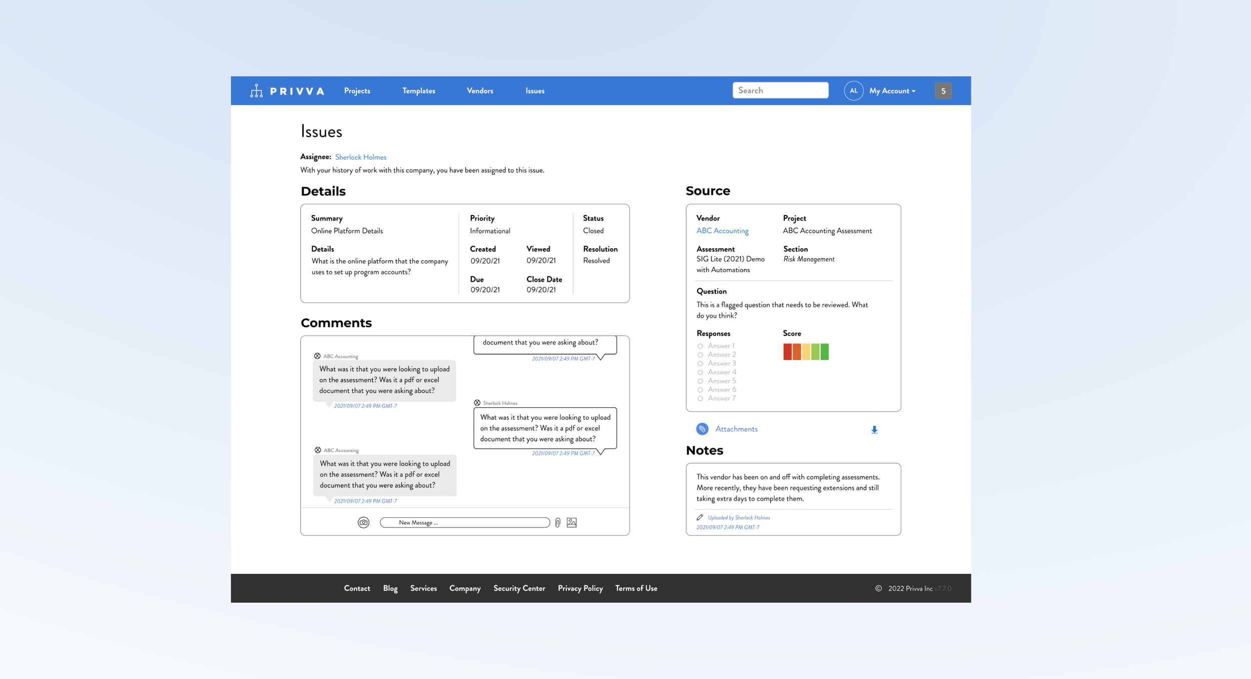
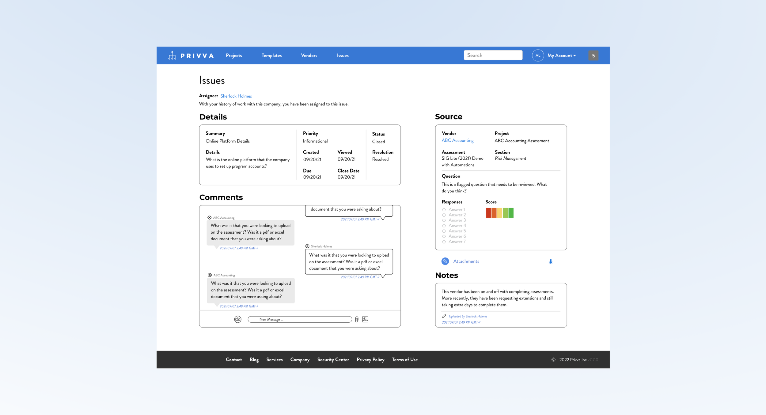
8 Project Samples + Finds Explained
#1, Issues Layout_3.3.2
2 Adds and Restructure of the Issues Page
Project Objective
Change
Along with the new messaging section and change in page layout, other changes were made:
Incorporate a “Comments,” message section.
Include a Risk Score for the “Source” section.
Conceptualize a new page layout.
Create and include a “Notes,” Section.
Restructure the “Source,” and “Details,” content.
Iteration
After feedback, changes were made to take into account time stamps, other risk scores, and content order:
Include a time stamp on the “Notes,” section.
Include a time stamp on the “Comments,” section.
Show how multiple Risk Score Questions appear.
Delete download options except for “Attachments.”
Move assignee to the top of the screen.
Create a visual design of a messaging system and notes section and include it in a new reorganization of the client “Issues,” page.
The issues page information was originally stacked in 2 narrow columns , which made the additional “Comments,” messaging section look out of place in the original design. So, a new layout was suggested that organized all of the sections, “ in a different layout, with the new additions, to better make use of the space so that people can see, understand and use each section in relation to its function.
Summary and Next Steps
The messaging areas needs more page real estate because it needs to emphasize its priority and it functions better with a larger design so people can view current messages and see previous messages and because of its larger size. The “Details,” “Source,” “Notes,” and “Comments,” section are restructured individually and reorganized as a group to acomodate for the messaging section and show all of the information that a user would need on a page.
Suggested Test: SUS Usability
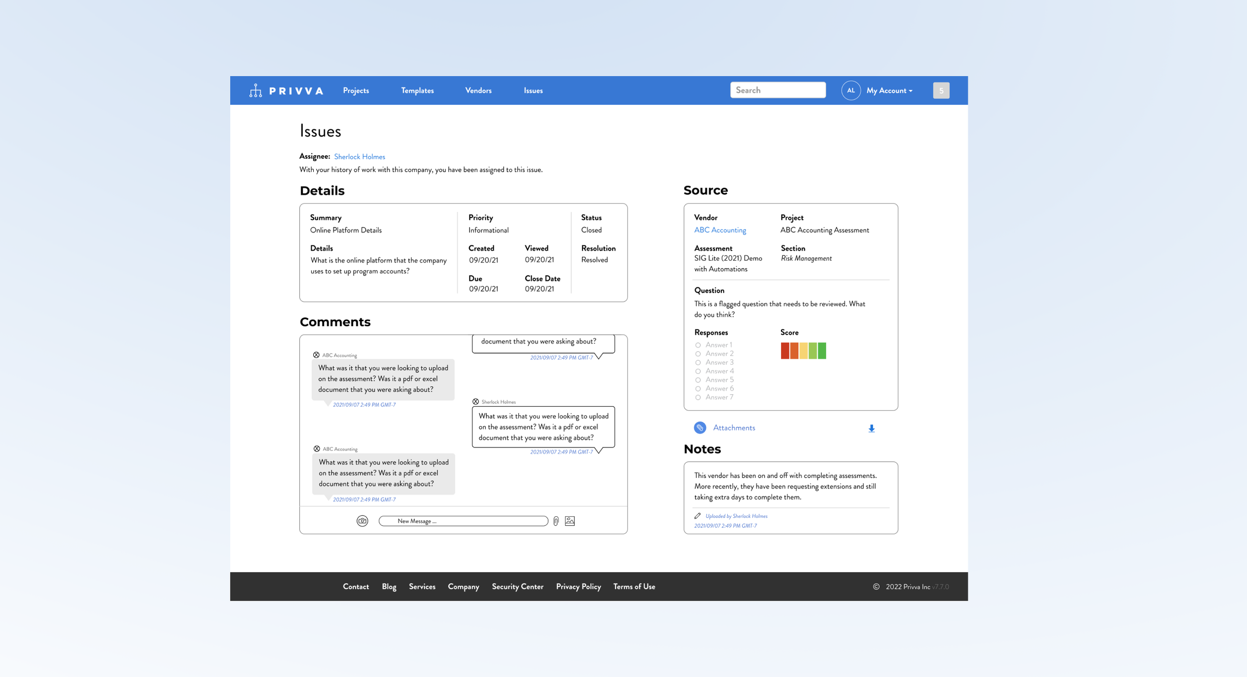
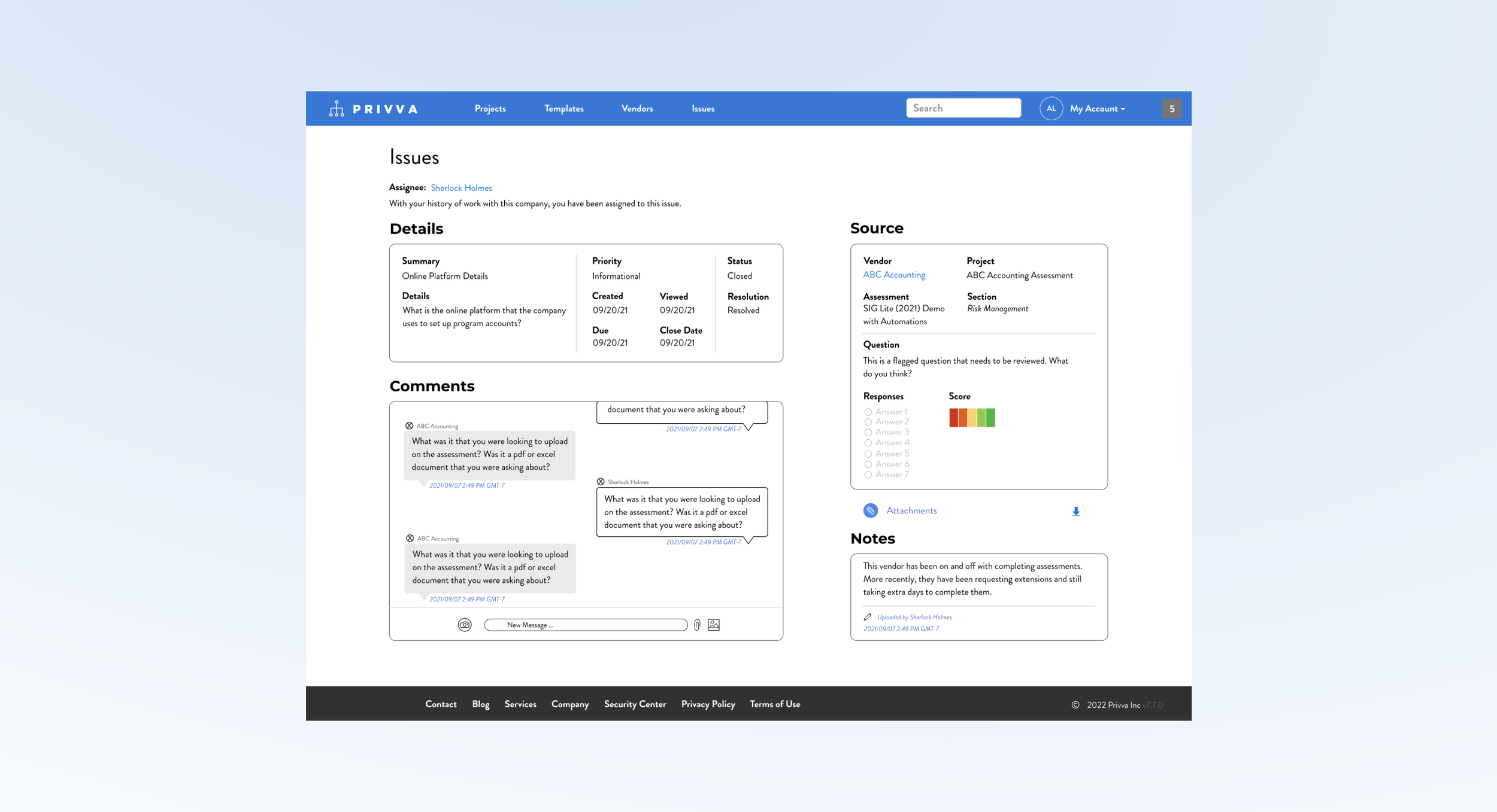
8 Project Samples + Finds Explained
#1, Issues Layout_3.3.3
2 Adds and Restructure of the Issues Page
Project Objective
Change
Along with the new messaging section and change in page layout, other changes were made:
Incorporate a “Comments,” message section.
Include a Risk Score for the “Source” section.
Conceptualize a new page layout.
Create and include a “Notes,” Section.
Restructure the “Source,” and “Details,” content.
Iteration
After feedback, changes were made to take into account time stamps, other risk scores, and content order:
Include a time stamp on the “Notes,” section.
Include a time stamp on the “Comments,” section.
Show how multiple Risk Score Questions appear.
Delete download options except for “Attachments.”
Move assignee to the top of the screen.
Create a visual design of a messaging system and notes section and include it in a new reorganization of the client “Issues,” page.
The issues page information was originally stacked in 2 narrow columns , which made the additional “Comments,” messaging section look out of place in the original design. So, a new layout was suggested that organized all of the sections, “ in a different layout, with the new additions, to better make use of the space so that people can see, understand and use each section in relation to its function.
Summary and Next Steps
The messaging areas needs more page real estate because it needs to emphasize its priority and it functions better with a larger design so people can view current messages and see previous messages and because of its larger size. The “Details,” “Source,” “Notes,” and “Comments,” section are restructured individually and reorganized as a group to acomodate for the messaging section and show all of the information that a user would need on a page.
Suggested Test: SUS Usability
8 Project Samples + Finds Explained
#1, Issues Layout_3.2
2 Adds and Restructure of the Issues Page
Project Objective
Change
Along with the new messaging section and change in page layout, other changes were made:
Incorporate a “Comments,” message section.
Include a Risk Score for the “Source” section.
Conceptualize a new page layout.
Create and include a “Notes,” Section.
Restructure the “Source,” and “Details,” content.
Iteration
After feedback, changes were made to take into account time stamps, other risk scores, and content order:
Include a time stamp on the “Notes,” section.
Include a time stamp on the “Comments,” section.
Show how multiple Risk Score Questions appear.
Delete download options except for “Attachments.”
Move assignee to the top of the screen.
Create a visual design of a messaging system and notes section and include it in a new reorganization of the client “Issues,” page.
The issues page information was originally stacked in 2 narrow columns , which made the additional “Comments,” messaging section look out of place in the original design. So, a new layout was suggested that organized all of the sections, “ in a different layout, with the new additions, to better make use of the space so that people can see, understand and use each section in relation to its function.
Summary and Next Steps
The messaging areas needs more page real estate because it needs to emphasize its priority and it functions better with a larger design so people can view current messages and see previous messages and because of its larger size. The “Details,” “Source,” “Notes,” and “Comments,” section are restructured individually and reorganized as a group to acomodate for the messaging section and show all of the information that a user would need on a page.
Suggested Test: SUS Usability

8 Project Samples + Finds Explained
#1, Issues Layout_3.3
2 Adds and Restructure of the Issues Page
Project Objective
Change
Along with the new messaging section and change in page layout, other changes were made:
Incorporate a “Comments,” message section.
Include a Risk Score for the “Source” section.
Conceptualize a new page layout.
Create and include a “Notes,” Section.
Restructure the “Source,” and “Details,” content.
Iteration
After feedback, changes were made to take into account time stamps, other risk scores, and content order:
Include a time stamp on the “Notes,” section.
Include a time stamp on the “Comments,” section.
Show how multiple Risk Score Questions appear.
Delete download options except for “Attachments.”
Move assignee to the top of the screen.
Create a visual design of a messaging system and notes section and include it in a new reorganization of the client “Issues,” page.
The issues page information was originally stacked in 2 narrow columns , which made the additional “Comments,” messaging section look out of place in the original design. So, a new layout was suggested that organized all of the sections, “ in a different layout, with the new additions, to better make use of the space so that people can see, understand and use each section in relation to its function.
Summary and Next Steps
The messaging areas needs more page real estate because it needs to emphasize its priority and it functions better with a larger design so people can view current messages and see previous messages and because of its larger size. The “Details,” “Source,” “Notes,” and “Comments,” section are restructured individually and reorganized as a group to acomodate for the messaging section and show all of the information that a user would need on a page.
Suggested Test: SUS Usability

8 Project Samples + Finds Explained
#1, Issues Layout_3.4
2 Adds and Restructure of the Issues Page
Project Objective
Change
Along with the new messaging section and change in page layout, other changes were made:
Incorporate a “Comments,” message section.
Include a Risk Score for the “Source” section.
Conceptualize a new page layout.
Create and include a “Notes,” Section.
Restructure the “Source,” and “Details,” content.
Iteration
After feedback, changes were made to take into account time stamps, other risk scores, and content order:
Include a time stamp on the “Notes,” section.
Include a time stamp on the “Comments,” section.
Show how multiple Risk Score Questions appear.
Delete download options except for “Attachments.”
Move assignee to the top of the screen.
Create a visual design of a messaging system and notes section and include it in a new reorganization of the client “Issues,” page.
The issues page information was originally stacked in 2 narrow columns , which made the additional “Comments,” messaging section look out of place in the original design. So, a new layout was suggested that organized all of the sections, “ in a different layout, with the new additions, to better make use of the space so that people can see, understand and use each section in relation to its function.
Summary and Next Steps
The messaging areas needs more page real estate because it needs to emphasize its priority and it functions better with a larger design so people can view current messages and see previous messages and because of its larger size. The “Details,” “Source,” “Notes,” and “Comments,” section are restructured individually and reorganized as a group to acomodate for the messaging section and show all of the information that a user would need on a page.
Suggested Test: SUS Usability

8 Project Samples + Finds Explained
#1, Issues Layout_3.5
2 Adds and Restructure of the Issues Page
Project Objective
Change
Along with the new messaging section and change in page layout, other changes were made:
Incorporate a “Comments,” message section.
Include a Risk Score for the “Source” section.
Conceptualize a new page layout.
Create and include a “Notes,” Section.
Restructure the “Source,” and “Details,” content.
Iteration
After feedback, changes were made to take into account time stamps, other risk scores, and content order:
Include a time stamp on the “Notes,” section.
Include a time stamp on the “Comments,” section.
Show how multiple Risk Score Questions appear.
Delete download options except for “Attachments.”
Move assignee to the top of the screen.
Create a visual design of a messaging system and notes section and include it in a new reorganization of the client “Issues,” page.
The issues page information was originally stacked in 2 narrow columns , which made the additional “Comments,” messaging section look out of place in the original design. So, a new layout was suggested that organized all of the sections, “ in a different layout, with the new additions, to better make use of the space so that people can see, understand and use each section in relation to its function.
Summary and Next Steps
The messaging areas needs more page real estate because it needs to emphasize its priority and it functions better with a larger design so people can view current messages and see previous messages and because of its larger size. The “Details,” “Source,” “Notes,” and “Comments,” section are restructured individually and reorganized as a group to acomodate for the messaging section and show all of the information that a user would need on a page.
Suggested Test: SUS Usability
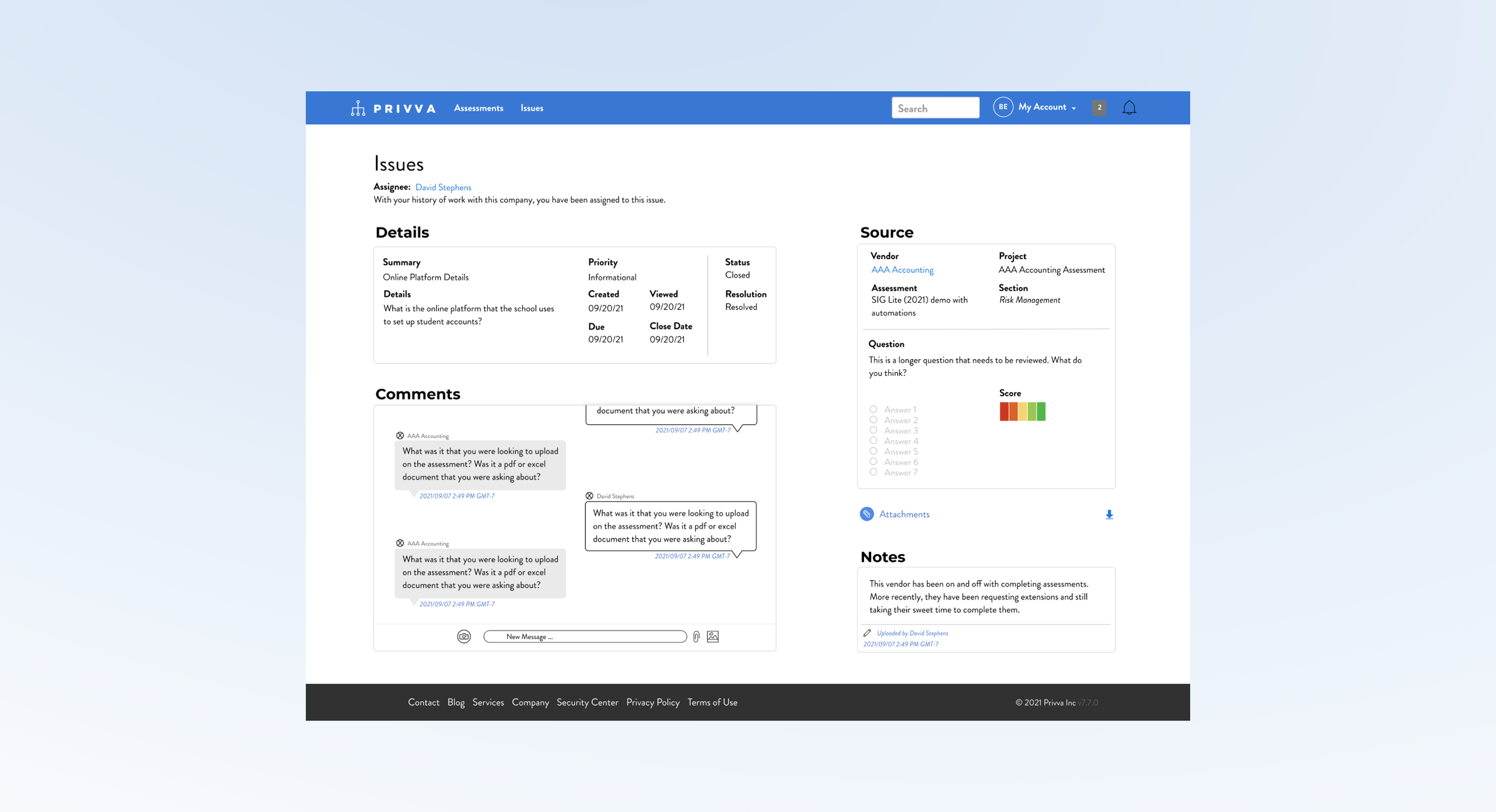
8 Project Samples + Finds Explained
#1, Issues Layout_1
2 Adds and Restructure of the Issues Page
Project Objective
Change
Along with the new messaging section and change in page layout, other changes were made:
Incorporate a “Comments,” message section.
Include a Risk Score for the “Source” section.
Conceptualize a new page layout.
Create and include a “Notes,” Section.
Restructure the “Source,” and “Details,” content.
Iteration
After feedback, changes were made to take into account time stamps, other risk scores, and content order:
Include a time stamp on the “Notes,” section.
Include a time stamp on the “Comments,” section.
Show how multiple Risk Score Questions appear.
Delete download options except for “Attachments.”
Move assignee to the top of the screen.
Create a visual design of a messaging system and notes section and include it in a new reorganization of the client “Issues,” page.
The issues page information was originally stacked in 2 narrow columns , which made the additional “Comments,” messaging section look out of place in the original design. So, a new layout was suggested that organized all of the sections, “ in a different layout, with the new additions, to better make use of the space so that people can see, understand and use each section in relation to its function.
Summary and Next Steps
The messaging areas needs more page real estate because it needs to emphasize its priority and it functions better with a larger design so people can view current messages and see previous messages and because of its larger size. The “Details,” “Source,” “Notes,” and “Comments,” section are restructured individually and reorganized as a group to acomodate for the messaging section and show all of the information that a user would need on a page.
Suggested Test: SUS Usability

8 Project Samples + Finds Explained
#1, Issues Layout_2
2 Adds and Restructure of the Issues Page
Project Objective
Change
Along with the new messaging section and change in page layout, other changes were made:
Incorporate a “Comments,” message section.
Include a Risk Score for the “Source” section.
Conceptualize a new page layout.
Create and include a “Notes,” Section.
Restructure the “Source,” and “Details,” content.
Iteration
After feedback, changes were made to take into account time stamps, other risk scores, and content order:
Include a time stamp on the “Notes,” section.
Include a time stamp on the “Comments,” section.
Show how multiple Risk Score Questions appear.
Delete download options except for “Attachments.”
Move assignee to the top of the screen.
Create a visual design of a messaging system and notes section and include it in a new reorganization of the client “Issues,” page.
The issues page information was originally stacked in 2 narrow columns , which made the additional “Comments,” messaging section look out of place in the original design. So, a new layout was suggested that organized all of the sections, “ in a different layout, with the new additions, to better make use of the space so that people can see, understand and use each section in relation to its function.
Summary and Next Steps
The messaging areas needs more page real estate because it needs to emphasize its priority and it functions better with a larger design so people can view current messages and see previous messages and because of its larger size. The “Details,” “Source,” “Notes,” and “Comments,” section are restructured individually and reorganized as a group to acomodate for the messaging section and show all of the information that a user would need on a page.
Suggested Test: SUS Usability

8 Project Samples + Finds Explained
#1, Issues Layout_3
2 Adds and Restructure of the Issues Page
Project Objective
Change
Along with the new messaging section and change in page layout, other changes were made:
Incorporate a “Comments,” message section.
Include a Risk Score for the “Source” section.
Conceptualize a new page layout.
Create and include a “Notes,” Section.
Restructure the “Source,” and “Details,” content.
Iteration
After feedback, changes were made to take into account time stamps, other risk scores, and content order:
Include a time stamp on the “Notes,” section.
Include a time stamp on the “Comments,” section.
Show how multiple Risk Score Questions appear.
Delete download options except for “Attachments.”
Move assignee to the top of the screen.
Create a visual design of a messaging system and notes section and include it in a new reorganization of the client “Issues,” page.
The issues page information was originally stacked in 2 narrow columns , which made the additional “Comments,” messaging section look out of place in the original design. So, a new layout was suggested that organized all of the sections, “ in a different layout, with the new additions, to better make use of the space so that people can see, understand and use each section in relation to its function.
Summary and Next Steps
The messaging areas needs more page real estate because it needs to emphasize its priority and it functions better with a larger design so people can view current messages and see previous messages and because of its larger size. The “Details,” “Source,” “Notes,” and “Comments,” section are restructured individually and reorganized as a group to acomodate for the messaging section and show all of the information that a user would need on a page.
Suggested Test: SUS Usability
8 Project Samples + Finds Explained
#1, Issues Layout
2 Adds and Restructure of the Issues Page
Project Objective
Change
Along with the new messaging section and change in page layout, other changes were made:
Incorporate a “Comments,” message section.
Include a Risk Score for the “Source” section.
Conceptualize a new page layout.
Create and include a “Notes,” Section.
Restructure the “Source,” and “Details,” content.
Iteration
After feedback, changes were made to take into account time stamps, other risk scores, and content order:
Include a time stamp on the “Notes,” section.
Include a time stamp on the “Comments,” section.
Show how multiple Risk Score Questions appear.
Delete download options except for “Attachments.”
Move assignee to the top of the screen.
Create a visual design of a messaging system and notes section and include it in a new reorganization of the client “Issues,” page.
The issues page information was originally stacked in 2 narrow columns , which made the additional “Comments,” messaging section look out of place in the original design. So, a new layout was suggested that organized all of the sections, “ in a different layout, with the new additions, to better make use of the space so that people can see, understand and use each section in relation to its function.
Summary and Next Steps
The messaging areas needs more page real estate because it needs to emphasize its priority and it functions better with a larger design so people can view current messages and see previous messages and because of its larger size. The “Details,” “Source,” “Notes,” and “Comments,” section are restructured individually and reorganized as a group to acomodate for the messaging section and show all of the information that a user would need on a page.
Suggested Test: SUS Usability

8 Project Samples + Finds Explained
#1, Issues Layout.
2 Adds and Restructure of the Issues Page
Project Objective
Change
Along with the new messaging section and change in page layout, other changes were made:
Incorporate a “Comments,” message section.
Include a Risk Score for the “Source” section.
Conceptualize a new page layout.
Create and include a “Notes,” Section.
Restructure the “Source,” and “Details,” content.
Iteration
After feedback, changes were made to take into account time stamps, other risk scores, and content order:
Include a time stamp on the “Notes,” section.
Include a time stamp on the “Comments,” section.
Show how multiple Risk Score Questions appear.
Delete download options except for “Attachments.”
Move assignee to the top of the screen.
Create a visual design of a messaging system and notes section and include it in a new reorganization of the client “Issues,” page.
The issues page information was originally stacked in 2 narrow columns , which made the additional “Comments,” messaging section look out of place in the original design. So, a new layout was suggested that organized all of the sections, “ in a different layout, with the new additions, to better make use of the space so that people can see, understand and use each section in relation to its function.
Summary and Next Steps
The messaging areas needs more page real estate because it needs to emphasize its priority and it functions better with a larger design so people can view current messages and see previous messages and because of its larger size. The “Details,” “Source,” “Notes,” and “Comments,” section are restructured individually and reorganized as a group to acomodate for the messaging section and show all of the information that a user would need on a page.
Suggested Test: SUS Usability
8 Project Samples + Finds Explained
#1, Issues Layout
2 Adds and Restructure of the Issues Page
Project Objective
Change
Along with the new messaging section and change in page layout, other changes were made:
Incorporate a “Comments,” message section.
Include a Risk Score for the “Source” section.
Conceptualize a new page layout.
Create and include a “Notes,” Section.
Restructure the “Source,” and “Details,” content.
Iteration
After feedback, changes were made to take into account time stamps, other risk scores, and content order:
Include a time stamp on the “Notes,” section.
Include a time stamp on the “Comments,” section.
Show how multiple Risk Score Questions appear.
Delete download options except for “Attachments.”
Move assignee to the top of the screen.
Create a visual design of a messaging system and notes section and include it in a new reorganization of the client “Issues,” page.
The issues page information was originally stacked in 2 narrow columns , which made the additional “Comments,” messaging section look out of place in the original design. So, a new layout was suggested that organized all of the sections, “ in a different layout, with the new additions, to better make use of the space so that people can see, understand and use each section in relation to its function.
Summary and Next Steps
The messaging areas needs more page real estate because it needs to emphasize its priority and it functions better with a larger design so people can view current messages and see previous messages and because of its larger size. The “Details,” “Source,” “Notes,” and “Comments,” section are restructured individually and reorganized as a group to acomodate for the messaging section and show all of the information that a user would need on a page.
Suggested Test: SUS Usability
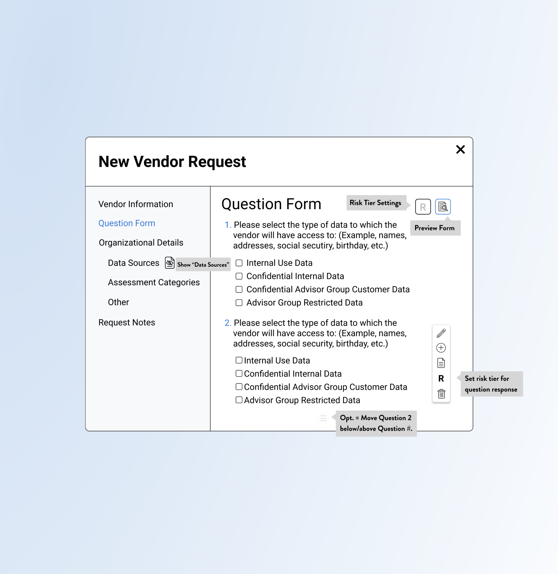
#2, Vendor Requests
20 Screens for the Form Action Process
Iterations included changes to the custom field look and to the edit option function:
Custom Fields content was condensed.
Remove extra save and download steps
Tool tips for icons and an ability to hide and view question answers was shown.
Update the Vendor Request Design Placement and Process with Sections and Options such as “Organizational Details” and Risk Scores.
Privva had a Vendor Request Form process already integrated onto their site. Because of the location of the CTAs and layout of the page content, it was oftentimes overlooked by users. The project consisted of a new placement and visual for the vendor request process with new sections, new form fields, question edit options, custom fields and a larger popup modal.
Change
The main change was the Vendor Request process but other adjustments were included:
Include Icons for edit options, like edit text, write notes, add question, risk score, delete.
New order of the Vendor Request Sections.
Larger modal and adjusted look of content
Iteration
Objective
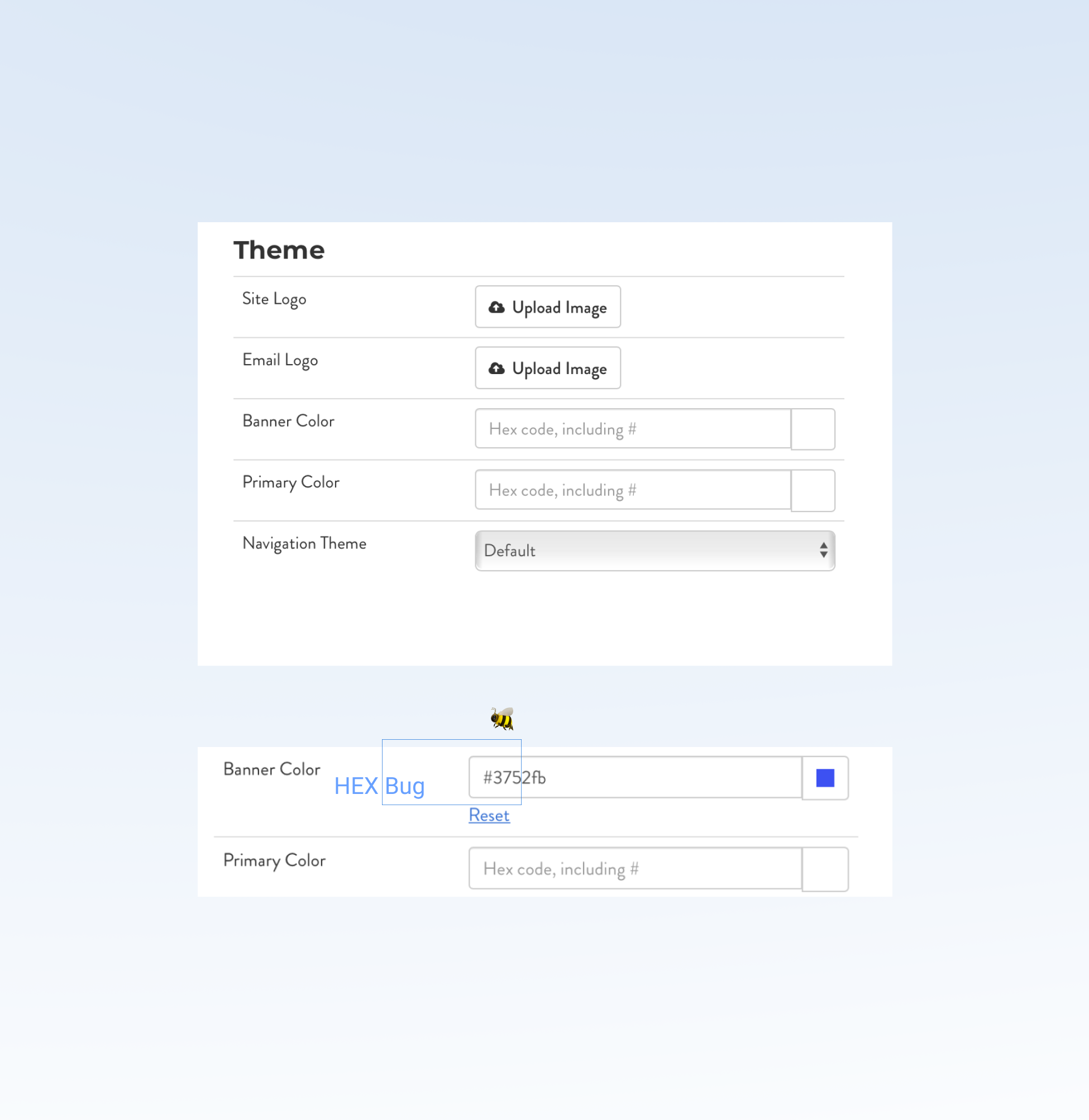
#3, Code Bugs
2 Bugs Found on the Client Portal
No iterations to this find!
After calling out the HEX code hiccup to the Project Manager, the HEX code manual entry was fixed. Both the date picker and the typed in color code adjusted the portal’s banner to the company’s brand or a custom account color.
Inform the Project Manager about the HEX code error, where a manual entry of the HEX color code was glitching on the user side.
During research and task analysis on the the client settings page, I noticed the “Banner Color,” was inaccurately auto-filling the HEX color to another color than the initially typed HEX code. This happened after typing in 3 HEX code letters and numbers, where the form field would complete the 6 numeral HEX code to a different color code that was unable to be adjusted, even if you retyped the letters.
Change 🦋
During a project for the client portal, I noticed an error for the Banner Color change:
The color picker option worked just fine for people who chose that option but the second option, to type in a HEX color would be adjusted with backend code that would allow it to function properly for users.
Iteration
Objective
#4, Email Templates
25 Email Designs for Varied Scenarios
Other versions were added over time to the template list with specific actions and details:
Included client custom banner choices.
CTAs, like “Extend Assessment,” “View Assessment,” and “Sign-in” were included.
Copy was changed to align to feedback.
Create new email designs that apply to general Privva company templates, to specific use cases, and updated Client and Vendor content.
The original email designs had inconsistent layouts, colors, and type that were visibly condensed in an email. This made the content difficult to take in and read since a lot of white space surrounded small text size and compacted content. The new email designs focused on larger typeface, stretching content to the email screen, and using current Privva brand colors consistently for each email design.
Change
Create visuals that could be used for current or future company, client, and vendor emails:
Edit copy for a clear company tone, order of information, and for cleaned up text.
Include Privva’s brand logo and colors.
Pair text with white space for readability.
Iteration
Objective
A Few Projects and Finds Summary
With these changes, a user has access to an upgraded vendor request process with new features and cleaner text, a seamless banner color change without surprise bugs, and various emails that align with Privva’s brand identity and their belief in client customization. These changes reflect a focus on information architecture, visual design, and user interaction with updated designs and new additions that seamlessly connect to their original design.
Placement of sections and text, buttons and action processes were prioritized with a visual lift to content.
Summary: A placement and visual for the Vendor Request Forms was a part of the design project where the Vendor Request Form process was adjusted with new sections, new form fields, question edit options, custom fields, and a larger popup modal.
Next Steps: To test how the integration of new features worked in the design process with a focus on risk scores.
Suggested Test: SUS Usability
These 3 projects prioritize new features, hierarchy of information, and adjusted visuals to reorganize content and improve product structure and portal experience.
1 of 2 bugs that was caught during research and information architecture on the online portal.
Summary: This was my first digital bug catch, and I learned that the inability to enter the HEX manually was a design change that the Developer Team would fix. Lorem Ipsum Space would go here. Maybe more Lorem Ipsum Space.
Next Steps: The other bug would correct itself on a page refresh but it would be inconvenient to people whose first experience was a glitch.
Suggested Test: Observational
Improve readability with larger text and white space that pairs together for a clean and easy to read email.
Summary: Blue hues that were no longer being used through the current Privva branding were edited to match the current brand guide.
Next Steps: The new email designs focused on larger typeface, bringing the current Privva colors into the logo and email details, and text that could be adjusted for new future emails or adjusted to existing email copy.
Suggested Test: A/B ; SUS Usability
#2, Vendor Requests
#3, Code Bugs
#4, Email Templates
👏 Break, Project Summary
#2, #3, #4 Project Summaries and Next Steps
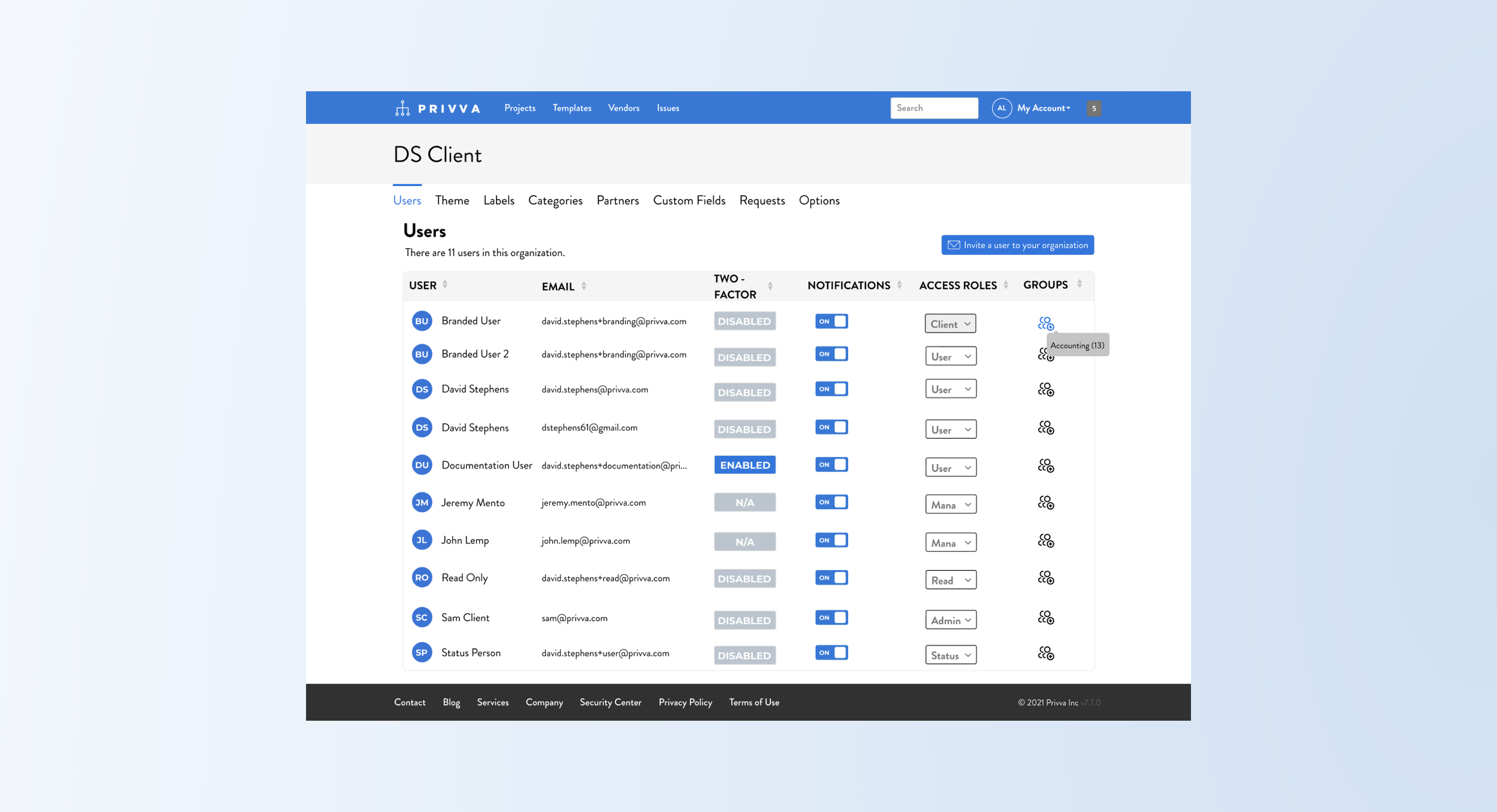
#5, Users Page
New Placement and Design of the Page
Project Objective
Change
With a “User’s” Page already incorporated onto the client portal, the new criteria was added and shown through: (changed the visual look)
Reimagine and create a user page for the account
Include a column for “Access Roles” and “Groups”
Show how you would assign user’s to “Groups.”
Include a CTA to “invite a user to your organization.”
Redistribute user and email content to fit the page.
Iteration
The “Users,” page was looking to include access roles for different groups and an ability to invite a user to the client’s company or organization.
Users would be assigned to groups and these groups would have different access roles on the account portal. This meant that different people who were users in the client organization or company would be able to access and engage with different parts of the account portal depending on their role and their team responsibilities.
After a hi-fi mockup was created feedback on the access roles look and process was adjusted along with:
Instead of text, use an icon for the “Groups” row.
Include a number placement for the group.
Have a visual or the user’s initials by their name.
Copy change for the titles and access roles?
Differentiate groups versus access roles; the search and delete process for groups. Tool tip? list of ppl?
Summary and Next Steps
The user’s page was getting an update because there was more information that the company wanted to add to the page with the admin, management, user access roles and with the process of creating groups for the users as well. Next steps would be to conduct testing on the group process since we went through a few steps to get the steps for the action correct.
Suggested Test: A/B and Usability SUS
#6, Contributor Page
5 Selected Options and Switch Process
Project Objective
Change
The main points were to include secondary contributors and show how they would be reassigned along with:
Differentiate between primary and secondary contributors in the client company
Combine the contributors on 1 list view
Provide options for the contributor section
Add in the contributor “Role” and “Email” information.
Show how to edit and move contributors.
Iteration
After sharing mockup options of the contributor lists, the information was cleaned up and process refined:
Include the initials of the contributors by their name. This could later be updated with profile pictures or kept as a visual identifier with initials.
Adjust the process to change the contributors to fewer steps than the initial proposed action process.
Decide on an automatic delete of the primary contributor, what was this?
On their custom fields page, the company was looking to add in secondary contributors along with their primary contributors.
Their current page only showed 1 contributor, but the client could have other contributors with different levels of site access with only 1 contributor visible on the details page. (That wasn’t represented on the details page). A primary contributor xyz, while a secondary contributor xyz.
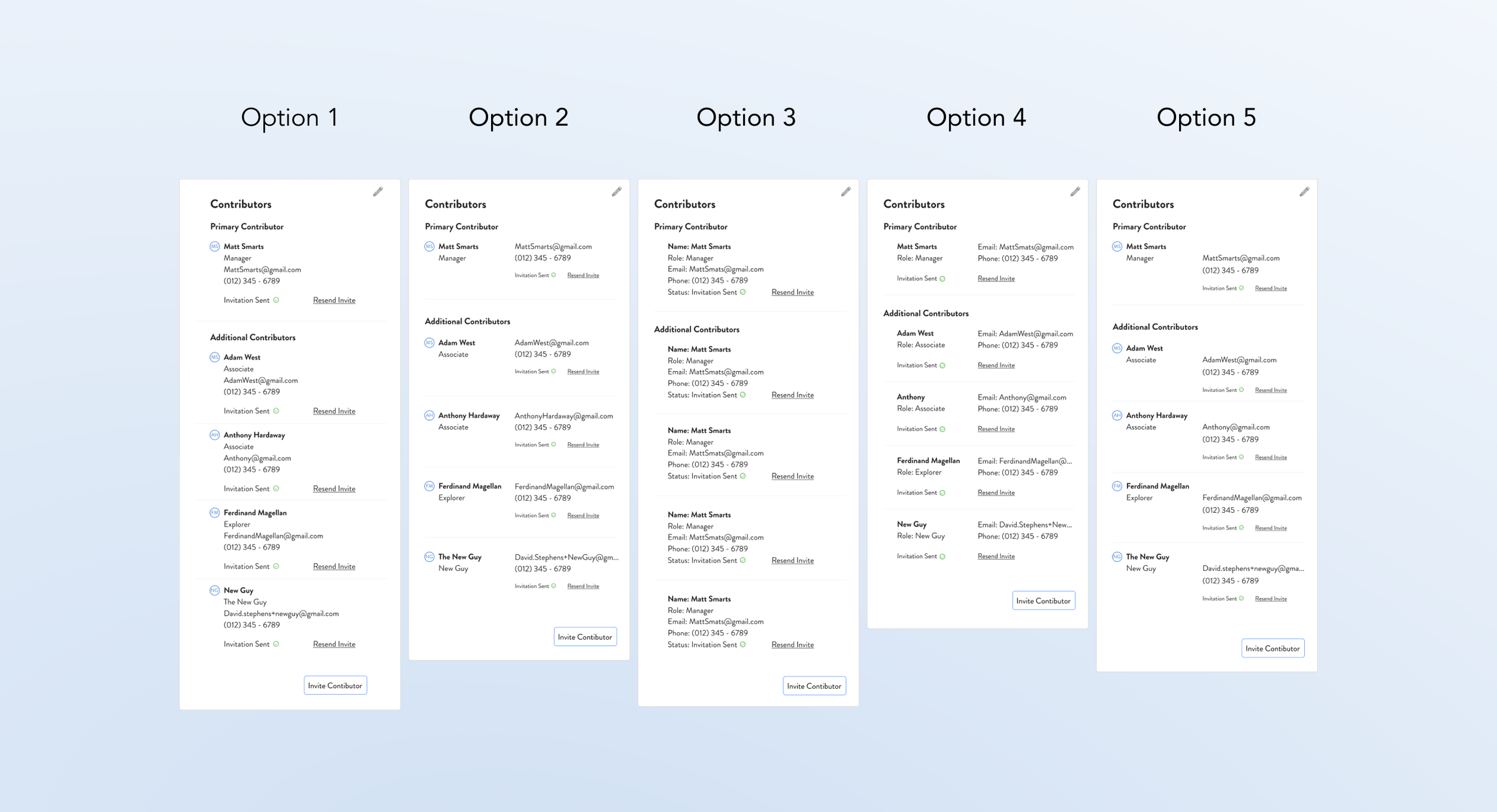
Summary and Next Steps
The project was a mix of visual design changes that represented actual client company contributor roles that could be shown online. With the visual contributor options that includes the roles, email, and contributor title, the process of changing secondary contributors to primary contributors was included. This originally was a longer process but keeping with the common theme of simplicity for the company design goals, the process was simplified to an add and delete option and reassignment of their status. Next steps would be to test the adding and deleting of contributors and seeing if an A/B test for the process would smooth out any errors and provide new perspective for the design implementation that gets the job done but also works the best at the time for the users.
Suggested Test: A/B and Usability SUS
Two More to Go!
2 User Finds during the Projects
#7, Type Inconsistency
Context
Throughout the website portal, the sizing of the headers, body, and other copy were mismatched on different pages.
Font: Decimal Type Face, such as 19.2 could round to 20 px font.
Language Choices: For new processes, identifying terms that would be user-friendly.
Reword Text: Similar or confusing text would be given recommendations for other labels.
Summary
At other times a focus on assigning a term to a new process or rewording a previous portal label was a priority.
Suggested Test: A/B + Review
Text and Language Inconsistency
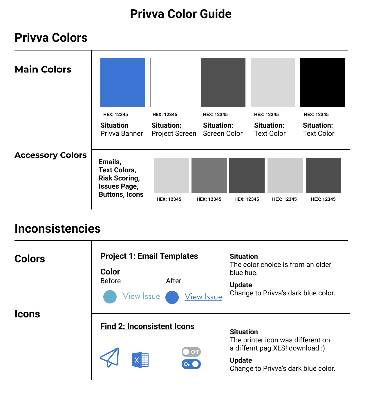
#8, Visual Discrepancy
Context
On the Privva page and with the original Privva emails, there were color discrepancies with the blue and grey colors being used.
Color Callouts: Decimal Type Face, such as 19.2 could round to 20 px font.
Color of Text & Links: EMAIL TEMPLATE COLOR call out here. Tie that in so they can link that too!
Icons: For new processes, identifying terms that would be user-friendly.
Summary
On the Privva page and with the original Privva emails, there were color discrepancies with the blue and grey colors being used.
Suggested Test: A/B + Review
Color and Icon Finds
Timeline Revisit
MVP, Visual Designs, Work Process
Again, circle back to this amount of hi-fi designs were able to be completed and sent off to the developer team due to the focus on MVP designs. The designs that get the job done and were simple but functional were prioritized over actions, visuals, and processes that would require more time and complication (finesse) to implement. (Bullet point this). At the time, the site/ company priorities (tangled knot) , prerogative was on updated parts of the portal that were causing people confusion, and adding in new features. for these for this phase of their product simple design was best, with quick turnaround an new project efforts. Simple was best!
Talk about workflow pros and cons, user testing
Work flow was MVP based, which meant that the first iteration was made in a short time frame and with a mid to high-fi design with less prototyping and interactive additions but with more tagged notes and bigger picture ideas saved for later.
***Reasoning for this . . . the stakeholders know the product well enough and the way in which it functions with the clients and vendors well enough to suggest designs they would like to implement. Is it always a bad thing or a good thing? In this case, the product is complicated and also adaptable.
Delta and Plus graph for this?
Customization Reason
___
Desire for user-testing and the back and forth changes based off what other people said was super frustrating.
Later, you can share the UX note about adaptability and a counter UX Note too, (quote, note, insight)
Naming conventions and mismatched icons too!
All of the designs were incorporated into the structure of Privva’s current visual design. the designs were matched to Privva’s baseline visual design even if other visual looks that were modern were suggested.
Lesson + iteration contributors = A simplified way to change contributors = Simplify on the contributors side!
2 types of projects that were worked on, #1 visual look and #2 process!
Priority of speed implementation even thought they say it costs more and take more time to fix something without user testing.
Maybe something else can go here title-wise
“These 3 projects prioritize new features, hierarchy of information, and adjusted visuals to better organize content and improve the visual, use, and interactive relationship of Vendors and Clients with Privva’s product structure and product experience.”
Work Experience Reflection
Speed of the work and how that allowed for more visual designs and MVP design work based off POCs but the work was mainly based on the company’s vision and the stakeholder’s user preferences and goals for their product’s features and functions. Work reflection | I valued the visual design practice, but the lack of testing and design team work could be something to explore in future projects.
Reflect about working with a team here too.
Simple | Simpler is way better, but!
With a list of tasks, it was more about cleaning up the original design and creating space for prioritized new features that could be a blue print for an overall visual look and in my opinion and hope, more thorough user testing.
David told me much of the time to be simple! ex. Vendor request forms, delete, what do you need now. ; A lesson I learned reflection, can take it or leave it, grain of salt or not. * * *
Speed of the work and User-testing
Next Steps
Next steps would be to see how the individual upgrades to the web portal for the client and vendor would be understood and rated for its usability and agreeableness. This way the company, Privva, would have a coherent understanding of how their own objectives and feedback aligned or misaligned with the experience of both their clients and vendors. Additionally, they would have the opportunity to compare how their changes to both experiences measured next to each other. The client work was prioritized and with that, I question if the experience of the vendor would be as upgraded and beneficial as the clients. But upgrades don’t always mean they were better. Sometimes, something that works well and is older but reliable isn’t always in a need of a change. As long as the feedback can demonstrate that the older product experience still is achieving the results of present day work, then perhaps it is worth keeping versus upgrading. But that is where testing comes in handy, because when you utilize testing to compare and contrast how various products do against each other, then maybe, you’ll know for sure that the previous project was the right one to implement now or that a new design would eventually meet and even exceed the hallmark rating experience, and open doors and perspective to new ways of working a design for the user and for the user to upgrade themselves with the design pushing them kindly but firmly to grow learn and to then push the design to learn and to grow.
Speed of the Work and User-testing
How to next steps for other project?
Visual look | User testing | streamlining action flow | reorganization | Big look
1,2,3) From a micro look, we were constantly looking at micro elements zoomed into changes specific to certain parts of their web portal with these changes made and more often throughout the process, it would be beneficial to zoom out and take in the picture of their designs too!
Client’s take too on why lack of user testing worked here too!
Untangling a lot of knots versus making it more tangled, when they untangle it, they can take it in, say xyz and choose to move on or not to a whole upgrade.