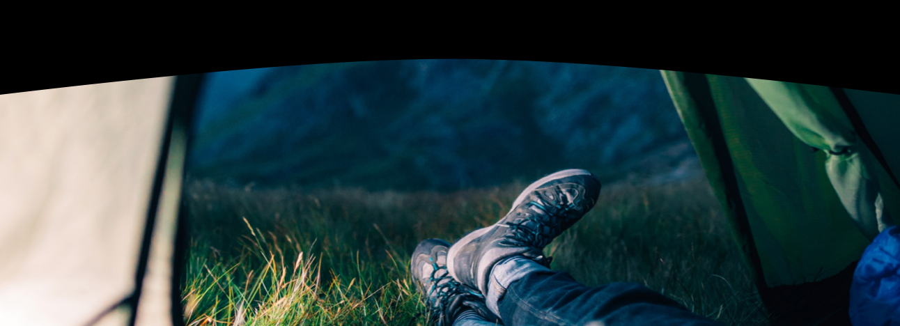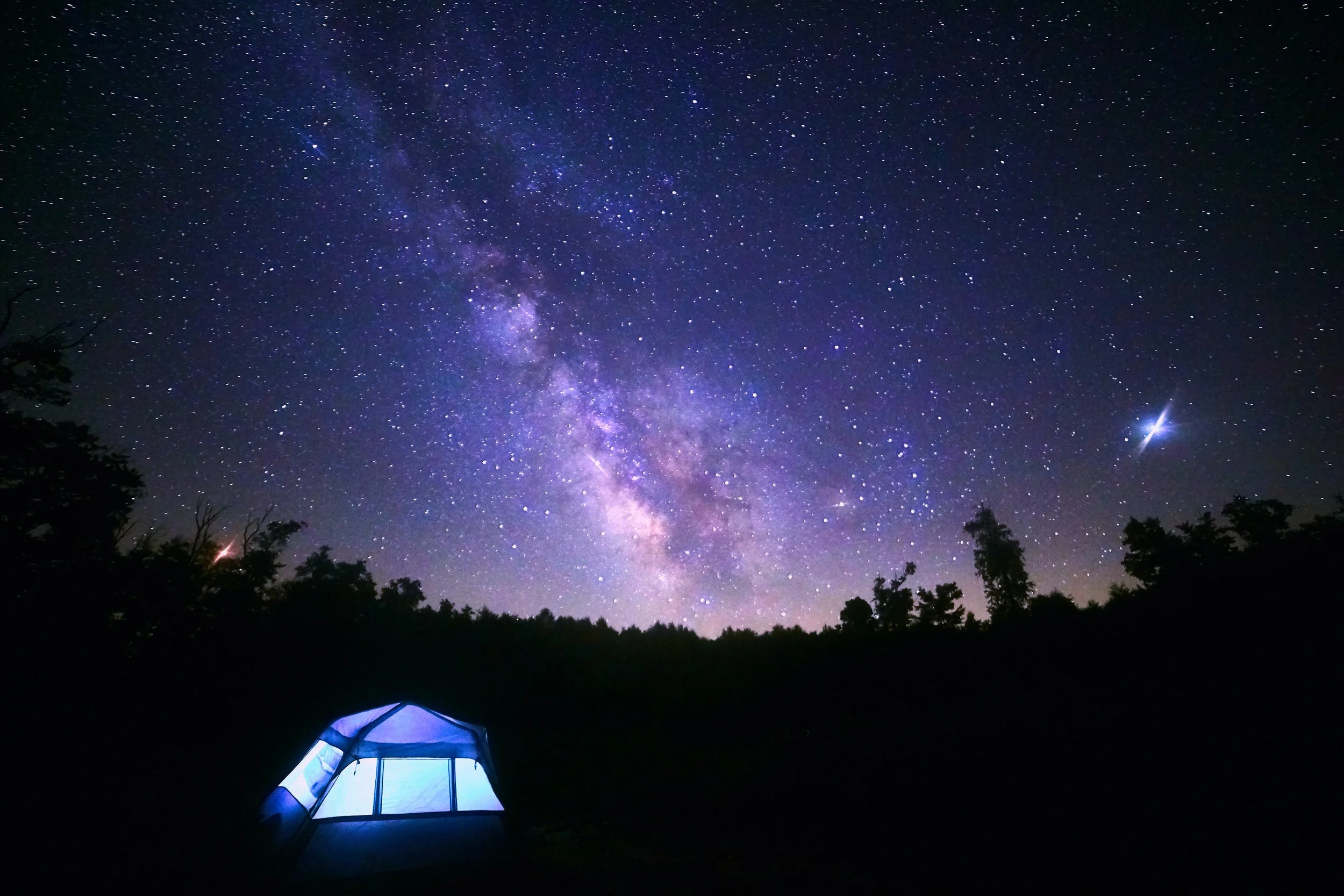
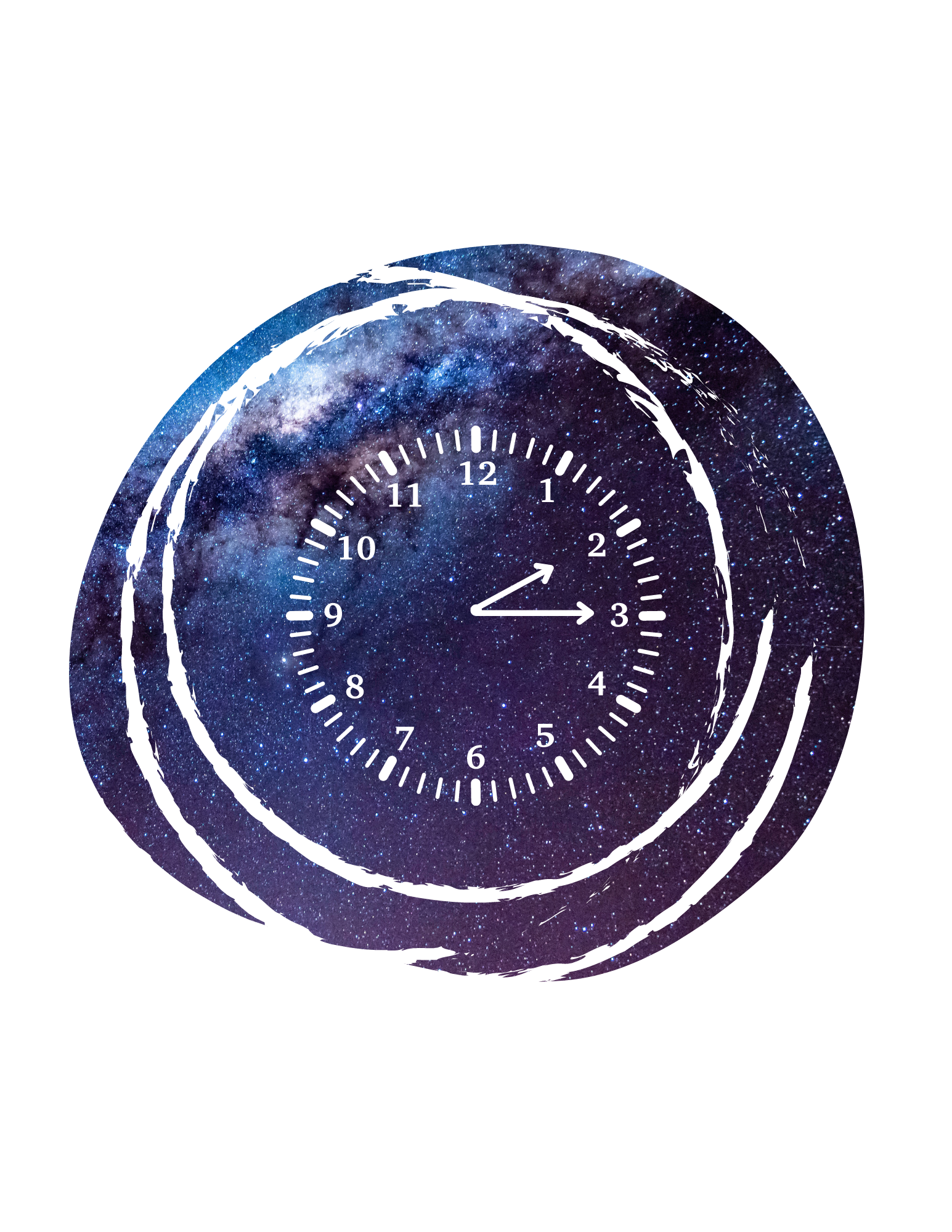
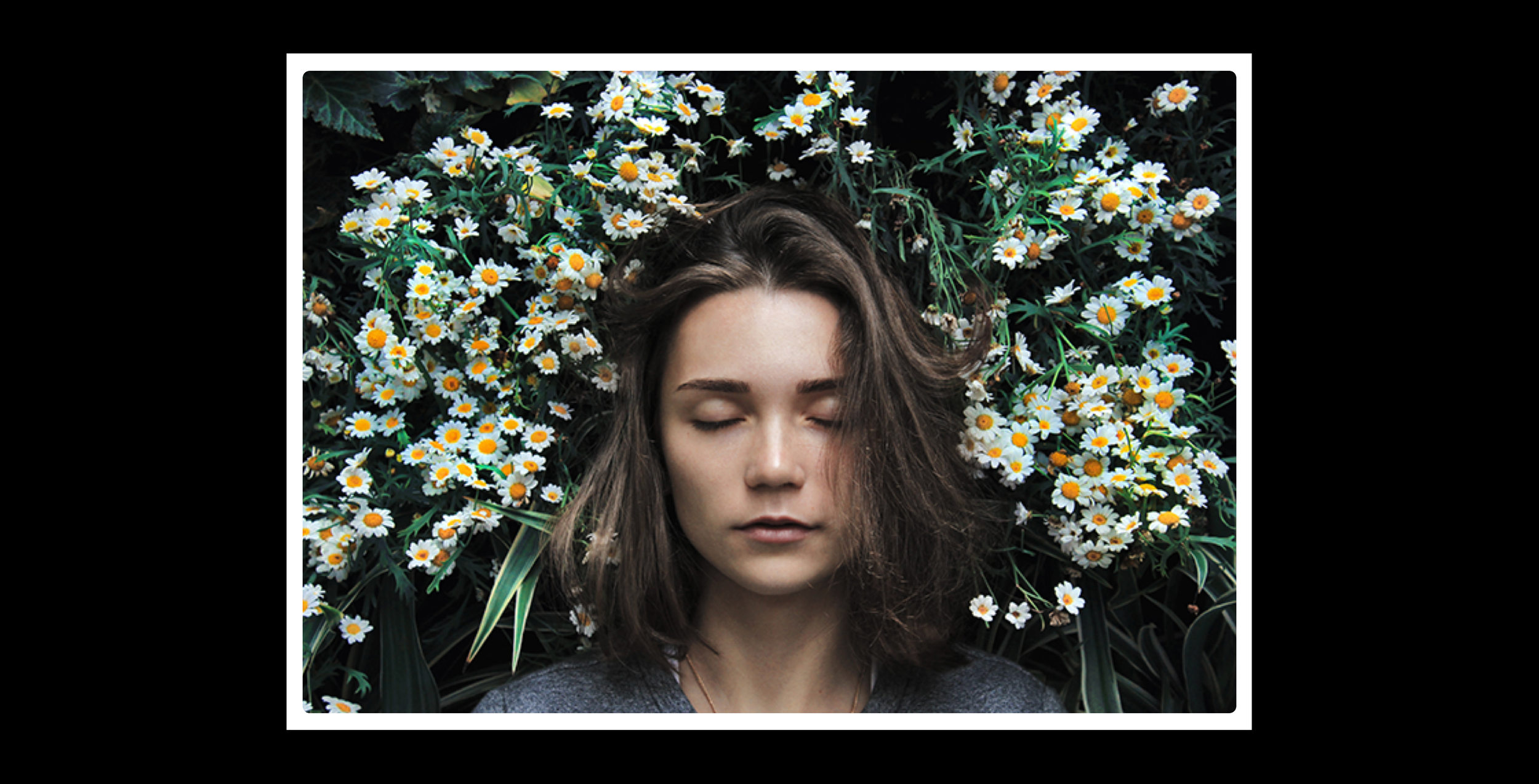
Sleep & Recharge
UX Research and Visual Design Newsletter Project
Focus.
Infographics
Content Writing
Research
Science Translation
Visual Design
Email Newsletter
Cohesive Read
Tools.
Sketch
Adobe Illustrator
Photoshop
Keynote
Unsplash
Preview
Adobe Acrobat
Overview.
With 89% of people in the Nation reporting sleep problems, a read on how to get a better night’s sleep and how sleep occurs seemed like a relevant topic for people to learn about and that might benefit their sleep patterns, and also be an entertaining read. This project takes sciencey information, which can be dense at times, and utilizes infographics, a natural tone, and connected hierarchy for an informative, clear, and practical read.
Problem.
Research on health, and research in general, can take a lot of time to read through and contain technical terms that detract from the content since readers are focused on understanding what is written. This can create a cognitive overload of information and an effort to learn about health information, which limits how often people search for information on health.
Keywords & Phrases.
Sleep, Cycles, Waves, REM, NREM, Sleep Benefits, Sleep Stages, Recommended Hours, Koalas, Rest
Goal.
The intention is to provide information, that can at times be really scientific and lead people to bounce to other activities and articles in a way that is absorbable and has the potential to be utilized later, be remembered, and be enjoyable, not something to chew through for a long time and then prescribe to daily life for better rest. The goal is to create a read that takes important and relevant information related to people’s lives and is communicated in a way that is accessible for an everyday reader. The information will hopefully, be digested quickly and even actively engaged with in their lives if they choose to.
UX, Visual Design, & Communication Objectives
Bring together a proto-persona’s user experience, visual design elements, and visual and written content for a learnable read that packs a friendly punch.
01 UX Design | Research on Sleep, Select (synthesized) Themes on Sleep, proto-persona perspective and insights, and emphasize visuals!
02 Visual Design | Layout, hierarchy, infographics
03 Communication Translation | Science research, facts, and repeated themes communicated in a tone of voice that synthesizes the research in a frank tone and is communicated clearly to the reader.
Why focus on these 3 design goals?
01 UX Design
Define Research Topics + Synthesize Findings + Connect the Pieces + Plan for Visuals
The Design Focus
◈ Find and Select relevant research.
◈ Utilize infographics, imagery, and other visuals to share the information.
◈ Draft a plan for the visual concepts based on how people learn content.
While we know that the topic for the email newsletter is on sleep, we need to define what topics will be highlighted and presented to people through visuals and text. So, an initial research phase scoped out the types of sleep topics being shared online and what themes seemed to appear more often than other themes. Based on the research findings, some more common and repetitive, and some less frequent but fascinating, the visual plan was loosely drafted, so that it had the flexibility to be adapted down the path of this project creation.
02 Visual Design
Select a visual theme for the design with a layout, hierarchy, and colors
The Design Focus
◈ Text Choice, like “Benefits, How To, and Cycles.”
◈ White Space + Hierarchy, Why = Room to breathe & process content.
◈ Color Choice = key visuals + content + lift them together.
Visual information can capture and portray a message and connect various topics together through the order in which it presents content, it’s hierarchy, and through the way it is pieced together on a page with image sizes and text placement, it’s layout. A theme of sleep is meant to be rejuvenating and restful for readers, so colors and font were chosen to represent this naturally occurring process as well as nature, where sleep occurs universally and in tandem with the light of the day. The layout and hierarchy will intend to connect this theme and content in a way that would shape how the science is told and learned through visuals of various kind and text of various intensity.
03 Communication Translation
To the point text and related imagery + An engaging and conversational tone
The Design Focus
◈ Tone of voice = Chill, human, understandable, clean, transmits clearly.
◈ Passive to active learning, content taken off the page and into life.
◈ Back + forth learning with text and related images throughout the read.
Once sleep topics have been selected, can the information be shared in a conversational tone that would work to engage the reader. With their interaction with the content, it will also work to efficiently share topics and connect them together so that readers could have the possibility of actively incorporating what they’ve remembered into their lives if it seems relevant, piques their interest, and may also benefit them. With the text and imagery being placed in way that intends to strengthen the learning process, with images - which give anchors and visual understanding, - speaking with the text, which gives context to the images, people will be able to connect to the message and apply the learning in how they sleep. Isn’t it cooler to know the benefits of why you are doing something, or how it works, or interesting facts about it. It makes it more relatable and exciting and maybe you’ll want to try it out more too!
Why focus on these 3 design goals?
01 UX Design
Define Research Topics + Synthesize Findings + Connect the Pieces + Plan for Visuals
The Design Focus
◈ Find and Select relevant research.
◈ Utilize infographics, imagery, and other visuals to share the information.
◈ Draft a plan for the visual concepts based on how people learn content.
While we know that the topic for the email newsletter is on sleep, we need to define what topics will be highlighted and presented to people through visuals and text. So, an initial research phase scoped out the types of sleep topics being shared online and what themes seemed to appear more often than other themes (what common topics were being shared online). Based on the research findings, some repetitive and common, and some less common (frequent) but fascinating, the visual plan was loosely drafted, so that it had (active . . .) the flexibility (wc) to be adapted down the path (airflight journey) of this project creation.
02 Visual Design
Bring/ Select a visual theme for the design and apply visual styles, such as layout and hierarchy, and colors, to connect written content and infographic images.
The Design Focus
◈ Text Choice, like “Benefits, How To, and Cycles.”
◈ White Space + Hierarchy, Why = Room to breathe & process content.
◈ Color Choice = key visuals + content + lift them together.
Visual information can capture and portray a message and connect various topics together through the order in which it presents content - type, icons, images, etc. - and through the way it is pieced together on a page with image sizes and text placement. (Think example = pyramid or a cake; could also do a science learn here). With a theme of sleep being (meant to be) rejuvenating + restful (for readers to learn about) and occurring naturally (naturally occurring a naturally occurring state; everyone goes through the process), the layout and hierarchy (further Travel, camping tools to communicate sleep + science) will intend to connect content to a theme that would shape how the science is told and learned visually through images and text (is text visually or another word) (absorbed/ heard/ unfold). Toolbox/ camping bag image?
03 Science Translated
Select sleep topics, such as benefits, how to, and cycles, and concisely communicate them in an online email read through succint text and related imagery. Play with a tone that works with the visual design and engages the user’s experience with a conversational tone [information made digestible = understandable + fun]
The Design Focus
◈ Chill, human, understandable, clean, transmits clearly.
◈ Passive to active, info content taken off of the page into their lives.
◈ Back + Forth Learn + Collab = Strengthen the learning cycle, process, path, and river with room for new constructions and open spaces for learning and growth, additions and takeaways, almost like a blood barrier interaction with cells.
Once sleep topics have been selected, can the objective information be shared in a conversational tone that would work with an experience of engagement, interest, and relatability that would keep the reader engaged for the article, efficiently share the topics, and connect them together so that they could have the possibility of actively incorporating what they’ve remembered into their lives if it seems relevant and would benefit them. What How Why; How to create information and share it in a conversational that connects and relates to readers (prevalence and salience) so that readers , how through the article, why so readers grasp , integrate, and actively use knowledge. Can the information become active knowledge? Passive learning and passive information and passive knowledge translated to active but possibly zig-zagging back and forth together! For a constant learning integration, activation, reconceptualization process and action and collaboration.
Simply put communication Translation = Passive Knowledge to Active Knowledge. *
Isn’t it cooler to know the benefits of why you are doing something, or how it works, or interesting facts about it. It makes more relatable and exciting and maybe you’ll want to try it out more too!
Simply put communication Translation = Passive Knowledge to Active Knowledge. * visual dialogue
Why focus on these 3 design goals?
01 UX Design
Define Research Topics + Synthesize Findings + Connect the Pieces + Plan for Visuals
The Design Focus 01
◈ Find and Select relevant research
◈ Utilize infographics, imagery, and other visuals to share the information
◈ Draft a visual plan for based on how people take in content.
While we know that the topic for the email newsletter is on sleep, we need to define what topics to present to people through visuals and text. So, an initial research phase began to see what common topics were being shared online and what themes seemed to appear more often than other themes. Based on the research findings, some repetitive and common, and some less common but fascinating, the visual plan was loosely drafted, so that it could be adapted down the path of this project creation.
02 Visual Design
Bring/ Select a visual theme for the design and apply visual styles, such as layout and hierarchy, and colors, to connect written content and infographic images.
Visual information can capture and portray a message and connect various topics together through the order in which it presents content - type, icons, images, etc. - and through the way it is pieced together on a page with image sizes and text placement. (Think example = pyramid or a cake; could also do a science learn here). With a theme of sleep being (meant to be) rejuvenating + restful (for readers to learn about) and occurring naturally (naturally occurring a naturally occurring state; everyone goes through the process), the layout and hierarchy (further Travel, camping tools to communicate sleep + science) will intend to connect content to a theme that would shape how the science is told and learned visually through images and text (is text visually or another word) (absorbed/ heard/ unfold). Toolbox/ camping bag image?
How To
◆ Text choice, like “word, word, nature”
◇ White space, why = room to breathe and process content
◈ Color choice = key visuals + content + lift them together
◈
◈
◈
03 Science Translated
Select sleep topics, such as benefits, how to, and cycles, and concisely communicate them in an online email read through succint text and related imagery. Play with a tone that works with the visual design and engages the user’s experience with a conversational tone [information made digestible = understandable + fun]
Once sleep topics have been selected, can the objective information be shared in a conversational tone that would work with an experience of engagement, interest, and relatability that would keep the reader engaged for the article, efficiently share the topics, and connect them together so that they could have the possibility of actively incorporating what they’ve remembered into their lives if it seems relevant and would benefit them. What How Why; How to create information and share it in a conversational that connects and relates to readers (prevalence and salience) so that readers , how through the article, why so readers grasp , integrate, and actively use knowledge. Can the information become active knowledge? Passive learning and passive information and passive knowledge translated to active but possibly zig-zagging back and forth together! For a constant learning integration, activation, reconceptualization process and action and collaboration.
Simply put communication Translation = Passive Knowledge to Active Knowledge. *
How To
◆ Tone, Chill, human, understandable, clean, transmits clearly. Thanks!
◇ Passive to Active, Info Content taken off of the page into their lives.
◈ Back + Forth Learn + Collab = Strengthen the learning cycle, process, path, and river with room for new constructions and open spaces for learning growth, additions and takeaways, almost like a blood barrier interaction with cells.
Why focus on these 3 design goals?
01 UX Design
Define Research Topics + Synthesize Findings + Connect the Pieces + Plan for Visuals
How To
◈ Find and Select relevant research
◈ Utilize infographics, imagery, and other visuals to share the information
◈ Draft a visual plan for based on how people take in content.
While we know that the topic for the email newsletter is on sleep, we need to define what topics to present to people through visuals and text. So, an initial research phase began to see what common topics were being shared online and what themes seemed to appear more often than other themes. Based on the research findings, some repetitive and common, and some less common but fascinating, the visual plan was loosely drafted, so that it could be adapted down the path of this project creation.
Information visually displayed (visual information) is more quickly read and more easily remembered then type (link).
Visuals work with type to communicate a message that a reader will more easily recall when partnered (paired, side-by-side) together.
A focus of the project is finding and selecting relevant research (science, content, breadcrumbs) and utilizing (employing) infographics, imagery, and other visuals to share the sleep science, so that people will be able to have multiple ways (paths) to take in the information and apply it to their lives (verbal + Visual, kinetic) in a human tone.
Could have a graphics = visual and text - Tone = Brain = Apply = Like a story board almost! :) Journey Story !
How To
◆
◇
◈
. . . Iterate goal(s) and how this part will the overall objective, problem, goal . . . This objective. State objective how to solve and loop to picture.
Can link in the proto - persona (why a proto-versus an actual) here?
How To
(Diamond character) Lorem Ipsum
01 UX Design
Create Visuals + Link Research Findings
Information displayed visually is more quickly read and more easily remembered then type. When paired together, visuals work with type to communicate a message that a reader will more easily recall. A focus of the project is finding and selecting relevant research and utilizing infographics, imagery, and other visuals to share the sleep science.
How to
⟡
⬦⬩◆ ◇ ◈
♢ ♦
02 Visual Design
Bring/ Select a visual theme for the design and apply visual styles, such as layout and hierarchy, and colors, to connect written content and infographic images.
Visual information can capture and portray a message and connect various topics together through the order in which it presents content - type, icons, images, etc. - and through the way it is pieced together on a page with image sizes and text placement. (Think example = pyramid or a cake; could also do a science learn here). With a theme of sleep being (meant to be) rejuvenating + restful (for readers to learn about) and occurring naturally (naturally occurring a naturally occurring state; everyone goes through the process), the layout and hierarchy (further Travel, camping tools to communicate sleep + science) will intend to connect content to a theme that would shape how the science is told and learned visually through images and text (is text visually or another word) (absorbed/ heard/ unfold). Toolbox/ camping bag image?
How To
◆ Text choice, like “word, word, nature”
◇ White space, why = room to breathe and process content
◈ Color choice = key visuals + content + lift them together
◈
◈
◈
03 Science Translated
Select sleep topics, such as benefits, how to, and cycles, and concisely communicate them in an online email read through succint text and related imagery. Play with a tone that works with the visual design and engages the user’s experience with a conversational tone [information made digestible = understandable + fun]
Once sleep topics have been selected, can the objective information be shared in a conversational tone that would work with an experience of engagement, interest, and relatability that would keep the reader engaged for the article, efficiently share the topics, and connect them together so that they could have the possibility of actively incorporating what they’ve remembered into their lives if it seems relevant and would benefit them. What How Why; How to create information and share it in a conversational that connects and relates to readers (prevalence and salience) so that readers , how through the article, why so readers grasp , integrate, and actively use knowledge. Can the information become active knowledge? Passive learning and passive information and passive knowledge translated to active but possibly zig-zagging back and forth together! For a constant learning integration, activation, reconceptualization process and action and collaboration.
Simply put communication Translation = Passive Knowledge to Active Knowledge. *
How To
◆ Tone, Chill, human, understandable, clean, transmits clearly. Thanks!
◇ Passive to Active, Info Content taken off of the page into their lives.
◈ Back + Forth Learn + Collab = Strengthen the learning cycle, process, path, and river with room for new constructions and open spaces for learning growth, additions and takeaways, almost like a blood barrier interaction with cells.
Why focus on these 3 design goals?
01 UX Design
Define Research Topics + Synthesize Findings + Connect the Pieces + Plan for Visuals
Information visually displayed (visual information) is more quickly read and more easily remembered then type (link).
Visuals work with type to communicate a message that a reader will more easily recall when partnered (paired, side-by-side) together.
A focus of the project is finding and selecting relevant research (science, content, breadcrumbs) and utilizing (employing) infographics, imagery, and other visuals to share the sleep science, so that people will be able to have multiple ways (paths) to take in the information and apply it to their lives (verbal + Visual, kinetic) in a human tone
Could have a graphics = visual and text - Tone = Brain = Apply = Like a story board almost! :) Journey Story !
How To
◆
◇
◈
. . . Iterate goal(s) and how this part will the overall objective, problem, goal . . . This objective. State objective how to solve and loop to picture.
Can link in the proto - persona (why a proto-versus an actual) here?
How To
(Diamond character) Lorem Ipsum
01 UX Design
Create Visuals + Link Research Findings
Information displayed visually is more quickly read and more easily remembered then type. When paired together, visuals work with type to communicate a message that a reader will more easily recall. A focus of the project is finding and selecting relevant research and utilizing infographics, imagery, and other visuals to share the sleep science.
How to
⟡
⬦⬩◆ ◇ ◈
♢ ♦
02 Visual Design
Bring/ Select a visual theme for the design and apply visual styles, such as layout and hierarchy, and colors, to connect written content and infographic images.
Visual information can capture and portray a message and connect various topics together through the order in which it presents content - type, icons, images, etc. - and through the way it is pieced together on a page with image sizes and text placement. (Think example = pyramid or a cake; could also do a science learn here). With a theme of sleep being (meant to be) rejuvenating + restful (for readers to learn about) and occurring naturally (naturally occurring a naturally occurring state; everyone goes through the process), the layout and hierarchy (further Travel, camping tools to communicate sleep + science) will intend to connect content to a theme that would shape how the science is told and learned visually through images and text (is text visually or another word) (absorbed/ heard/ unfold). Toolbox/ camping bag image?
How To
◆ Text choice, like “word, word, nature”
◇ White space, why = room to breathe and process content
◈ Color choice = key visuals + content + lift them together
03 Science Translated
Select sleep topics, such as benefits, how to, and cycles, and concisely communicate them in an online email read through succint text and related imagery. Play with a tone that works with the visual design and engages the user’s experience with a conversational tone [information made digestible = understandable + fun]
Once sleep topics have been selected, can the objective information be shared in a conversational tone that would work with an experience of engagement, interest, and relatability that would keep the reader engaged for the article, efficiently share the topics, and connect them together so that they could have the possibility of actively incorporating what they’ve remembered into their lives if it seems relevant and would benefit them. What How Why; How to create information and share it in a conversational that connects and relates to readers (prevalence and salience) so that readers , how through the article, why so readers grasp , integrate, and actively use knowledge. Can the information become active knowledge? Passive learning and passive information and passive knowledge translated to active but possibly zig-zagging back and forth together! For a constant learning integration, activation, reconceptualization process and action and collaboration.
Simply put communication Translation = Passive Knowledge to Active Knowledge. *
How To
◆ Tone, Chill, human, understandable, clean, transmits clearly. Thanks!
◇ Passive to Active, Info Content taken off of the page into their lives.
◈ Back + Forth Learn + Collab = Strengthen the learning cycle, process, path, and river with room for new constructions and open spaces for learning growth, additions and takeaways, almost like a blood barrier interaction with cells.
Why focus on these 3 design goals?
01 UX Design
Create Visuals + Link Research Findings
Information displayed visually is more quickly read (visual displayed) and more easily remembered then type (link). When paired together, visuals work with (side-by-side; partnered) type to translate/communicate a message that a reader will more easily recall. Rewrite. A focus of the project if finding and selecting relevant research (science, content, breadcrumbs) and utilizing (employing) infographics, imagery, and other visuals to share the sleep science, so that . . . Iterate goal(s) and how this part will the overall objective, problem, goal . . . This objective. State objective how to solve and loop to picture.
How To
(Diamond character) Lorem Ipsum
02 Visual Design
Bring/ Select a visual theme for the design and apply visual styles, such as layout and hierarchy, and colors, to connect written content and infographic images.
Visual information can capture a message and connect various topics together through the order in which it presents content - type, icons, images, etc. - and through the way it is pieced together on a page with image sizes and text placement. With a theme of sleep being restful and occurring naturally, the layout and hierarchy connect content to a theme that shapes how the science is told and learned. (absorbed/ heard).
03 Science Translated
Select sleep topics, such as benefits, how to, and cycles, and concisely communicate them in an online email read through succint text and related imagery. Play with a tone that works with the visual design and engages the user’s experience with a conversational tone [information made digestible = understandable + fun]
Once sleep topics have been selected, can the objective information be shared in a conversational tone that would work with an experience of engagement, interest, and relatability that would keep the reader engaged for the article, efficiently share the topics, and connect them together so that they could have the possibility of actively incorporating what they’ve remembered into their lives if it seems relevant and would benefit them.
Why focus on these 3 design goals?
01 UX Design
Create Visuals + Link Research Findings
Information displayed visually is more quickly read and more easily remembered then type. When paired together, visuals work with type to communicate a message that a reader will more easily recall. A focus of the project is finding and selecting relevant research and utilizing infographics, imagery, and other visuals to share the sleep science.
02 Visual Design
Bring/ Select a visual theme for the design and apply visual styles, such as layout and hierarchy, and colors, to connect written content and infographic images.
Visual information can capture a message and connect various topics together through the order in which it presents content - type, icons, images, etc. - and through the way it is pieced together on a page with image sizes and text placement. With a theme of sleep being restful and occurring naturally, the layout and hierarchy connect content to a theme that shapes how the science is told and learned. (absorbed/ heard).
03 Science Translated
Select sleep topics, such as benefits, how to, and cycles, and concisely communicate them in an online email read through succint text and related imagery. Play with a tone that works with the visual design and engages the user’s experience with a conversational tone [information made digestible = understandable + fun]
Once sleep topics have been selected, can the objective information be shared in a conversational tone that would work with an experience of engagement, interest, and relatability that would keep the reader engaged for the article, efficiently share the topics, and connect them together so that they could have the possibility of actively incorporating what they’ve remembered into their lives if it seems relevant and would benefit them.
Choosing what Sleep Content to Communicate & Research Pivot ~
Prioritizing what information to share and what topics work together for a substantial and engaging read.
I THINK THIS IS ALL A RESEARCH BASED PIVOT AND WHAT THAT LOOKED LIKE AND HOW THAT CHANGED THINGS
Pivot . . .
So much information so what themes should be selected. Narrow in on topics that work together. Share reoccurring information.
Sleep Questions . . .
What are common THEMES within the online articles that I am finding and WHICH ONES DO I CHOOSE. for the newsletter? What am I LEARNING about sleep that may be MOST RELEVANT to the readers and MOST USEFUL and can FURTHER CONNECT to other themes? What will keep the READER ENGAGED (IMMERSED) with the (DIGITAL READ) the whole time (DURATION)?
Redirection . . .
There was so much info out there and you could work different visuals with each. Select topics and themes that work together for this read.
Selection . . .
But, in the end, I decided to take peices from each that seemed important and relevant, and place them together in a way that is learnable, ties together, and because they tie together, connects with a reader perhaps more substantially then if it was 1 topic. A 3 course meal versus 1 dish for 3 meals.
Message . . .
Instead of boring like sleep and forget it as a snooze, more interesting with clean imagery so the eye can move and not get stuck. EMPHASIZE EYE MOVEMENT! MAYBE A STAT IN THERE TOO!
Pivot
. . . . . . . . . . . . . . . . . . . . . . . . . .
So much information so what themes should be selected. Narrow in on topics that work together. Share reoccurring information.
Sleep Questions
. . . . . . . . . . . . . . . . . . . . . . . . . . .
What are common THEMES within the online articles that I am finding and WHICH ONES DO I CHOOSE. for the newsletter? What am I LEARNING about sleep that may be MOST RELEVANT to the readers and MOST USEFUL and can FURTHER CONNECT to other themes? What will keep the READER ENGAGED (IMMERSED) with the (DIGITAL READ) the whole time (DURATION)?
Redirection
◆◇◈◇◆◆◇◈◇◆◆◇◈◇◆◆◇
There was so much info out there and you could work different visuals with each. Select topics and themes that work together for this read.
Selection
. . . . . . . . . . . . . . . . . . . . . . . . . . . .
But, in the end, I decided to take peices from each that seemed important and relevant, and place them together in a way that is learnable, ties together, and because they tie together, connects with a reader perhaps more substantially then if it was 1 topic. A 3 course meal versus 1 dish for 3 meals.
Message
Instead of boring like sleep and forget it as a snooze, more interesting with clean imagery so the eye can move and not get stuck.
Choosing what Sleep Content to Communicate & Research Pivot ~
Prioritizing what information to share and what topics work together for a substantial and engaging read.
Pivot |
Sleep Questions |
Redirection |
Selection |
Message |
Pivot
So much information so what themes should be selected. Narrow in on topics that work together. Share reoccurring information.
Sleep Questions
What are common themes within the online articles that I am finding and which ones do I choose. for the newsletter? What am I learning about sleep that may be most relevant to the readers and most useful and can further connect to other themes? What will keep the reader engaged with the digital read the whole time?
Redirection
There was so much info out there and you could work different visuals with each. Select topics and themes that work together for this read.
Selection
But, in the end, I decided to take peices from each that seemed important and relevant, and place them together in a way that is learnable, ties together, and because they tie together, connects with a reader perhaps more substantially then if it was 1 topic. A 3 course meal versus 1 dish for 3 meals.
Message
Instead of boring like sleep and forget it as a snooze, more interesting with clean imagery so the eye can move and not get stuck.
Choosing what Sleep Content to Communicate & Research Pivot ~
Prioritizing what information to share and what topics work together for a substantial and engaging read.
There is a whole lot of information on sleep that could be shared and relevant to readers, but I had to select content that I thought would be most relevant and also interesting to the user. I decided to synthesize repetitive themes, and messages from articles, such as sleep stages, cycles and benefits. Along with the more frequently shared content, I found less common content on the order of sleep stages, circadian rhythms, and recommended sleep tips that seemed like an interesting addition that would work well with the consistently shared sleep science.
Pivot
So much information so what themes should be selected. Narrow in on topics that work together. Share reoccurring information.
Sleep Questions
What are common themes within the online articles that I am finding and which ones do I choose. for the newsletter? What am I learning about sleep that may be most relevant to the readers and most useful and can further connect to other themes? What will keep the reader engaged with the digital read the whole time?
Redirection
There was so much info out there and you could work different visuals with each. Select topics and themes that work together for this read.
Selection
But, in the end, I decided to take peices from each that seemed important and relevant, and place them together in a way that is learnable, ties together, and because they tie together, connects with a reader perhaps more substantially then if it was 1 topic. A 3 course meal versus 1 dish for 3 meals.
Message
Instead of boring like sleep and forget it as a snooze, more interesting with clean imagery so the eye can move and not get stuck.
Narrow in on a focus
5 topics/themes from the selected research on sleep.
01 Cycles
Impact of sleep on the body.
02 Benefits
Ways to improve sleep patterns
03 How to Do It
Defining the sleep process.
04 Sleep Stages
How much sleep is best for various ages
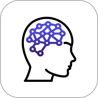
05 Brain
Sleep cycles and those around us
Why share these 5 themes?
I decided on these 5 themes for the focus of the article under the research aspect. I found it important for people to learn about the sleep cycles, which made up the meat and potatoes of the research content, and if they are learning
about the benefits of sleep, they may as well learn how to do it. Along with the cycles, stages, and recommeded hours, it synced well to also share how the brain changes during these sleep processes, patterns, and (what is sleep and
what happens). Additionally, sleep is a mechanism that has a lot going on. It influences and beats in tandem with the many other systems of the body {10/12 including cardiovascular, circulatory, and muscular systems}. Link
Visual Design, UX Design, Sciency Info Graph!
Reconnect to the Game Plan
Reconnect to the 3 overarching main design focuses
within the newsletter project (with the cycles, layout,
and content being sub goals)
What’s up with the users?
Bring it back to the users after setting up the process for
creating the newsletter. Protopersona imagery. = ca
n show a graph here too ! UX
Link , Science Data
1. People spend on average 10 seconds reading a brand email (“Statista” Link) Benefits ~ “People are more likely to remember visual info.” (Link)
2. People spend on average 10 seconds reading a brand email (“Statista” Link) Benefits ~ “People are more likely to remember visual info.” (Link)
People remember around 80% of what they see versus 10% of what they hear and 20% of what they read. (Link)
People process images 60,000 x’s faster than written or typed text. (Link) Or the average time people spend asleep or how much sleep on average is recommended for xyz adults.
People spend on average 10 seconds reading a brand email (“Statista” Link) Benefits ~ “People are more likely to remember visual info.” (Link)
People will spend less than 15 seconds actively reading on a website. (Link) People more strongly remember content when images combine and support the text. (Find Link!)
People process images 60,000 x’s faster than written or typed text. (Link) Or the average time people spend asleep or how much sleep on average is recommended for xyz adults.
People spend on average 10 seconds reading a brand email (“Statista” Link)
People remember around 80% of what they see versus 10% of what they hear and 20% of what they read. (Link)
People spend on average 10 seconds reading a brand email (“Statista” Link) Benefits ~ “People are more likely to remember visual info.” (Link)
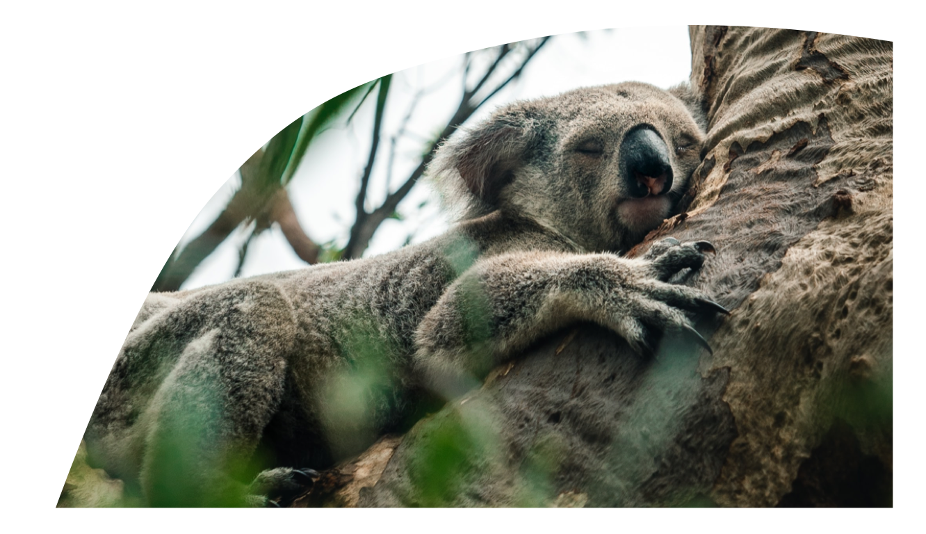
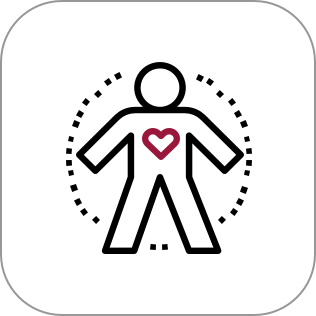
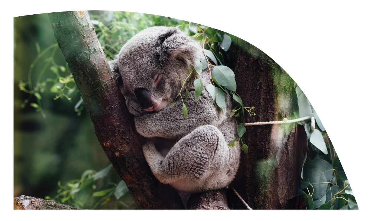
People + Koalas
Users are anyone who would like to learn about sleep, whether people, koalas . . .
How does this benefit them
Sleep
How does this benefit the reader?
How do I achieve it?
How does it work?
Connect to benefits of sleep? For example, sleep has a lot going on. It influences and beats in tandem with the many other systems of the body such as the cardiovascular system, circulatory system, and musculatory system. I could share a blurb here about the benefits. Sleep connected to the protopersona and how it influences a protopersona , so why it is important to learn information on the protopersona.
Pro-topersona imagery. = can show a graph here too ! UX
Users are more general = anybody who sleep applies to, which is everyone and for
anyone who would like to learn about sleep, whether people, koalas . . .
What would a people research graph even look like? [I think this is more like a situation or journey for a user about sleep.
People Research Graph Here!
Users’ hypothesized reaction, focus for the user! User emotions
Connect sleep learns with these elements 1,2 3,
Why would I do this? Why should I read this ? Why do I want to know this ? How does this benefit me? And I I know that benefits how do I do it? And If I am curious and desire to know about how to do it maybe I’ll want to know how it works too. Sometimes knowing how something works helps to make it interesting and like something I’d want to use versus it being vague and disconnected/unrelated to my life.
People spend on average 10 seconds reading a brand email (“Statista” Link) Benefits ~ “People are more likely to remember visual info.” (Link)
Hypothesize
Include a hypothese: I hypothesize that information that “selective information” on sleep shared in a visual way and through an intentional layout will catch users, interest, relate to thier lives, have the potential to be read, have the potential to be utilized, and possibly have the potential to be shared with others too!
Goal
Goal: For people to read the newsletter in their emial [digital letter about sleep!] and for sciencey info to be shared well [reconnect with beginning statement [note seems like that happens a lot. These reconnections to the beginnning or to these areas but with a new vantage point.
Prob. Statement
Funnel this into a so that statement , problem statement. The protopersona needs or wants to know about sleep, so that they can understand how their body works and make smart choices about rest and wakefulness.
HMW
HMW = setting it up for action [Visuals, infographics, layout, almost like confirmation bias with the goals and an understanding of the persona too!]
Let’s Go
Something here to make it 5 and more action! Clearly state how the newsletter will be made as a process and as an edit and as a . . . what do I intend the reader to get from it etc. Anything else?
People spend on average 10 seconds reading a brand email (“Statista” Link) Benefits ~ “People are more likely to remember visual info.” (Link)
Benefits of Sleep for Koalas and People
Starting with a list of benefits, more in-depth examples, and how to accomplish the benefits.
Prioritize Info. what to choose and how to share it. Prioritize Info. what to choose and how to share it. Prioritize Info. what to choose and how to share it. Prioritize Info. what to choose and how to share it.
Benefits of Sleep | Lower rates of heart disease, preventing depression, lower inflammation, greater physical output, increased concentration
Stronger Immune System
Focus | How does sleep help people to stay healthy?
“Keep the body’s defenses strong + capable. During rest, you create protective antibodies and cytokines, which combat illness. You also build up your energy so you can fight bugs and stay healthy.”
+ + + Energy
Focus | The energy you get from how you sleep and how you feel from your sleep.
“Sleep quality, quantity, and satisfaction impact how energized you feel for the day. Increased sleep satisfaction = stronger feelings of energy and positive emotions.”
Social and Emotional Skills
Focus | Rest connects to people’s ability to recognize how other people feel.
“When you are well-rested, you are better able to recognize emotions in other people. Getting good sleep sustains your emotional empathy, so get some good rest and emote!”
Koala 2
Bookend the section with ways to fall asleep, Zzz
Once they know, how can they actively put the information into the ways in which they prepare for sleep, stay asleep, and act to take care of their bodies, mind, and relationships with how they rest and move into their day.
Heres’s how to do it | Less noise, cooler temperatures, consistent time fro bed, get a good pillow, active during the day
People remember around 80% of what they see versus 10% of what they hear and 20% of what they read. (Link)
Creation and Sleep | REM + NREM Cycles
What happens during sleep?
Lorem Ipsum Dolores
Once people fall asleep, many things occur, such as the brain, body, waves, moving through different stages and cycles throughout the time people are asleep. During the shifts in sleep patterns throughout the night, the brain moves through different wave patterns, and during this rest, memories are created and healing occurs.
The 4 stages of sleep that you move through through your night of sleep cycle through REM + NREM sleep during the hours of rest and with that the amount of REM + NREM cycles you move through.

Focus
Time Info Here
Stage Info Here
Cycle Info Here
Infographic 1
P1 Of Visual Representation
Part 1 : Stages etc. a lot of research here = refined it and
concentrated it into the infographic where you can take in 5ish different sections on the stages in 1 block linked together into 4 image blocks for 1 visual on sleep - the sections and subsections chunked together and it works since they all have different values but similar sections types. From beginning to end, these are the 5 types of sleep stages . . . note, there used to be 4 but now it is more common to know the sleep stages as 5 (link).
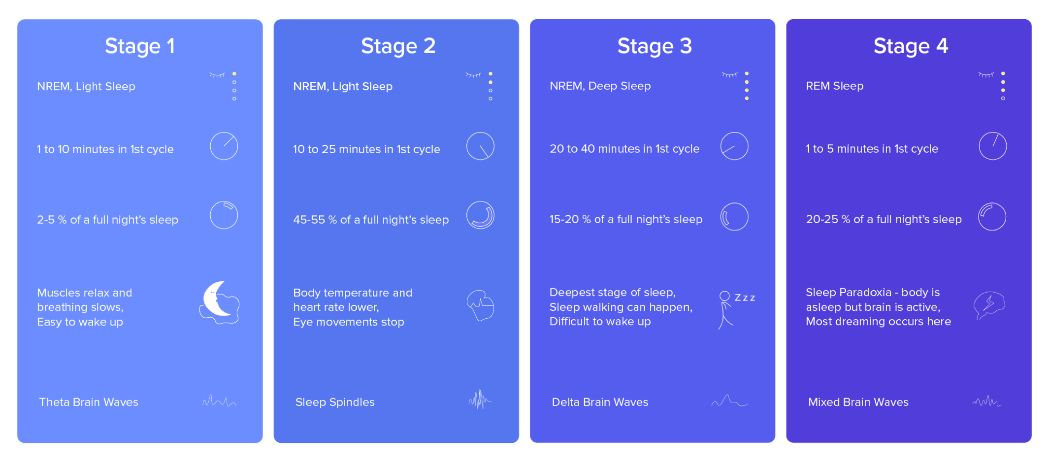
Visualize 4 in 1.
NREM | Non - Rapid Eye Movement
Lorem Ipsum, Lorem Ipsum, Lorem Ipsum, Lorem Ipsum, Lorem Ipsum, Lorem Ipsum, Lorem Ipsum, Lorem Ipsum, Lorem Ipsum, Lorem Ipsum
REM | Rapid Eye Movement
Lorem Ipsum, Lorem Ipsum, Lorem Ipsum, Lorem Ipsum, Lorem Ipsum, Lorem Ipsum, Lorem Ipsum, Lorem Ipsum, Lorem Ipsum, Lorem Ipsum
People process images 60,000 x’s faster than written or typed text. (Link) Or the average time people spend asleep or how much sleep on average is recommended for xyz adults.
Visualize 4 in 1
Sleep Stages in numbers
Lorem ipsum dolor sit amet, consectetur adipiscing elit, sed do eiusmod tempor incididunt ut labore et dolore magna aliqua. Ut enim ad minim veniam, quis nostrud exercitation ullamco laboris nisi ut aliquip ex ea commodo consequat.
% in Each Stage of Sleep
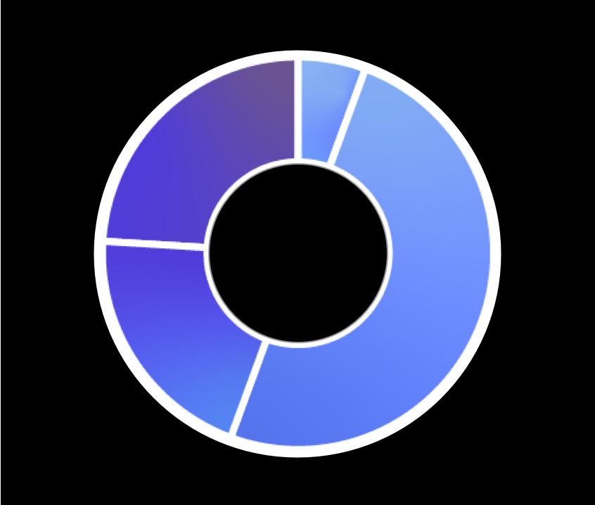
People process images 60,000 x’s faster than written or typed text. (Link) Or the average time people spend asleep or how much sleep on average is recommended for xyz adults.
Visualize 4 in 1.
Text Content | Tone
It all begins with an idea. Maybe you want to launch a business. Maybe you want to turn a hobby into something more. Or maybe you have a creative project to share with the world. Whatever it is, the way you tell your story online can make all the difference.
Visual Icons | Imagery
It all begins with an idea. Maybe you want to launch a business. Maybe you want to turn a hobby into something more. Or maybe you have a creative project to share with the world. Whatever it is, the way you tell your story online can make all the difference.
People spend on average 10 seconds reading a brand email (“Statista” Link)
Email Read.
“Final” Newsletter
Bringing it together and send.
Lorem ipsum dolor sit amet, consectetur adipiscing elit, sed do eiusmod tempor incididunt ut labore et dolore magna aliqua. Ut enim ad minim veniam, quis nostrud exercitation ullamco laboris nisi ut aliquip ex ea commodo consequat. sit amet, consectetur adipiscing elit, sed do eiusmod tempor incididunt ut labore et dolore magna aliqua.
Lorem Ipsum
Lorem Ipsum
Lorem Ipsum
Lorem Ipsum
Lorem Ipsum
sit amet, consectetur adipiscing elit, sed do eiusmod tempor incididunt ut labore et dolore magna aliqua. Ut enim ad minim veniam, quis nostrud exercitation ullamco laboris nisi ut aliquip ex ea commodo consequat.
Possibly share about text compression here as well! Steps to minimize the email send but still keep it in a good visual quality without a folder being opened for a Google Drive link. !!!
People process images 60,000 x’s faster than written or typed text. (Link) Or the average time people spend asleep or how much sleep on average is recommended for xyz adults.
What guided the info. read’s message?
Article Resources and Additional Reads if you’d like to explore more
Sleep.
Sleep affects everyone and is for the 66 percent of the time most of us are awake each day, 33% of the time of our body is resting in sleep or daydreams.
Sleep
Additionally, sleep is a mechanism that has a lot going on. It influences and beats in tandem with the many other systems of the body {10/12 including cardiovascular, circulatory, and muscular}.
Sleep
Sleep is something relevant to everyone and with the understanding of science and research and info. people have a 25% tendency to be aware or make choices based on that newly digested information.
Stress.
Stress affects 100% of humanity, and 89% of it had been noted to be related to sleep disturbances, adverse effects, and obstructions.
Stress
Stress can also be related to diet, xyz, and pyx which also influences a person’s sleep patterns.
Stress
One of the most impactful ways that a person can help their stress levels to subside or maintain a better wave length is to sleep well, eat, well, breathe well, exercise well, and socialize well.
With Sleep + Stress being something to work on together or that influences each other, it was a topic that was far reaching in terms of people’s relationship to the material and to how they may perceive sleep and to how they may choose to influence sleep. Their own sleep patterns, and the sleep patterns of those around them. On a personal note, I think it is fun to learn about the why behind things.
With Sleep + Stress being something to work on together or that influences each other, it was a topic that was far reaching in terms of people’s relationship to the material and to how they may perceive sleep and to how they may choose to influence sleep.
People will spend less than 15 seconds actively reading on a website. (Link) People more strongly remember content when images combine and support the text. (Find Link!)
Whatever it is, the way you tell your story online can make all the difference.
Reflection . . . Desing process, themes and schematic networks. A summary recap other points adn links to resources. Joke recap
That’s A Snooze. Onwards into the light!
Next Steps
01.
Goal: It all begins with an idea. Maybe you want to launch a business. Maybe you want to turn.
How: It all begins with an idea. Maybe you want to launch a business. Maybe you want to turn.
User Hypothesis + Support (Think whiteboard challenge recap!): It all begins with an idea. Maybe you want to launch a business. Maybe you want to turn.
02.
Goal: It all begins with an idea. Maybe you want to launch a business. Maybe you want to turn.
How: It all begins with an idea. Maybe you want to launch a business. Maybe you want to turn.
User Hypothesis + Support (Think whiteboard challenge recap!): It all begins with an idea. Maybe you want to launch a business. Maybe you want to turn.
03.
Goal: It all begins with an idea. Maybe you want to launch a business. Maybe you want to turn.
How: It all begins with an idea. Maybe you want to launch a business. Maybe you want to turn.
User Hypothesis + Support (Think whiteboard challenge recap!): It all begins with an idea. Maybe you want to launch a business. Maybe you want to turn.
Wrap it up.
Brining the focuses into the design with the 5 themes with the emotional feedback response cycle with the other 3 focuses of infographics, research, and hierarchy (what are these technically called?)
Note on the conflict of user testing and research along with the decision to not get a user feedback in order to benefit the users more with a read that is fun versus over the top sciencey. This user perspective though was a lense that was applied to creating the newsletter, and with the protopersona in mind, the hypothesize of xyz is theorized to be met with the above goals being explained with the suer in mind. Whiteboard challenge but with more time and applied to a fun project.
Emotional cycle recap, sleep cycle info recap = hopefully they learned something fun about sleep here too and moving into a new day transition!
Emotional Cycle!
Emotional cycle recap, sleep cycle info recap = hopefully they learned something fun about sleep here too and moving into a new day transition!
People spend on average 10 seconds reading a brand email (“Statista” Link) Benefits ~ “People are more likely to remember visual info.” (Link)
Users = All People + Koalas
Return, good morning, back to the objective, here is a hot beverage (Connect 1,2,3) Returning back to the objective! Rested, cleaned, connected, learned, and ready for this day. “Oh cool, that was not too bad and the veggies were tasty.”
“Sleeping is no mean art; For its sake one must stay awake all day.”
— Friedriche Nietzsche