
Client project, San Francisco Startup
Wescover
Project
01 — Team
Kendra Fremont & Rick Holladay
02 — My Contribution
Information Architecture lead, research, usability testing, messenger portal with the Buyer interacting with the Creator (aristist, designer, seller).
03 — Tools
Figma, Keynote, Adobe Illustrator, Google Forms + Sheets, Lucidchart, Miro, Draw.io
Wescover Background + Objective
A startup based in San Francisco that showcases artists’ work on their site. Initially, a place of discovery to find unique items and learn more about artists, they have developed a marketplace for creatives to sell their products and for people to purchase custom made pieces.
Problem
The Wescover Messenger Portal currently does not allow images and attachments to be uploaded to the system. So, Buyers and Artists, or Creators, would leave Wescover to communicate through the Creator’s personal email.
Goal
Focus on finding ways to keep the Buyer and Creator on Wescover, so product inquiries and orders begin and are finalized through them.
Look at ways to include attachments on the messenger system and keep the users engaged through the process.
Design a solution to keep users interacting with Wescover, so Wescover’s initial emphasis as a place of discovery can continue to develop into a marketplace.
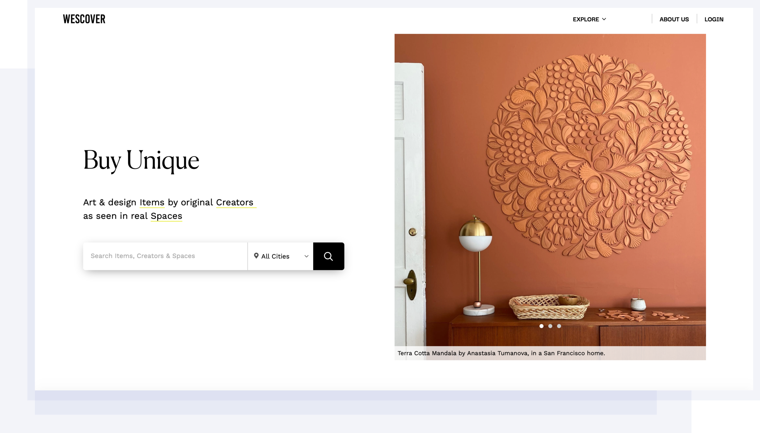
Wescover Site
Wescover Users - The Buyer and Creator
Emilia + Taylor
The Buyer wants to understand the flow of the site and feel that the site is trustworthy + credible.
Emmitt
The Creator wants to be able to express themselves and manage their business.
Emilia

Hospitality Designer, Buyer
motivation: to find one of a kind pieces for her projects
frustration: Lack of consistent communication with creators
Taylor

College Student, Buyer
motivation: Purchase a handmade gift for her parents.
frustration: Unclear on how to reach out to the Creators.
Emmit

Painter, Creator
motivation: Tell his story through art and sell his products online
frustration: Managing messages and business logistics.
Insights from Interviews
01 — Buyer
Their goal is to have enough information to understand how to order a product displayed in a clear format.
02 — Creator
Their goal is to send information like attachments, to the buyer, create online transactions, and increase their visibility.
03 — Stakeholder
Her goal is for a design that accounts for the interactions a Creator and Buyer may have and include the ability to upload information so that they can proceed with an order to promote a marketplace exchange.
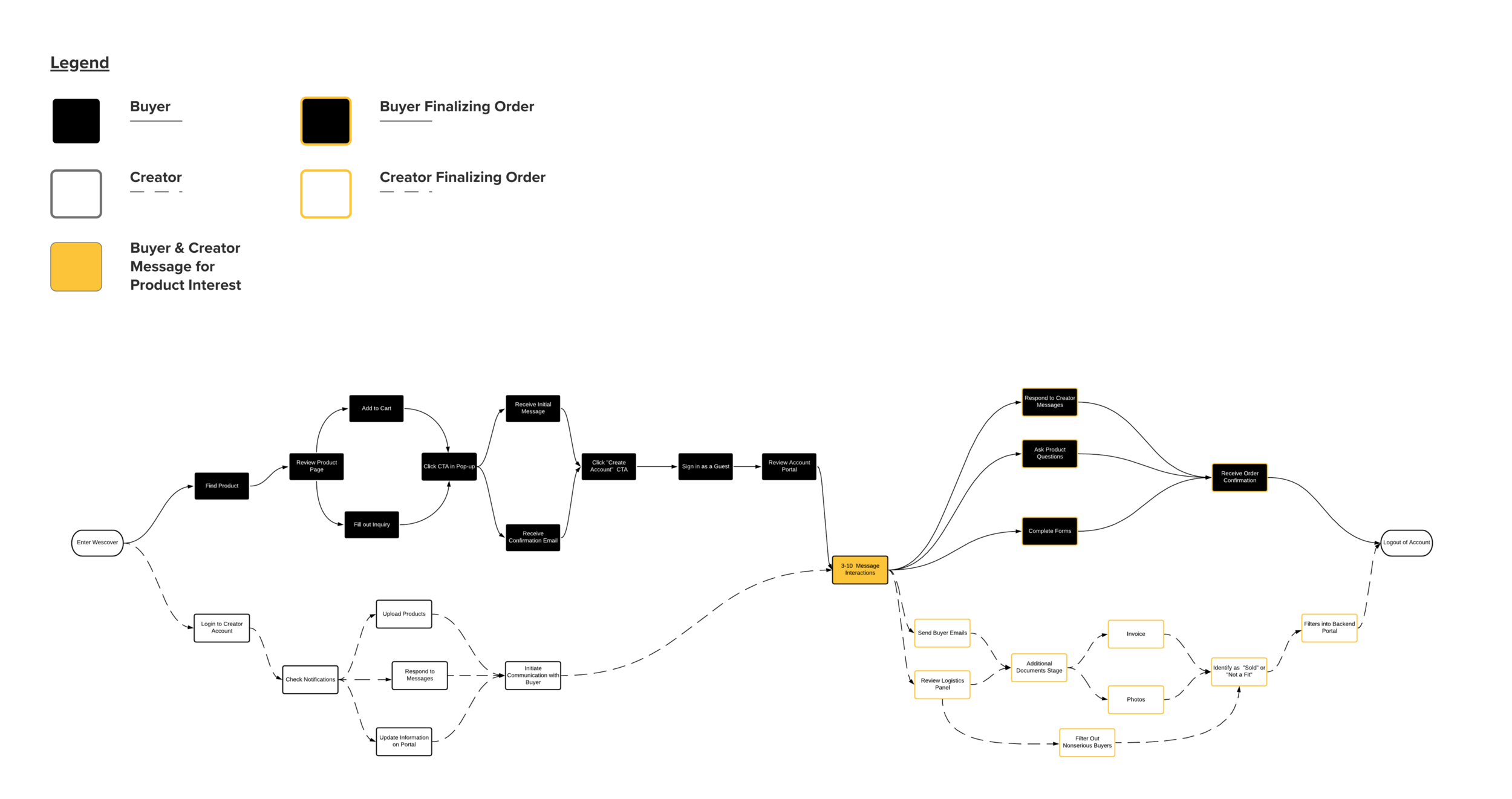
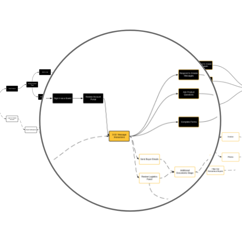
Dual User Flow for the Buyer + Creator
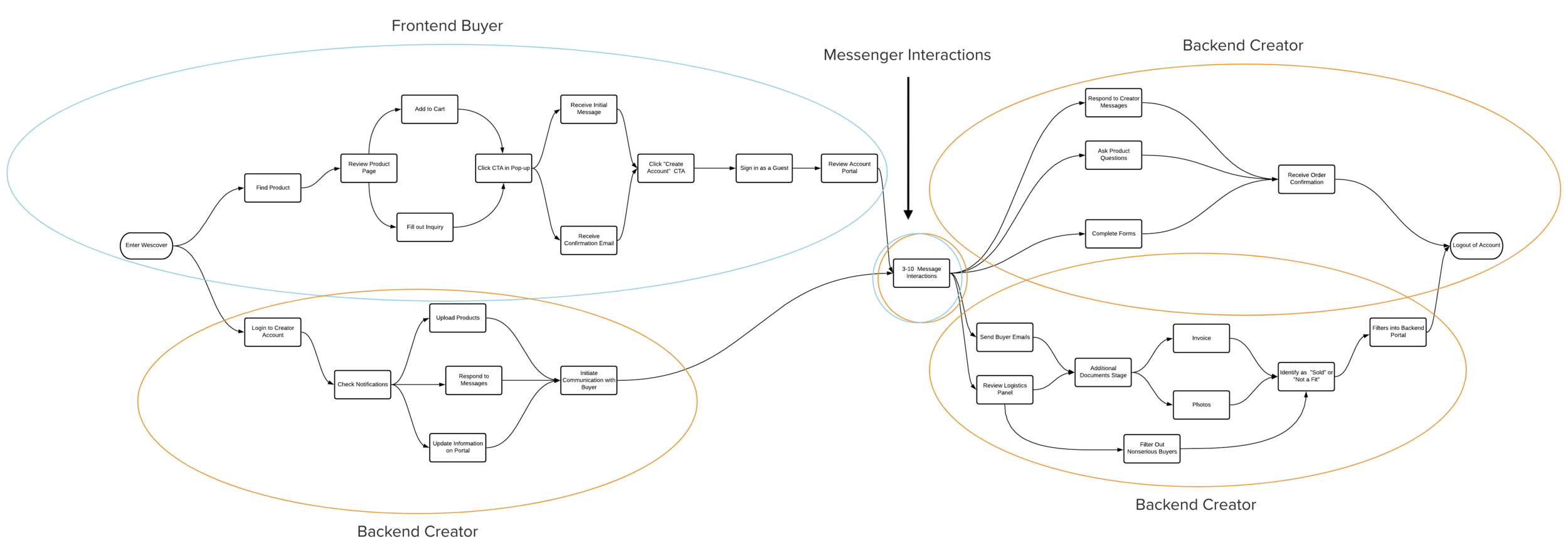
The dual user flow takes into account the two main groups of people who are interacting on the Wescover site. The Buyer and the Creator move through different user paths as they enter the website, Inquire about unique products, log onto their Creator account portal, and receive notifications. This flow is the blueprint for the different designs that take into account the Buyer looking for unique items on the site, the interaction between the Buyer and the Creator talking to each other about a product, and the Creator moving through the Dashboard to send invoices, create calendar reminders, and view Buyer messages.
Dual User Flow for the Buyer + Creator
The Main Points:
The dual user flow takes into account the 2 main groups of people who are interacting on the Wescover site. The Buyer and the Creator move through different user paths as they enter the website, Inquire about unique products, log onto their Creator account portal, and receive notifications. This flow is the blueprint for the different designs that take into account the Buyer looking for unique items on the site, the interaction between the Buyer and the Creator talking to each other about a product, + the Creator moving through the Dashboard to send invoices, create calendar reminders, + view Buyer messages.
This flow is the blueprint for the different designs that
into account the Buyer looking for unique items on the
into account the Buyer looking for unique items on the
into account the Buyer looking for unique items on the
into account the Buyer looking for unique items on the
into account the Buyer looking for unique items on the
into account the Buyer looking for unique items on the
This flow is the blueprint for the different designs that
Lorem Ipsum This flow is the blueprint for the different designs that
into account the Buyer looking for unique items on the
into account the Buyer looking for unique items on the
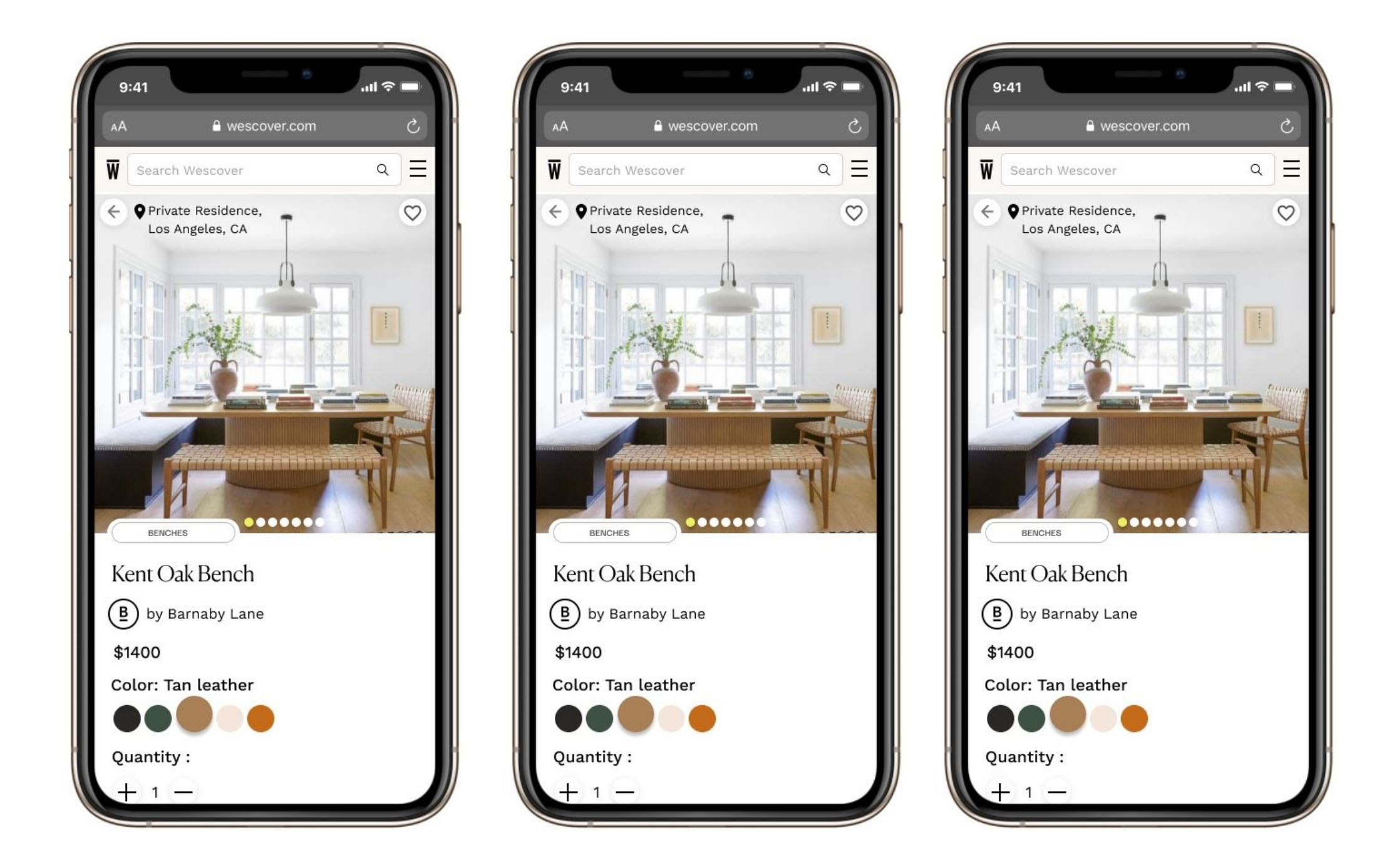
Frontend Buyer Mobile Screens
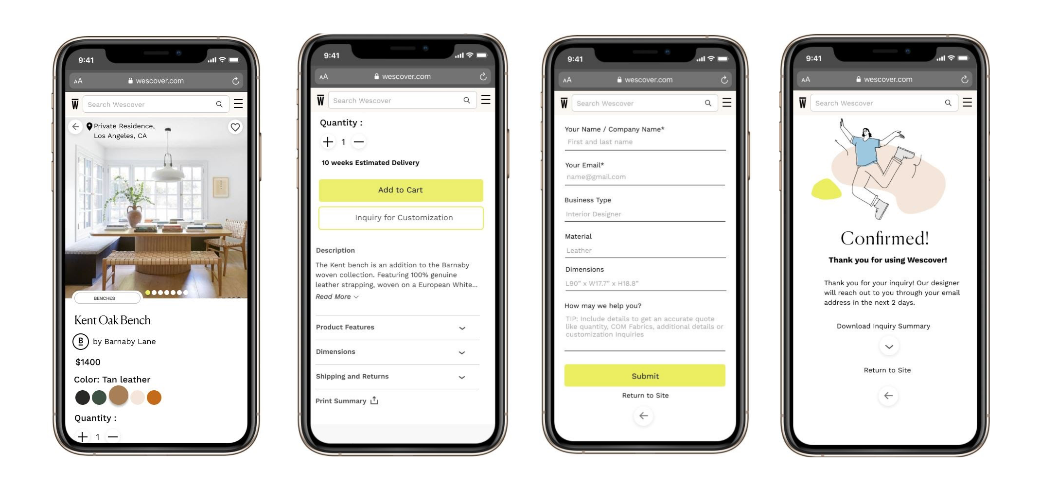
Frontend screens create a clear product view with organized content that is accessible for new and returning users. The buyer is able to view the product page, move through the “Inquiry for Customization” CTA, submit their product form, and receive a confirmation that the Creator has been sent a product inquiry.
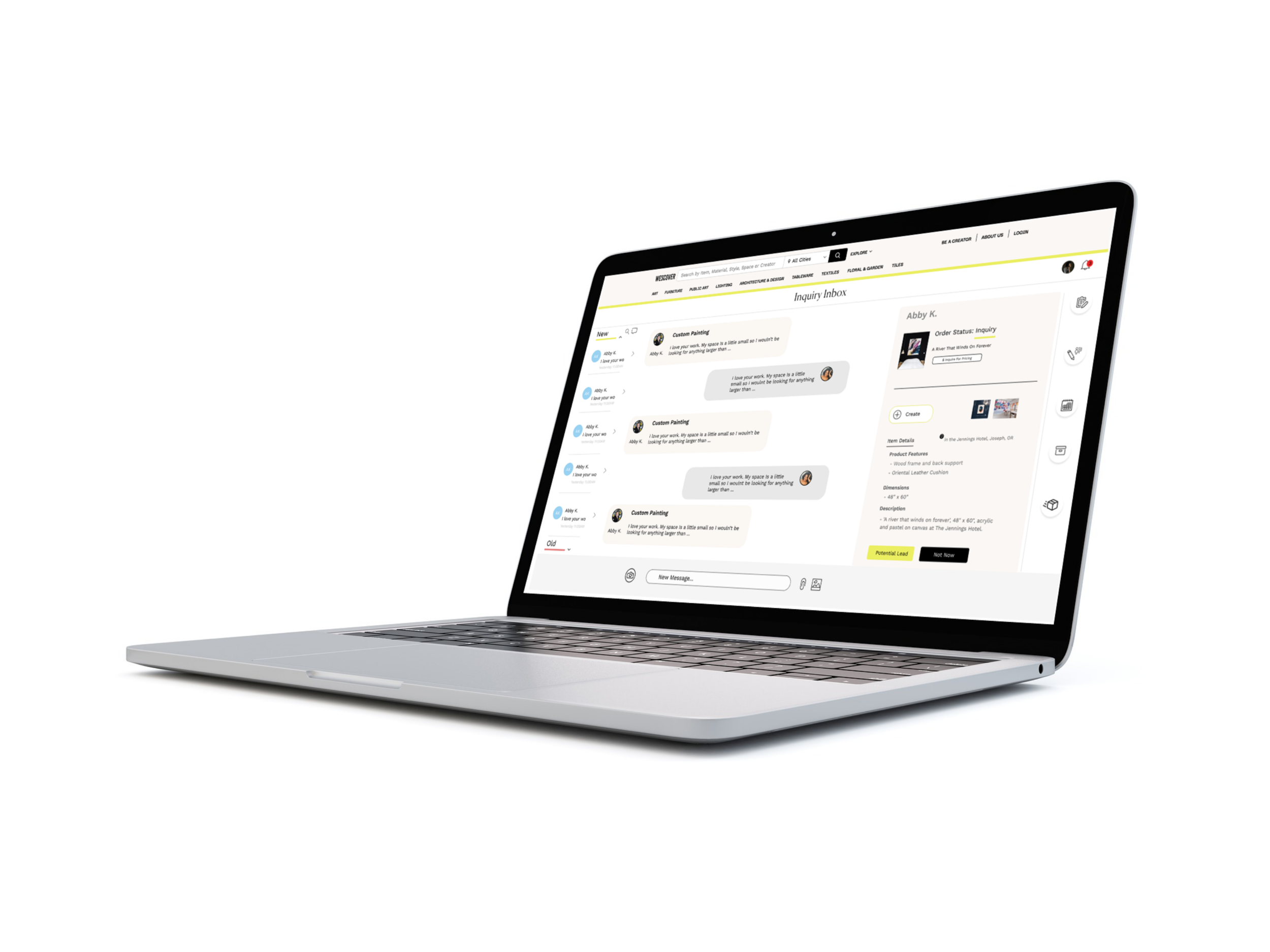
Messenger Portal Versions
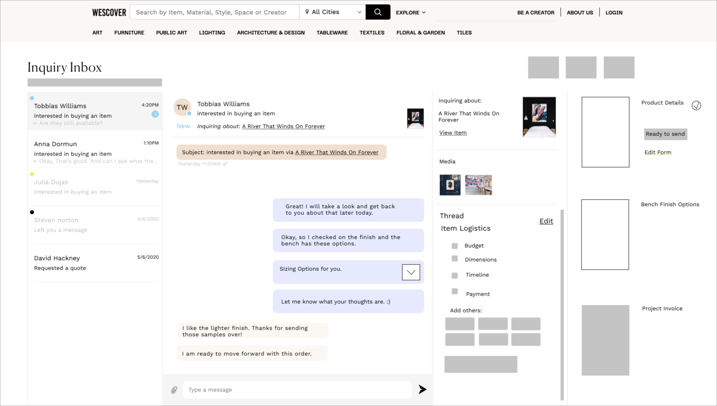
Original Draft
A workstation is added on the right for Creator’s to access attachments, such as invoices and product forms. “Item Logistics” is included as a checklist to note aspects of a custom order with informal messages or a more formal invoice.
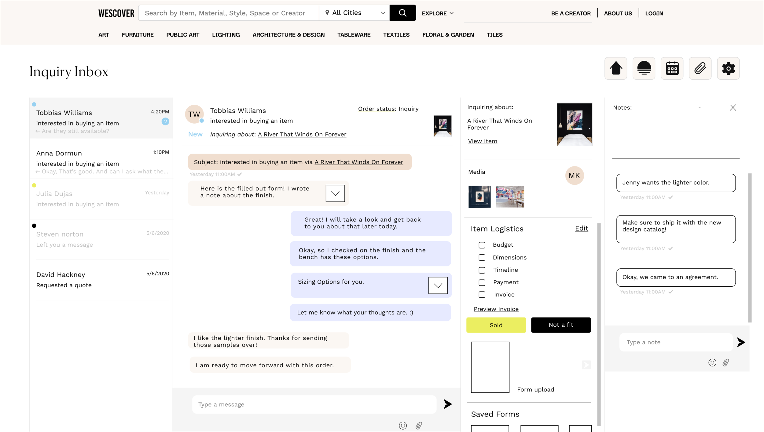
Before Testing
This was the complete message portal with an area to write notes about the customer inquiry, tabs at the top to return to the Creator Dashboard, edit uploaded products, mark dates on a calendar, add attachments, and review settings.

After Testing
Notes and other added features can be accessed through tabs. The design aligns with the visual design of the Creator Dashboard. There is more space to view messages, and the relevant Buyer information and CTAs are grouped to the right.
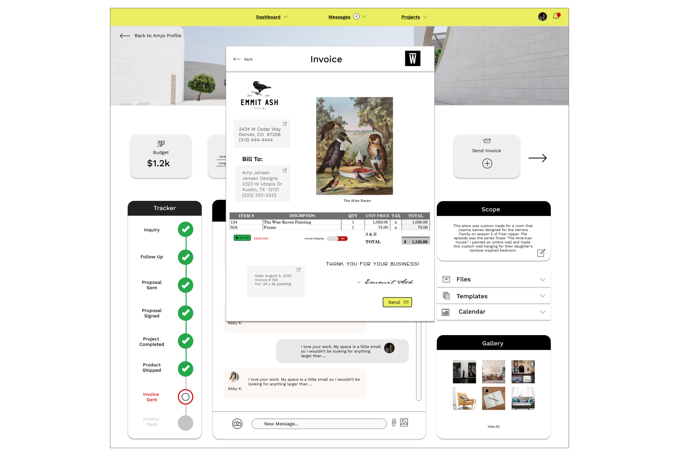
Backend Creator Account Portal
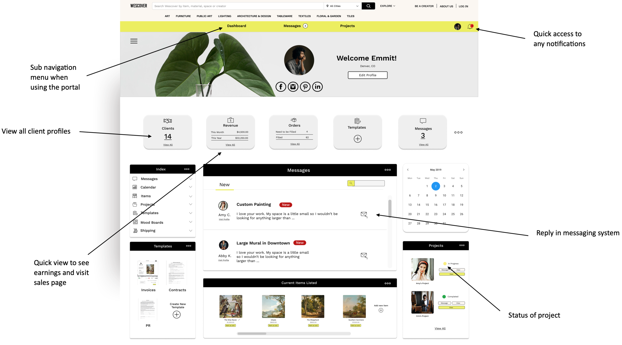
Creator Dashboard
Features accounted for:
Messages
Notifications
Templates
Notes
Calendar
Invoices
Usability
3 Testing Sections for 3 Prototypes
1. SUPR-Q for the Buyer on Mobile
Do a before and after screen
The SUPR-Q score increased from the original mobile site to the prototyped mobile site by 1.125 points, which shows an increase in credibility, usability, and trustworthiness. Normally, this is scaled to a percent. Because we did not have access to a SUPR-Q calculator, we scored this to the raw score versus ranking it as a percentile in comparison to other SUPR-Q scores.
6 out of 6 users had improved responses
2. Contextual Inquiry for the Creator on the Messenger Portal
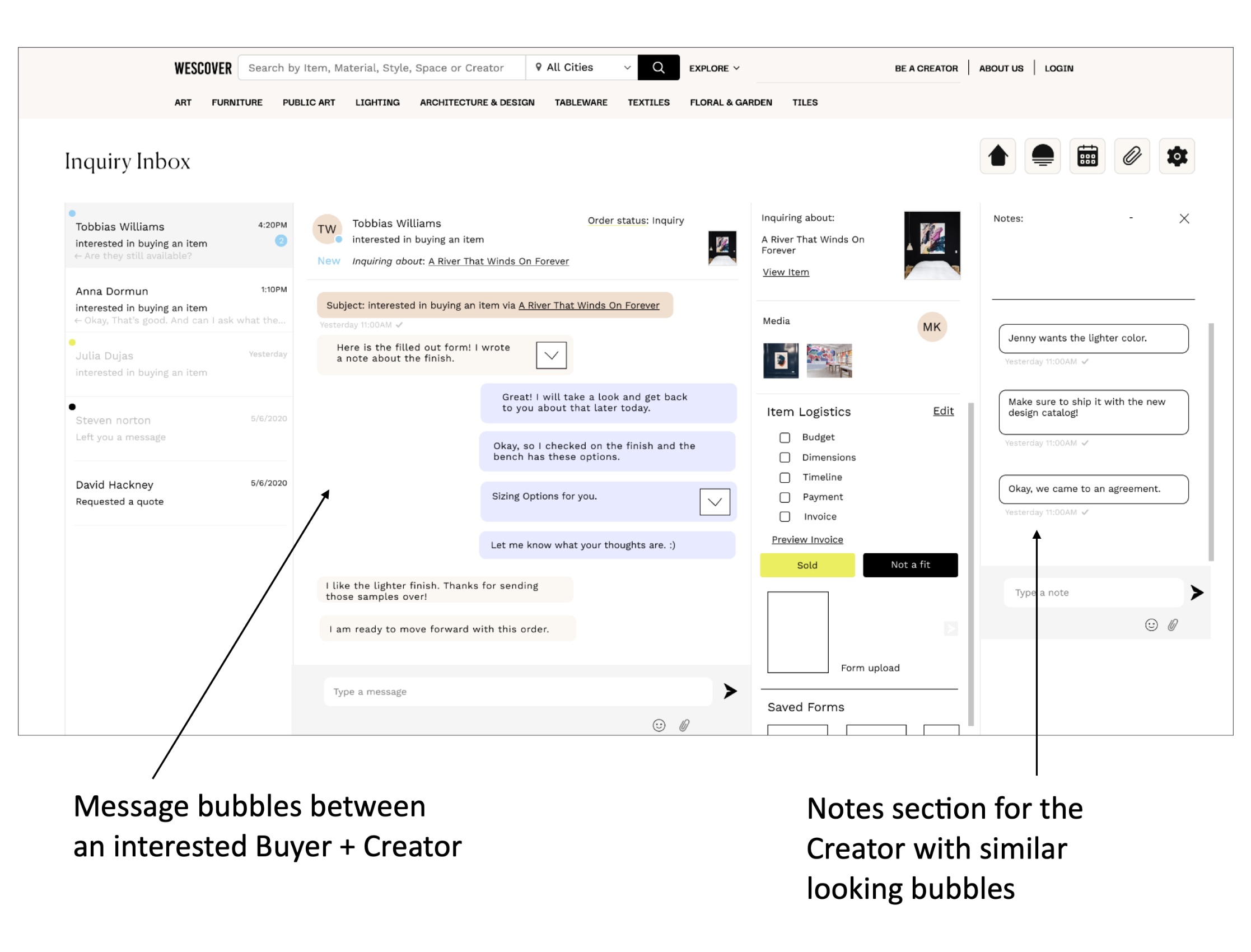
After laying out features onto the original Wescover design, I inquired about the layout. The feedback was that the notes section seemed confusing because of the text bubbles being similar to the messenger bubbles. Because of these insights, the messenger navigation changed so that notes and other features could be minimized with side tabs.
“ Lorem Ipsum, Lorem Ipsum, Lorem Ipsum, Lorem Ipsum, Lorem Ipsum.”
3. SUS for the Creator on the Dashboard
The average SUS score from responses gathered by 6 different participants is 53.33. This “Marginal” score shows that people thought that is “ok” to use with room for improvement. With a high score of 75, a portion of user’s found the prototype acceptable, nearing the high range of a SUS score. However, there are 2 very low scores of 35, which show that some people found the prototype difficult to use. This may be because the people who reviewed the Dashboard were a mix of users with some who were familiar with account portals and some who had no experience with account portals.
“ Lorem Ipsum, Lorem Ipsum, Lorem Ipsum, Lorem Ipsum, Lorem Ipsum”
From Rachely
“It was great to work with Christine (and her team) as part of the GA class, looking at our messenger portal design. They were very committed to the project and shared new design perspectives and visuals that helped us build our product infrastructure ."
- Wescover Stakeholder
Next Steps . . .
The Team tackled the messenger system by looking at all 3 parts of the process from the initial start of an inquiry, to the interactions within the messenger portal, to the Creator dashboard that managed their information. Moving forward, we would want to:
01 Test the iterated versions that we completed. We received initial scores and made changes, but we would like to compare new scores from the original designs.
02 We would like to see how the messaging system can continue to evolve with a focus on changes geared towards the interactions between creator and buyer and how to align the designs towards a Wescover marketplace.