
Wicked Good Books
Concept project, Local bookstore in Salem, MA
What
The goal of this project was to revamp a local bookstore's website into a more modern and better structured site. Research and information architecture, such as sitemaps, content inventory, and task analysis, were used to learn how the site functioned well and how it could be improved. At the end of 2 weeks, I presented a redesigned website with 22 new screen states that took into account pain points and key insights.
Background
The local store's website is Wicked Good Books (WGB), a bookstore in Salem, MA, that sells a mix of mainstream items, specific books on Salem's history, horror and mystery novels, and gift items. They also sell their own product line and emphasize their connection to their community. Their site was disorganized and lacked a structure that could guide users to easily and intuitively purchase books. They could highlight their niche and local market with a more modern visual look that still speaks to their distinctive brand.
Wicked Good Bookstore Site
Initial Site Research 👀
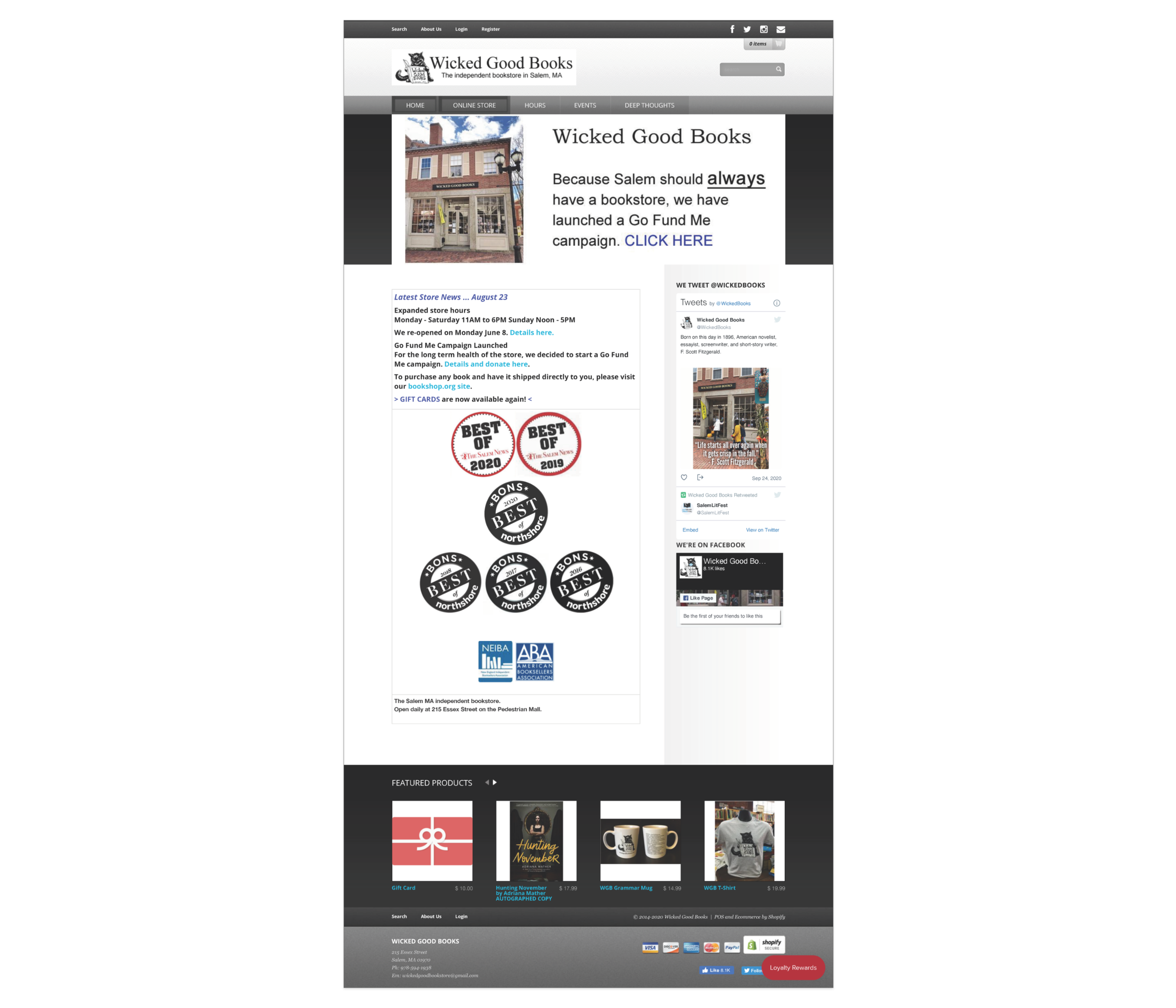
I explored the WGB website to find patterns in their current design. My initial impression was that the site aims to cater to their local community but that their current layout and navigation makes moving through their site difficult with unclear categories and 404/Not Found Pages.
Themes that were emphasized through their site were a focus on connecting to their local community, showing their unique identity, and sharing their history to Salem, MA.
Themes

Local Community
Unique Identity
Salem’s History
For example, they show a lot of products on their niche market and brand, but they do not seem to highlight their ability to sell books online. Their site content leans toward sharing store updates on the homepage, showcasing social media involvements and posts, and communicating upcoming events.
As a user, I may be more interested in how I can purchase a books versus learning about the store, but as a local store, they may value people knowing about their one of-a-kind-shop and community versus just selling books.
Original Homepage
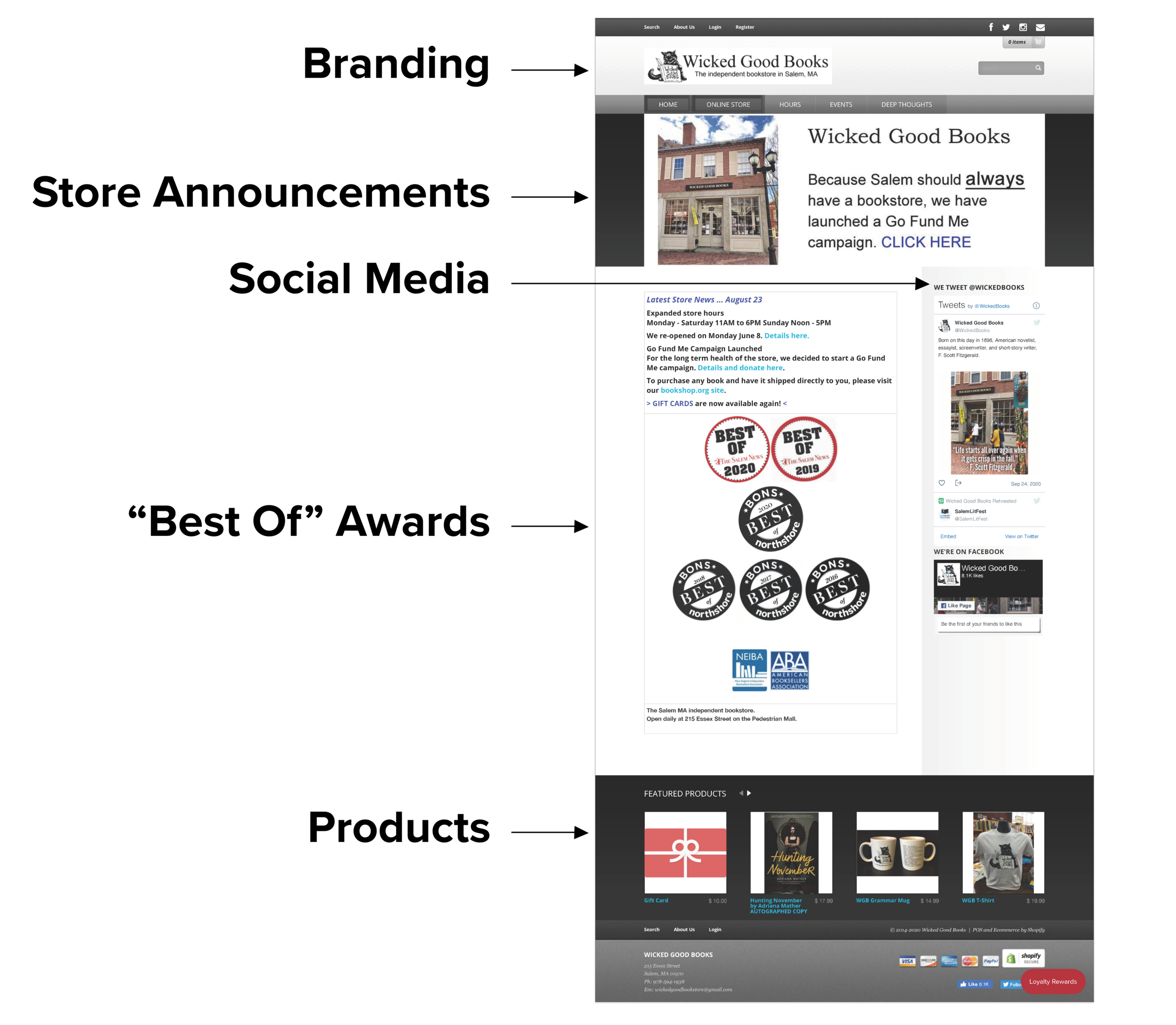
Key Points
The homepage captures an idea of who they are and what they value - community, connection, identity - more so then what they do - sell books and other items.
Current Navigation
The "Online Store" navigation prioritizes WGB products and their niche items first and the majority of their books, under the "All Products" label, last. So, the site's navigation could be better organized and the site could better highlight WGB's ability to sell books online.
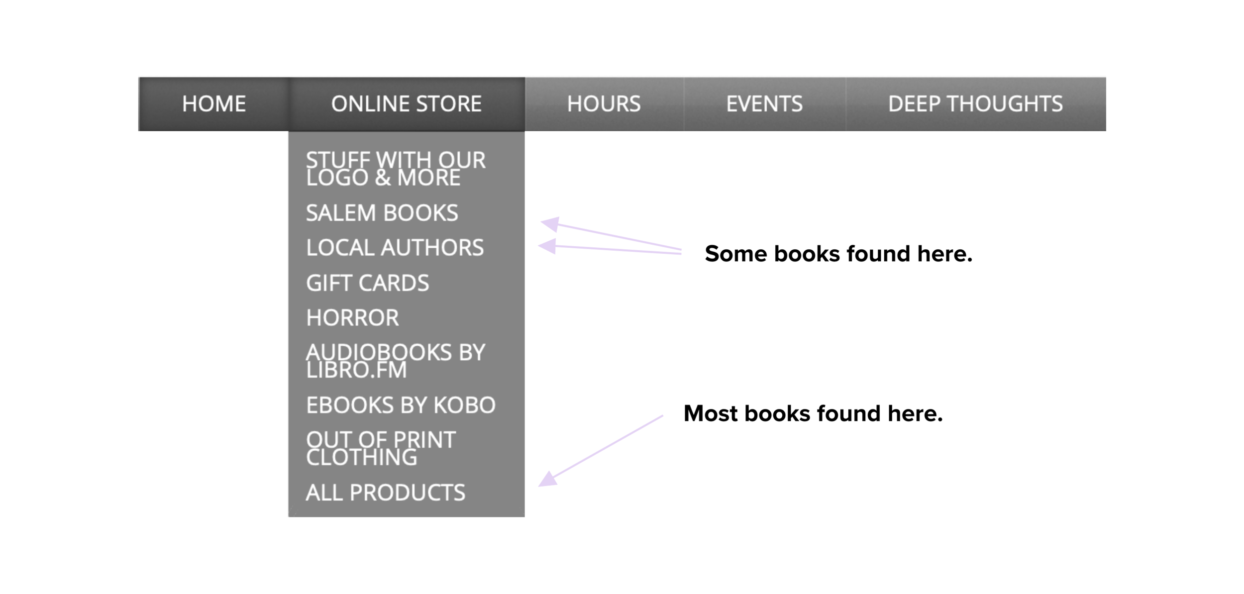
“All Products” contains the most inventory of books but it is listed last.
Competitive and Comparative Analysis
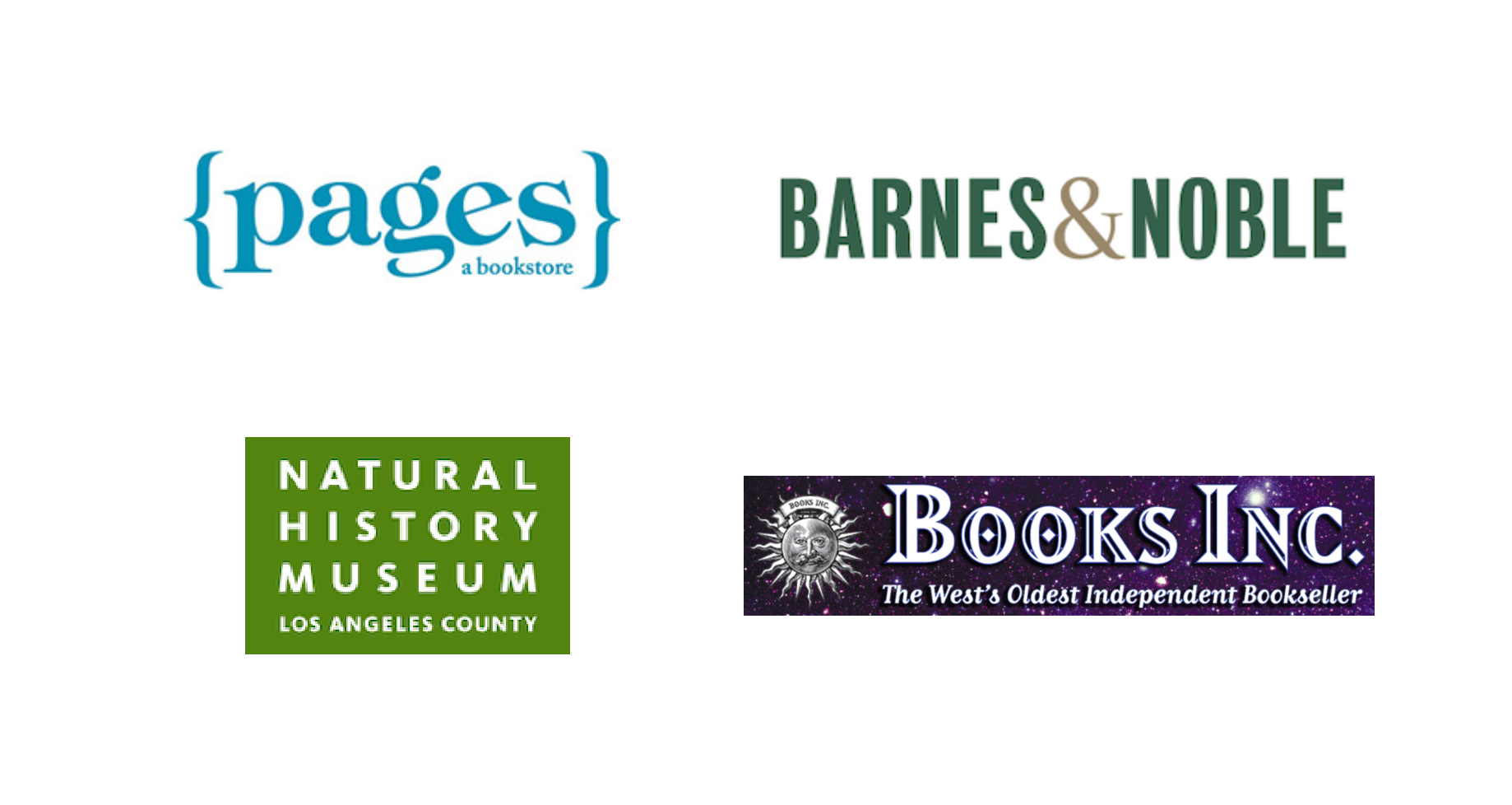
Next, I compared WGB to other stores and websites. Barnes and Noble and 2 local bookstores, Pages and Books Inc., were the first sites I looked at to compare how they organized their navigation and represented their store with visuals and site layout. I also researched the National History Museum to see how they presented their navigation for museum visits, education resources, and unique visits, because WGB has a focus on their building's history in Salem.
Next Stop, User Research
Now, it is time to interview local shoppers, bookstore enthusiasts, and online buyers to learn more about what they would value in a site like WGB. To narrow in on how to best design for both the user and WGB, I asked about their perceptions on brand identity, views on community and connection with local stores, online shopping and book preferences, and interest in knowing about the history of unique places.
Affinity Map Insights
Users care about:
* Ethics and ethos of smaller businesses
* Quick and convenient checkout process like Amazon
* Connection with people
* Face to face interactions
* Exploration of interesting places and items
* Learning about the history of places if they have the time to
* Discovery of unique and interesting products
* Experience of exploring bookstores in person
* Websites that are safe, help find what you want, and are easy to navigate
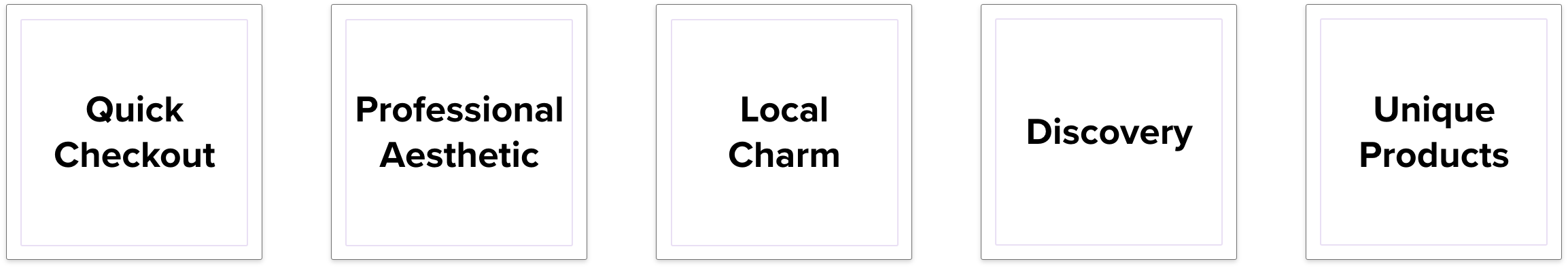
Summed up into themes, the user' s positive experience of local shops prioritize:
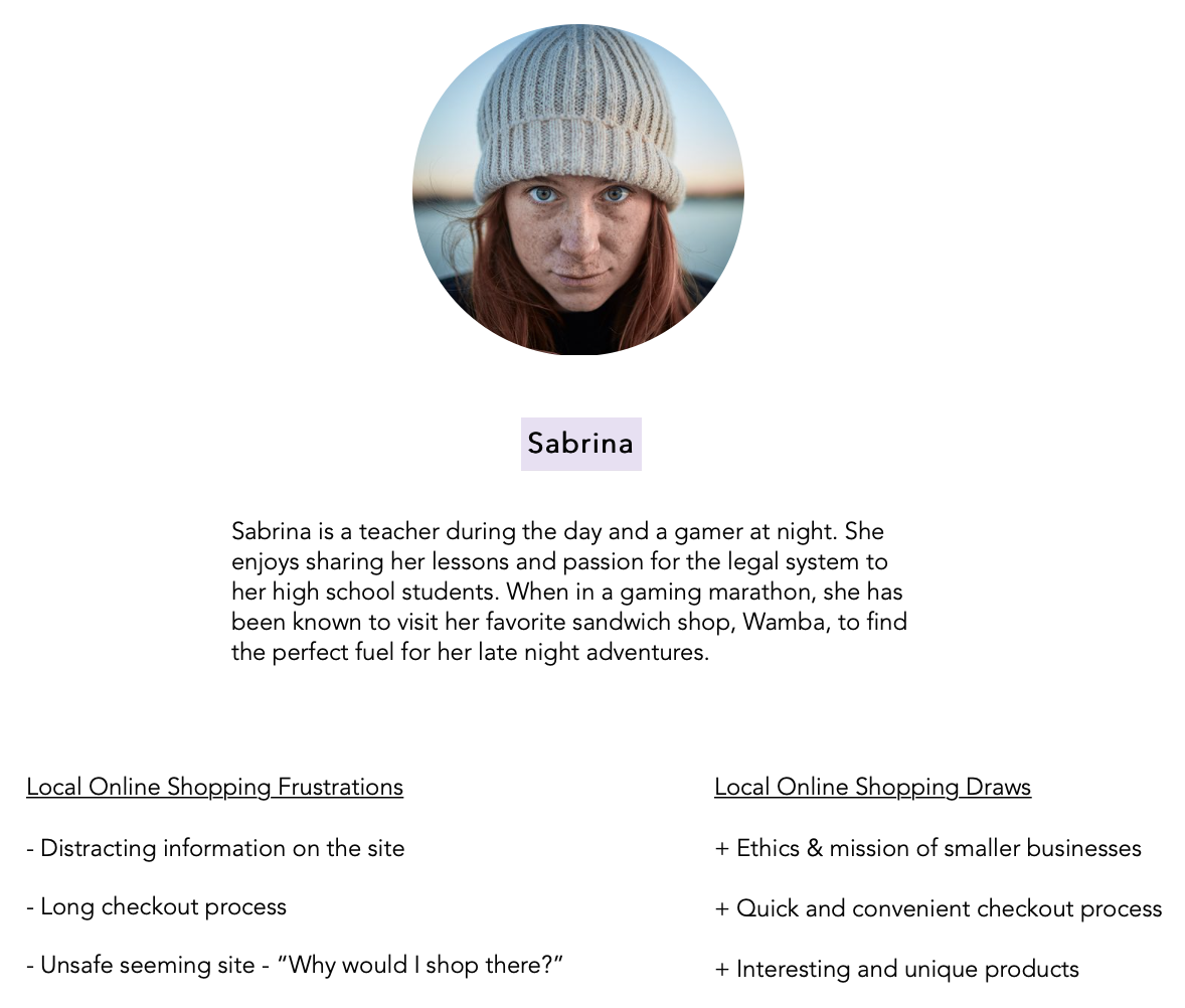
Persona
With this user feedback, the primary persona for this website redesign was created.
Journey Map
Sabrina travels through the WGB site to buy a book, and along the way, she interacts with products, like autographed books, forms, such as billing and shipping, and processes, such as picking a book to buy and moving through the checkout phase of her shopping experience.
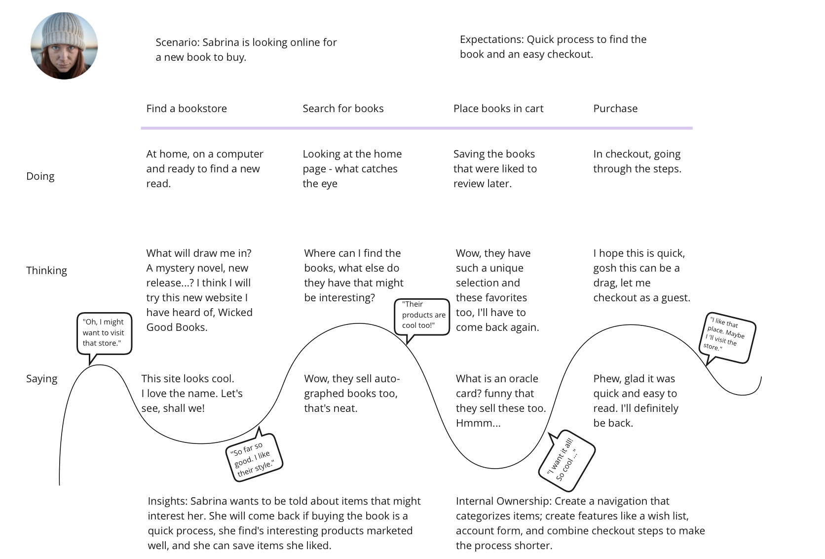
Journey Map Insight = A wishlist may keep the user interested and get returning customers to keep visiting their website.
A wishlist was a feature that Sabrina may find useful in keeping track of books and other products she liked. This feature would also organize her product selection and be an incentive to visit the site again. ⭐️
User Flow
A key point from Sabrina's user flow showed that as she moved through the WGB site, there was a hotspot where she may be motivated to to stay online to browse products.
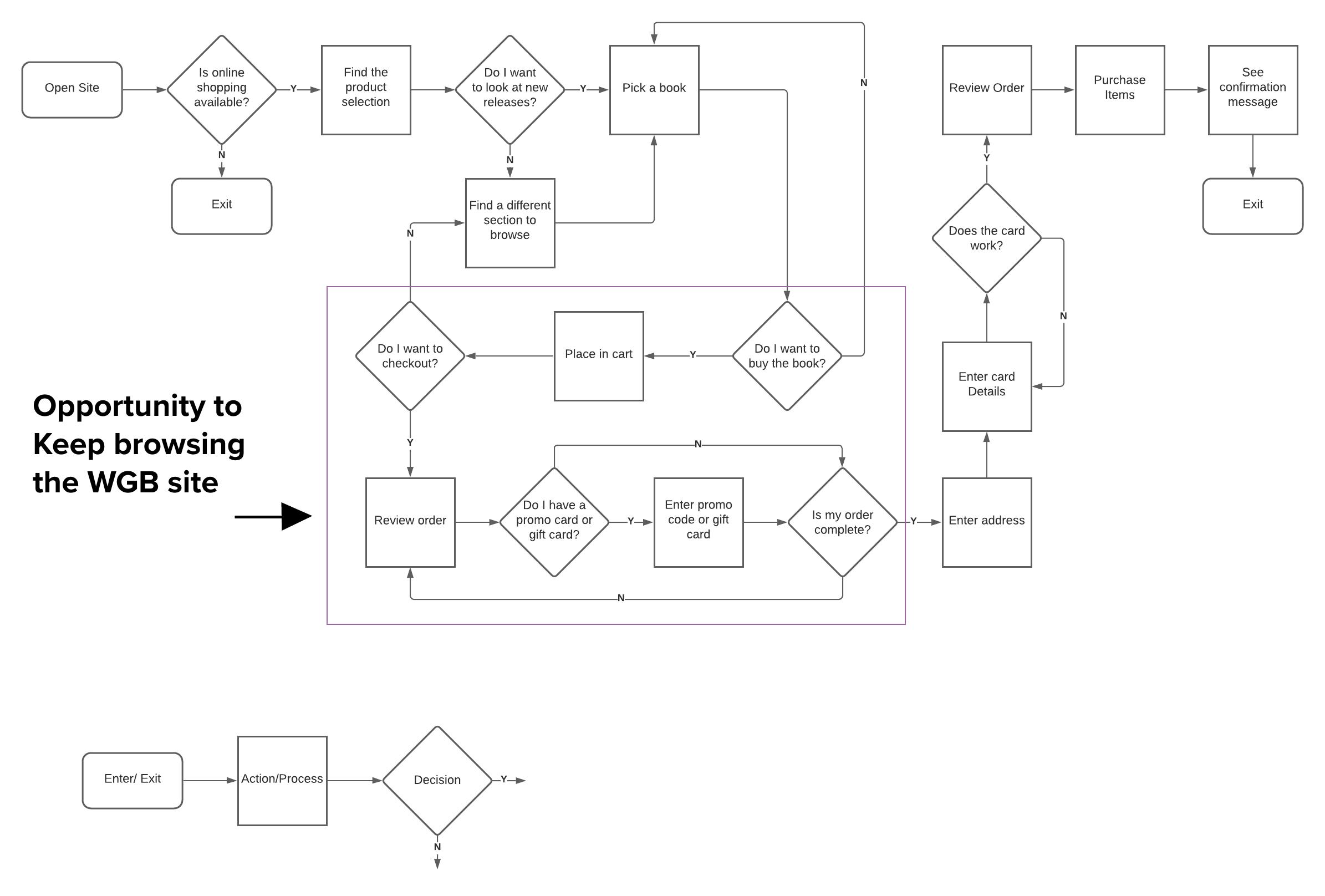
The best place to motivate Sabrina with new content is when she questions if she is ready to buy the book, checkout, complete the order and when she reviews her order. In this place, there is a decision that reoccurs. Should Sabrina continue to browse products and move back into the flow of online shopping or should she move through the checkout process to complete her buying loop with WGB?
Game Plan
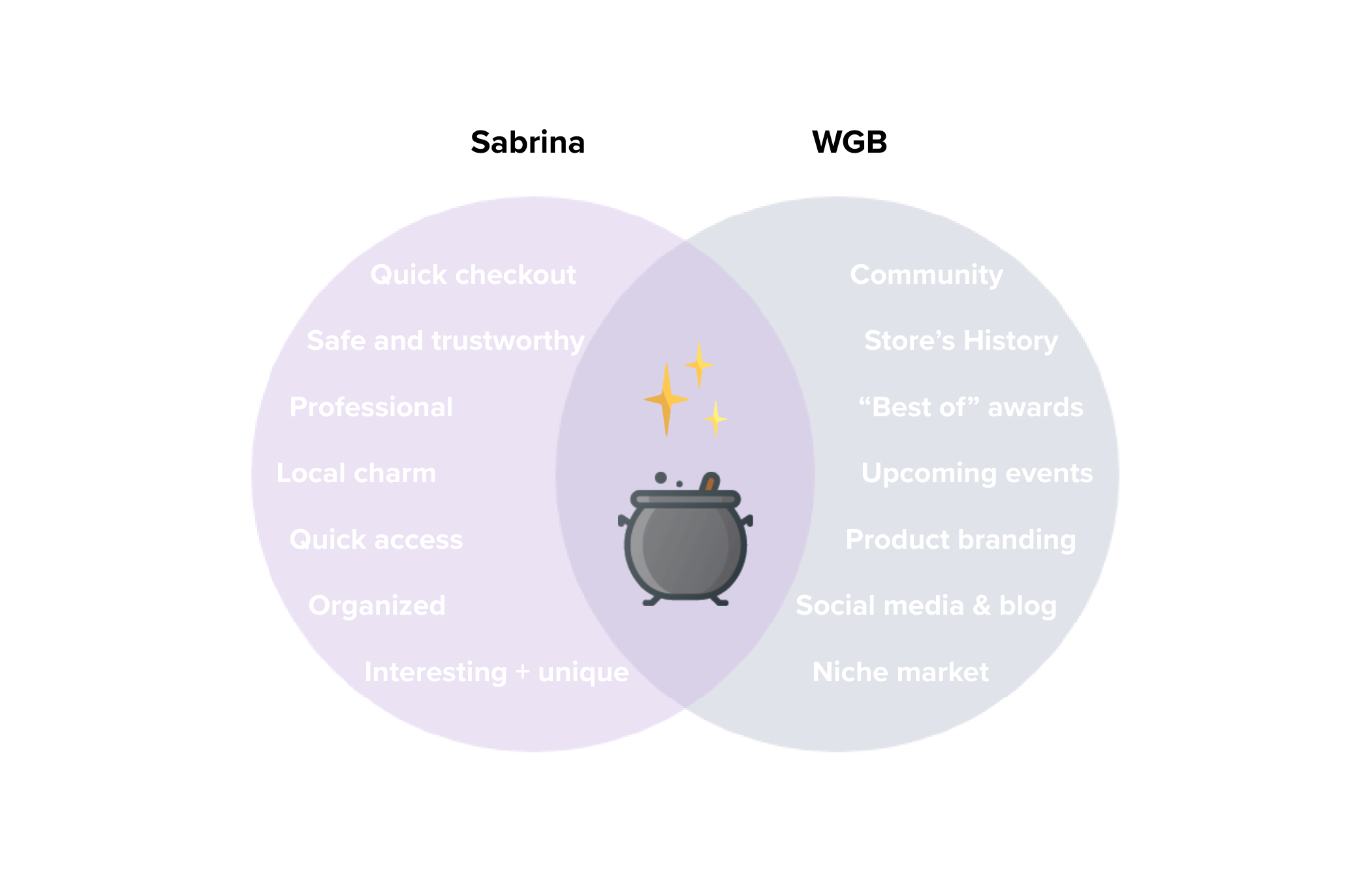
Sabrina needs online book shopping to be safe, interesting, and easy to navigate, because she wants to enjoy and support her local bookstore online just as much as she does in-person.
Wicked Good Bookstore wants to share their local and unique identity while engaging users enough to purchase products so that they can reach customers through their niche market.
What WGB and Sabrina want:
How to Do It:
+ Get rid of unnecessary content to highlight the site's selling points
+ Reorganize and update pages to reflect the "Best of" store awards
+ Add visuals that are appealing and attractive
+ Information on store and upcoming events that hook users
+ Quick seamless checkout process
+ New navigation that is better categorized
+ Recommended products shown throughout site
+ Highlight unique identity and products
+ New forms for guest checkout, add to cart, billing, shipping, and checkout
+ Add a wishlist for customers
Important questions to solve for the redesign
Can we make the site seamless so that users have the energy to keep looking at interesting products instead of sorting through unnecessary information?
Can we show products that users may like so that it is easier for them to decide on their next steps?
Next Stop, Map Out and Sketch the Design
A sitemap will lead you to where
you need to go and find new
discoveries along
the way.
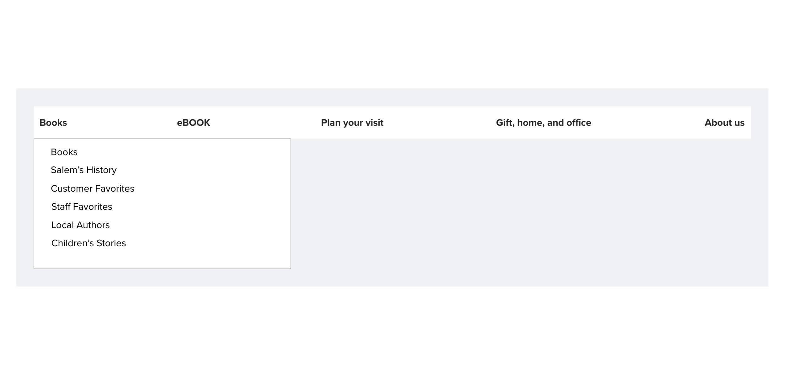
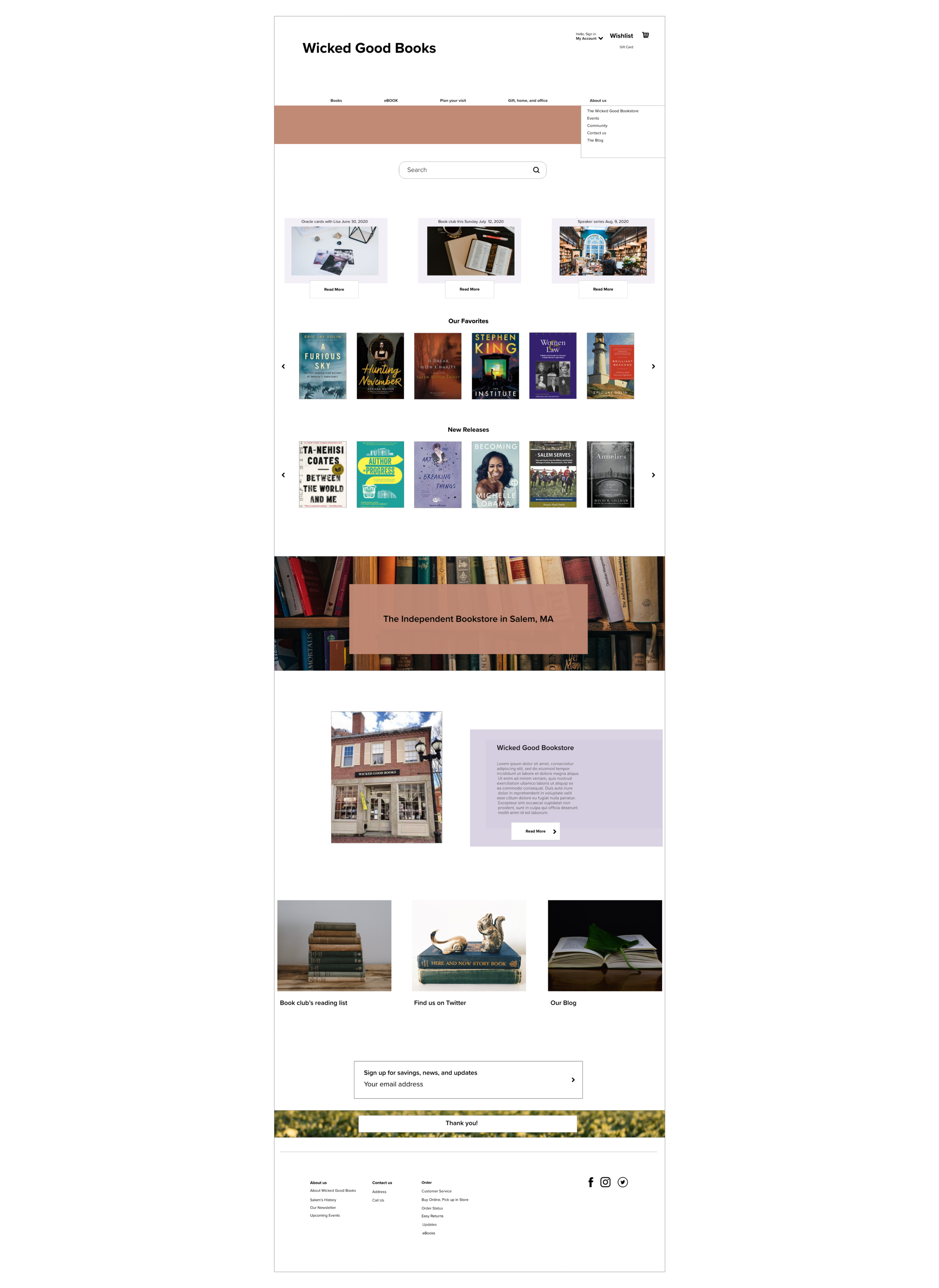
Redesigned Navigation
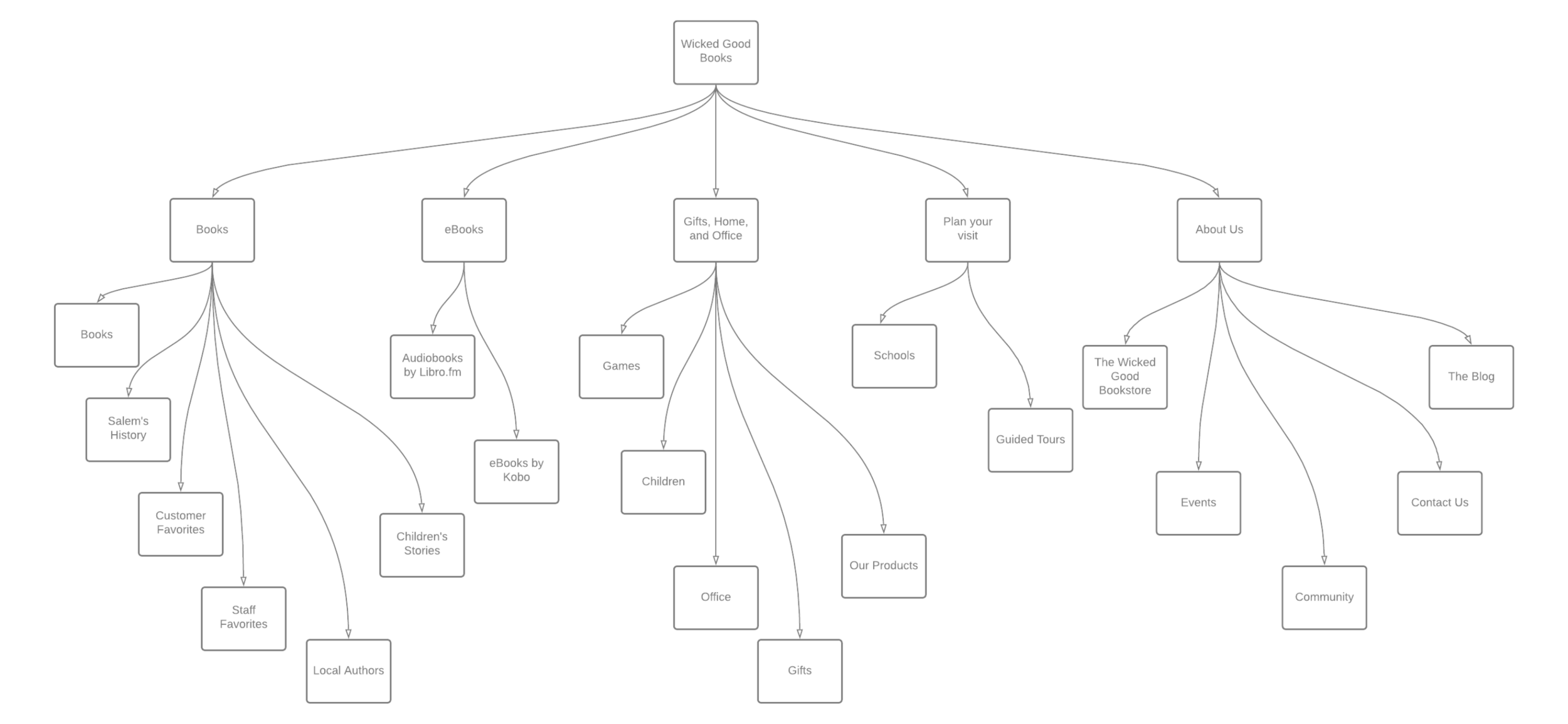
New Navigation
The redesigned navigation has categories that are more intuitive for users to move through. "Books" contain the different book categories, "eBook" shares information on audio and smart device reads, "Plan Your Visit" gives visitors information on the building and possible tours, "Gift, home, and office" contain the WGB product line and art items, and "About us" gives information on their location, hours, and blog.
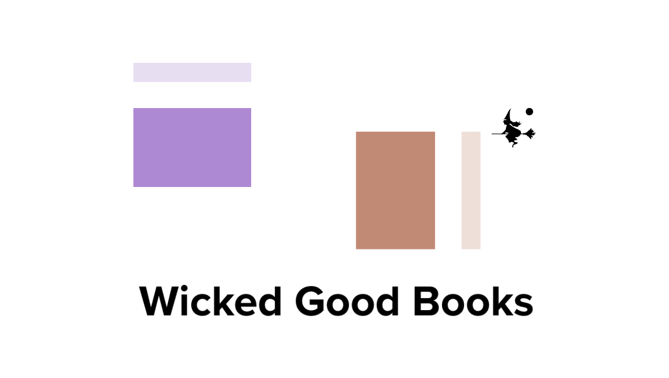
Color Scheme
A purple announcement on the current site inspired the purple hue chosen for the redesign. A light color purple is used to convey the welcoming and whimsical nature of the store. A light brown was picked to bring to mind a well-used library and the bookshelves, worn pages, and cozy chairs that make for a reading nook.
The colors are intended to support the local charm, more modern design, and professional feel of the new site. The main site is shown in shades of black and white, so splashes of color should help to bring more character to the local store site and help to break up the content of the different pages.
Brown : Warmer tones to suggest a well-used and well-loved bookstore
Purple : Pops of different purples to add to the charm of the store and emphasize their niche market
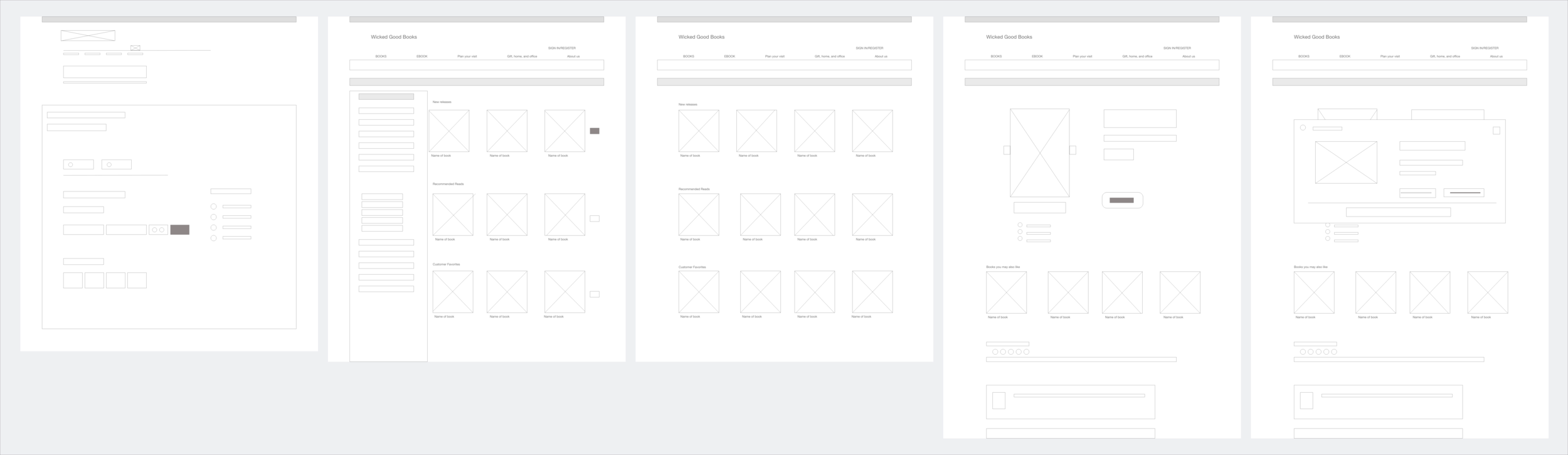
Wireframe Build
The main action for the user in the wireframe build was to show the user moving through the different stages of purchasing a book online - view books, choose book, add to cart, checkout process - from the start of entering the site on the homepage to deciding to leave the site after their curiosity has been satisfied. 🐱
Along the way, the user may be drawn to the wishlist, stumble upon a sold out book, and decide to learn more about the store's location and history.
Final Wireframes
🤚 Stop! User Feedback Pitstop
User feedback moved the design in a new direction once wireframes were completed and color and content were in the process of being added to the screens. I heard that the format of pages and the placement and sizing of the books could be changed to make the design more modern, similarly to how Netflix and Nike display their products.
This critique fueled the changes in visuals and page layout. It gave me new material from other sites, which led to adjustments in the original mock-up and further inspired its development towards a hi-fi prototype.
Changed Design from User Feedback
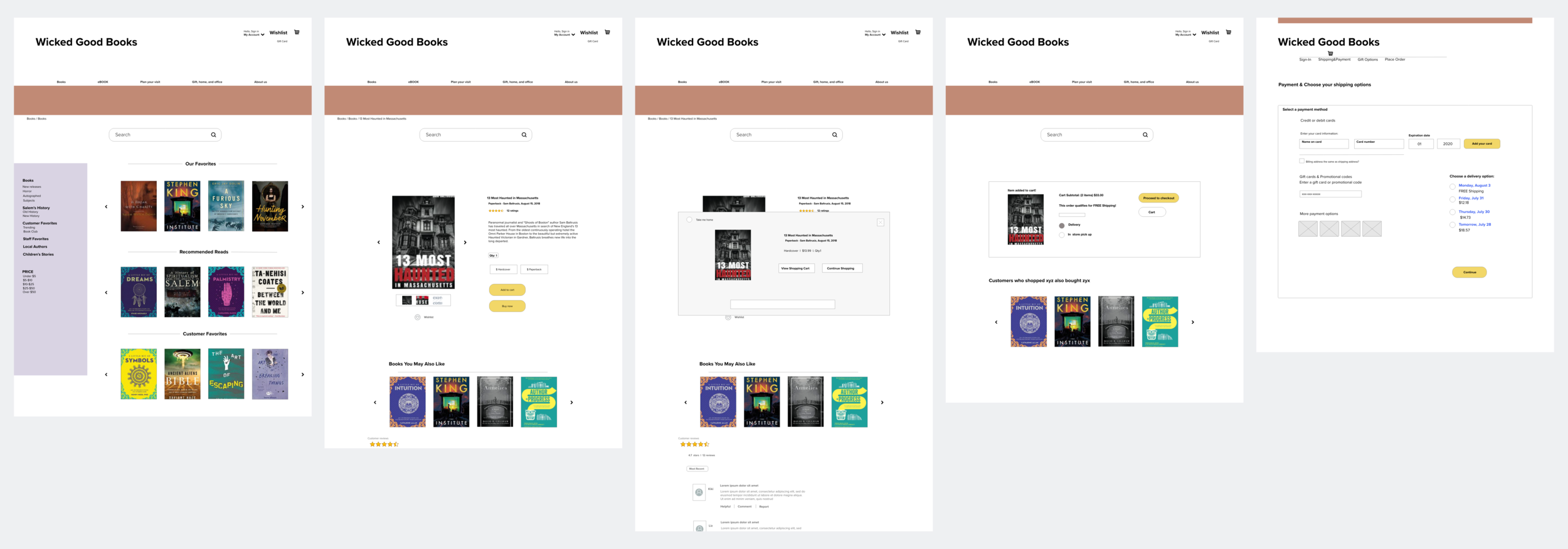
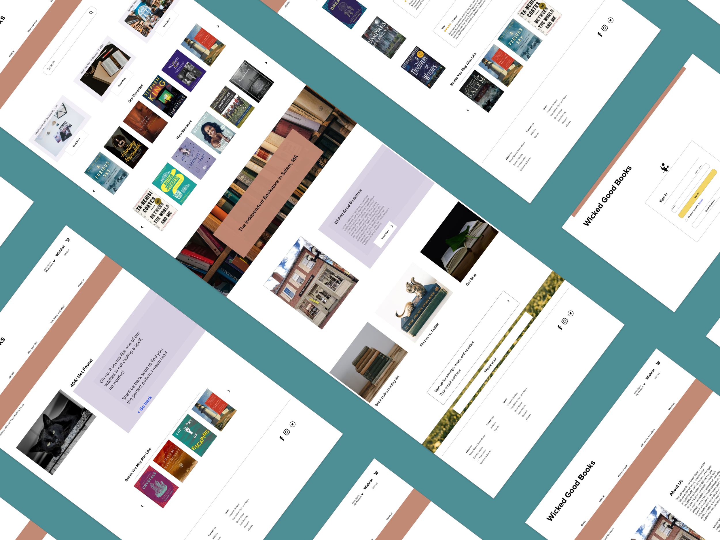
Hi-Fi Mock-up Pages
22 screens were completed and give an impression of the reimaged WGB site with both Sabrina and WGB's goals.
Sign-In Page
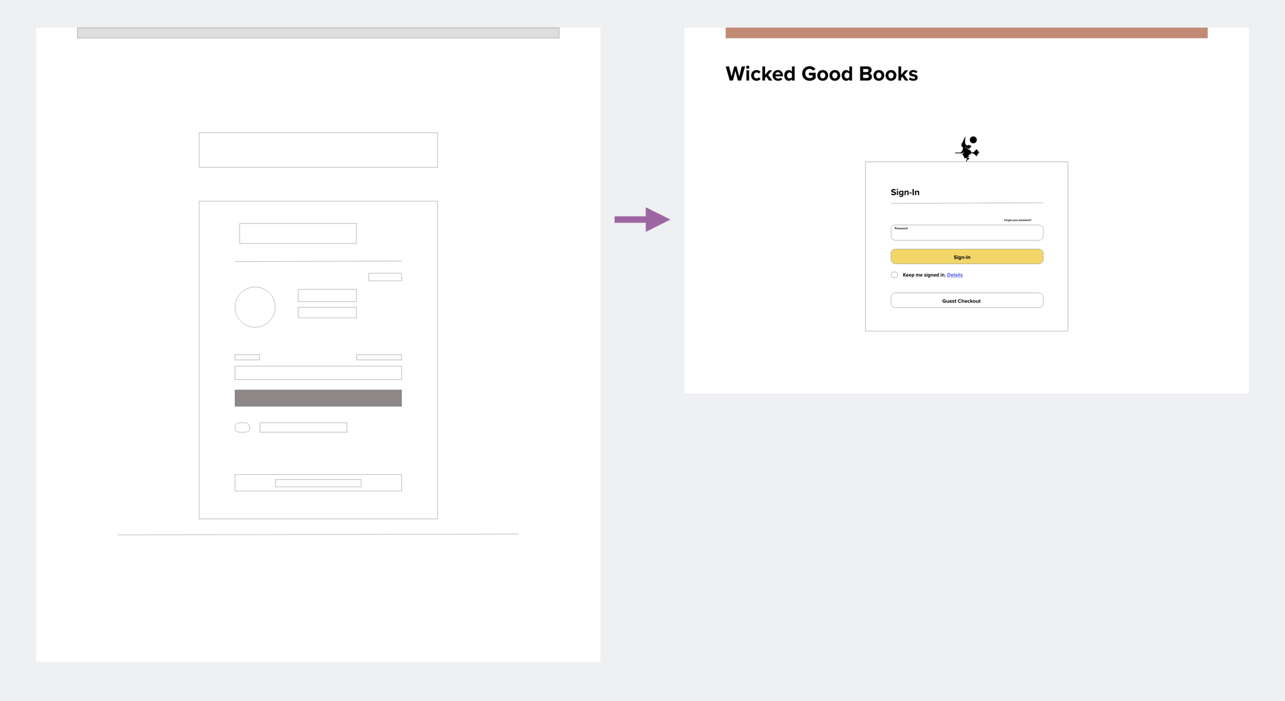
After choosing to checkout, a sign-in page appears.
The Amazon checkout process was repeatedly mentioned as an ideal online store shopping experience during user interviews. So, I used their site as a framework when building the WGB checkout experience. People liked the easy and speedy checkout, confirmation notification, and option to save payment and shipping information.
The WGB redesign draws on the intuitive impression of the Amazon checkout process as something customers would find natural to move through but adapted for WGB users.
The sign-in page similarly gives options to checkout as a guest or sign in to an account, but it is individualized to the local store with a witch icon and their color scheme.
Wishlist Page
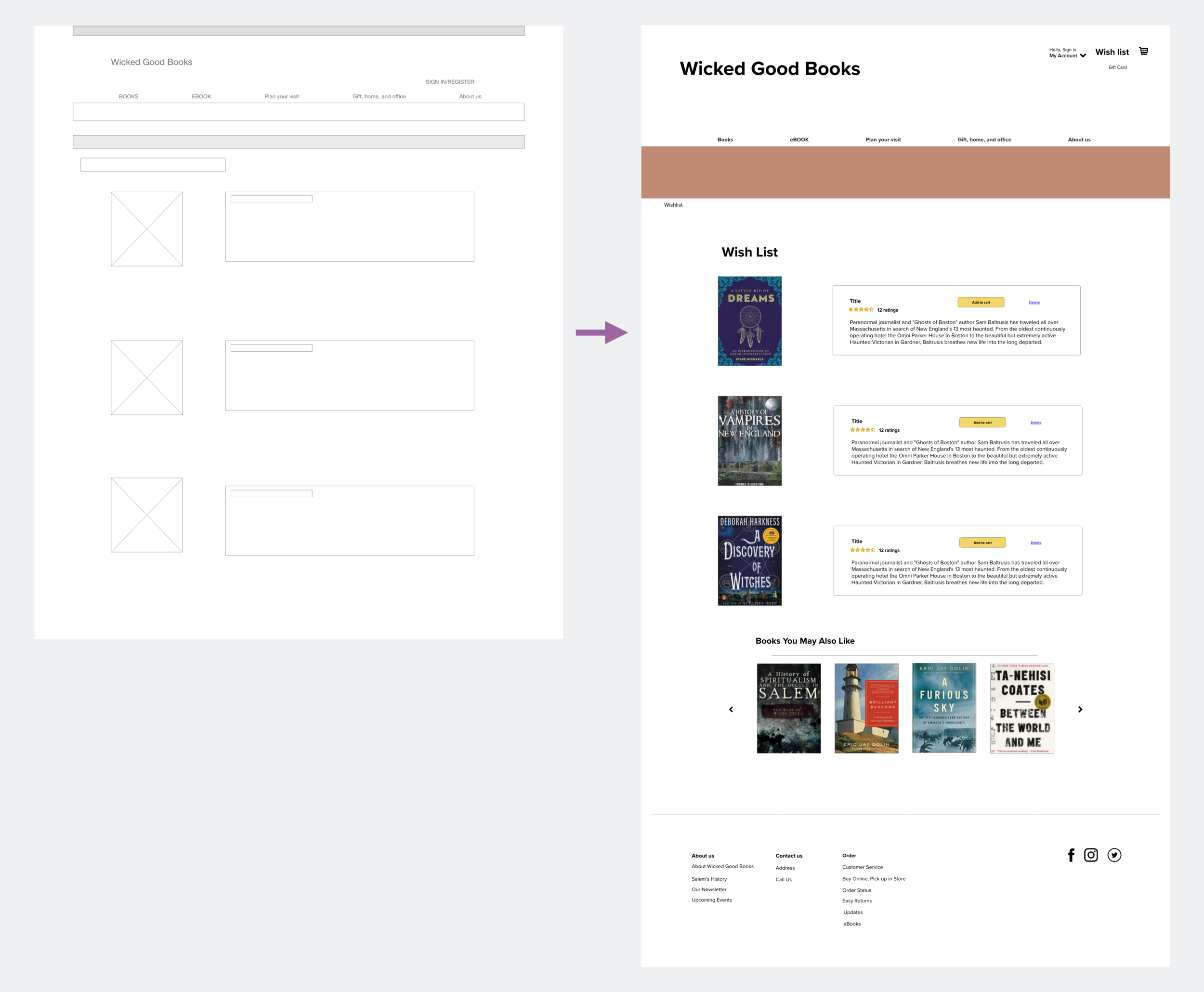
After purchasing a new item, you may find yourself drawn to a previous wishlist.
Sabrina's personalized Wish List saves items for her to explore before she checks out or after she checks out her initial cart items. It keeps her engaged with the WGB site, and recommended reads, suggested from previous purchases, browsing history, and wishlist selections, will appear as a natural next step for the user to take.
The wishlist section shows a summary of the book and options to delete the item or add it to the shopping cart.
404/ Not Found Page
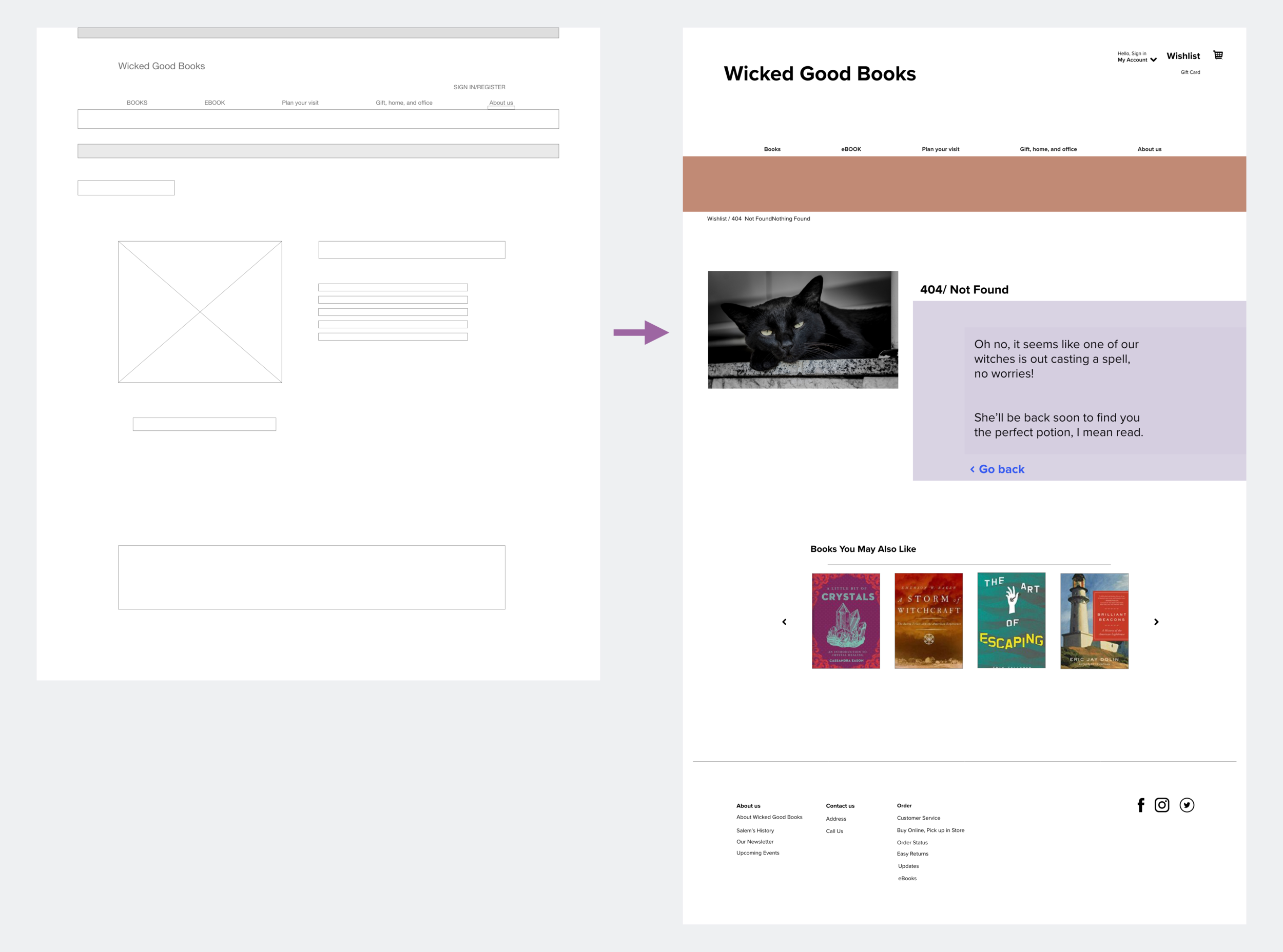
Oh, no! An alert will inform readers of a sold out product or unavailable page.
A 404/ Not Found page was created because content inventory and site research showed many products were sold out or had 404/ Not Found pages on the WGB site. To design for those instances, a personalized page was created to alleviate surprise and to redirect users back to their previous page or into a new path of looking at other books they may like.
The store cat will inform them,
“Oh, no, it seems like one of our witches is out casting a spell, no worries!
She’ll be back soon to find you the perfect potion, I mean read.”
They can then click on the breadcrumb, “Wishlist", or the back tab to return to the Wish List page. Or, they can browse recommended reads under the local cat's message.
Bonus Pages! Further Developments
For captivated and curious readers, there are new "About us" and "Contact" pages.
The original WGB "About Us" page was the same as the "Hours" page. It was confusing to have two different navigation titles leading to the same page, so I created 2 new pages to show the distinction between the store's contact information and WGB's background. Now, the "Contact Us" page informs users where the store is located, when it is open, and how to find them. The "About us" page tells readers who WGB is and shares information on it's connection to Salem with a description and the surrounding area with a timeline.
Original “Contact” and “About Us” Page
Redesign with an “About us” and “Contact” Page
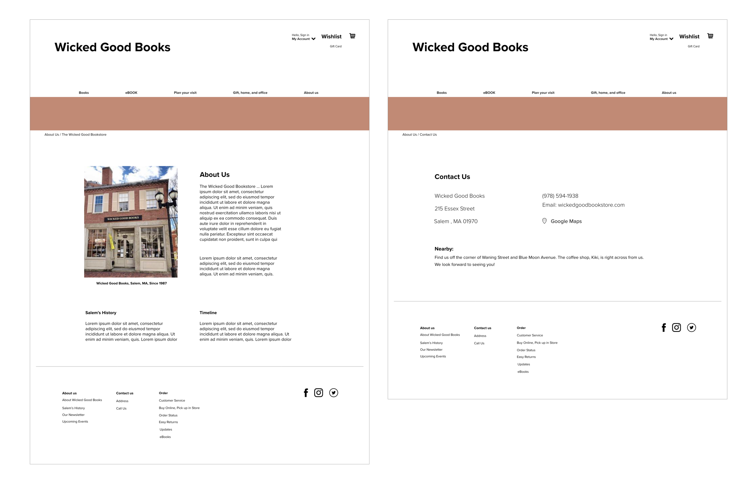
About us: A picture of the building, with the description, “Wicked Good Books, Salem, MA, Since 1987”, is shown next to a description of WGB. Additional information can be found under “Salem’s History” and “Timeline.”
Contact: Information is grouped clearly and concisely showing a link to Google maps, a phone number, an email, and an address. There are also directions given in relation to the other shops in the area.
Homepage Before + After
The redesign translates these points into a new layout and priority of information with a new visual look. Now the first site's values are better communicated to people looking for a charming local store market that displays information in a professional
Current Site
Redesign
Homepage Before + After
Current Site
Redesign
Prototype
The redesign translates these points into a new layout and priority of information with a new visual look. Now the first site's values are better communicated to people looking for a charming local store market that displays information in a professional and more modern look. Importantly, it also prioritizes the books they may want to view at the top of the page rather than items at the bottom of the page. 💫
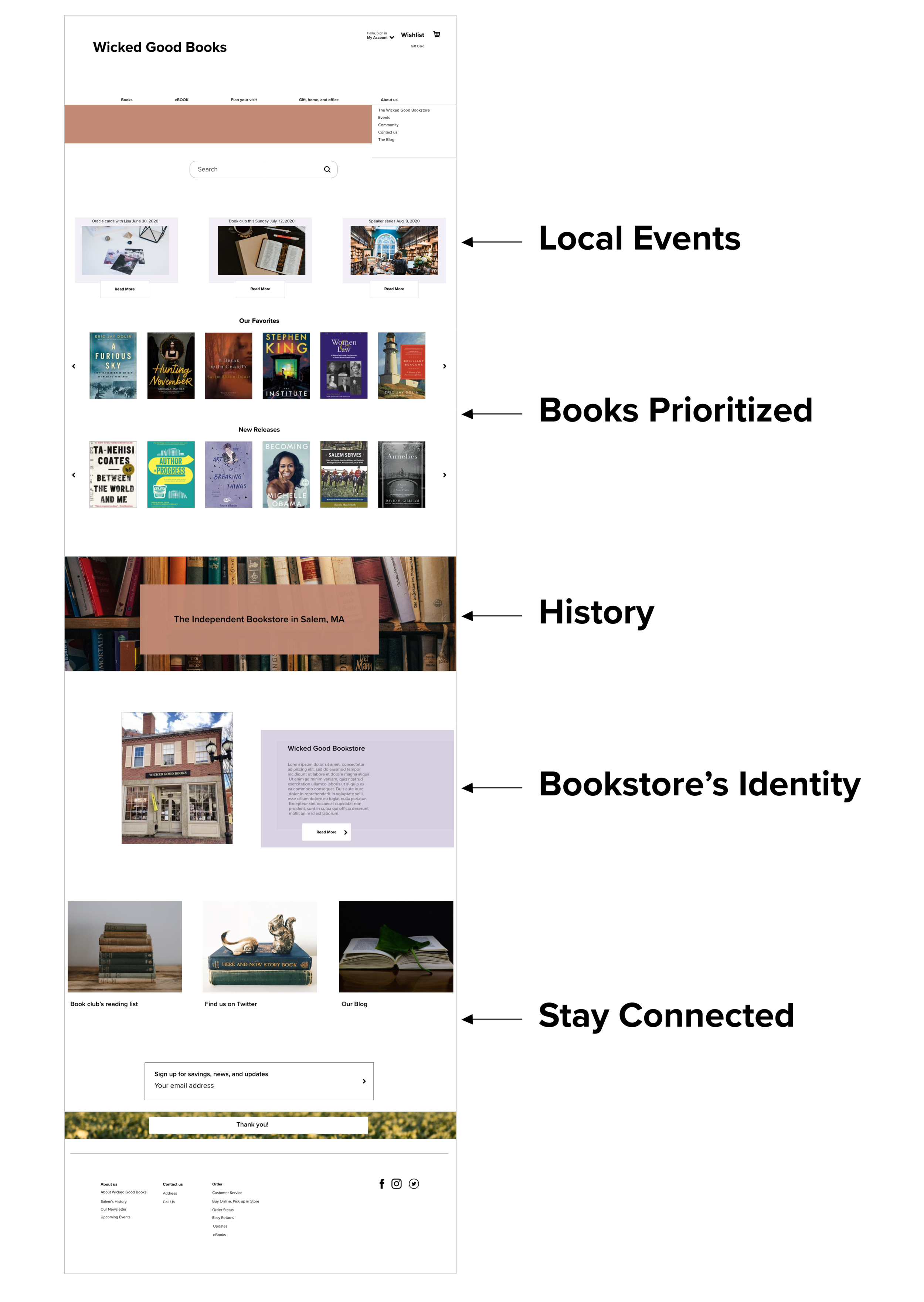
Redesigned Homepage
Key Points: The homepage takes what user's deemed important and what WGB values into the hierarchy, content, and visuals so that users are motivated and interested in the store and so that WGB shares who they are while also providing a useful online platform for what they do.
Online book buying and exploration of a niche market is more accessible, while users are also drawn into the story, local community feel, and history of WGB.
The homepage works to bring the goals of Sabrina, the target user, and WGB, the local store, together as the basis from which the user can choose to explore the site looking for books or browse an array of other WGB information.
Reflection and Next Steps
In-depth usability testing would be the next step to gather other people's perspectives on the function of the site and see if the design vision matches their experience of it. From this, adjustments can be tailored to their feedback and responses can show how the original site compares to the new one. A goal would be to look into a turbo checkout process and smart search to improve people's book search and quick checkout.